SaaS website examples that explain the product fast.
The best SaaS website examples answer three questions before the first scroll: what the product does, who it is for and what to do next. Here are product sites I designed for SaaS, AI and app companies, the pattern behind each and a homepage anatomy you can check your own site against. Built for CEOs, founders and marketing leads at B2B tech companies.
2 of 3 spots left in November
250+ brands in 8 yearsGoogle 4.7 (29)Upwork 4.9 (126 reviews)Proposal in 2-8 h
Check your own SaaS site in five minutes.
Open your homepage on a phone and answer these honestly. Every no is a fix.
- Can a stranger say what you do after the hero?
- Is there one action, not four?
- Does the proof name real customers or numbers?
- Does each buyer role find its page?
- Can your team add a page without a developer?
- Does ChatGPT describe your product correctly?
Six product websites, and the pattern in each.
Sites and website visuals I designed for SaaS, AI and app companies. Each card names the pattern worth copying.
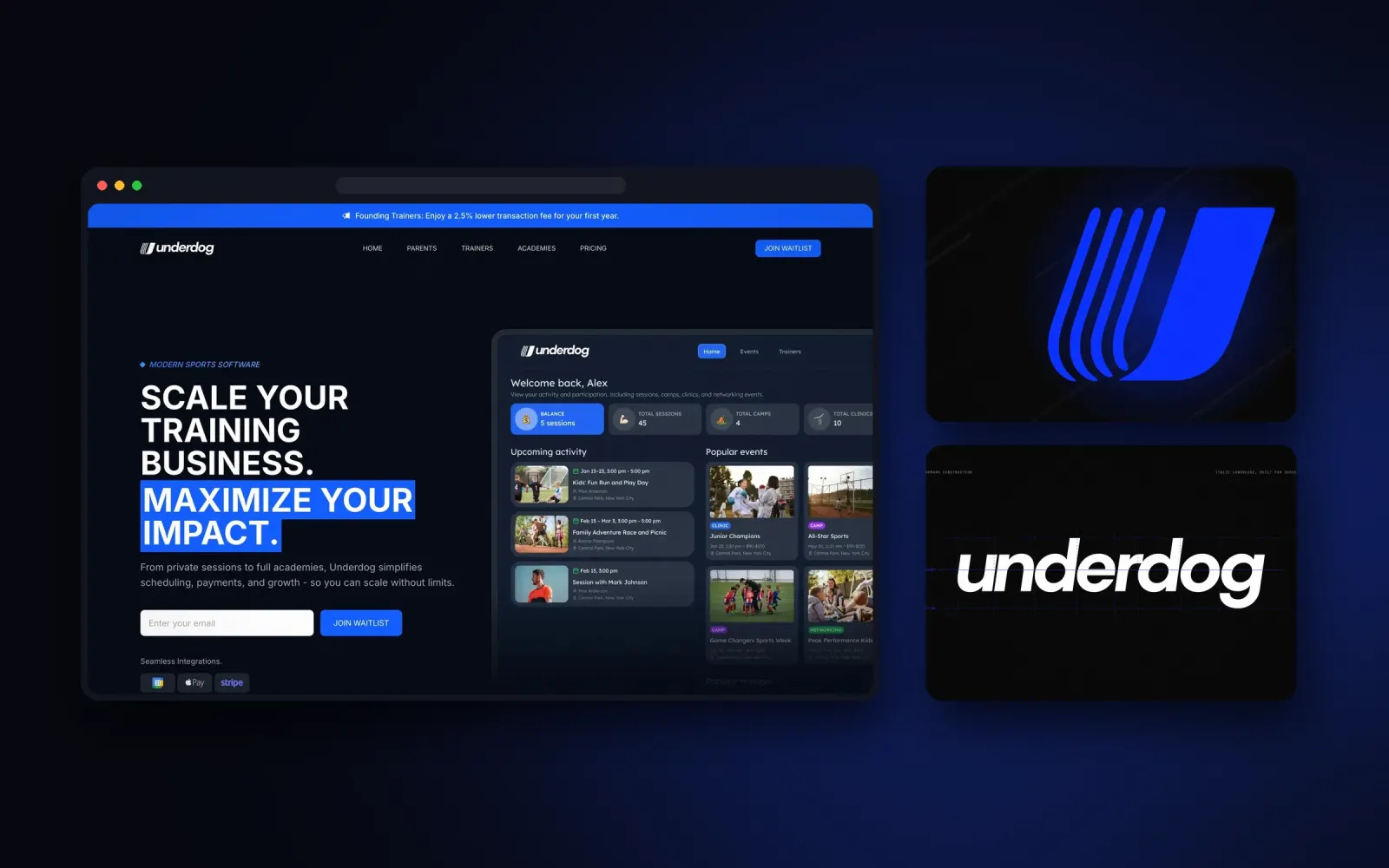
Underdog
Two audiences, one site: trainers running a business and parents booking sessions each get their own view. Pattern: split by role, not by feature.
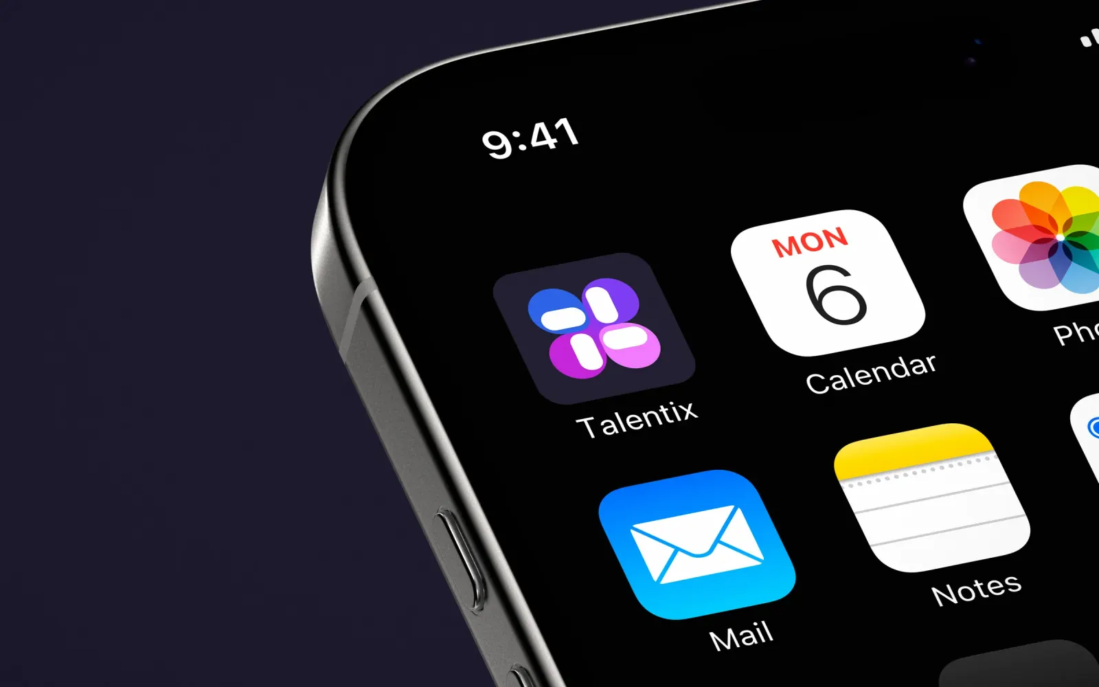
AI recruitment SaaSTalentix
Four AI modules shown as one hiring flow, each with its own piece of the mark and its own colour. Pattern: name the modules, sell the flow.
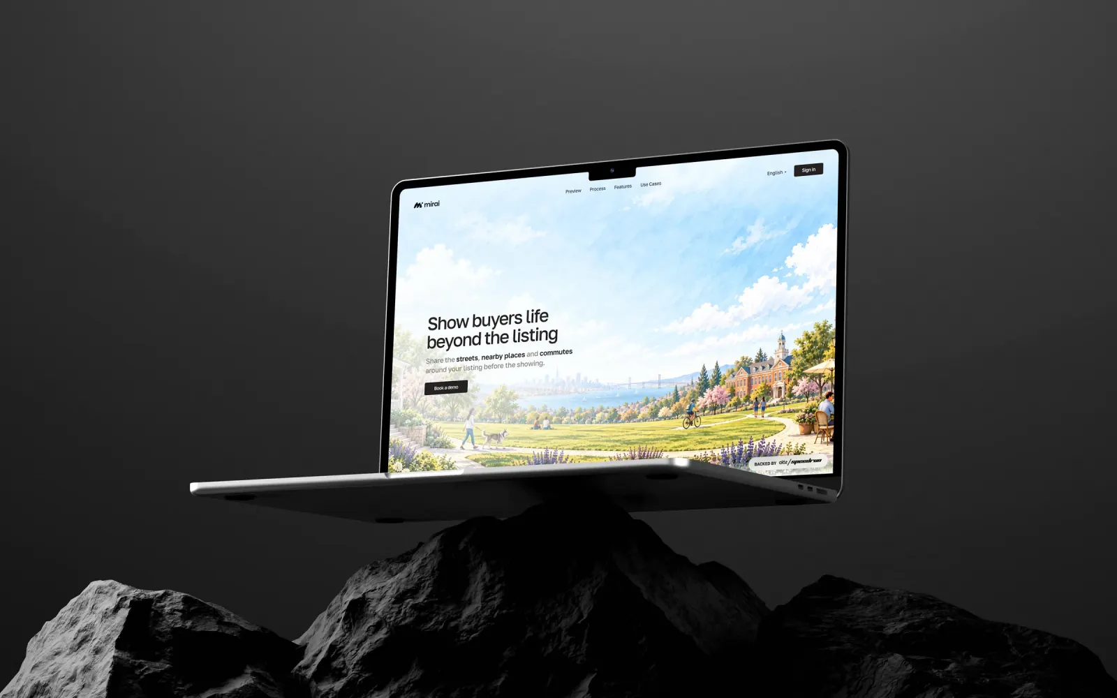
AI for real estateMirai
A warm orange brand against the blue of every portal and CRM, tested from a 16 px favicon up. Pattern: own one colour the category does not use. Live at heymirai.ai.
AI recruitment SaaSRecruitsome
A Framer site where “Hire Smart, Save Time, Grow Fast” runs from the hero to the campaigns. Pattern: one line the whole site repeats.
Offline navigation appTrackaroo
Built for early-access sign-ups. The key feature, BackTrack, appears exactly when the story needs it. Pattern: reveal the feature at the moment it matters.
Offshore telecomDeepsea Networks
Every service sits inside one six-chapter story instead of a services grid. Pattern: one story, services inside it.
What a SaaS homepage has to answer, in order.
| The visitor asks | What answers it | |
|---|---|---|
| Hero | What is this, and is it for me? | One line: what it does, for whom. One action. |
| Proof | Do people like me use it? | Logos, a number, a named quote |
| How it works | Is it simple? | Three steps or one flow, like Talentix's four modules |
| Use cases | Does it fit my situation? | A view per role, like Underdog's trainers and parents |
| Pricing or demo | What happens next? | One clear path: trial, demo or a call |
| FAQ | What about my objection? | Short answers, also read by ChatGPT and Google |
What the good SaaS websites have in common.
None of these is about a trend. The brand side of the same companies is on SaaS branding examples.
- The hero says what it does in plain words, no “platform” fog
- One action per section, the same one repeated
- A view per buyer role when there are two audiences
- Product UI in the brand, not generic dashboards
- Pages your team can add without a developer (pricing, changelog, use cases)
- Real HTML and clear facts, so ChatGPT describes the product correctly: see what a Brand OS is
Open the full cases.
Brand and website designed together, so the product, the site and the deck say the same thing.
How I build a SaaS website.
7-14 days for the site, 21 days with the brand.
Message first
What it does, for whom, why now. The hero line before any layout.
Structure and design
Homepage, product, use case and pricing pages in your brand.
Build
Framer or custom code, CMS, analytics, SEO and AI search basics.
Hand over
Every account in your name, and a short video so your team can edit.
Tell me about your brand. Get a plan in a minute.
Three taps, then my plan for you: the package, the days and what you get. If it fits, I write a fixed-price proposal in 2-8 hours. One field at the end, email or WhatsApp. Nothing is binding.
Before you decide: AI Mirror shows what ChatGPT says about your company today, and Position Check compares your site with competitors. Both free.

A feature-list site, next to a site that explains.
| Feature list | Explains the product | |
|---|---|---|
| Hero | All-in-one platform for teams | What it does, for whom |
| Structure | Twelve icons in a grid | One flow or one story |
| Action | Four buttons | One, repeated |
| AI search | Vague summary | Correct description |
Not right? Full refund.
You see the strategy and the first design direction before anything else gets built. If it doesn’t feel like your company, tell me within 24-48 hours and you get back everything you paid.
- Full refund if the first direction isn’t right
- Every file and key is yours from day one
- Fixed price, nothing added unless you ask
Written into every proposal.
Straight answers.
What makes a good SaaS website?
A hero that says what the product does and for whom, proof from real customers, one clear action and pages the team can add without a developer.
Framer or custom code for a SaaS site?
Framer when your marketing team should ship pages on its own, custom code for heavy 3D or unusual flows. See Framer websites.
Should a SaaS homepage show the product UI?
Yes, in the brand. Underdog's dashboard visuals were designed with the identity, so the product looks like the same company as the site.
Do I need the brand first?
Ideally both together: brand and website in 21 days. If the brand is solid, the site alone is 7-14 days. See brand and website in 21 days.
How do I check my current site?
Position Check compares it with competitors, and AI Mirror shows what ChatGPT says about you. Both free.
Want a SaaS site that explains itself? Tell me in a minute.
Proposal in 2-8 hours. Or 15 minutes on a call, and if it's not a fit, I'll tell you.