
 Hrvatski
Trackaroo. A website that loses signal as you scroll.
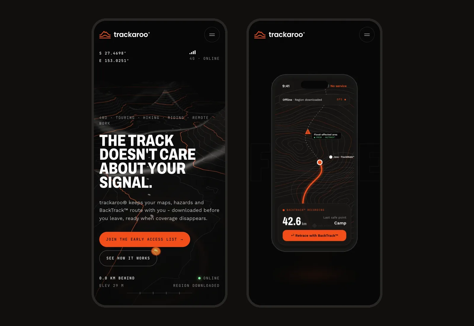
A brand and 3D website project for an offline navigation app. Logo, brand guidelines and a 3D website that feels like a film. It is for Trackaroo, an Australian offline navigation app. The mark puts Mount Kosciuszko over Uluru. The website drops from 4G to no service while BackTrack draws the way home.
The logo
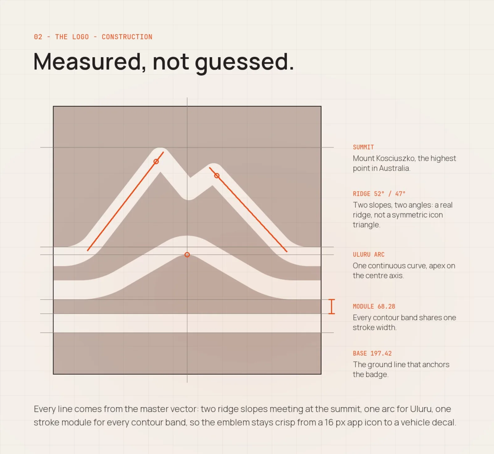
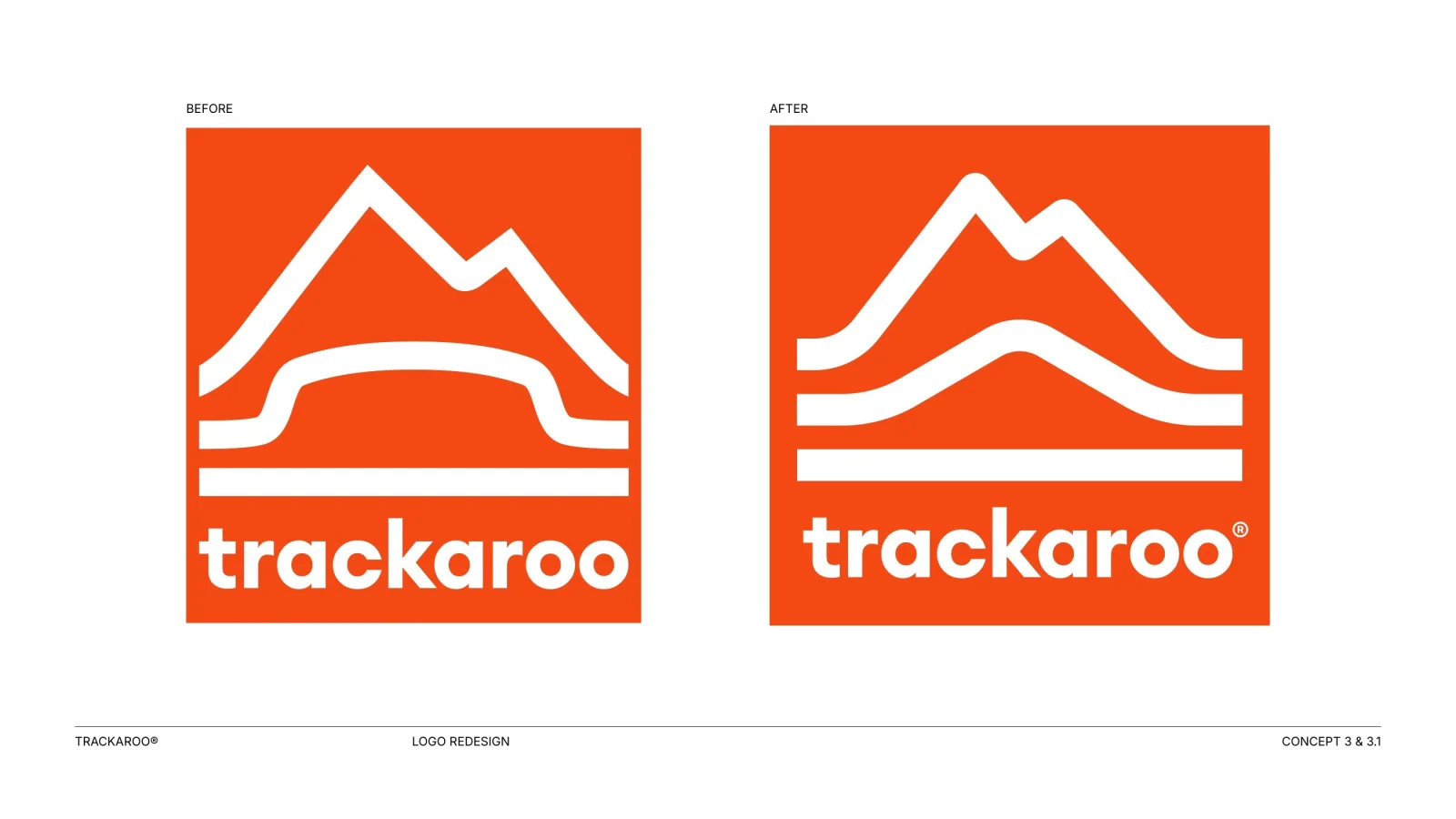
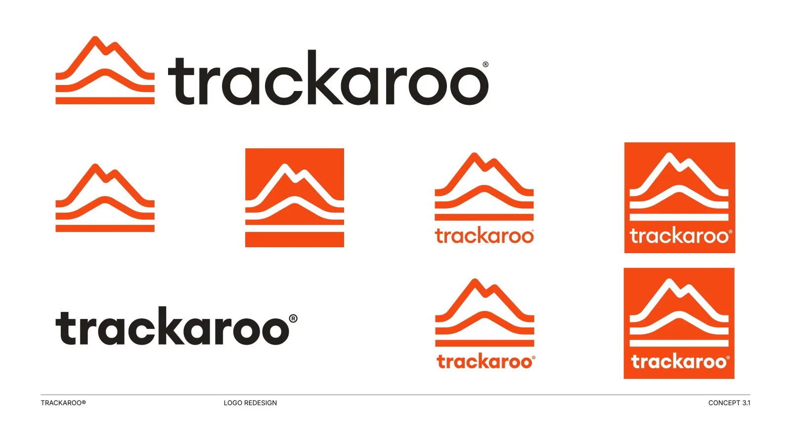
In the first round I explored seven directions. The client chose the landmark emblem. I then simplified the badge and rebuilt every line on one stroke module, so the mark holds from a 16 px app icon to a vehicle decal.
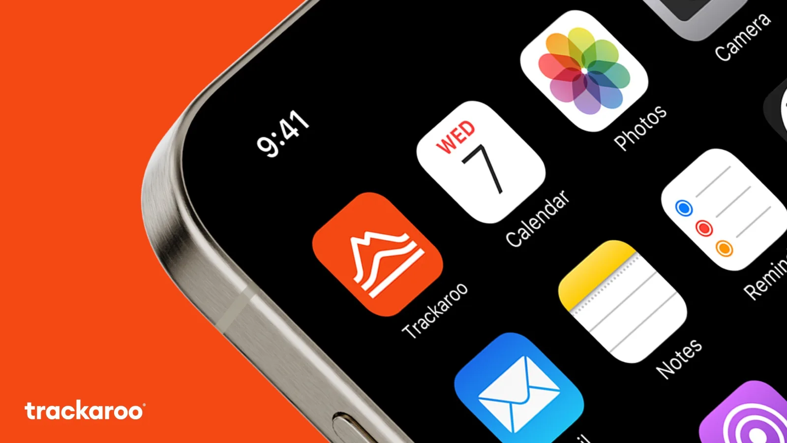
A navigation app that has to work where nothing else does.
Trackaroo keeps maps, hazards and a BackTrack route on your phone. They are ready when coverage disappears. I designed the logo and brand guidelines first, then the website. Most people only value offline navigation when it is too late. So the brand had to feel rugged and reliable. The website had to make visitors feel the moment the bars drop, before they ever need the app.
Make an offline feature feel urgent and build early-access sign-ups.
Safety, independence, calm, the outdoors.
Like a film, not a feature list. The screen tells the story. The outback, not stock hikers.
A website that loses signal as you scroll.
Stay the same everywhere you show up.Brand OS Portal keeps your logo, colors and rules on one link for your team.
Brand guidelines
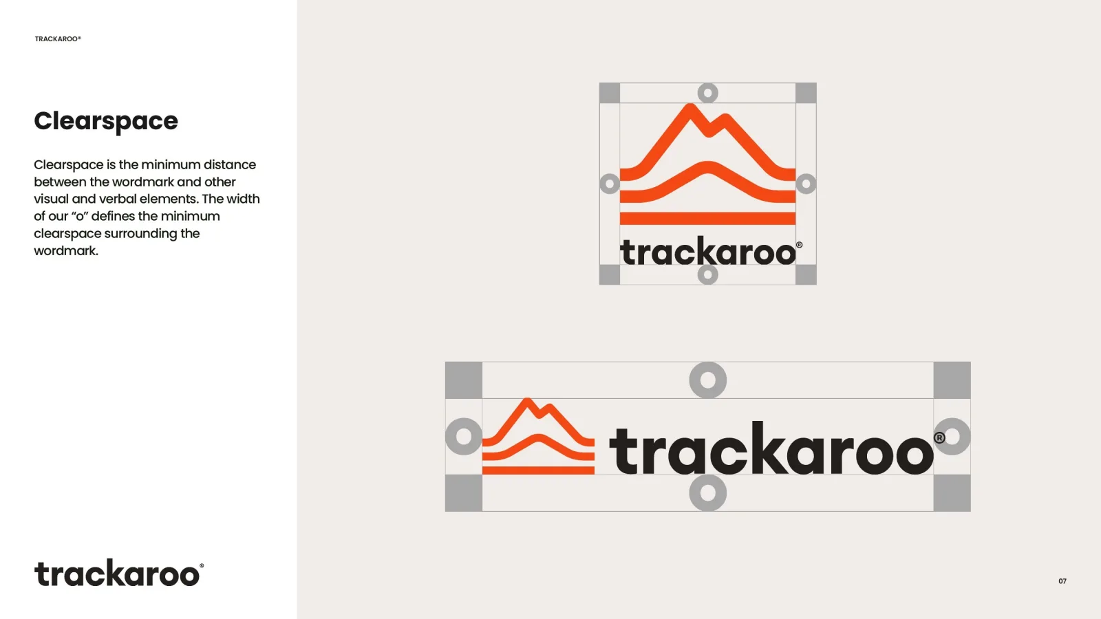
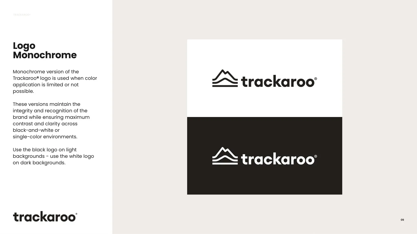
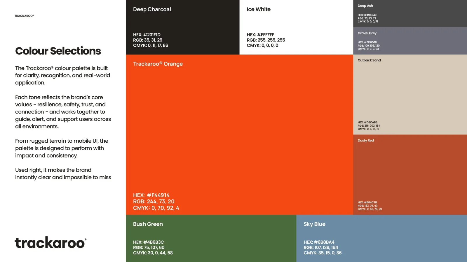
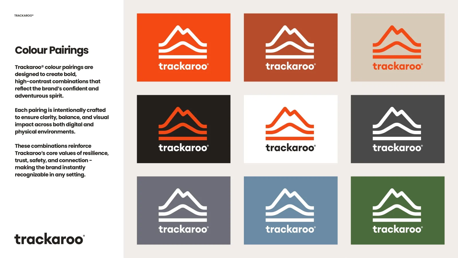
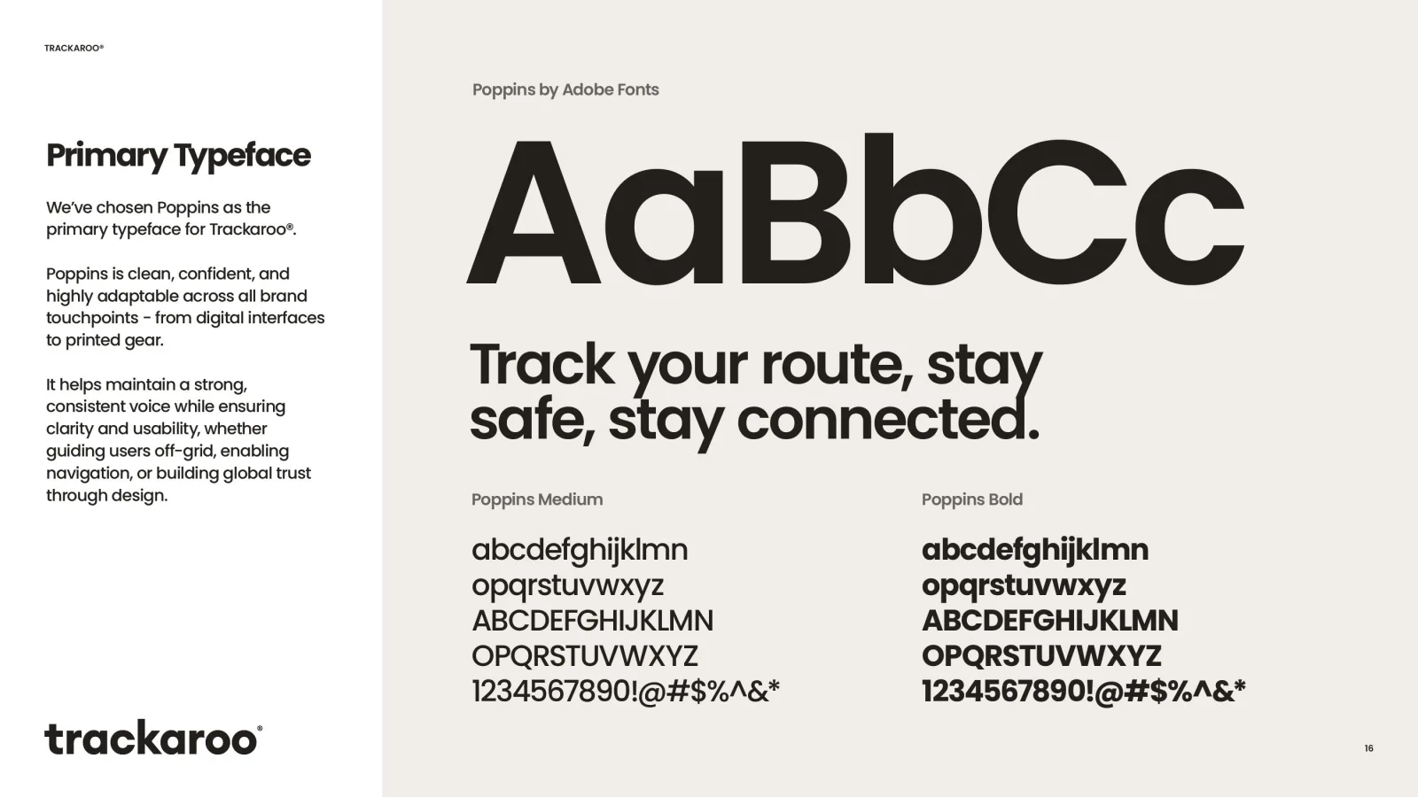
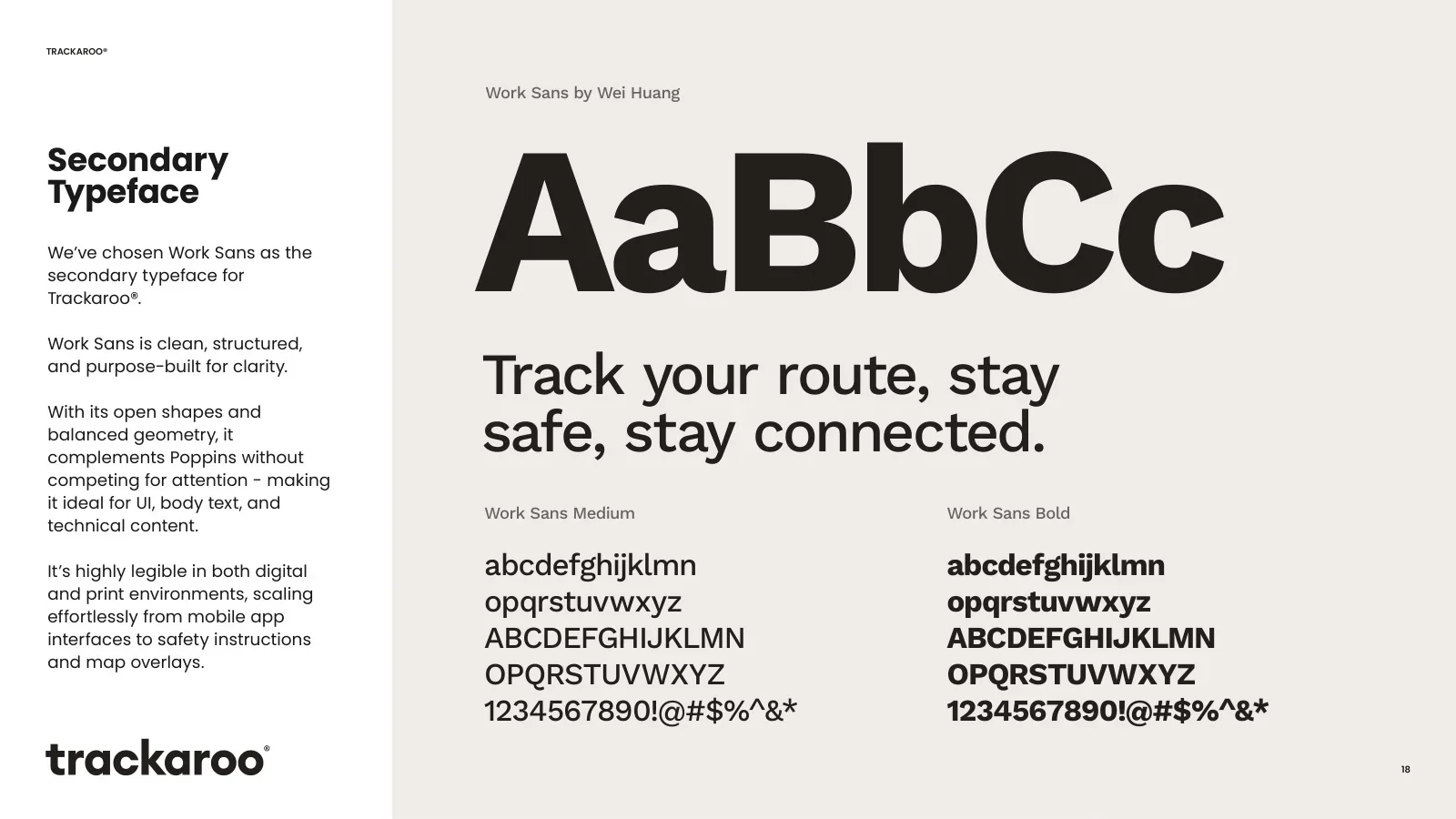
Clear space, monochrome versions, Trackaroo Orange with outback neutrals, colour pairings, Poppins and Work Sans: one system for the app, maps and equipment.
Trackaroo keeps you oriented when the signal is gone.
Maps that live on your device.
The route home, always drawn.
Warnings that do not need a tower.
Clear when everything else is not.
The 3D website
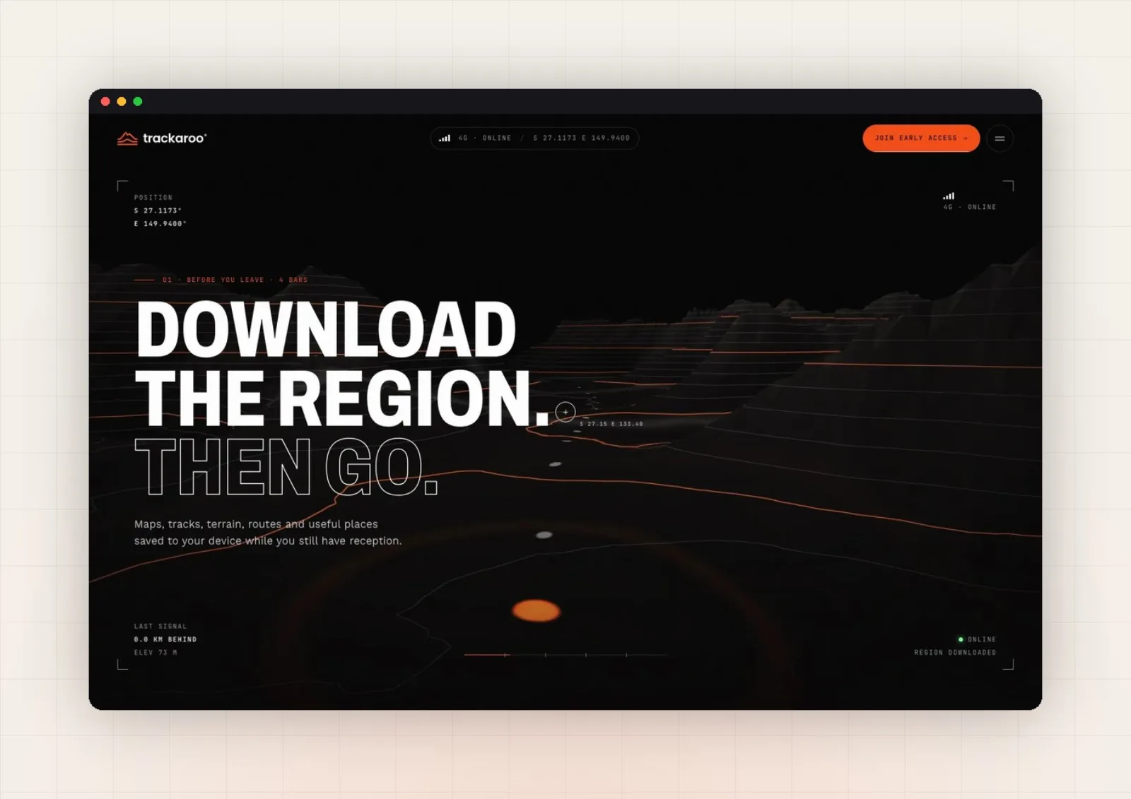
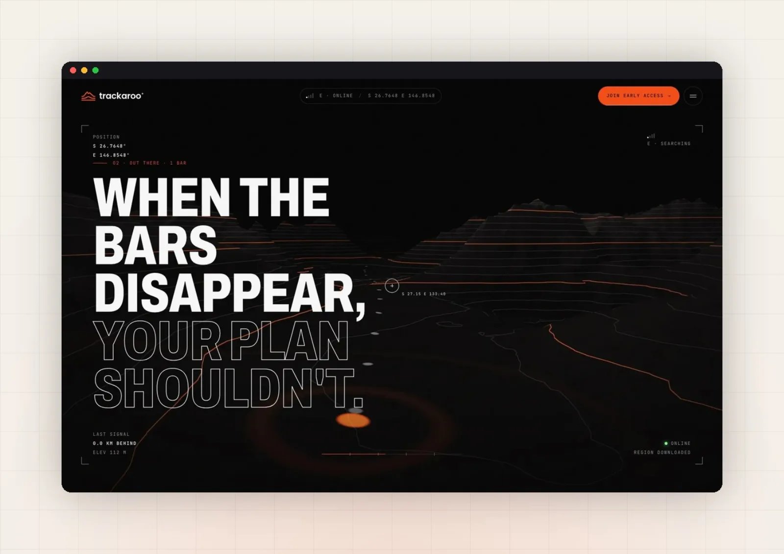
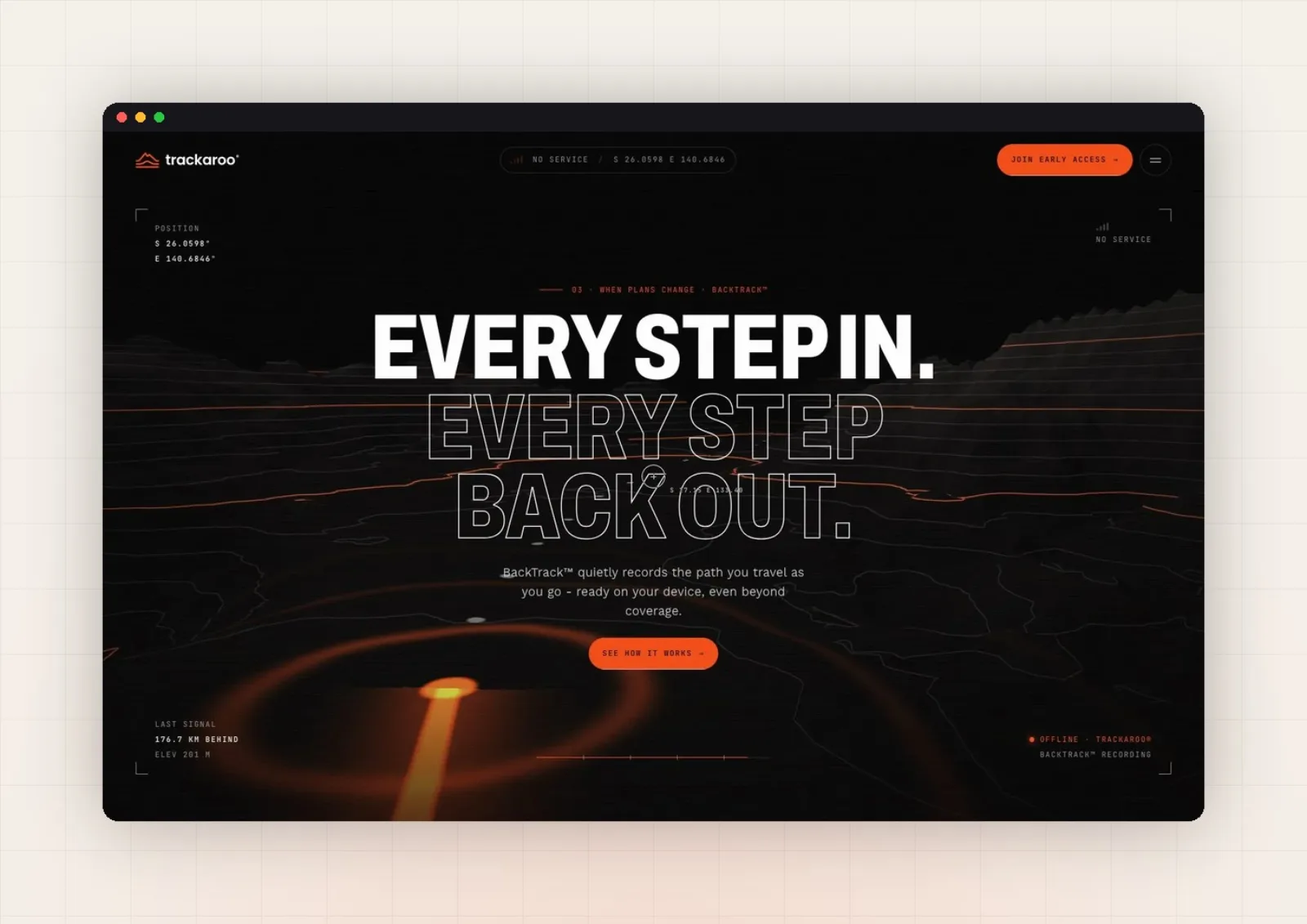
A scroll from 4G to no service over a 3D topographic terrain, with a live position readout and BackTrack drawing the route home.
Five decisions, and what I rejected.
- 01An emblem of two Australian landmarks
Mount Kosciuszko over Uluru, drawn as contour lines: a mark that is Australian at a glance and reads like a map. The brief said no mountains. I drew one anyway, and the client chose it.
RejectedAn arrow, a kangaroo or a generic map pin.
- 02A journey from 4G to no service
The signal indicator and the position readout degrade as you scroll deeper into the outback.
RejectedA feature grid with icons.
- 033D topographic terrain
The landscape sets the stakes better than any photo.
RejectedStock photos of hikers.
- 04Type that loses its fill
Headlines shift from solid to outlined as the signal weakens. The interface itself tells the story of losing connection.
RejectedStatic typography.
- 05BackTrack draws the way home
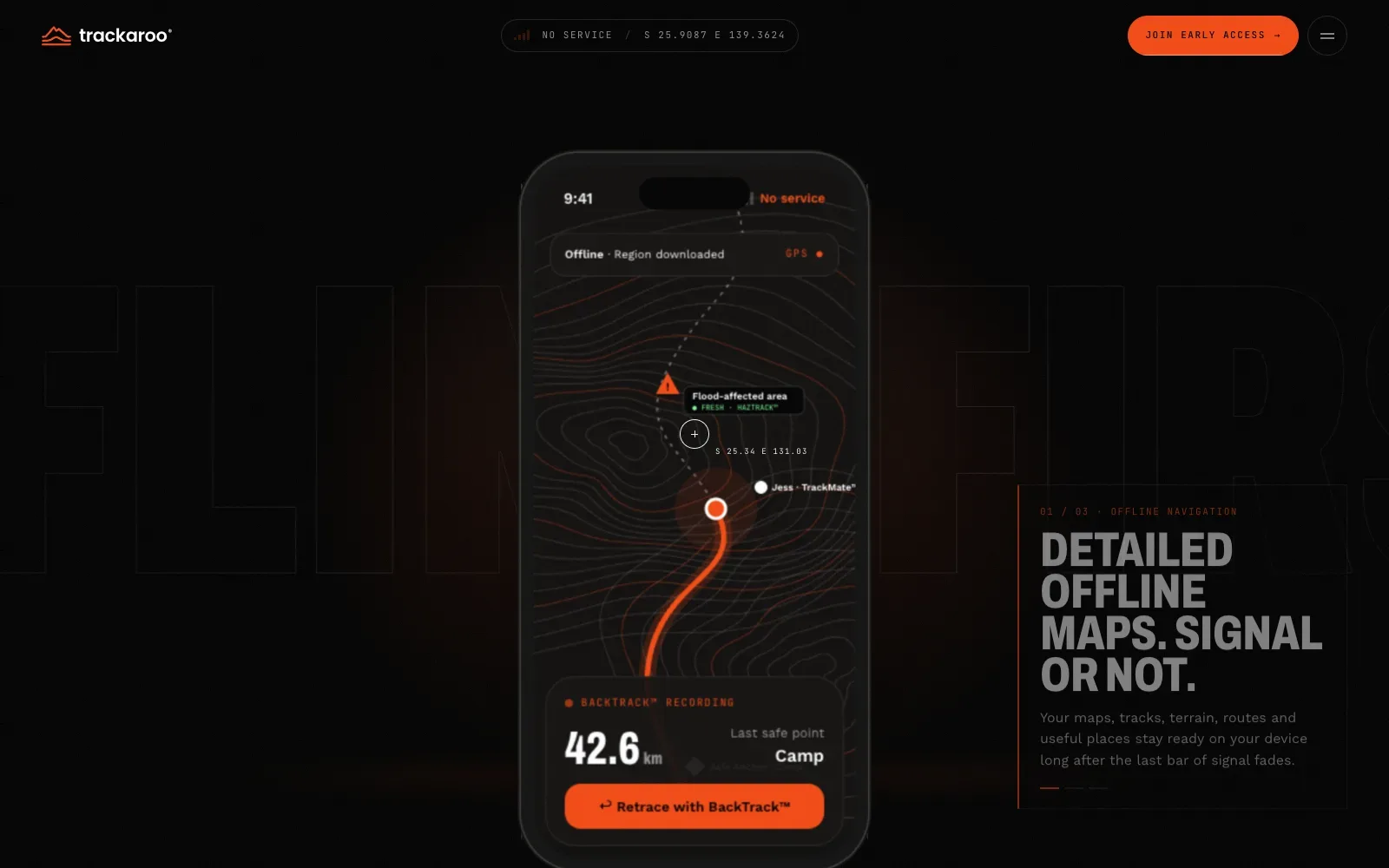
The key feature appears exactly when the story needs it.
RejectedListing BackTrack as one feature among many.
On mobile
The same story, rebuilt for the phone, where the app will actually be used.
What was broken, and what I built to fix it.
From logo to website, one trail.
Trackaroo got three things. A logo that is Australian at a glance. Guidelines that keep it consistent across the app, maps and equipment. A website that turns a plain feature into a story people feel. It is a clear example of 3D used for meaning, not decoration.
Emblem, lockups, colour, type.
4G to no service, live readout.
Signal-driven type and UI.
Want a brand like Trackaroo's?
15 minutes. No sales talk. You leave knowing what to do next.
Rather write to me?
Got it.
You hear from me within 2 to 8 hours.