
 Hrvatski
Breach. An AI brand built to break through complexity.
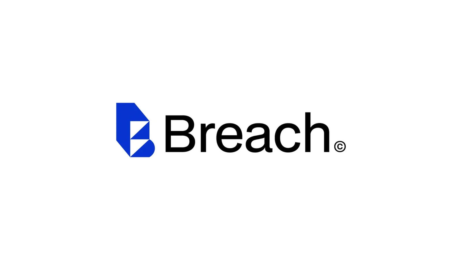
A B2B AI software branding project. I made the positioning, logo and brand identity for Breach, a US B2B AI software company. The mark is a geometric B with one cut. It has one colour that is theirs, and lines sales can repeat. It went from first idea to the full system in 21 days.
The logo
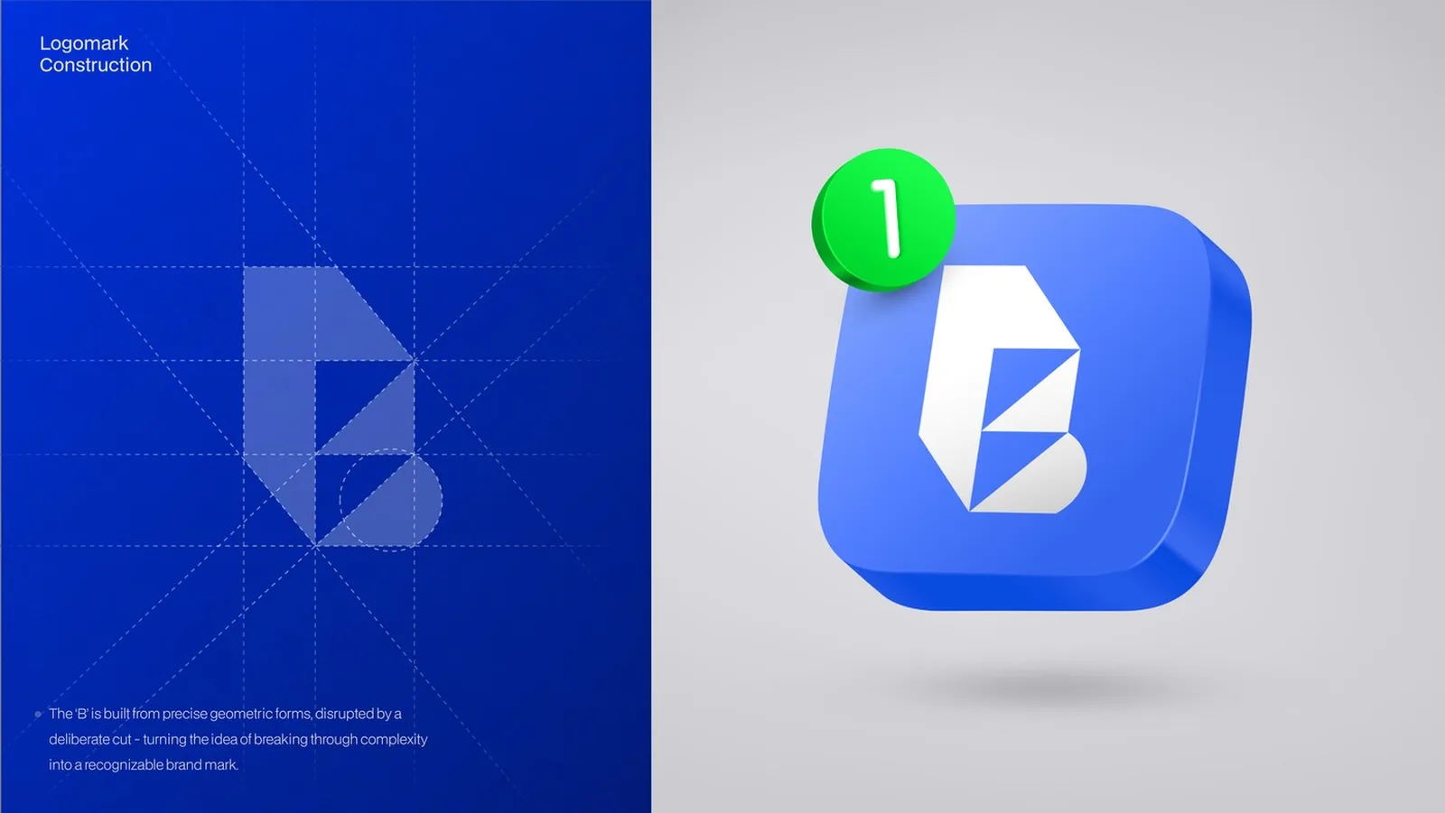
A B that breaks its own construction: precise geometric forms on a strict grid, one deliberate cut, a calm wordmark and a symbol that works alone as an app icon.
Good software, shown by a generic brand.
Breach builds AI software that makes complex work simple for B2B teams. The product was strong. The brand looked like every other AI company. It had a generic mark, borrowed gradients and a message buyers had to decode. Sales calls began by explaining what Breach was, not why it mattered. I built the brand from zero.
Look as established and credible as the product already was, from the very first contact.
Clarity, precision, ambition, trust.
Confident and technical, never cold. Distinct in a category full of look-alikes. Strong from app icon to conference stage.
A system people recognise: codes that say Breach before the logo appears. And one idea, breaking through complexity, in every element.
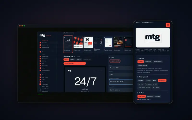
A clear brand has to stay clear.Brand OS Portal holds rules like these on one link, and your team makes posts and decks with them.
Colour and type
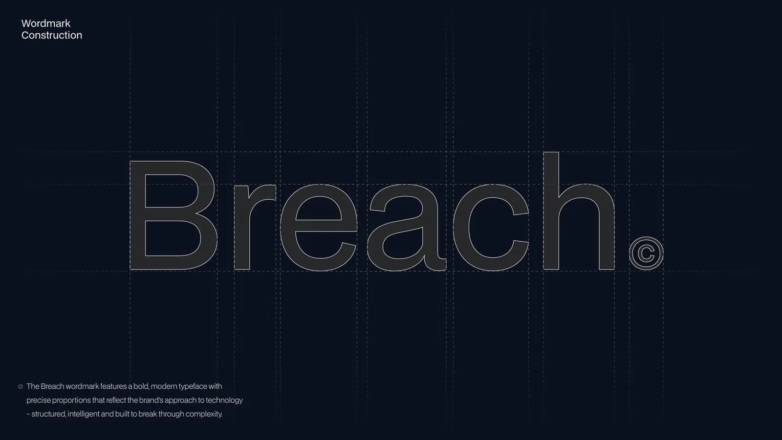
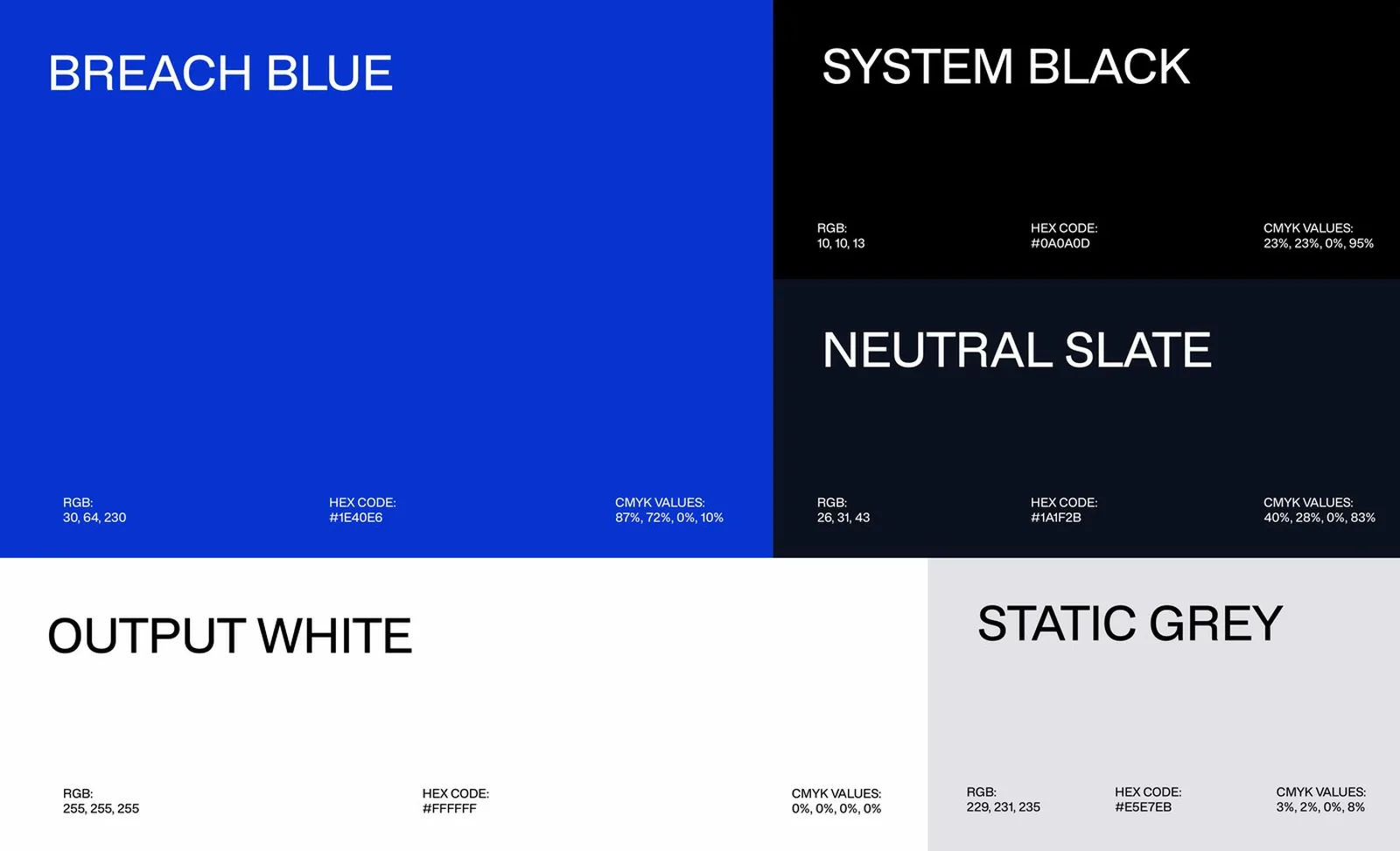
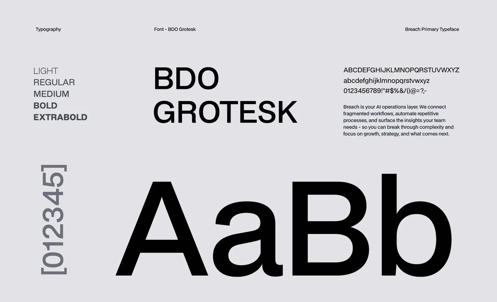
Breach Blue, System Black, Neutral Slate, Output White and Static Grey, set in BDO Grotesk from light to extrabold.
Breach is AI software that takes the complexity out of how B2B teams work.
Say what the product does in one line. No future-tech fog.
Precise shapes and restraint show a company that ships.
Controlled disruption: the brand moves, but the promise stays simple.
Codes that say Breach before the logo appears.
Product, campaign and stage
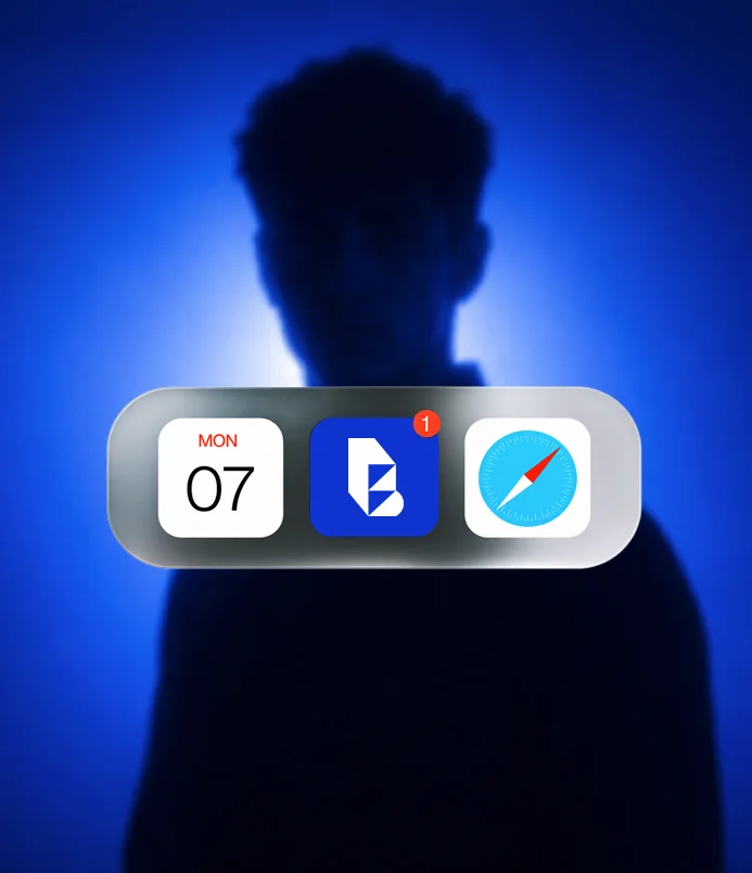
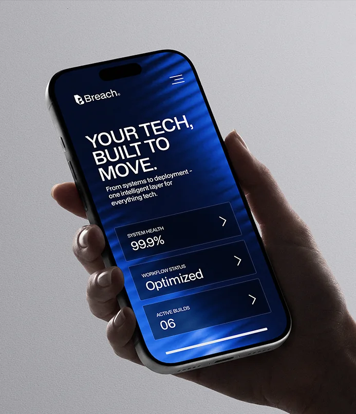
The same blue and the same light blades in the mobile app, on a watch, in a street campaign, on a conference stage and in social posts.
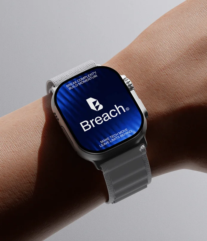
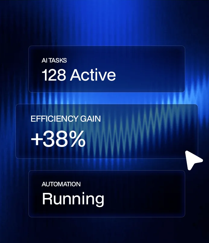
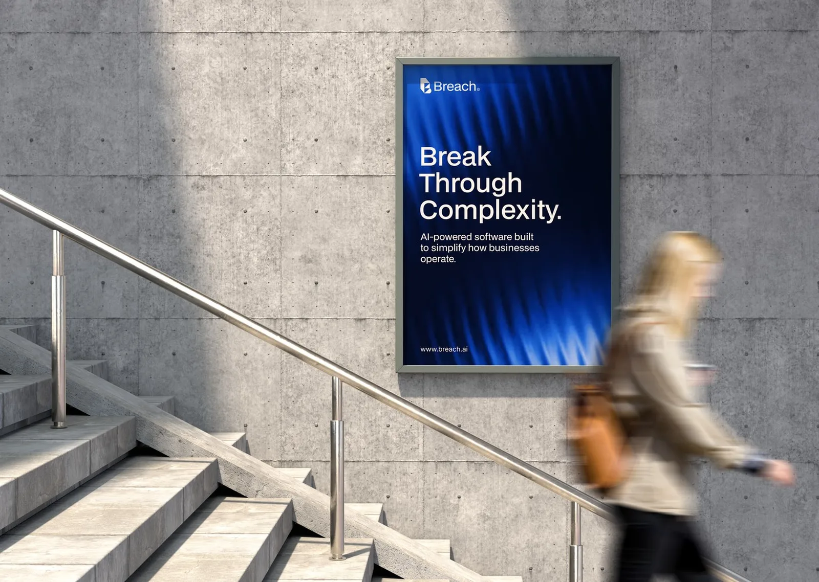
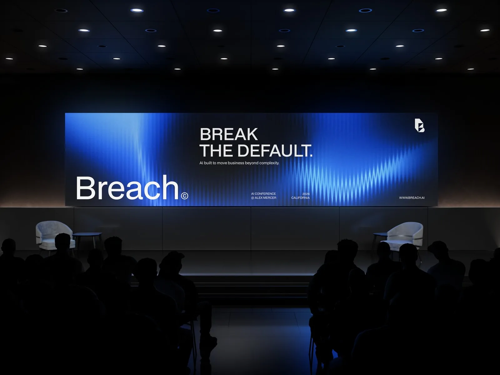
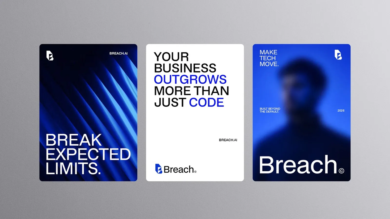
Five decisions, and what I said no to.
- 01A symbol that works at 16 px
The product lives in app icons, favicons and UI. A mark that reads when tiny gives Breach an anchor.
RejectedA wordmark-only logo that disappears inside the product.
- 02One cut through the B
A precise geometric B with a single diagonal break. The promise is drawn into the mark: break through complexity.
RejectedLiteral cracks, glitch effects and shield icons from the security aisle.
- 03Breach Blue as the only primary
A flat, strong blue that people know before they see the logo. It is the same in product UI and on a billboard.
RejectedThe multi-colour AI gradients most competitors already use.
- 04BDO Grotesk across product and print
A neutral font with character. It stays easy to read in UI, decks and signs.
RejectedFuturistic display fonts that date within a year.
- 05Headlines that carry the idea
The two lines explain it in campaigns and on stage.
RejectedFeature lists and buzzwords as headlines.
Print and apparel
Business cards, stationery, a team badge and a jacket: the same cut, on paper and fabric.
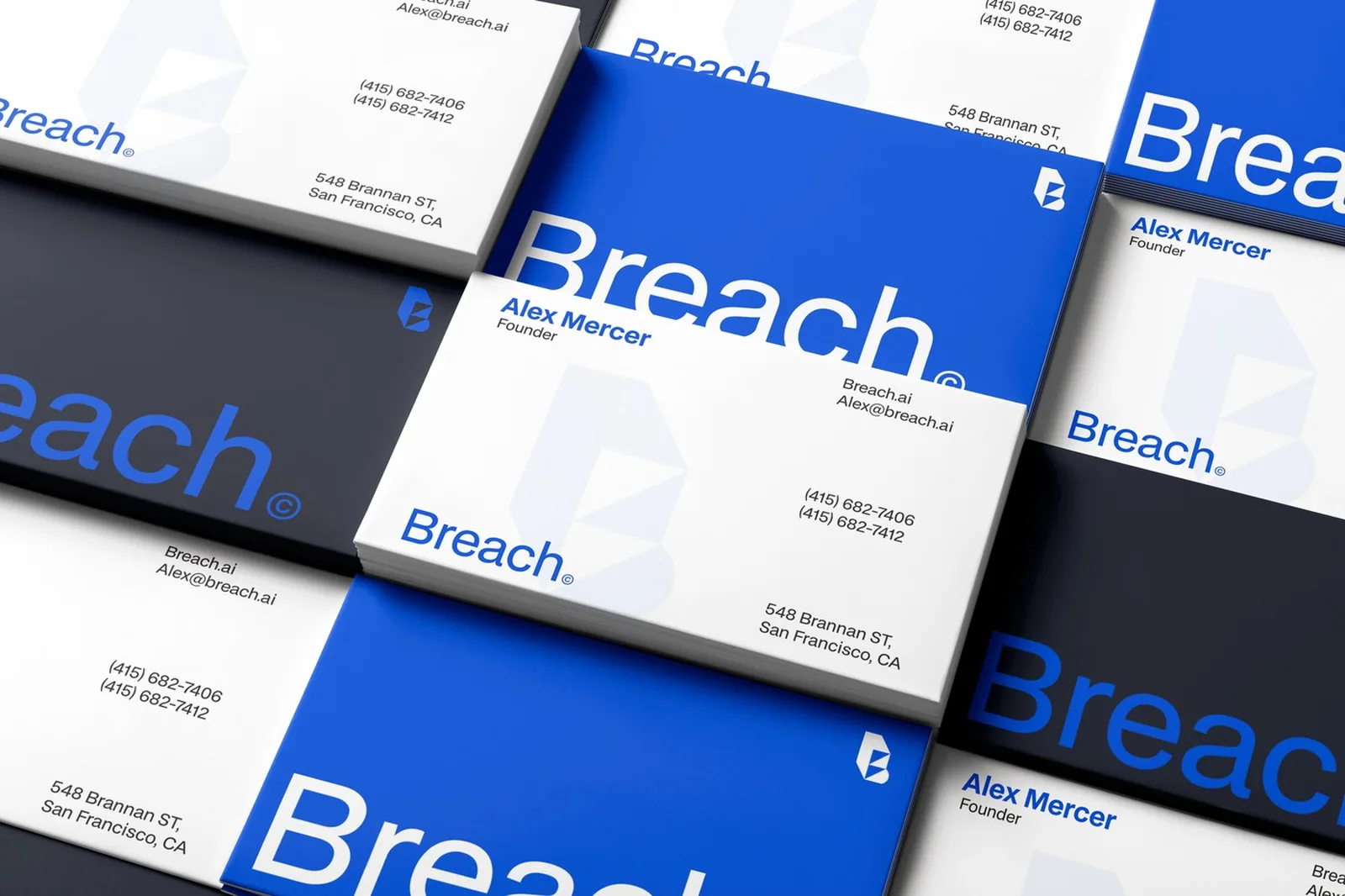
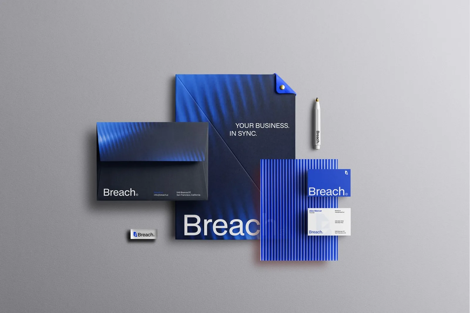
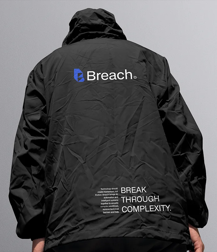
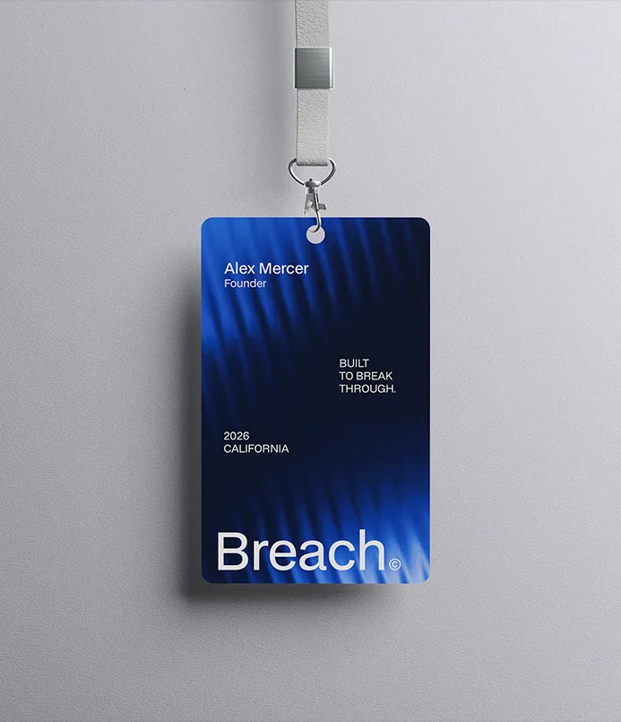
What was broken, and what I built to fix it.
Breach launched with a complete brand system.
One system now runs across product, sales decks, events, social and merchandise. I delivered it in 21 days. A complex AI offer now reads as clear and credible from the first contact. The team has the rules to keep it that way.
Built on a grid, tested from 16 px to billboard.
Breach Blue, System Black, BDO Grotesk.
Product UI, stationery, stage, social, apparel.
“We needed our brand to feel as solid as our product, and fast. Vedran didn't just design a logo - he gave us a system and a story our whole team can use. The first time we put the new identity in front of customers, the conversation started from credibility instead of explanation.”
Want a brand like Breach's?
15 minutes. No sales talk. You leave knowing what to do next.
Rather write to me?
Got it.
You hear from me within 2 to 8 hours.