Recruitsome. AI hiring that still feels human.
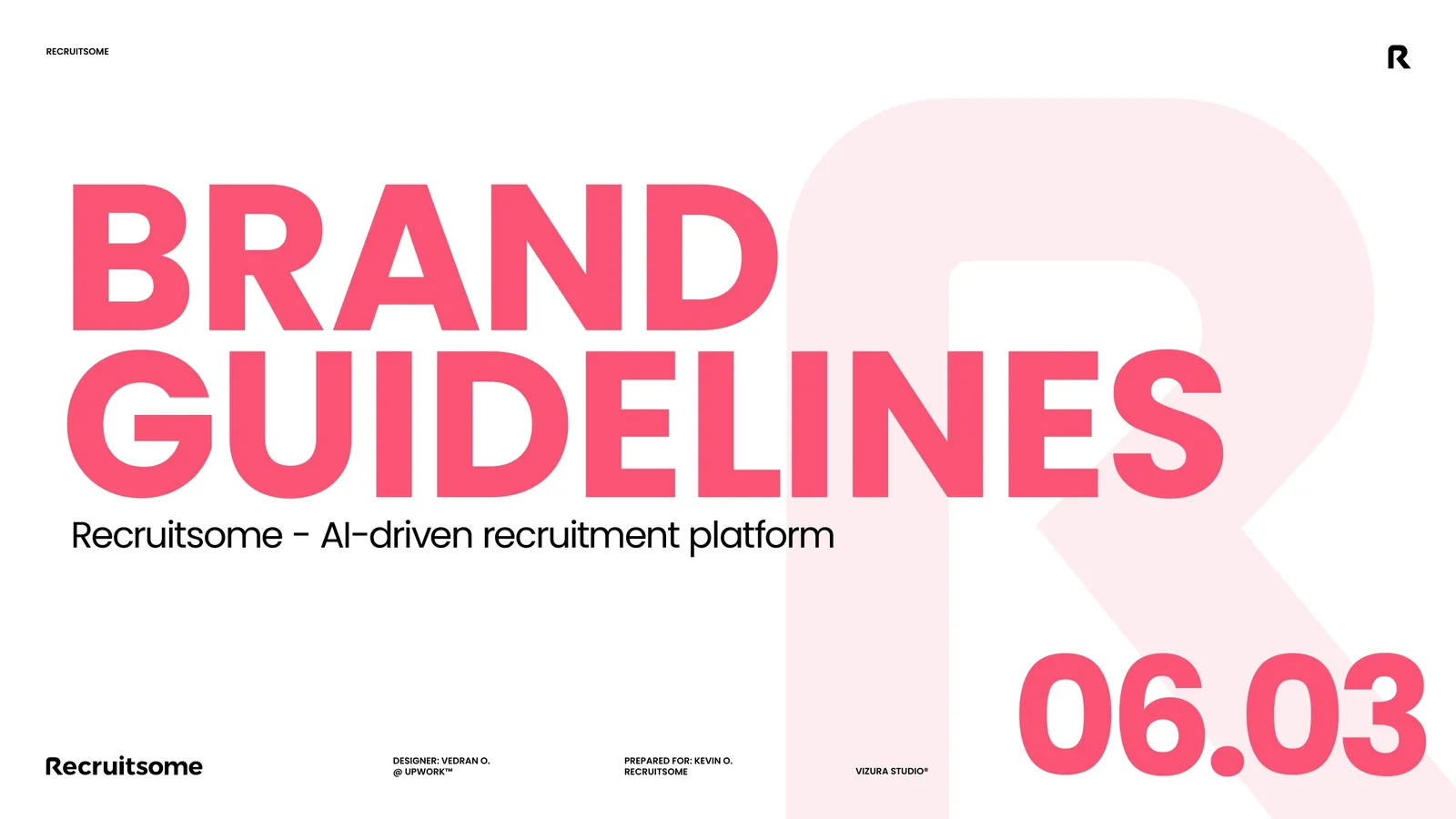
A brand identity system, brand guidelines and a Framer website for Recruitsome, a Dutch AI recruitment platform. I kept the founder's logo and built everything around it: bold pink, people and the R, and one line, Hire Smart, Save Time, Grow Fast.
Brand guidelines and colour
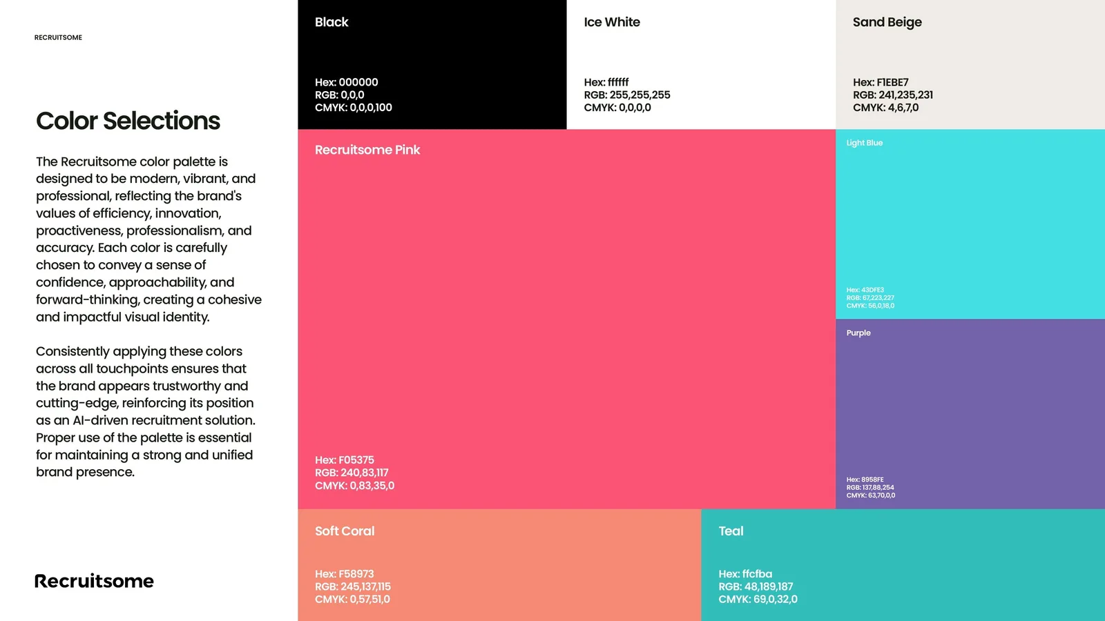
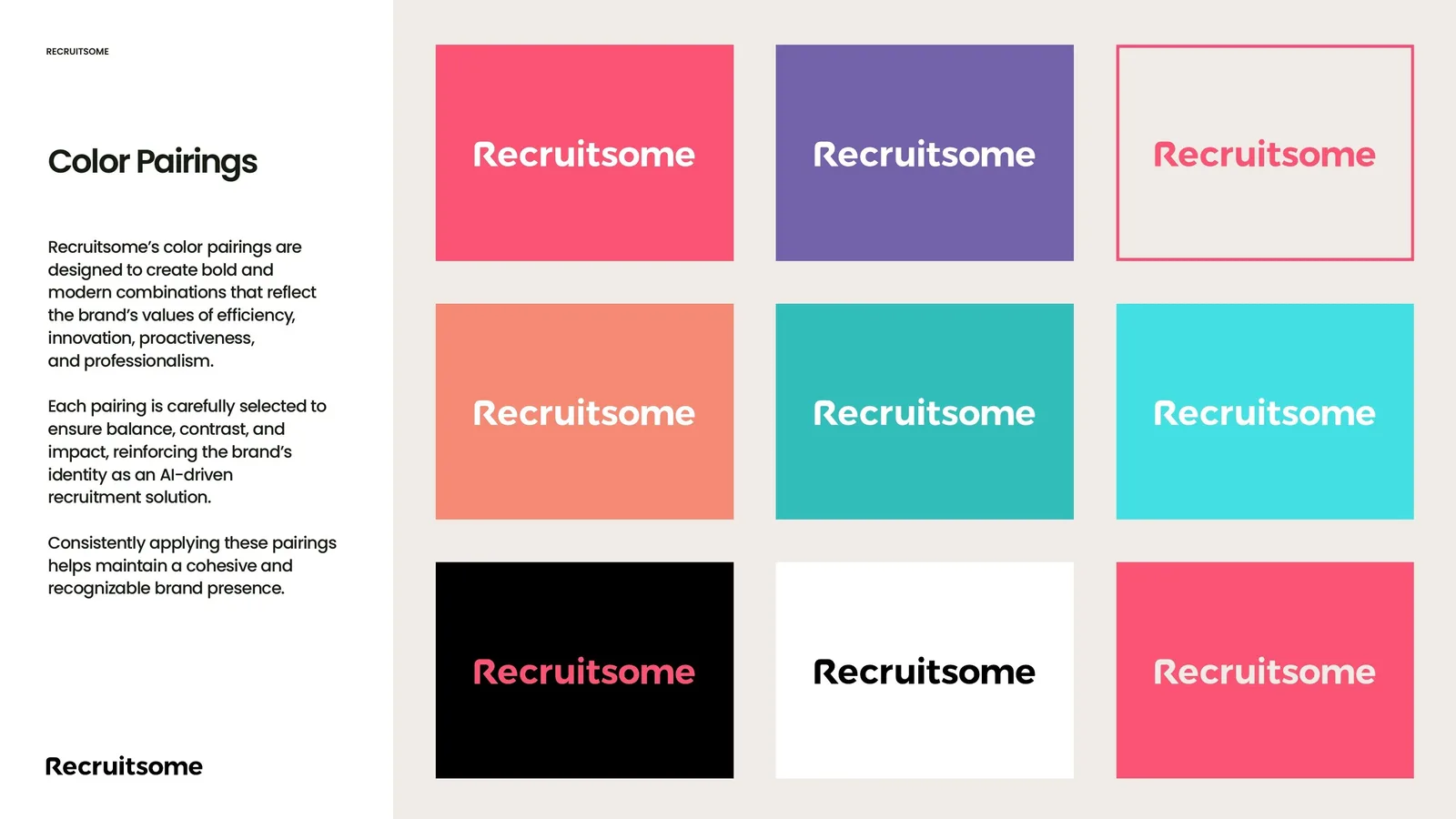
Guidelines for visual and verbal identity. Recruitsome Pink leads, with black, ice white, sand beige and a set of pairings that always keep the logo readable.
A logo, but no brand around it.
Recruitsome uses AI to make hiring faster and simpler. The founder had a logo and a product that worked. What was missing was everything around the logo: a system that could run social, campaigns, print and the website, and a way to look intelligent without looking like another cold HR tool.
A complete brand system built on the existing logo, ready for marketing, sales and the website.
Efficiency, proactivity, innovation, simplicity.
Warm where HR software is cold. Bold enough to stand out on LinkedIn. Simple enough for a small team to run.
Keep the equity of the logo. Build the system the logo never had.
Type, icons and pattern
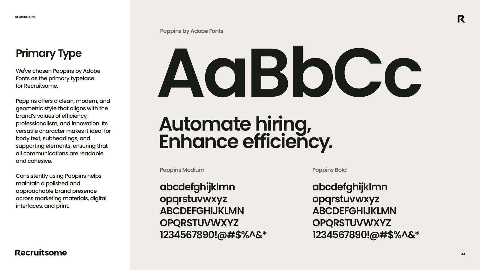
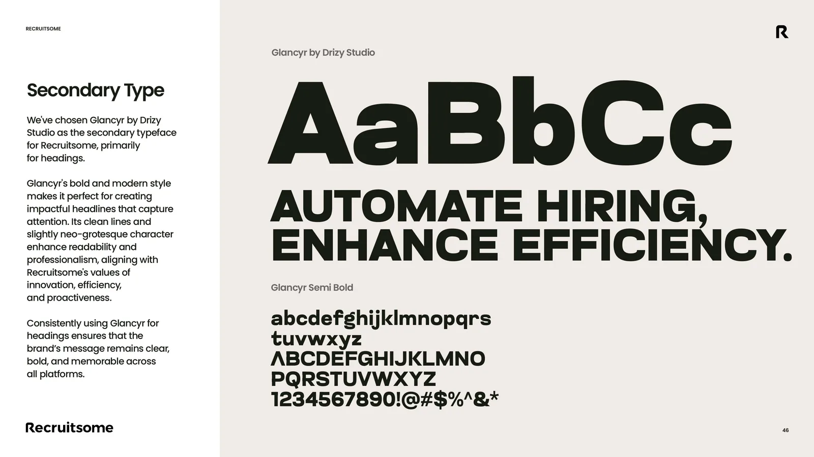
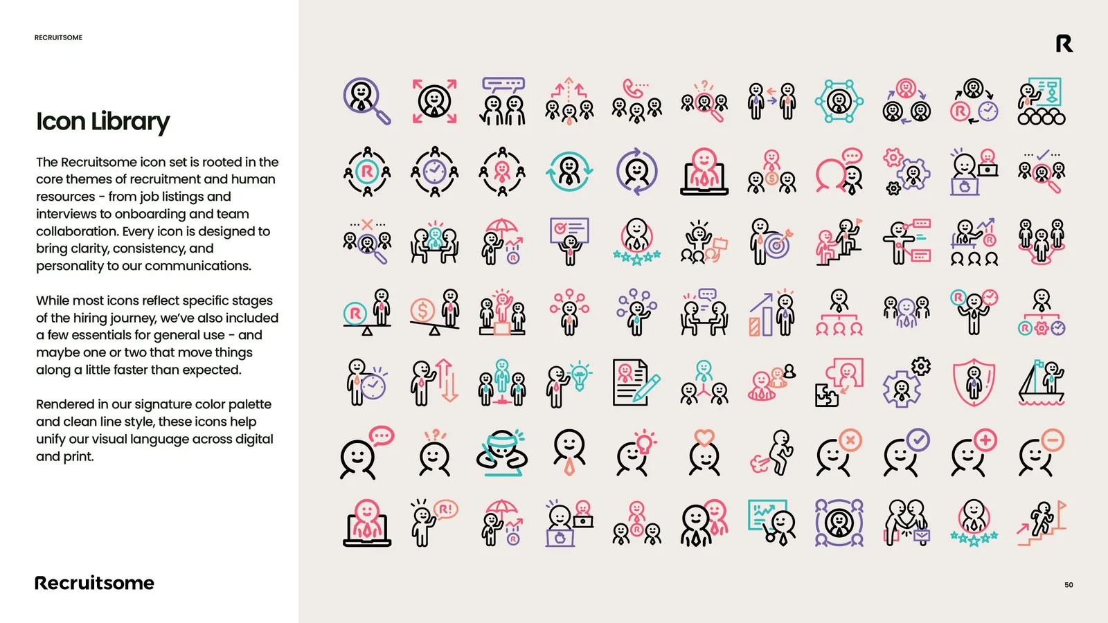
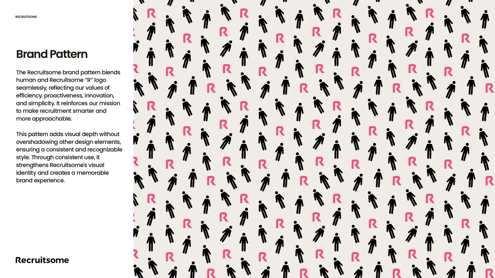
Poppins for clarity, Glancyr for bold headlines, an icon library for every stage of hiring, and a pattern where people and the R sit together.
Recruitsome is your AI recruitment colleague: it hires smart, saves time and keeps people at the centre.
Less admin, faster shortlists.
The AI works before you ask.
Modern without being cold.
One clear message per touchpoint.
Campaigns, social and print
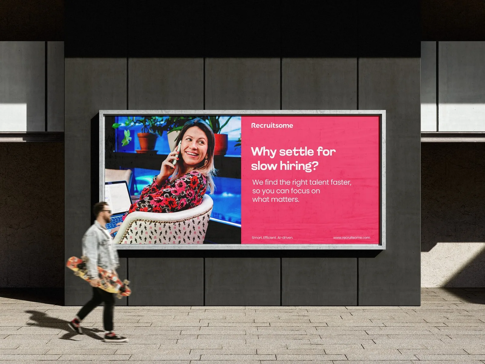
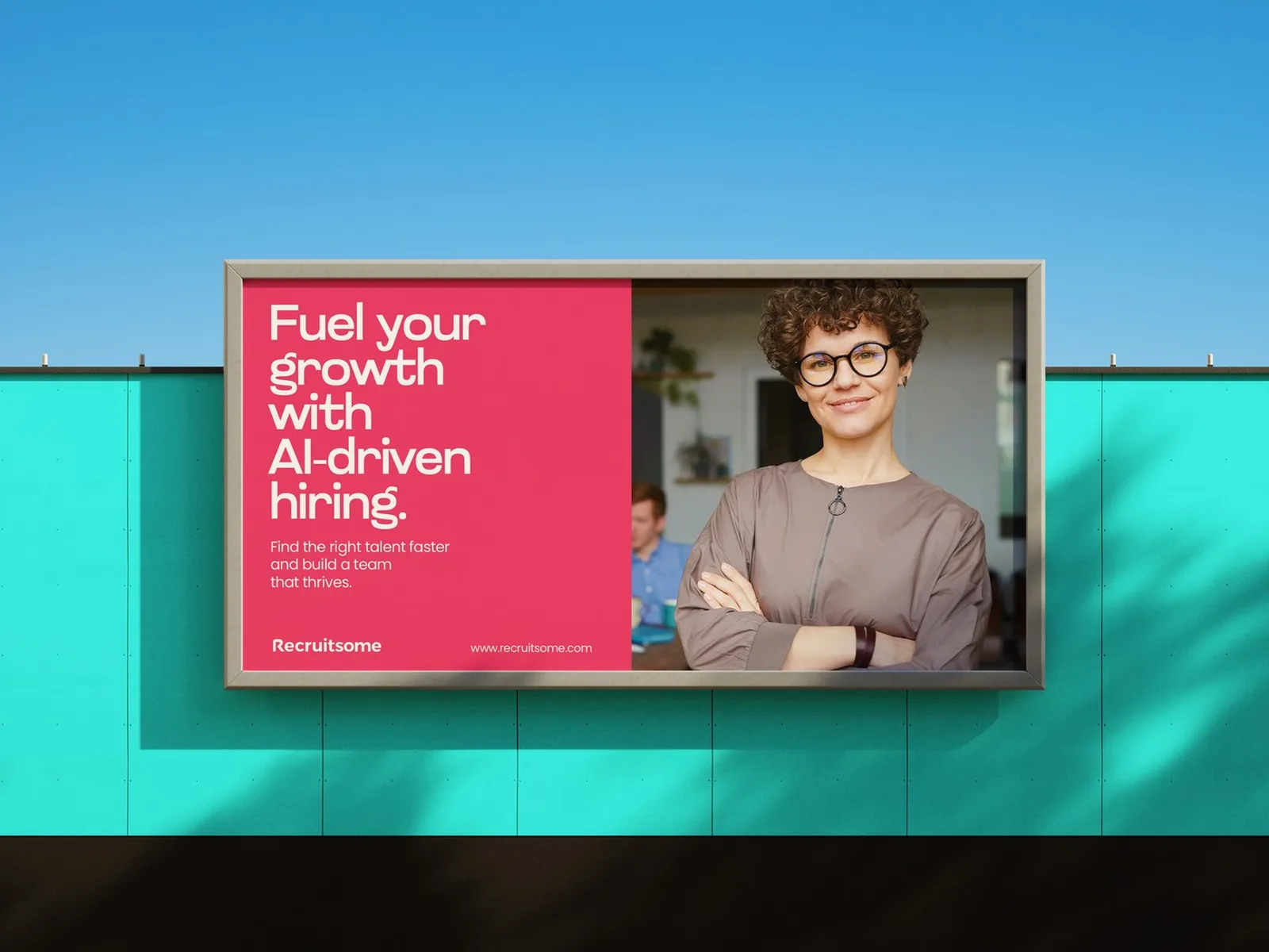
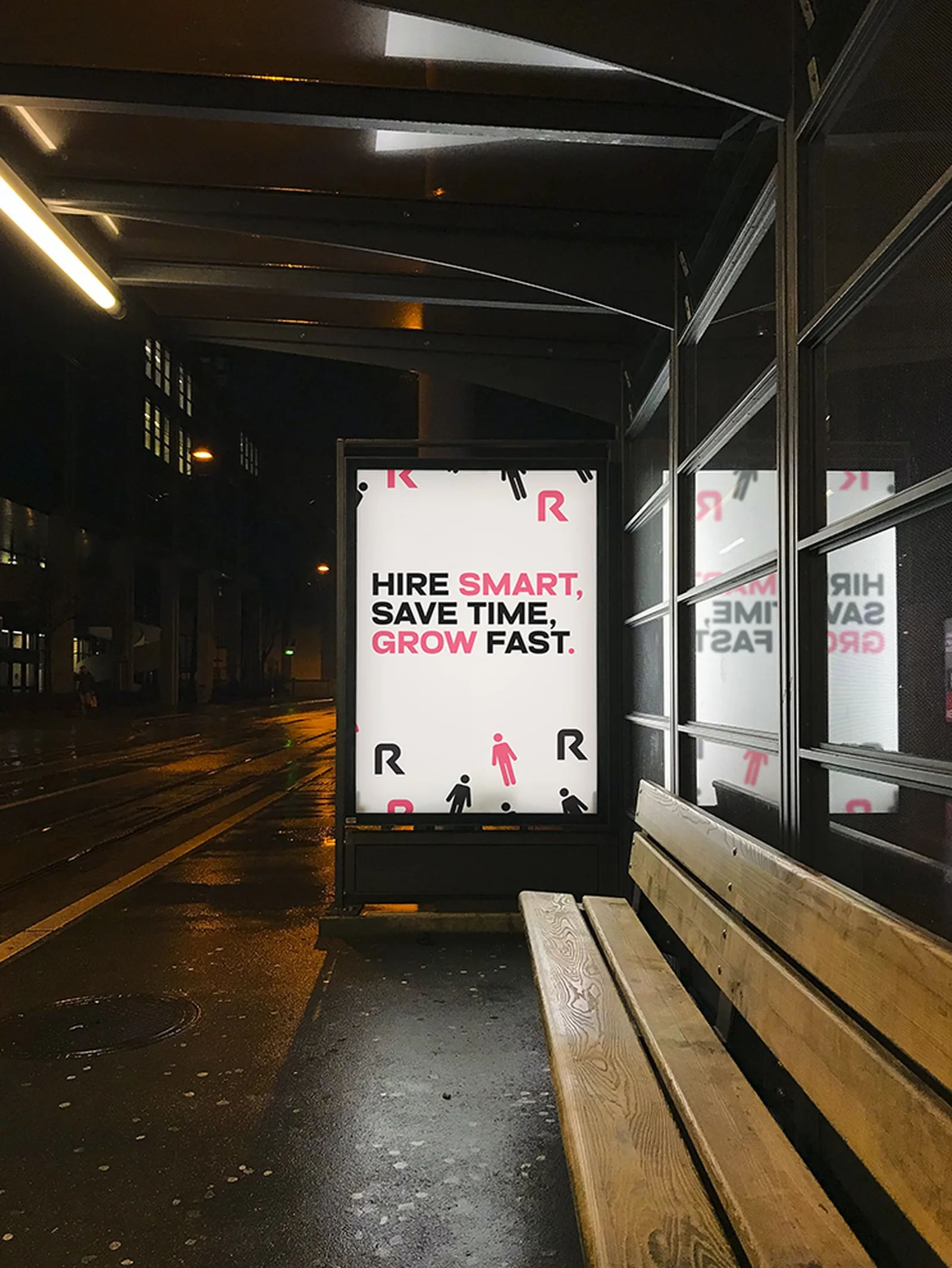
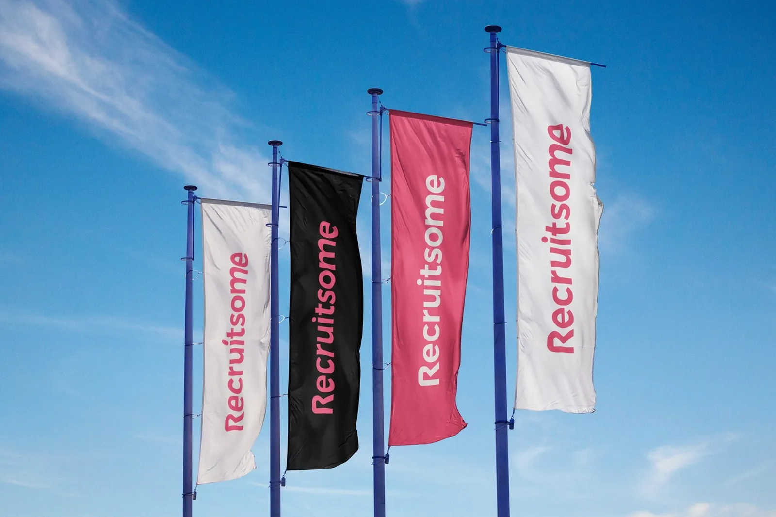
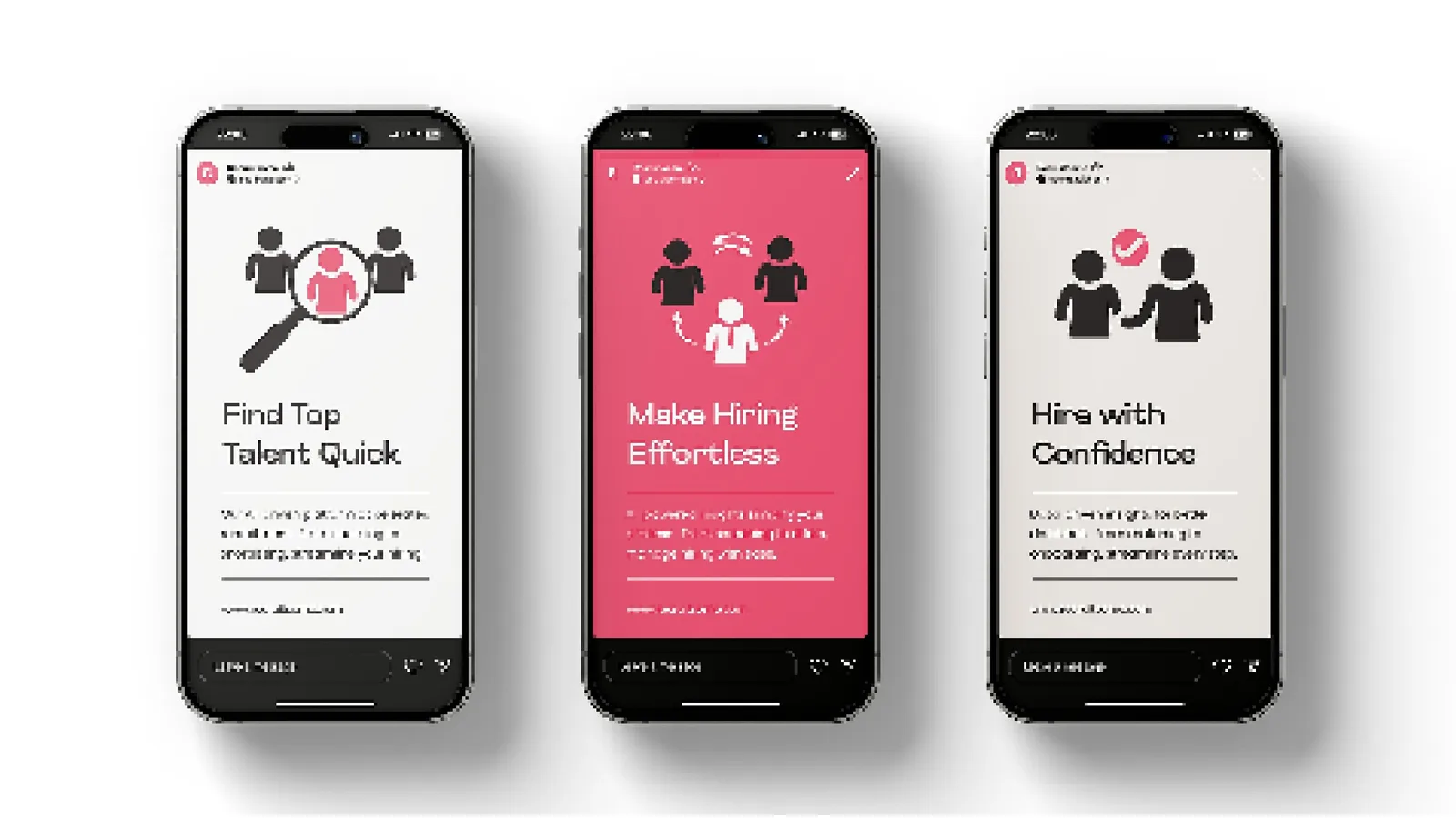
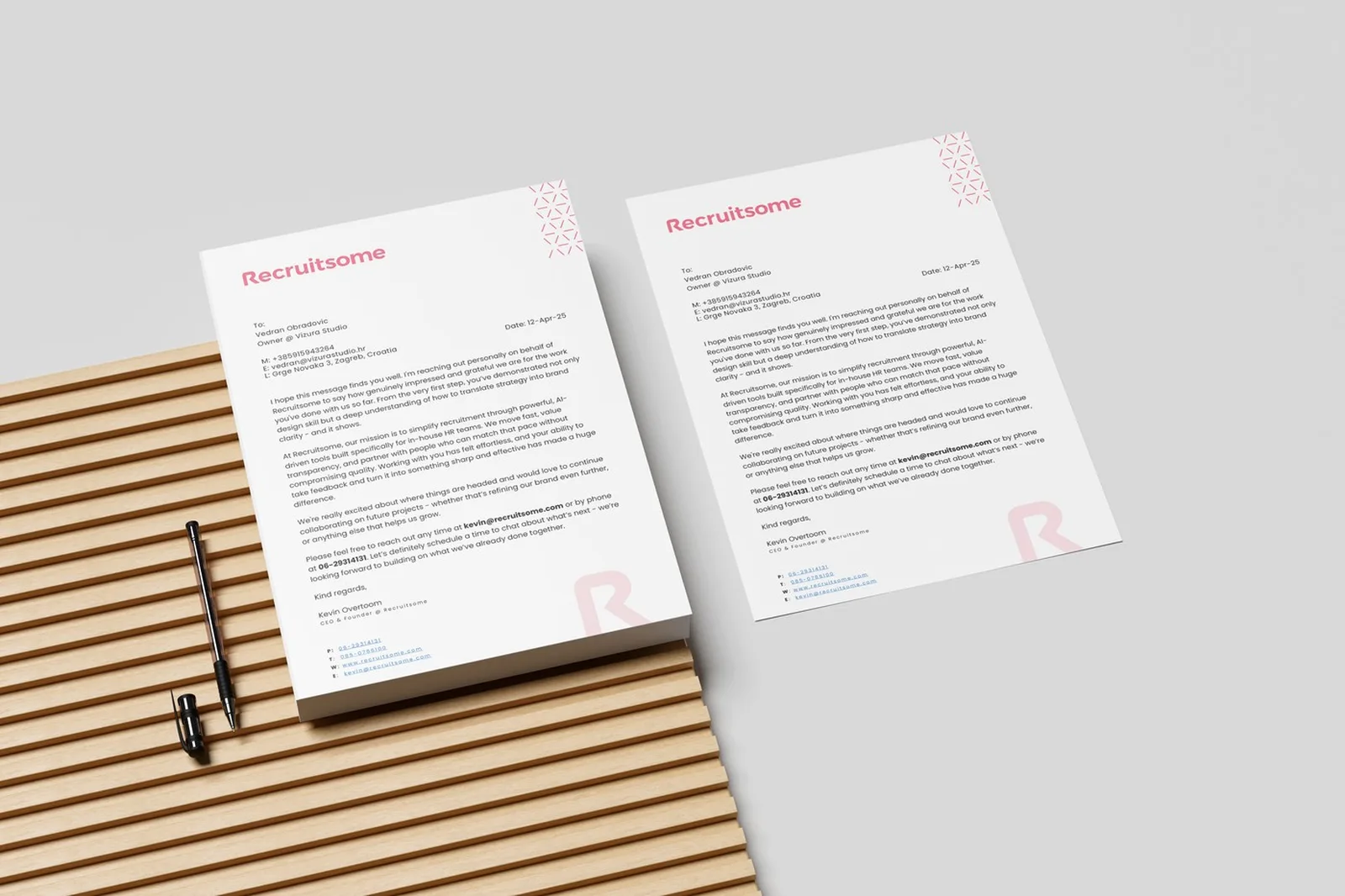
Billboards, a bus stop, flags, social posts and letterheads. One message everywhere: Hire Smart, Save Time, Grow Fast.
Five decisions, and what I rejected.
- 01Keep the logo, build the system
The founder's equity stayed. Consistency was added around it.
RejectedA full redesign that would restart recognition.
- 02Bold pink as the recognition cue
Energetic and ownable in a category of blue HR software. Pantone 184 C keeps it the same in print and on screen.
RejectedAnother corporate blue.
- 03Patterns combining people and the R
The AI-meets-human balance, visible in every layout, from a bus stop poster to a running shirt.
RejectedAbstract tech patterns with no people in them.
- 04Hire Smart, Save Time, Grow Fast
A benefit line that works as a whole communication platform: guidelines, social, campaigns and the website.
RejectedFeature-by-feature messaging.
- 05A tone that is modern, engaging, friendly and positive
Informal yet professional, written into the guidelines, so a small team can write like one brand.
RejectedFormal HR language and recruitment jargon.
The Framer website
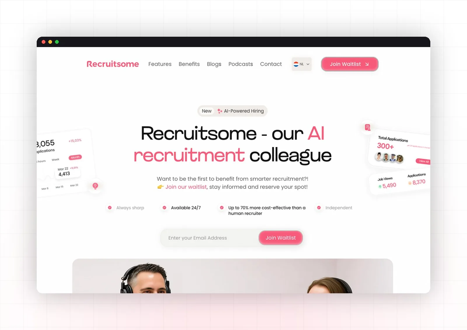
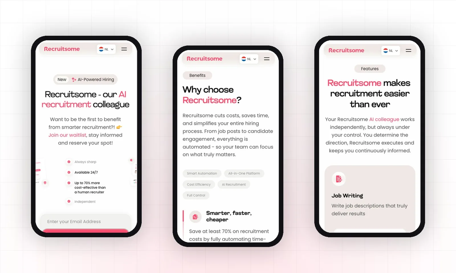
A launch website designed and built in Framer on the new system: the AI recruitment colleague, the benefits and a waitlist, on desktop and mobile.
Merch, and a marathon
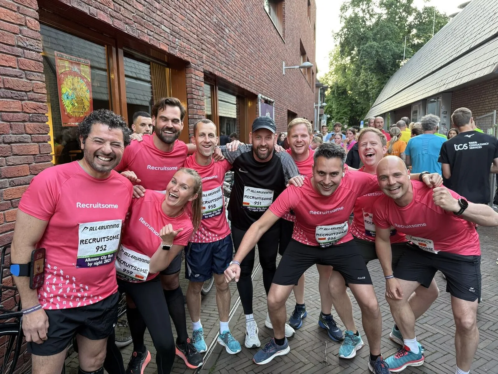
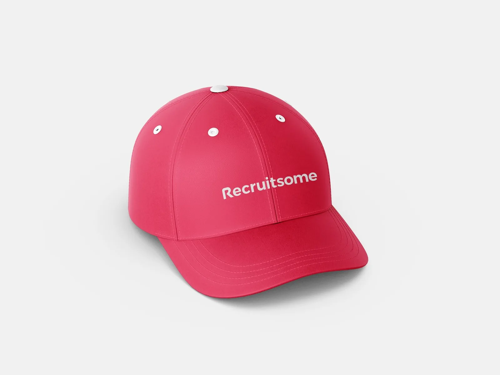
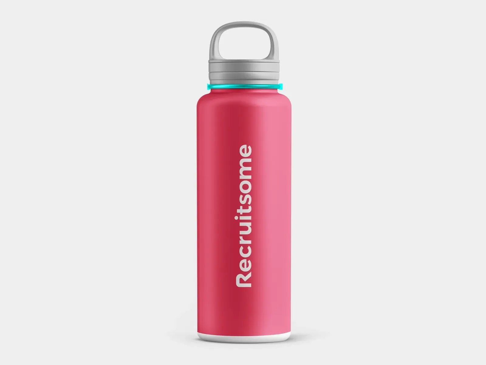
Shirts, caps and bottles in the brand. Right after launch, the team ran a marathon in them.
What was broken, and what I built to fix it.
A brand the team wanted to wear.
Recruitsome came out with a complete HR tech brand system. Right after launch, the team showed up at a marathon in branded shirts. The identity had already become something they wanted to represent.
Colour, type, patterns, icons, imagery.
Visual and verbal identity.
Launch site on the new system.
“Worked with Vizura on the logo and branding guide for my company Recruitsome. Loved working with them on the project. Our assumptions and feedback were challenged in a good way, results were delivered quickly.”
Want this for your brand? 3 quick taps, a fixed-price proposal in 2-8 hours.