Stepup. Progress, one step at a time.
A rebrand for Stepup, a US Web3 and blockchain consultancy: a logo where the S is built from four steps, orange and black, one grid for decks, digital and print, and brand guidelines. I led it as Lead Brand Designer, from strategy to guidelines in 16 days.
The logo
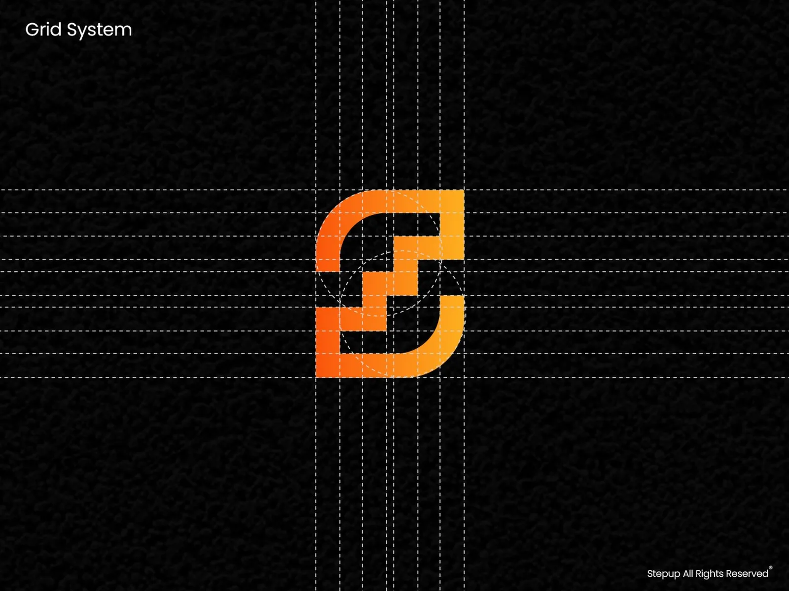
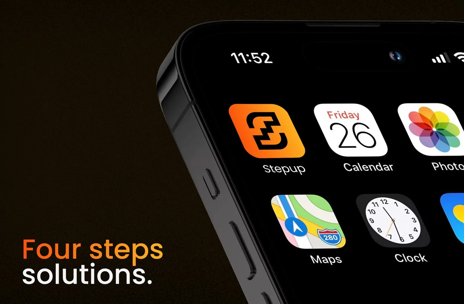
An S made of four steps, drawn on a strict grid. It reads as movement and progress at app-icon size, with no coins, no chains and no neon.
A serious consultancy in a speculative category.
Stepup helps companies adopt blockchain and Web3 technology. The category was full of neon, coins and hype, and Stepup's old brand leaned into it. Clients who wanted a serious partner saw another crypto project, and saw risk before expertise. The rebrand had to keep the innovation and lose the speculation.
Look like a credible consulting partner while still feeling like innovation.
Progress, precision, structure, momentum.
Innovative without looking speculative. Geometric and calm. One visual logic across every client material.
Stepup solves complex problems in structured steps, so the symbol should be made of steps.
Stationery and guidelines
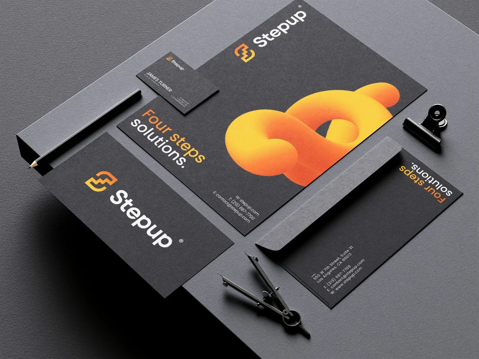
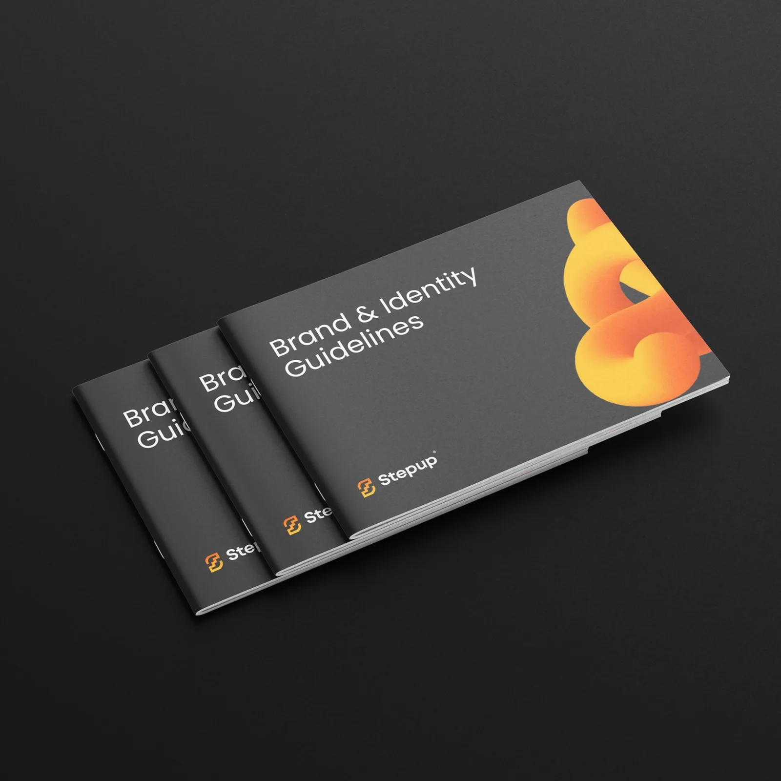
Business cards, letterhead, envelopes and the brand and identity guidelines, all on one grid in orange and black.
Stepup guides companies into Web3 in four structured steps.
Every asset moves forward.
Four steps, one method.
A grid behind every layout.
Orange that feels like momentum.
Five decisions, and what I rejected.
- 01The S as a four-step structure
The letter S and four steps merge into one symbol for movement, problem-solving and structured growth.
RejectedCoins, chains and blockchain cubes.
- 02Orange and black
Energy and confidence without the neon of crypto branding.
RejectedPurple gradients and holographic effects.
- 03One grid for everything
Presentations, digital assets, stationery and the app icon follow the same construction, so every piece looks like the same careful company.
RejectedSeparate looks for web, decks and social.
- 04A calm geometric wordmark
Clean geometric type next to the S keeps the signature serious and readable at any size.
RejectedFuturistic display type that reads as another token launch.
- 05A soft orange 3D form as the image
An orange-to-yellow form gives stationery and guidelines warmth and energy without a single crypto symbol.
RejectedTrading charts and glowing network imagery.
What was broken, and what I built to fix it.
A rebrand that moved the numbers.
Stepup gained a more credible position in Web3 consulting. Clearer communication and stronger recognition turned the rebrand into something measurable within six months, by the client's own numbers. A consultancy that now looks as structured as its work.
Four-step S, construction.
Colour, type, grid.
Decks, digital, stationery.
Want this for your brand? 3 quick taps, a fixed-price proposal in 2-8 hours.