Verticomm. Clarity built into complexity.
A logo redesign, verbal identity and 50-page brand guidelines for a Denver IT company with 25+ years behind it, moving from small-business IT to enterprise cybersecurity and managed IT. The mark: a cube of pathways and nodes. Launched in July 2025.
The brand in 3D
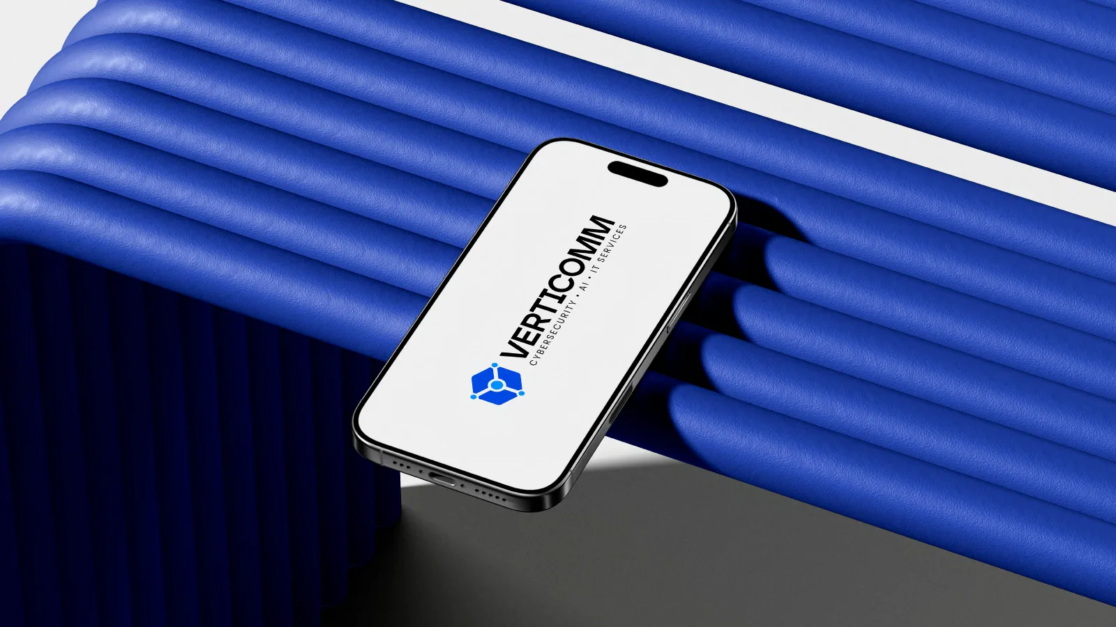
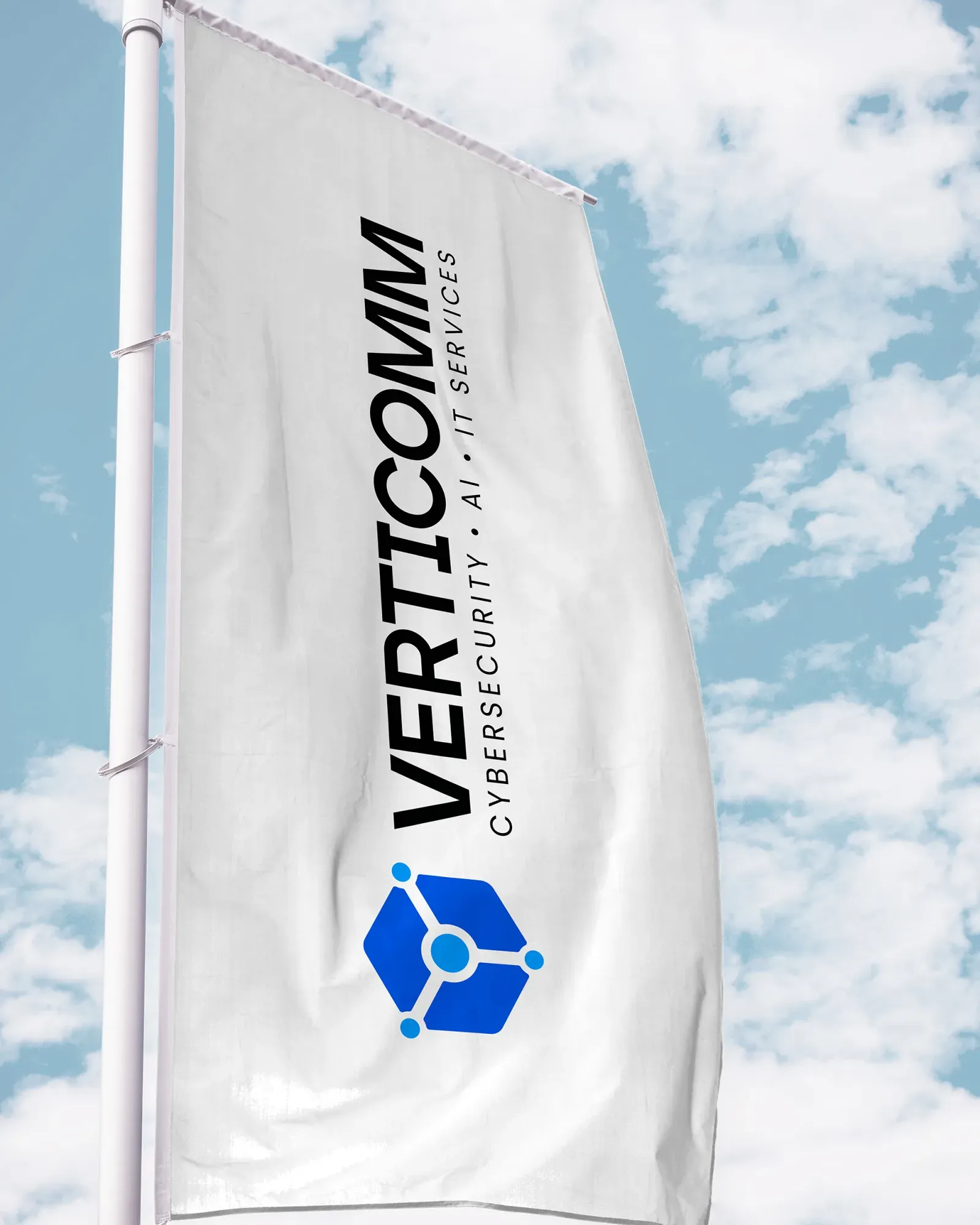
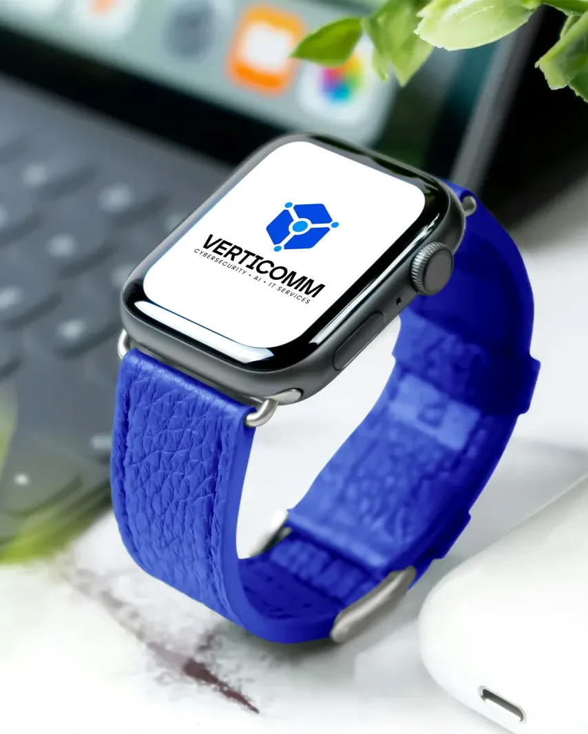
Phone, flag, watch, business card and mug: the cube and Core Blue, built to be seen before anyone reads a word.
25 years of IT work, and a logo it could not keep.
Verticomm started as a communications firm, grew into managed IT for small businesses and was moving to enterprise-grade cybersecurity and managed IT. Its work runs on NIST, ISO 27001 and ITIL. The old infinity mark had trademark issues and had to go. The new brand had to win the trust of CIOs, CISOs, CTOs and IT directors at companies with 50+ users, including healthcare and government.
Show a mature, enterprise-grade partner for cybersecurity and managed IT, and replace the logo before it became a legal problem.
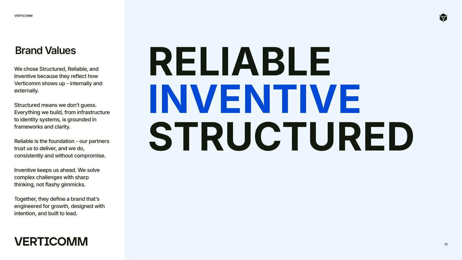
Structured, reliable, inventive.
Authoritative but approachable. Expert, yet simple and clear. Serious without being stiff.
A brand that looks as disciplined as the frameworks they work with.
The logo
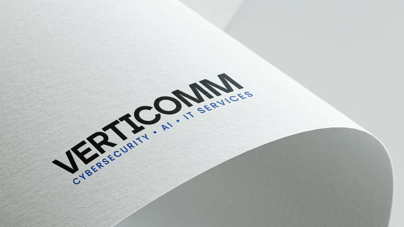
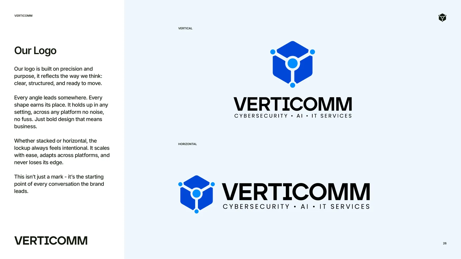
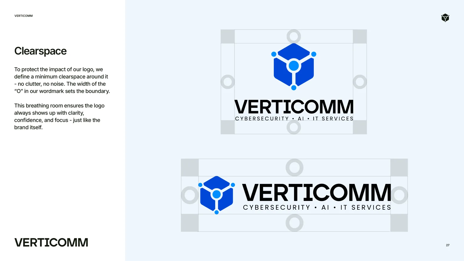
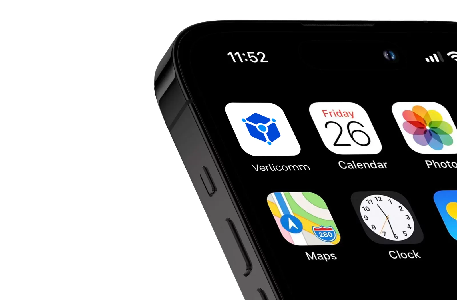
A cube of pathways and nodes with the wordmark and the line Cybersecurity, AI, IT services. Vertical and horizontal lockups, with clearspace set by the O, down to app-icon size.
Verticomm builds clarity into complexity: secure, scalable IT for mid-sized and enterprise businesses.
Grounded in frameworks. No guessing.
Partners trust them to deliver, every time.
Sharp thinking, not flashy gimmicks.
Technical but never robotic.
From the brand guidelines
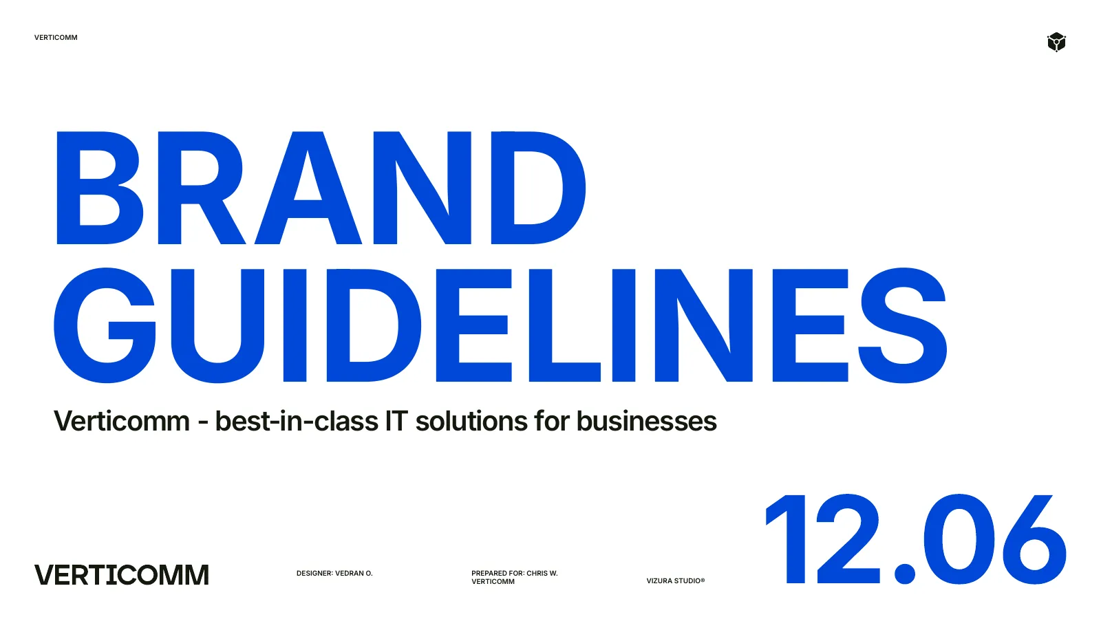
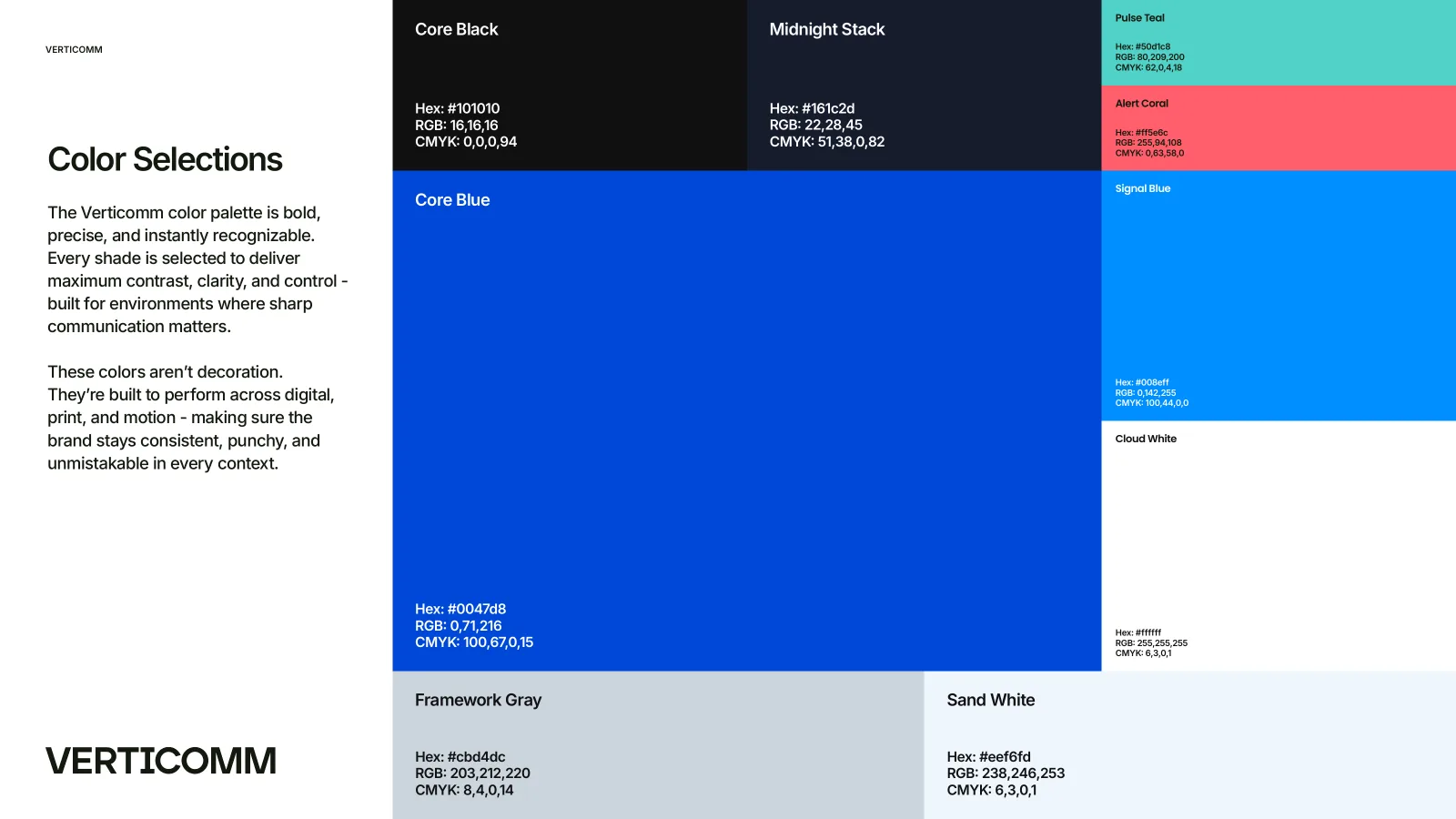
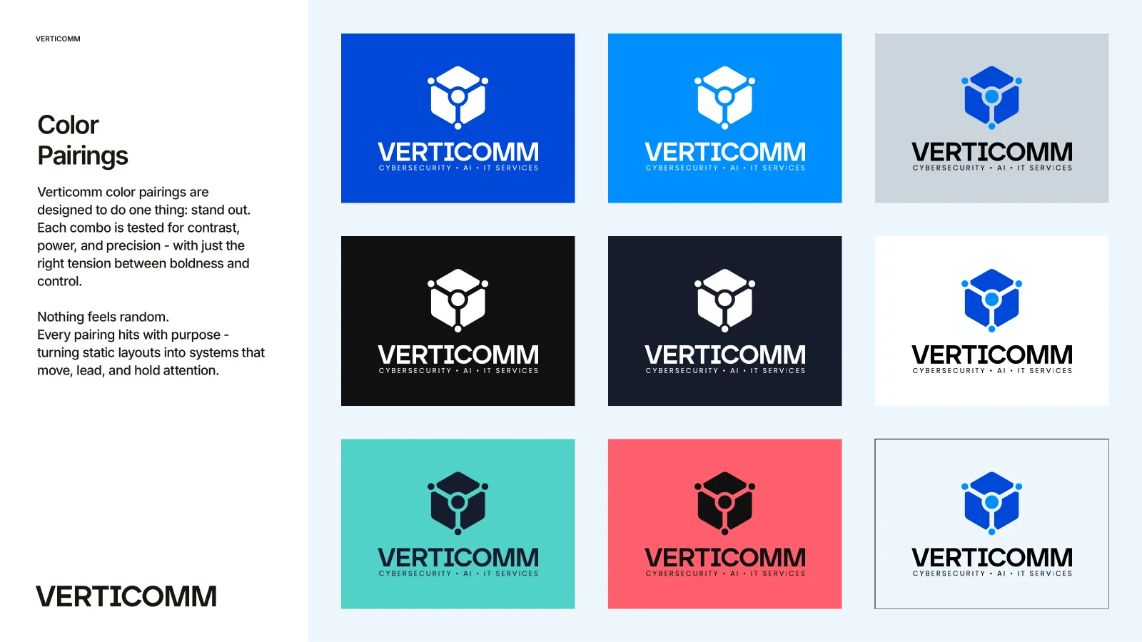
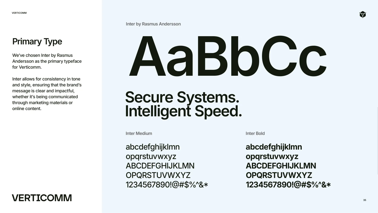
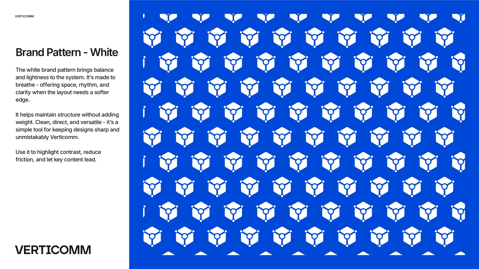
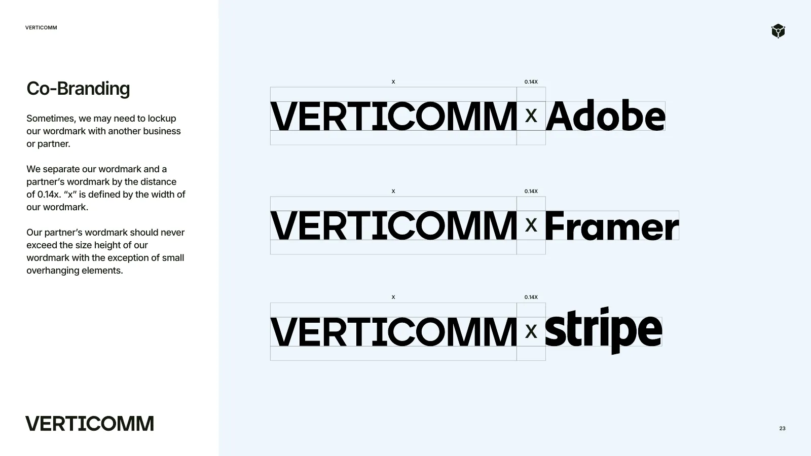
Pages from the final 50-page guidelines: the values, colour, pairings, Inter, the pattern and the co-branding rules.
Five decisions, and what I rejected.
- 01A cube built from pathways and nodes
The lines are pathways, the nodes are points of connection and security. The symbol reads as architecture, not decoration.
RejectedAnother twist on the infinity loop, the mark they had to drop.
- 02Refined in rounds until it held small
Layered structure, softer corners, thicker lines and larger nodes, checked down to app-icon size.
RejectedLocking the first sketch without testing it small.
- 03Core Blue on black and white
Core Blue carries the brand. Core Black and Midnight Stack give weight. Pulse Teal and Alert Coral are kept for signals.
RejectedSoft blue gradients that depend on a perfect screen.
- 04One clean sans for everything
Inter, from headlines to proposals: Secure Systems. Intelligent Speed. Clear on a slide, a report and a phone.
RejectedA techy display font that dates in a year.
- 05A verbal identity with real examples
Human, strategic, straightforward. Every rule has a do and a don't line: say less, mean more.
RejectedJargon like robust architecture solutions across scalable frameworks.
The website I designed
I designed the Verticomm website too. This is verticomm.com live today, on desktop and on a phone.
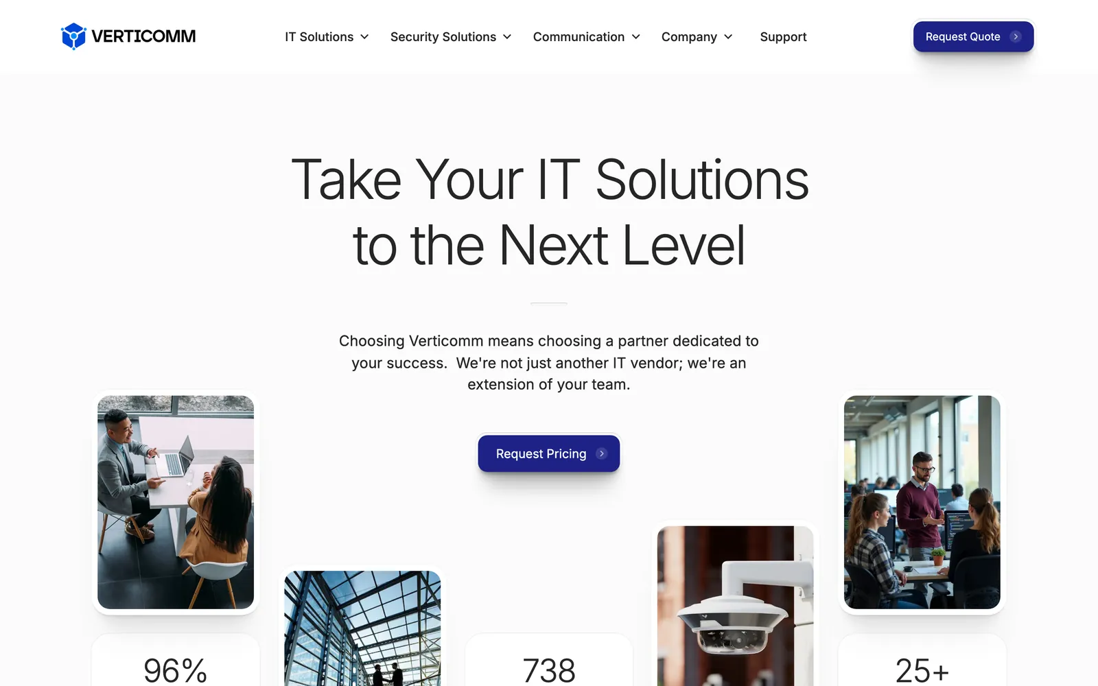
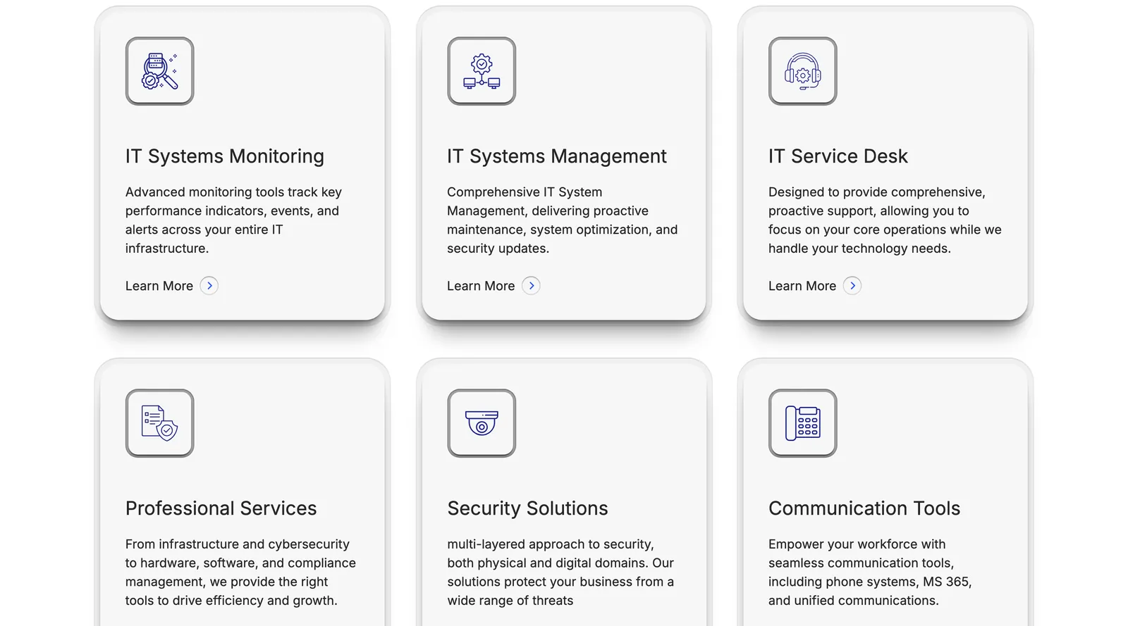

What was broken, and what I built to fix it.
An IT brand that reads enterprise-ready.
Verticomm launched the new brand in July 2025, as part of the ACP family. The launch was built on the three values from my guidelines: structured, reliable and inventive. The logo, the voice and the system now say what the company does before anyone reads a word.
Cube symbol, wordmark, lockups.
Strategy, voice, colour, type, pattern.
Web, devices, print, signage, merchandise.
“Our brand now accurately reflects how we operate - with precision, structure, and a focus on scalable results. We don't follow trends; we build systems that evolve with our clients' business objectives.”
Want this for your brand? 3 quick taps, a fixed-price proposal in 2-8 hours.