One shape per module
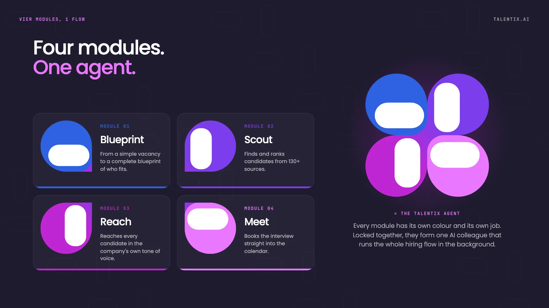
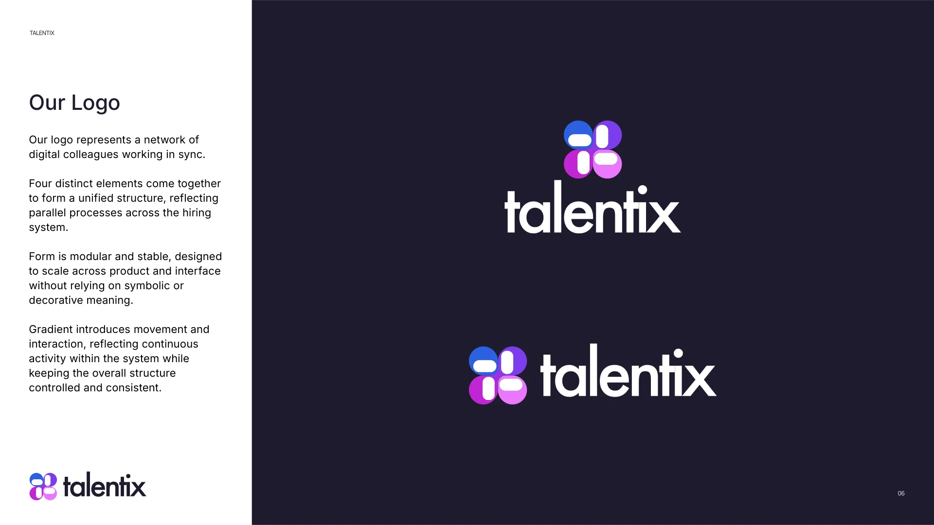
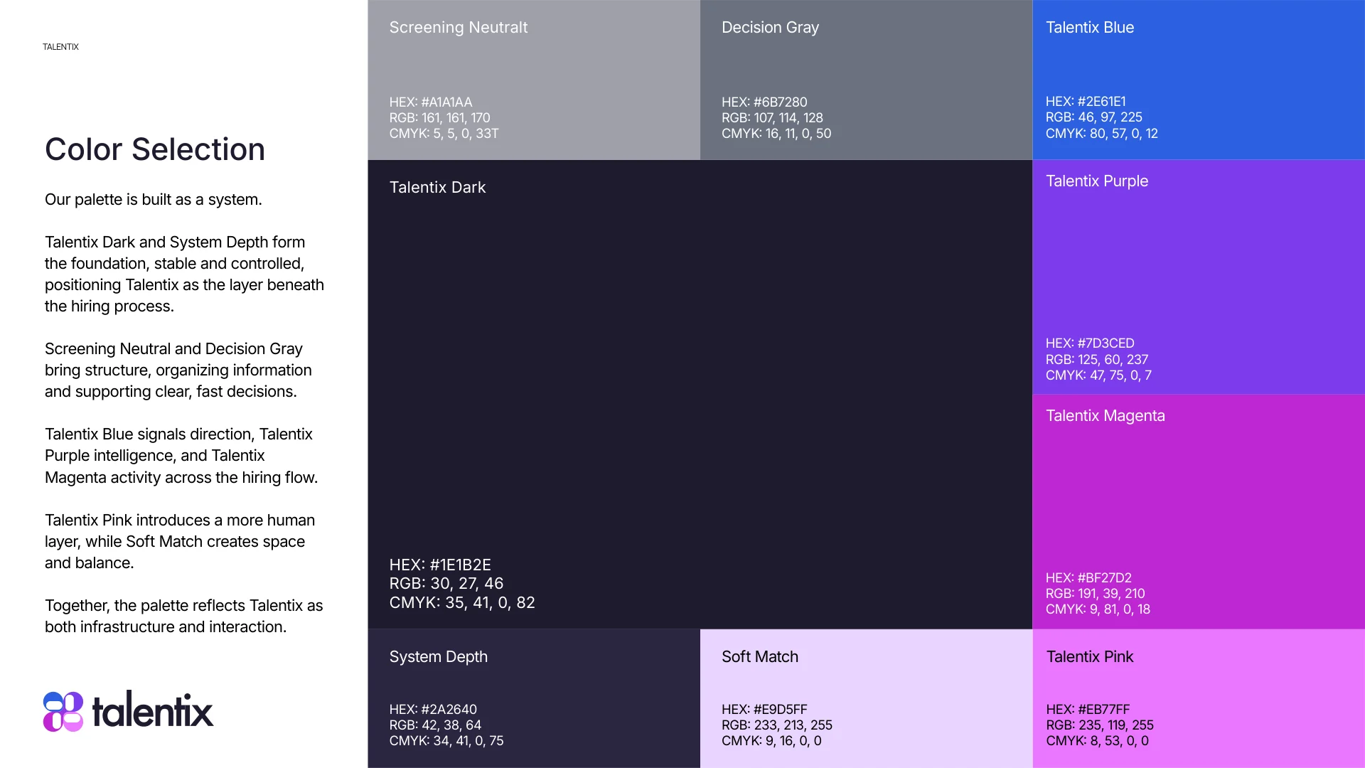
Blueprint, Scout, Reach and Meet each own a piece of the mark and a colour - blue, violet, magenta and pink.
Logo and brand guidelines for Talentix, a Dutch AI recruitment platform - four digital colleagues working in sync.
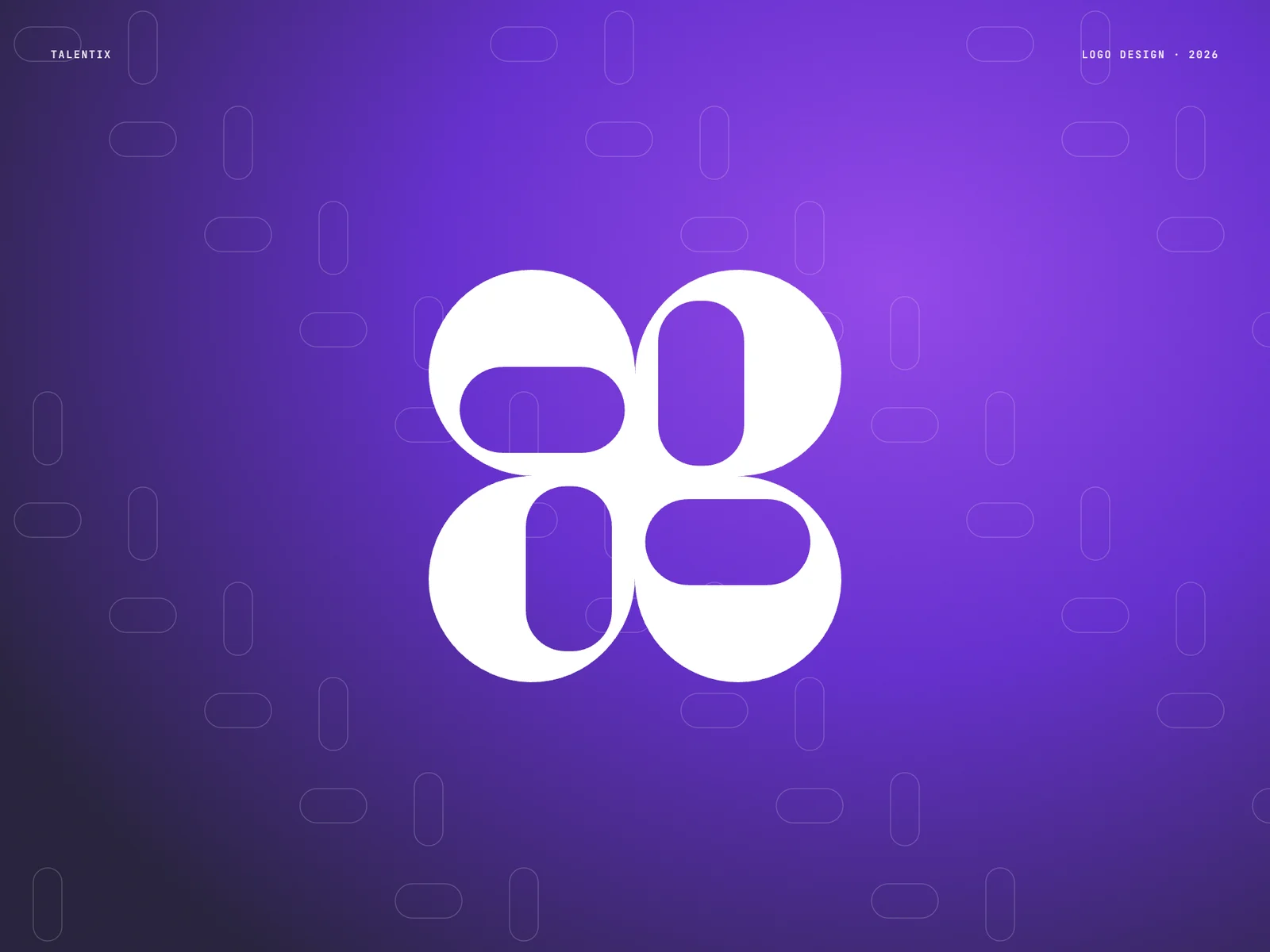
AI hiring tools tend to look either cold and robotic or generic and friendly. Talentix needed to feel like infrastructure for modern hiring - intelligent, efficient and in quiet control - while the candidate experience stays human.
The identity had to scale from a favicon to a product interface full of pipelines, cards and dashboards.
GoalsFour modules, one flow - each module is a piece of the mark, and together they are the AI agent.
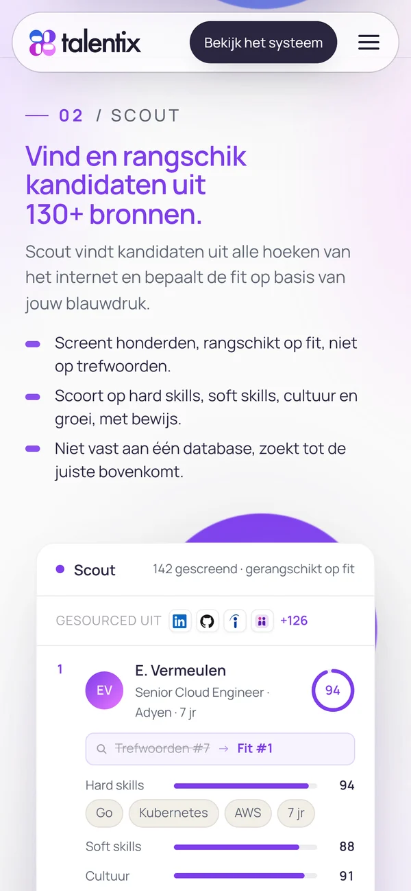
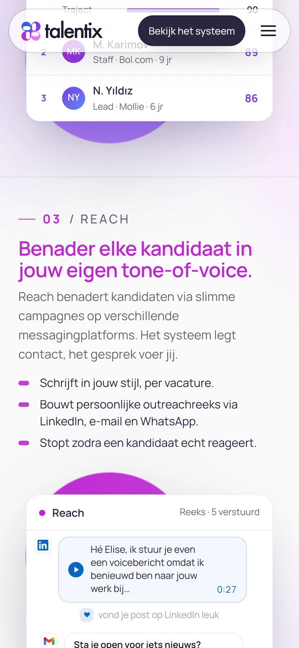
Talentix works in four modules, one flow: Blueprint turns a vacancy into a profile of who really fits, Scout finds and ranks candidates from 130+ sources, Reach contacts them in the company's own tone of voice and Meet books the interview. Each module got its own colour and its own shape in the mark - blue, violet, magenta and pink.
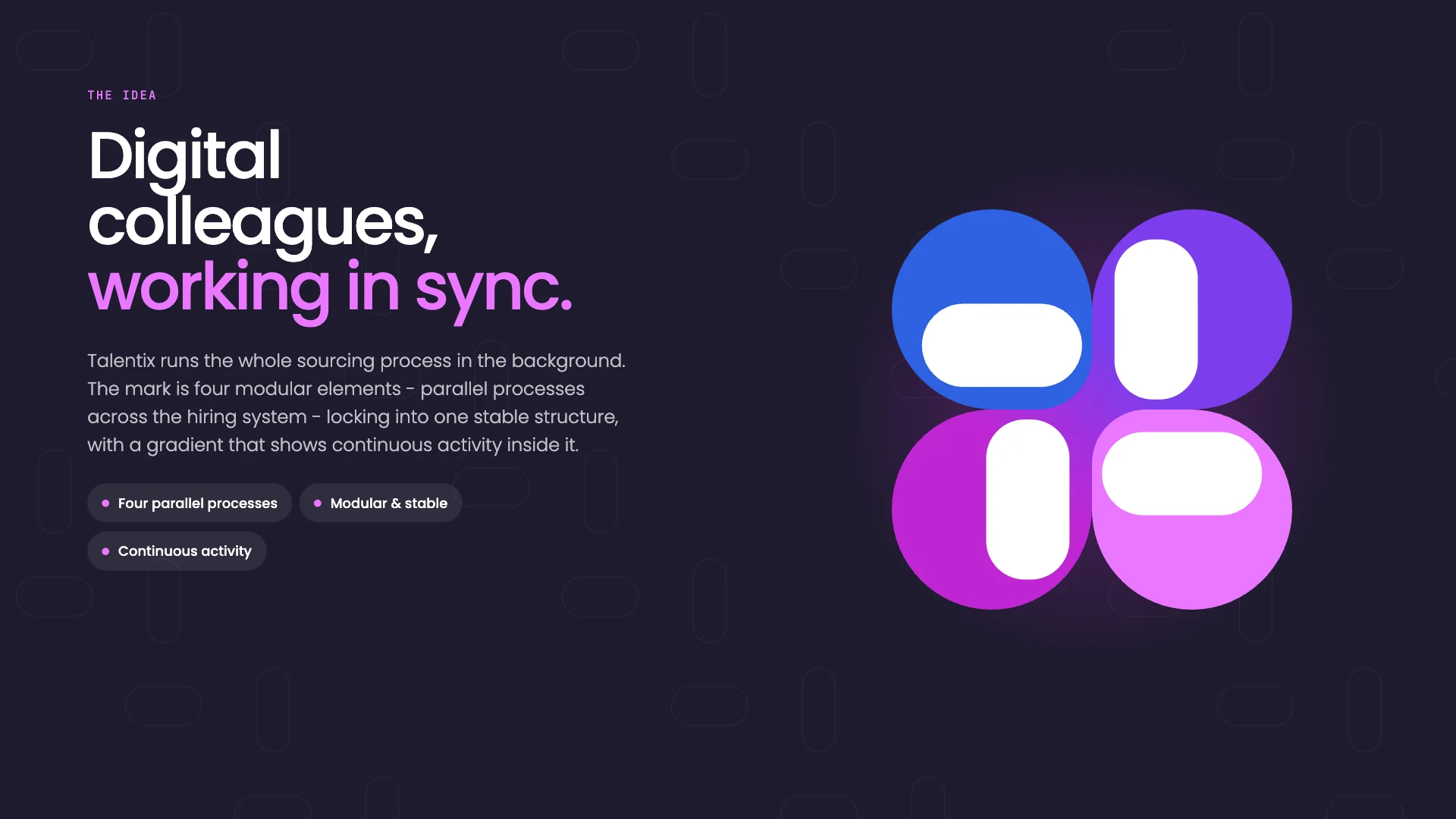
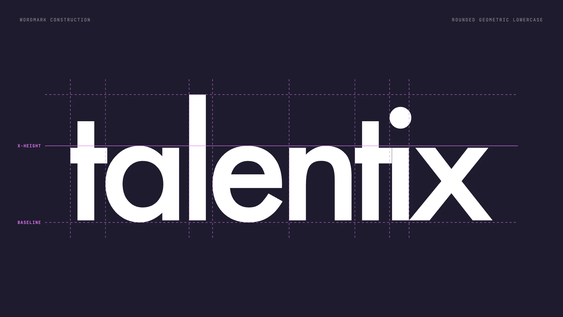
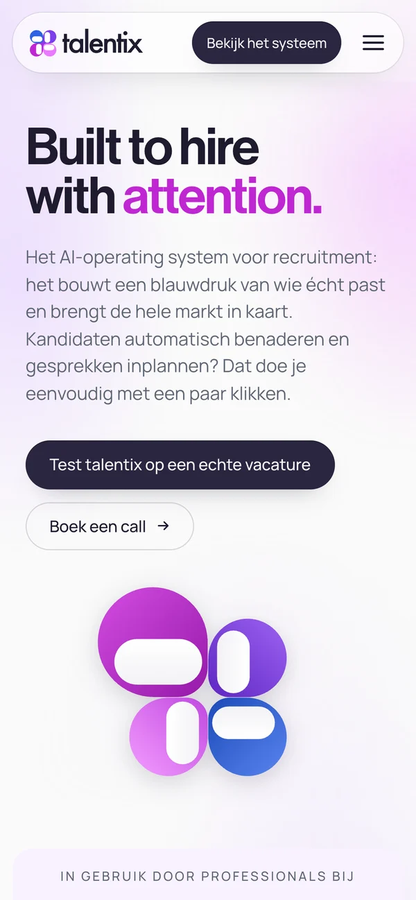
Locked together, the four modules form one symbol: the Talentix agent, one AI colleague that runs the whole hiring flow in the background. A rounded geometric wordmark and Talentix Dark keep the system calm and in control.
Blueprint, Scout, Reach and Meet each own a piece of the mark and a colour - blue, violet, magenta and pink.
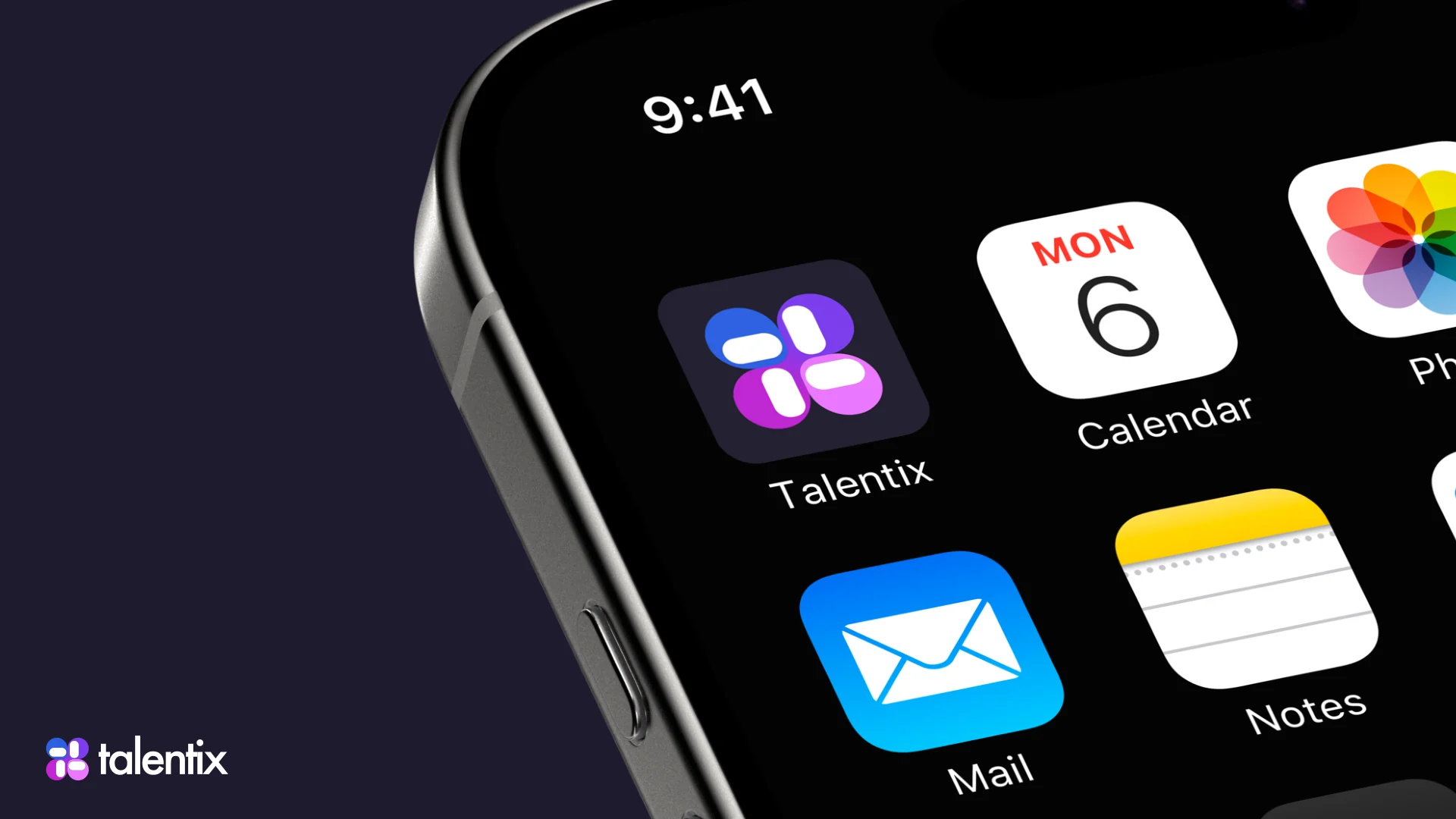
Locked into one symbol, the four modules become one AI colleague that runs hiring in the background.
Deep, calm neutrals give the product a sense of quiet control.
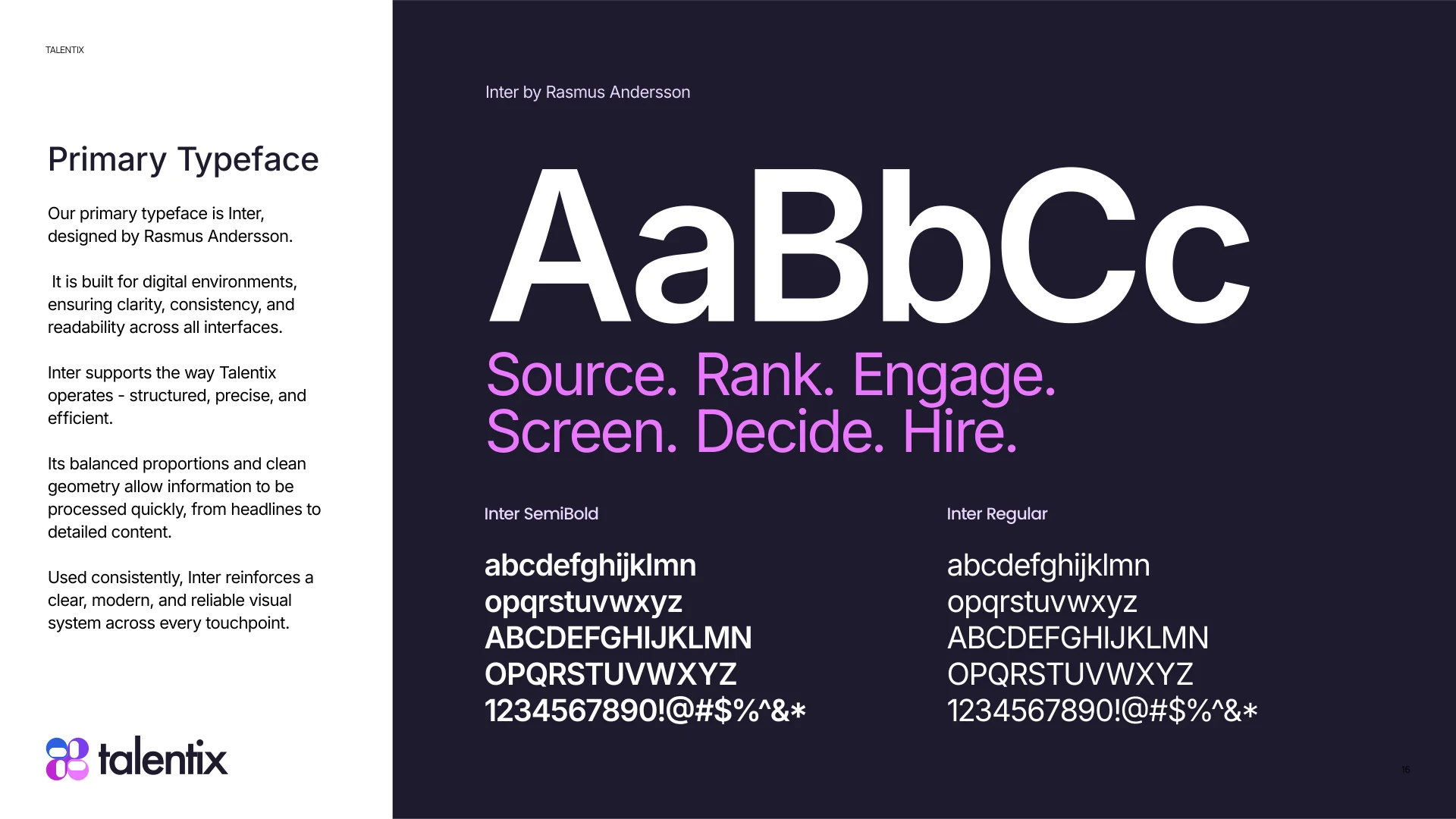
Friendly and legible next to dense pipelines and dashboards.
Four digital colleagues, one stable structure.
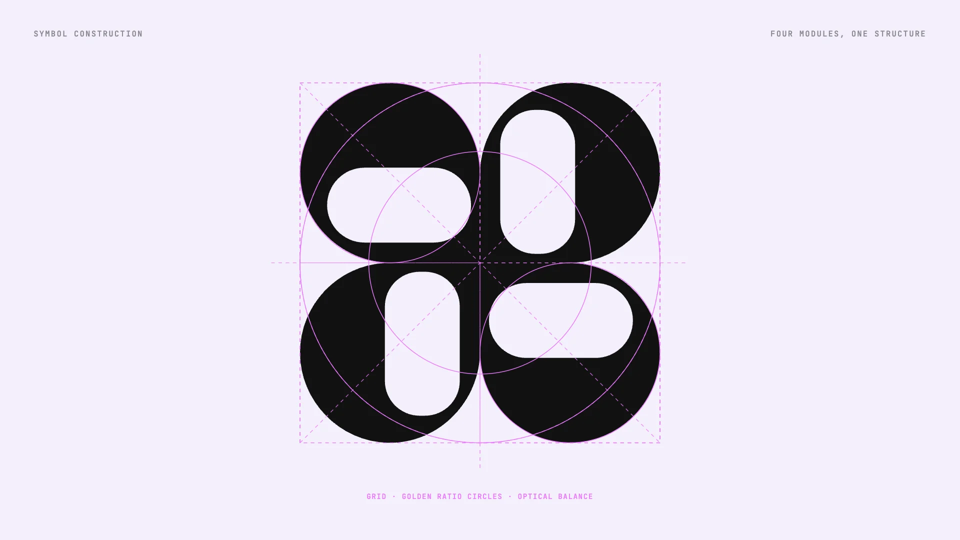
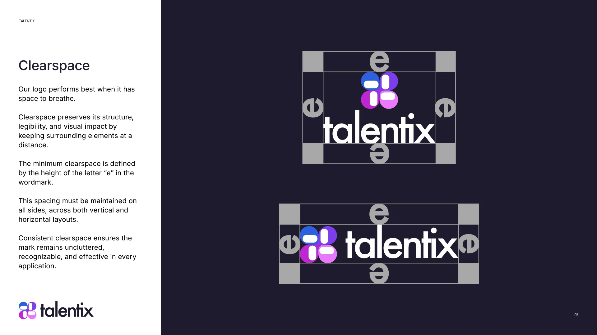
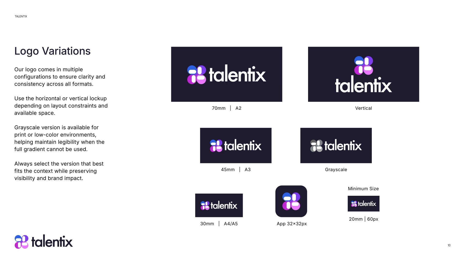
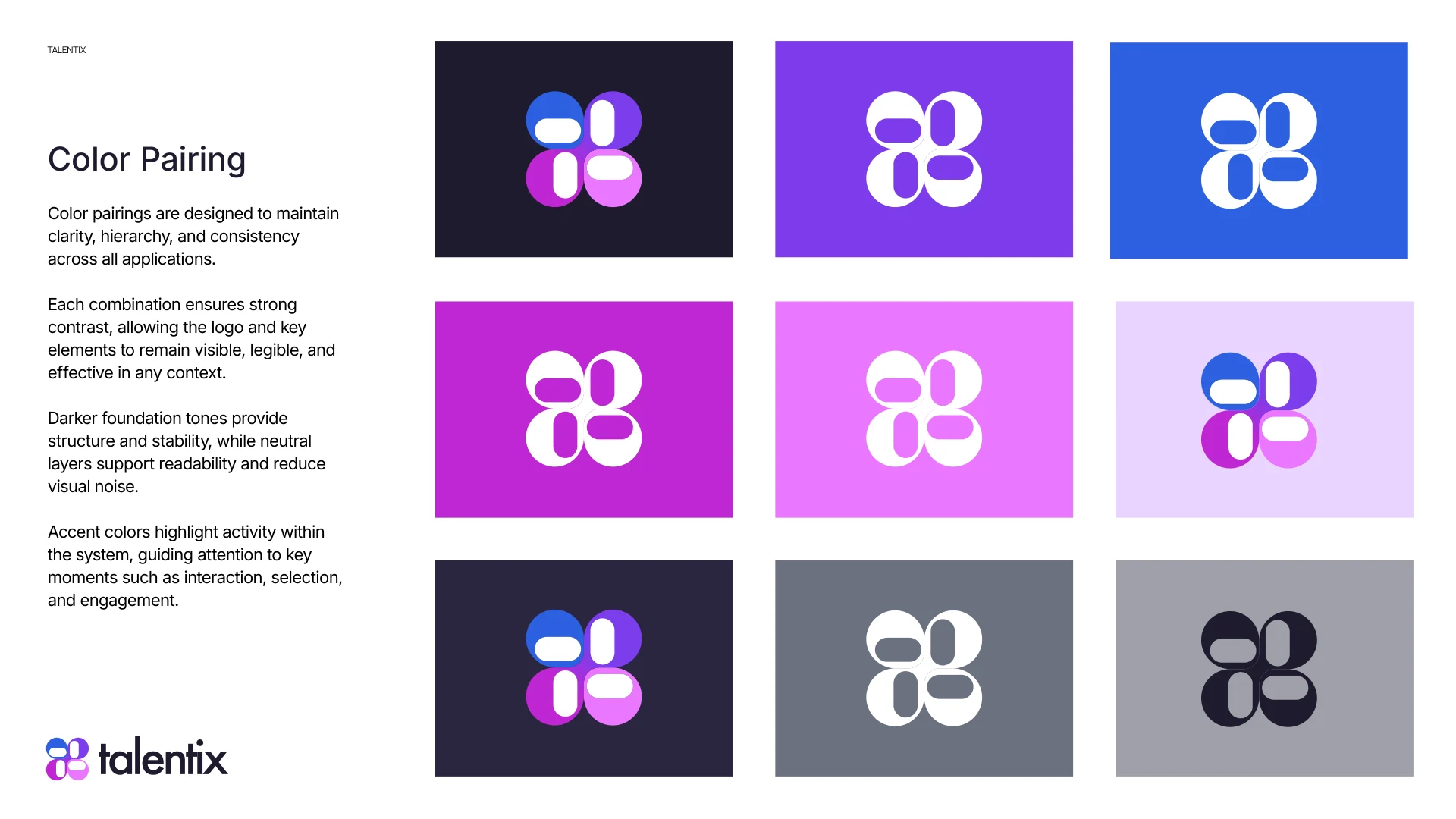
The full system: logo, clearspace, variations, colour, pairing and type.
talentix.ai - the AI operating system for recruitment, in the brand.
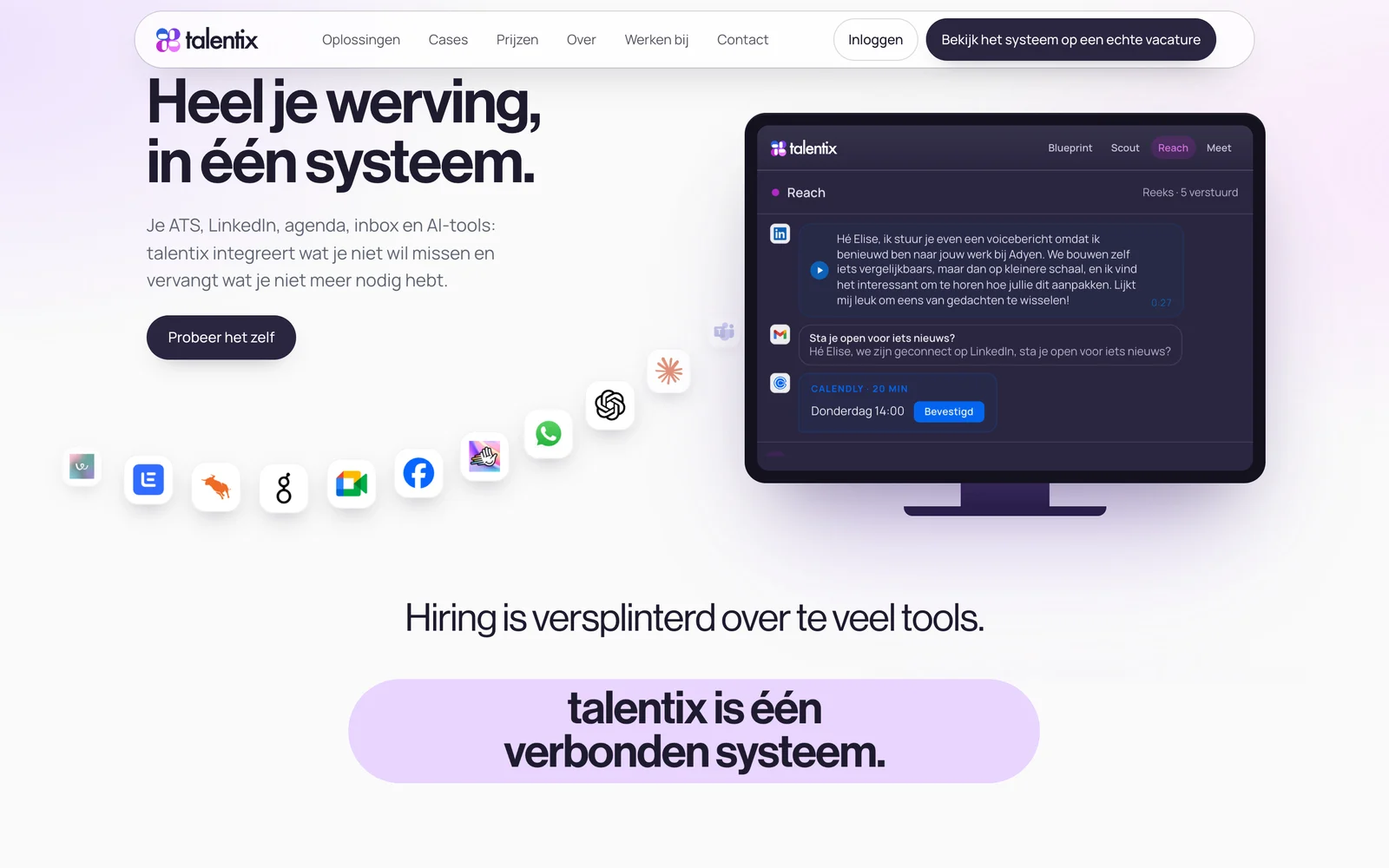
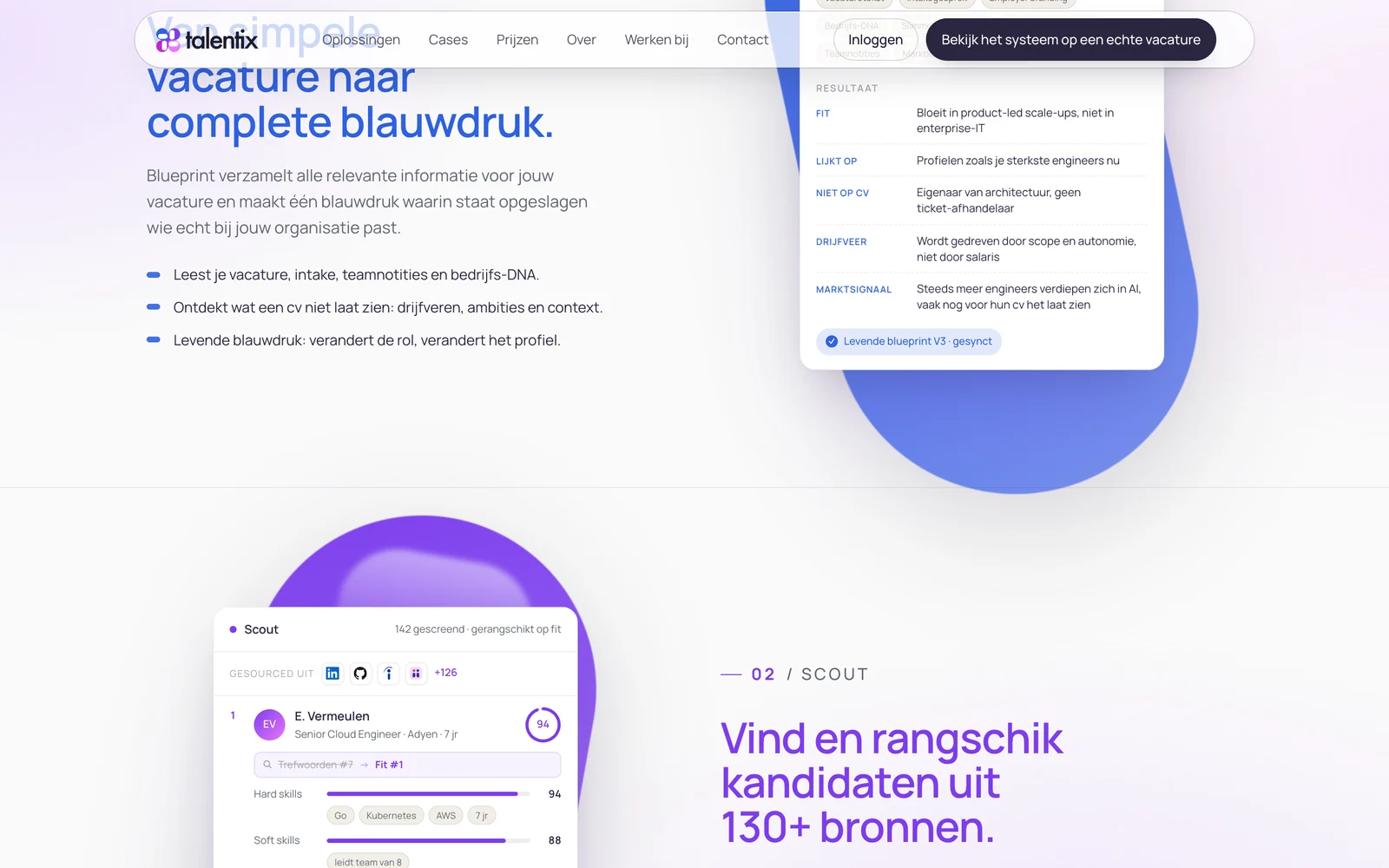
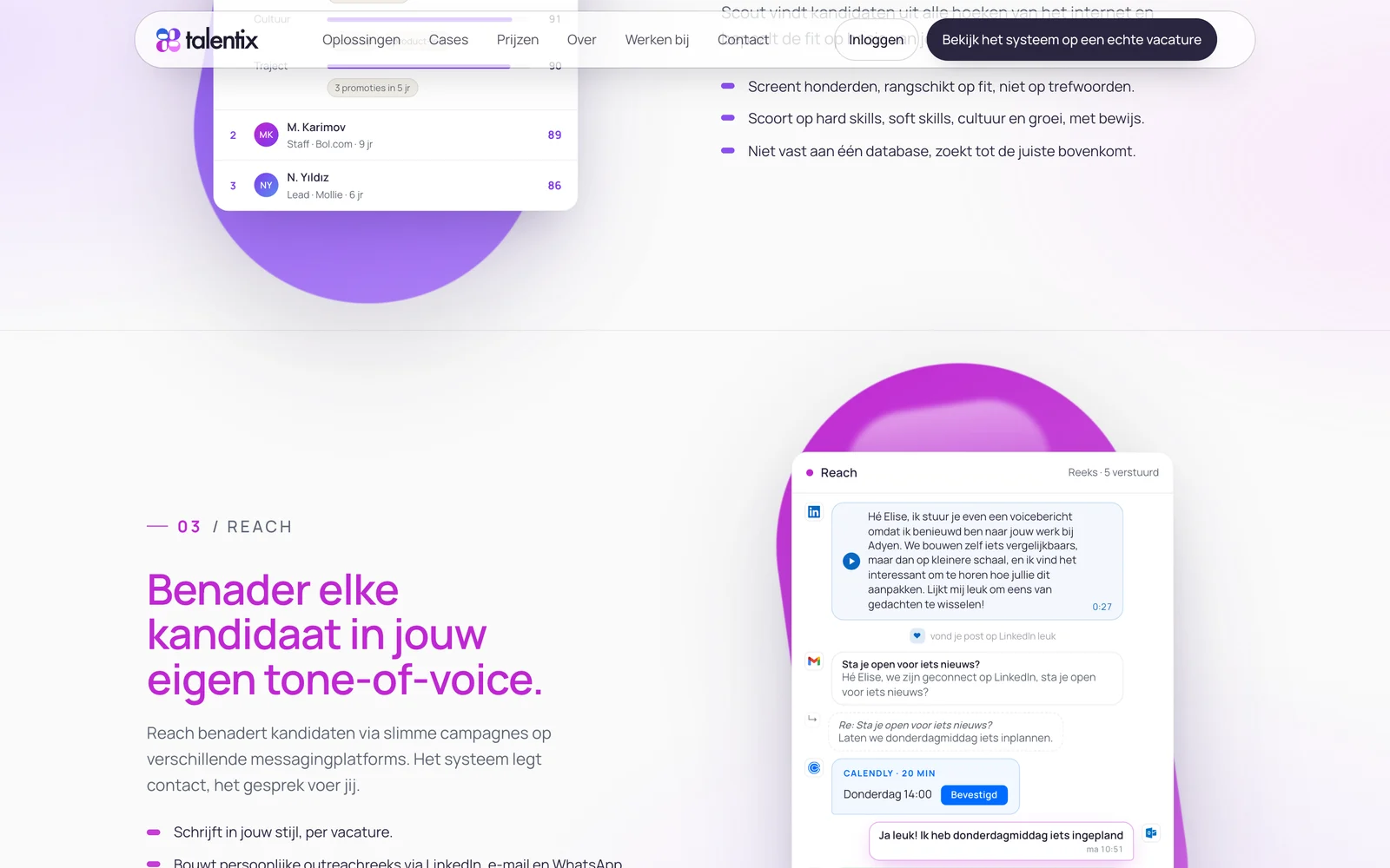
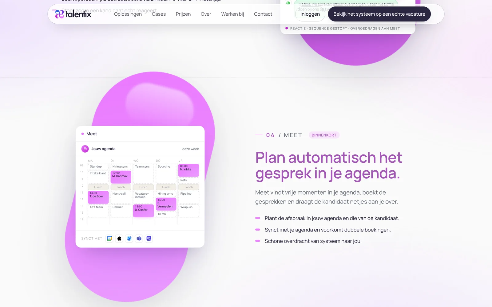
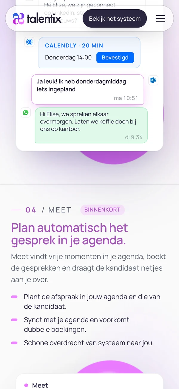
Talentix launched with a complete brand system - symbol, lockups, colour, typography and guidelines - that now runs across talentix.ai and the product itself.
Send a short message about your company and what you need. I reply personally within one working day.