
 Hrvatski
Mirai. A point on the map becomes a place.
A PropTech branding project for a real estate platform. I made the logo and identity for Mirai (heymirai.ai), a US PropTech platform. It turns a property address into a neighbourhood tour that buyers can explore. One bold stroke writes the M, and the dot of the i is the buyer. Done in 2 weeks.
The mark
One continuous stroke writes the M, the dot of the i is the buyer. A geometric lowercase wordmark keeps it calm.
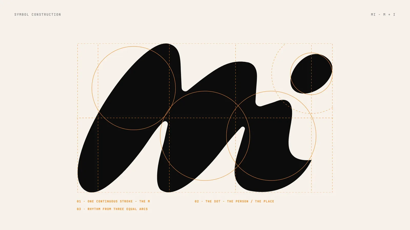
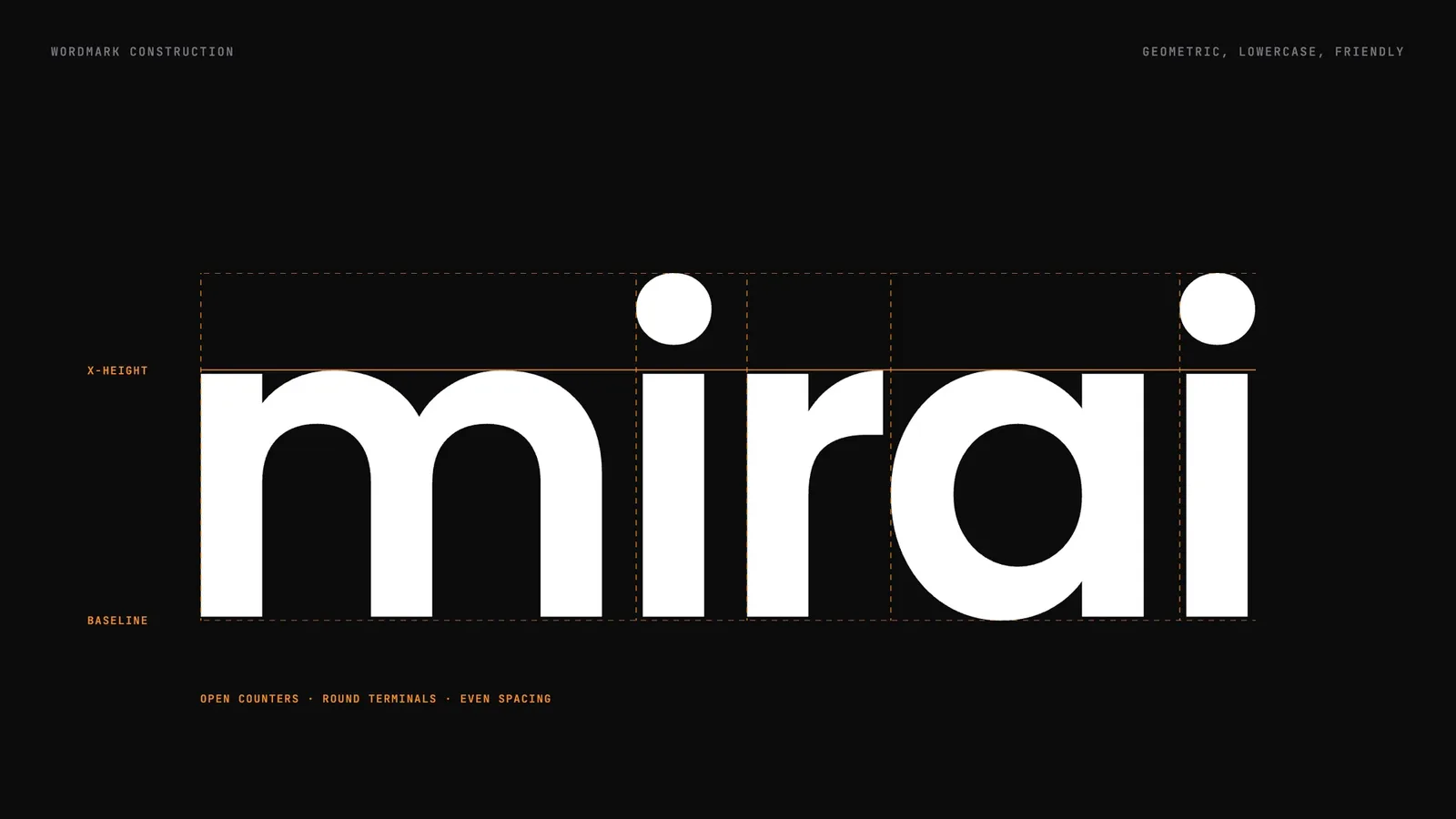
A PropTech brand that had to feel like a place, not a map pin.
Mirai helps real estate agents, brokerages and developers show buyers the life around a listing. That means streets, schools, coffee and the commute, in an interactive neighbourhood tour made from one address. Most PropTech brands use the same map pins, house outlines and cold blue gradients. So they blur together in agent tools and listing portals.
Stand apart from cold map-pin PropTech brands, and feel warm, human and local.
Warm, local, open, human.
A mark with a human hand in it. A calm wordmark. A colour that stands out next to the blue of every portal.
Buyers do not buy an address. They buy the life around it. So the mark starts from one point and opens into a place.
Keep every sign and post looking the same.Brand OS Portal gives your team designs made for your brand.
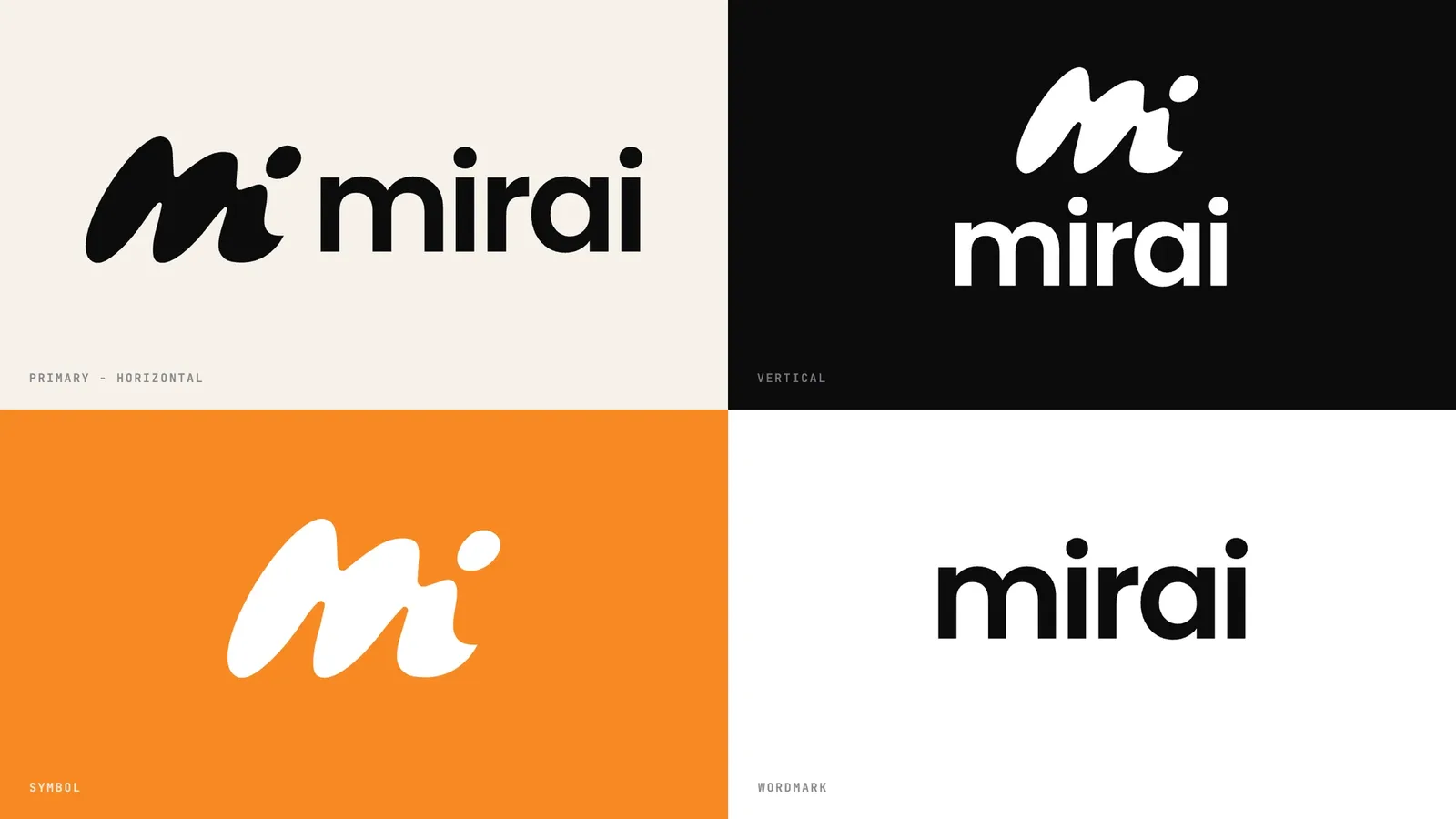
Lockups, colour and icon
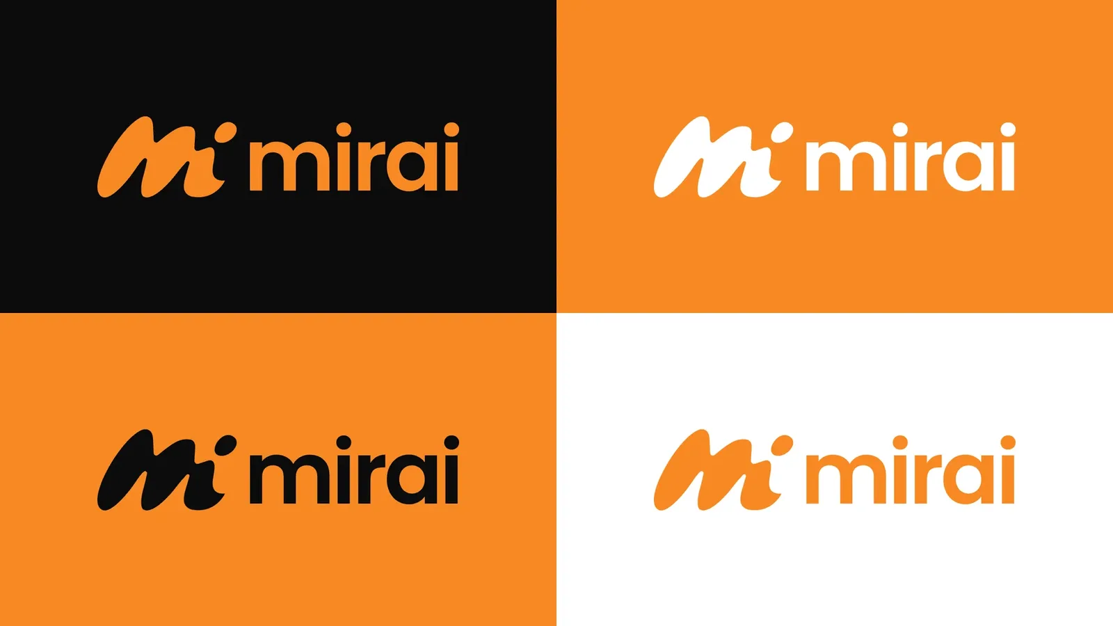
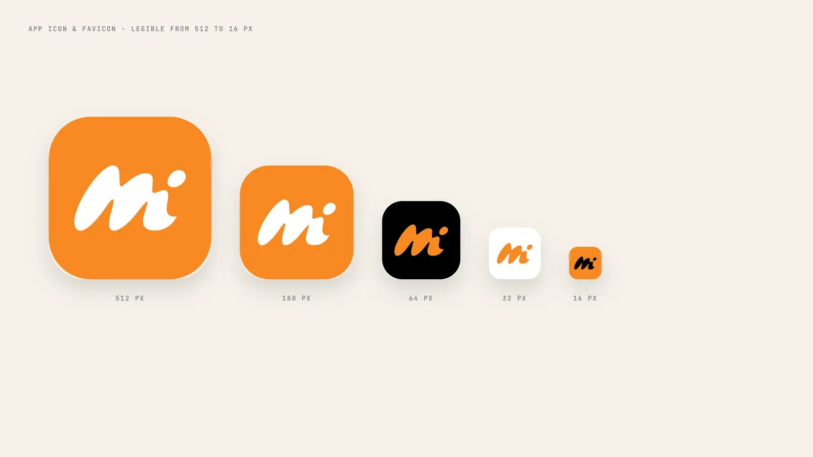
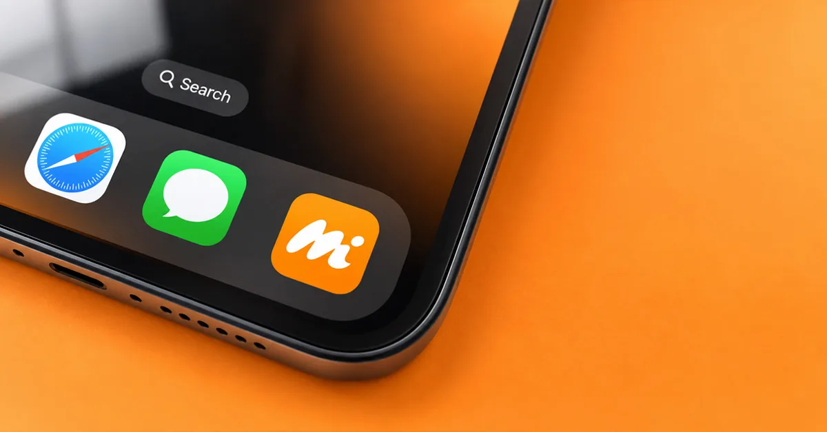
Horizontal and vertical lockups, four colourways in orange, ink and sand, and an app icon legible from 512 to 16 px.
Mirai shows buyers the life around a listing, before the showing.
Optimistic colour and a hand-drawn gesture, not cold data.
Streets, schools and coffee: the things buyers really ask about.
One address opens into a whole neighbourhood.
The buyer sits at the centre of every view.
From listing sign to social
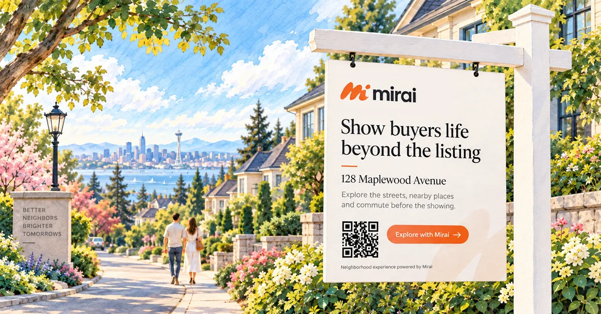
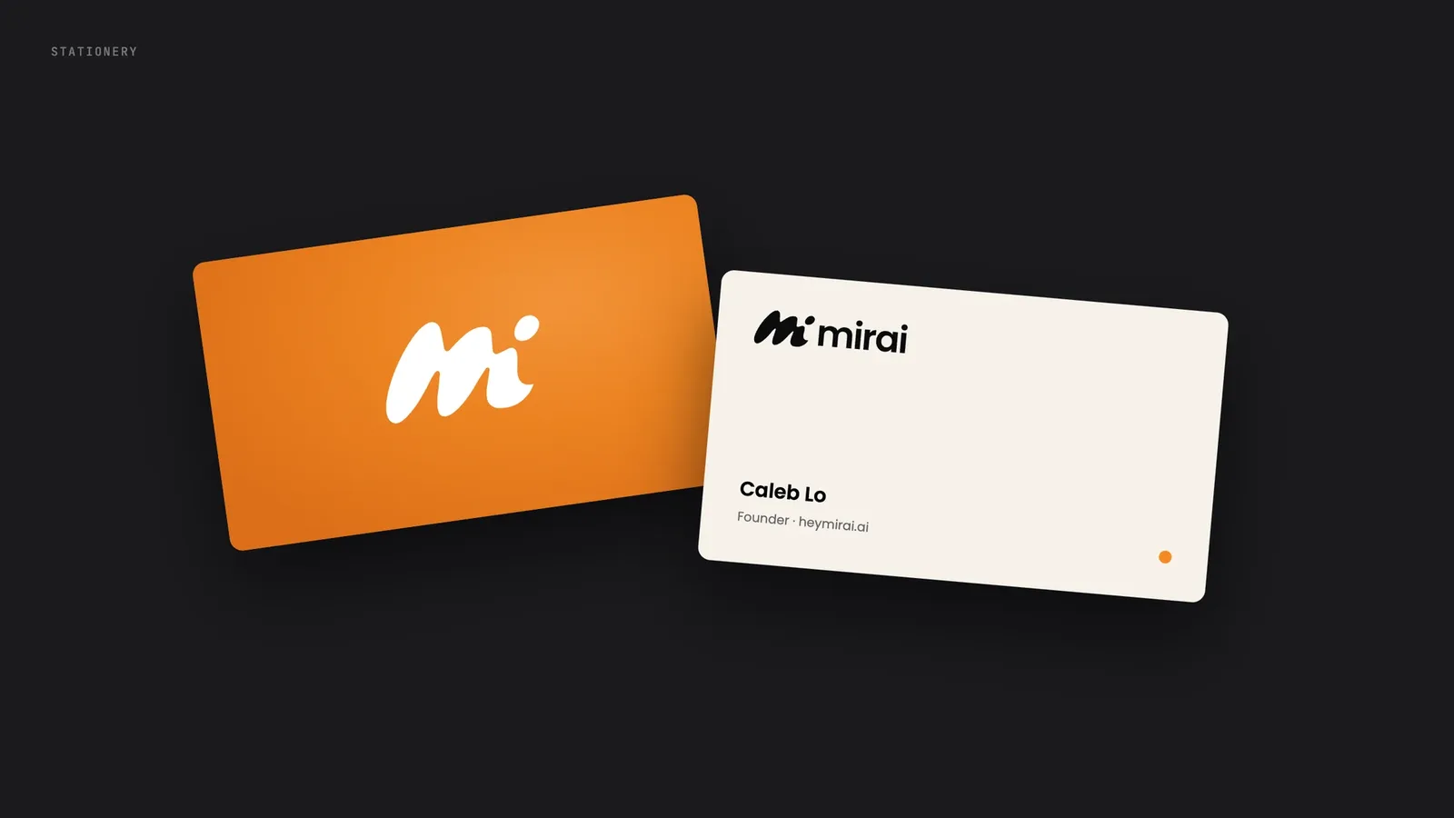
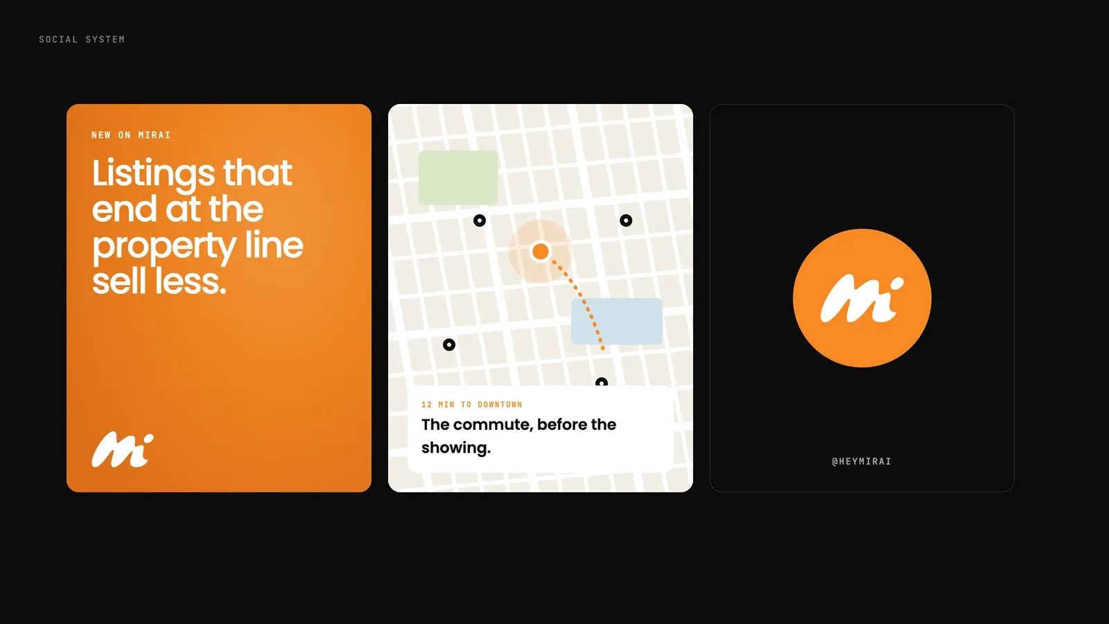
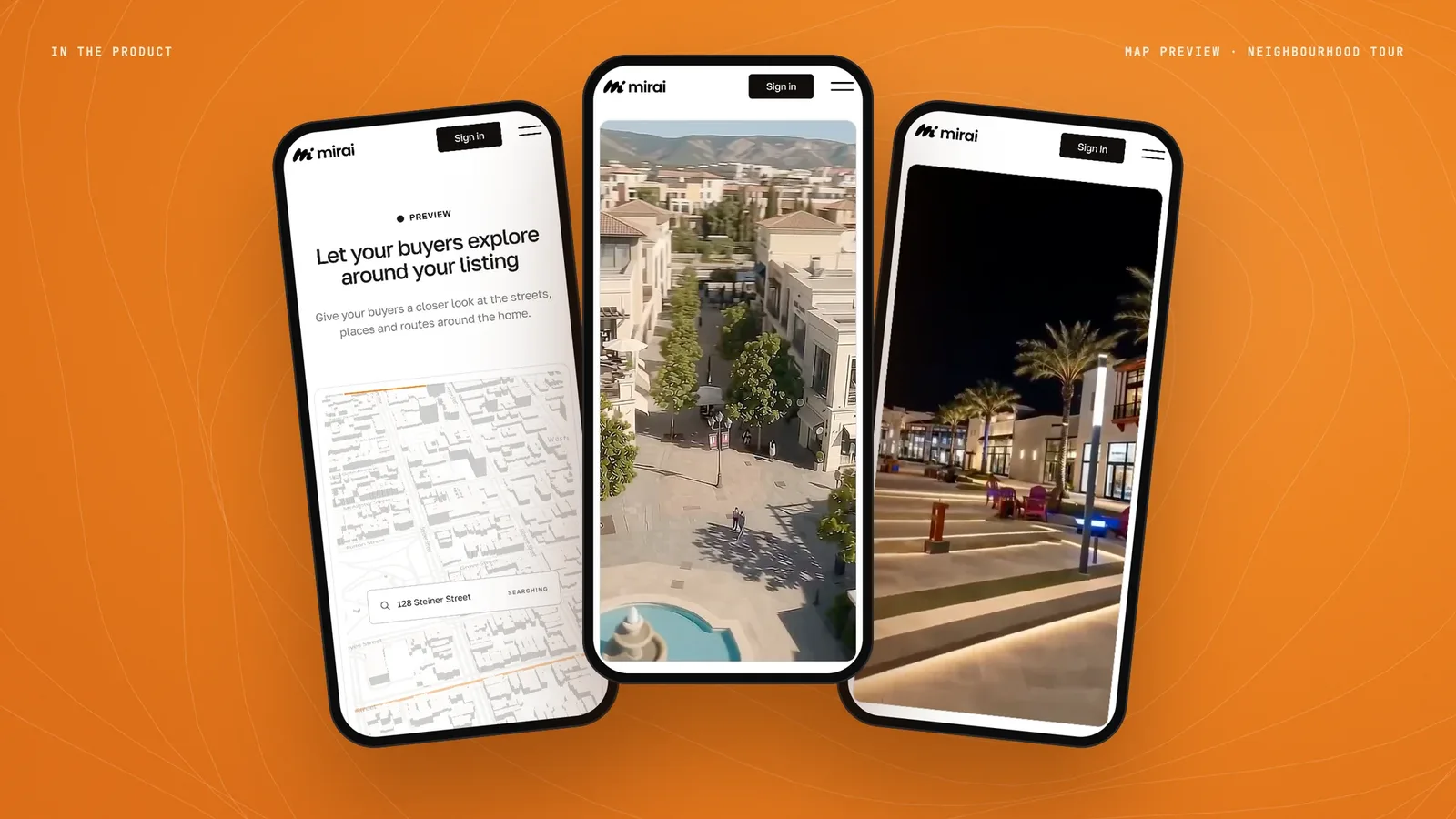
The brand where agents and buyers meet it: a QR listing sign, business cards, social posts and the product on a phone.
Five decisions, and what I rejected.
- 01One bold stroke for the M
One continuous gesture gives Mirai a human, handwritten warmth. Map pins and house icons never have it.
RejectedMap pins, house outlines and location markers.
- 02The dot is the person
The dot of the i is the buyer, at the centre of the neighbourhood. One small detail tells the story.
RejectedAbstract radar and grid marks from the first round, like Beyond the Point and More Than the Place.
- 03A geometric lowercase wordmark
A calm, friendly wordmark balances the bold symbol. It stays easy to read in busy listing screens.
RejectedA second expressive script that competes with the symbol.
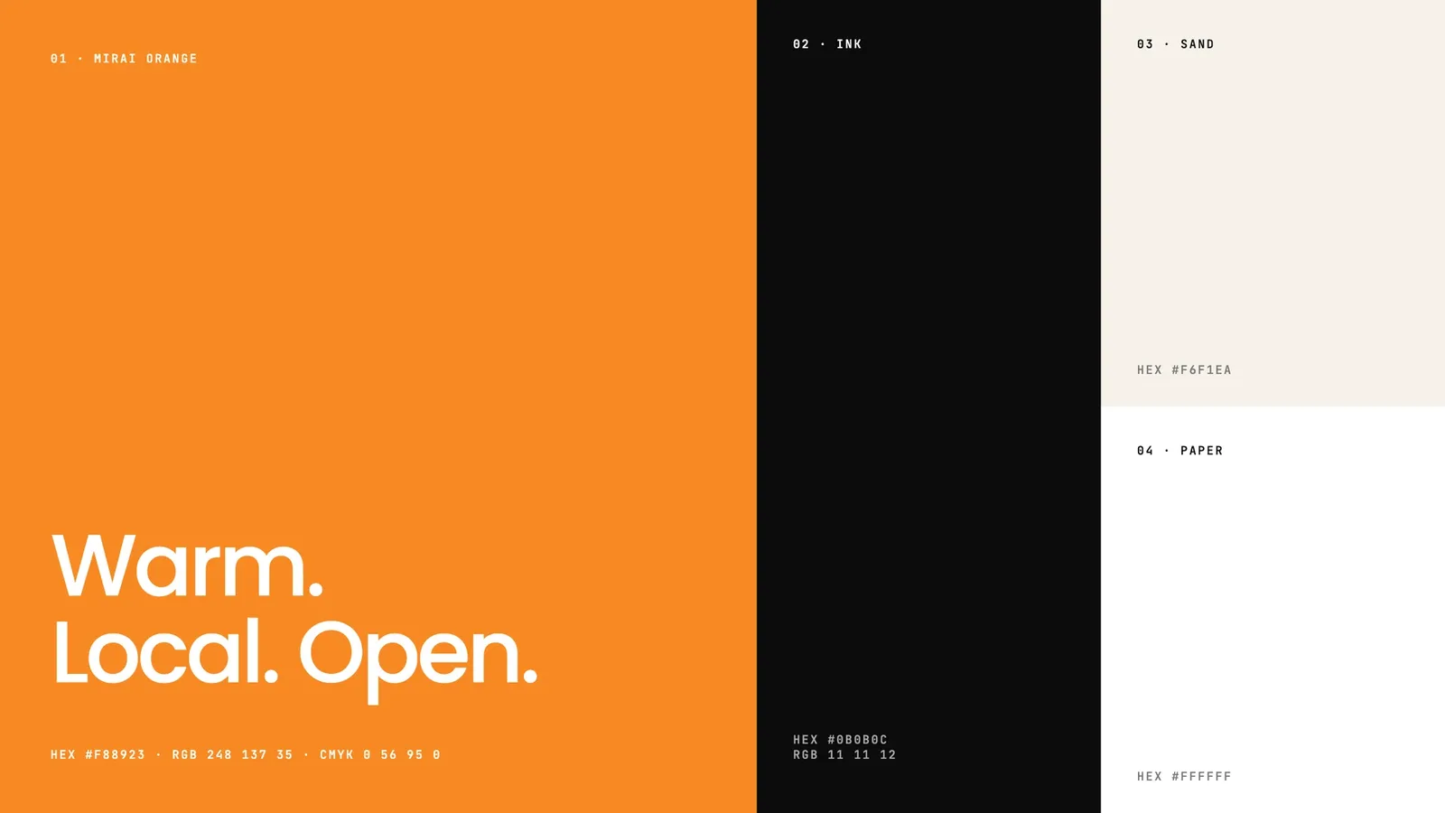
- 04Warm Mirai orange with ink and sand
Orange feels local and hopeful. It stands out against the blue of every portal and CRM.
RejectedCold blue gradients, the PropTech default.
- 05Built for every size agents use
I tested it as a 16 px favicon and as an app icon. It also works on a QR sign in front of a house.
RejectedA logo that only works large, on a hero banner.
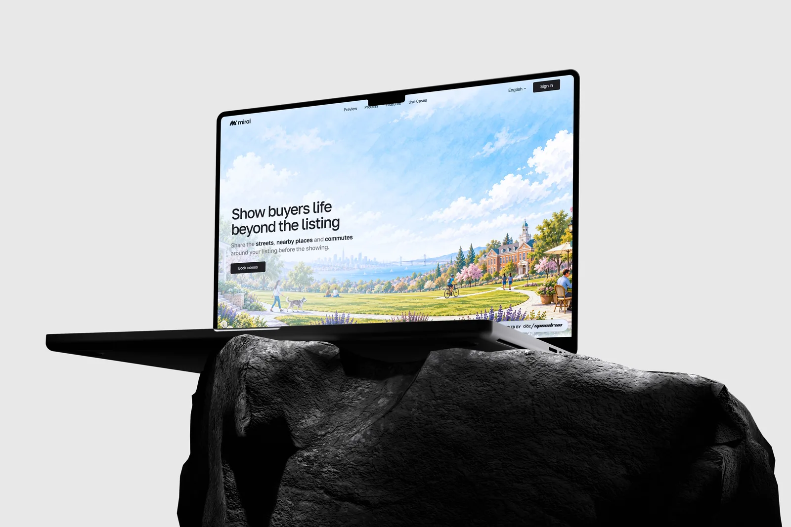
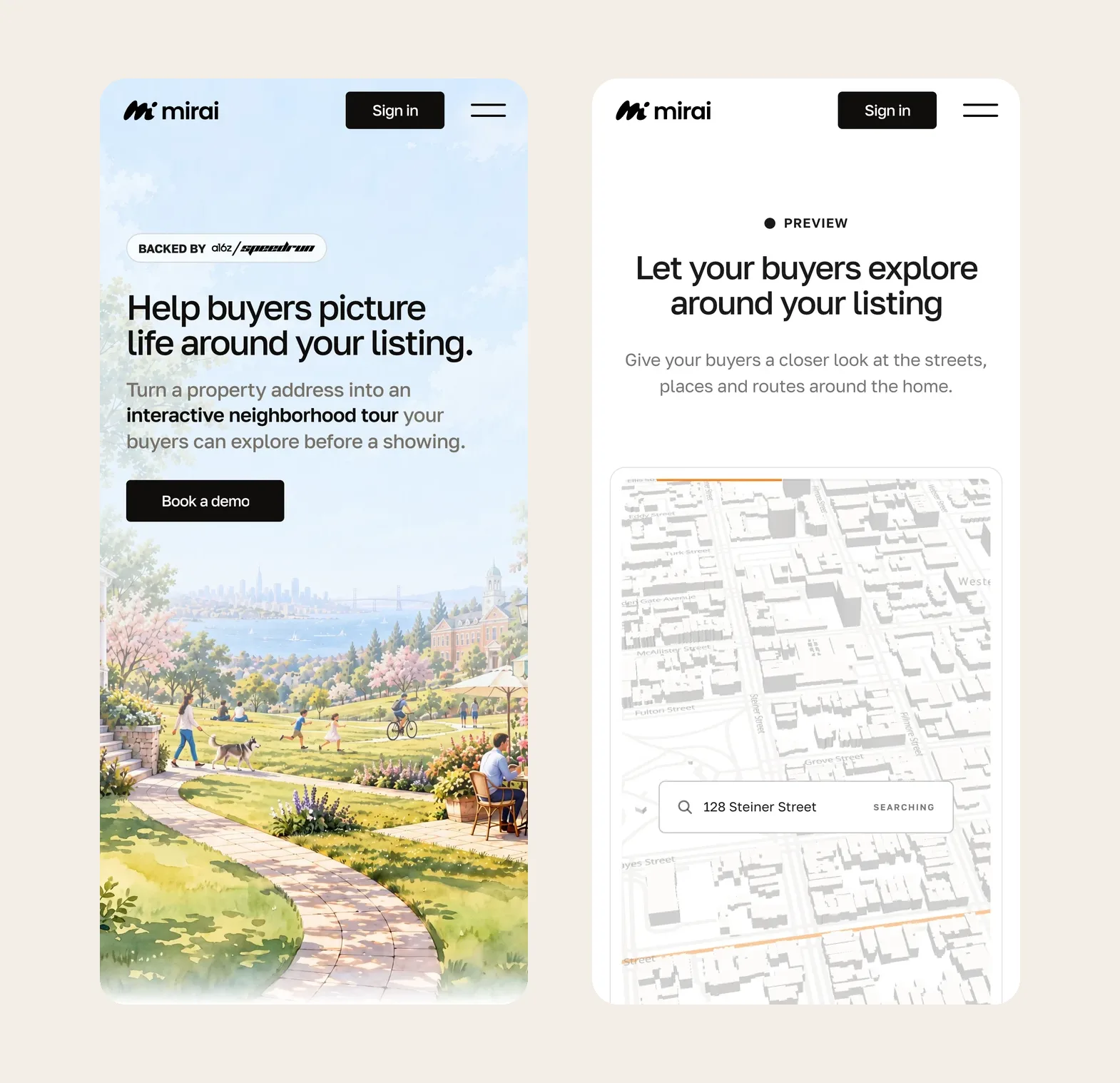
The website I designed: heymirai.ai
I designed the heymirai.ai website too: the identity running on the live product site, from the hero to the neighbourhood tour.
What was broken, and what I built to fix it.
A PropTech brand that reads as local and human.
Mirai launched with a complete logo system. It has a symbol, a wordmark, horizontal and vertical lockups, colour and a favicon set. It is ready for the product, listing signs, social and pitch decks. In a field full of cold data, it reads as a place.
One-stroke M, the dot as the buyer.
Lockups, colour, favicon and app icon.
SVG, PNG, PDF, AI, EPS in RGB and CMYK.
Want a brand like Mirai's?
15 minutes. No sales talk. You leave knowing what to do next.
Rather write to me?
Got it.
You hear from me within 2 to 8 hours.