Contrail
An arrow flies up and loops back - the path from risk to renewal, steered by the team.
Logo for ImpactPilot, a Belgian customer success platform built for HubSpot - a contrail that loops from risk to renewal.

Customer success tools blur together - dashboards, charts, generic stars and checkmarks. ImpactPilot needed a mark that says direction and measurable progress, and one that stays sharp as a tiny icon inside HubSpot.
The name combines two ideas, impact and piloting, and the logo had to hold both without becoming literal.
GoalsCustomer success is steering accounts along a route - so the mark is a flight path, not another chart.
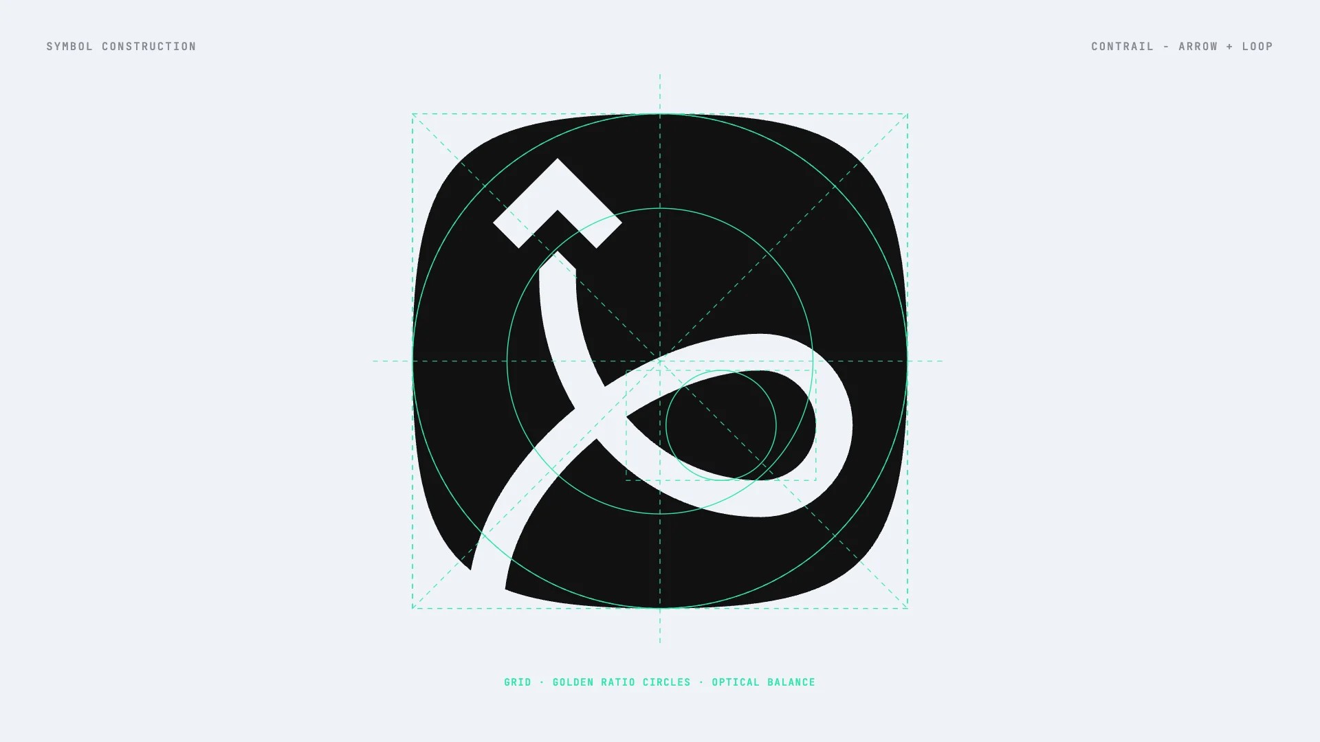
From three directions I developed Contrail: an arrow that flies up and loops back - the flight path an account takes from risk to renewal, steered by the CS team.
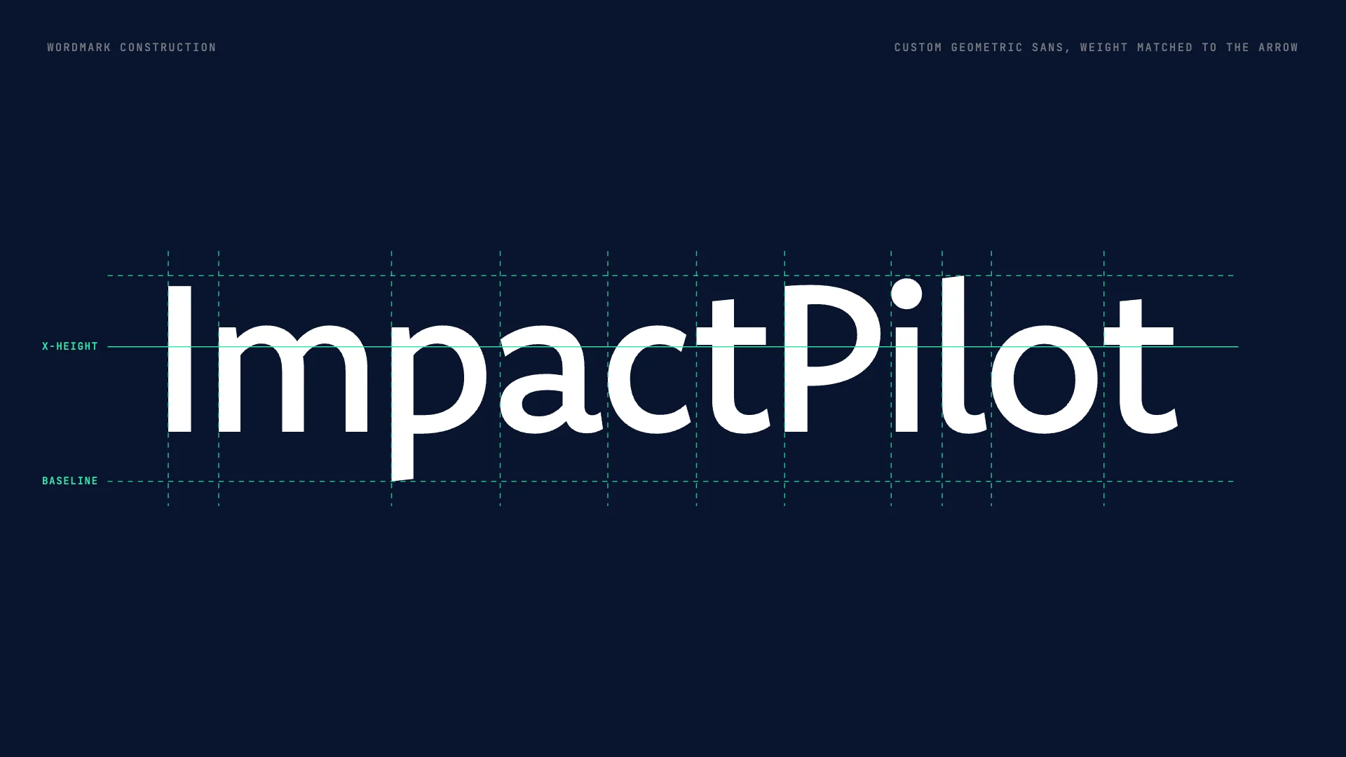
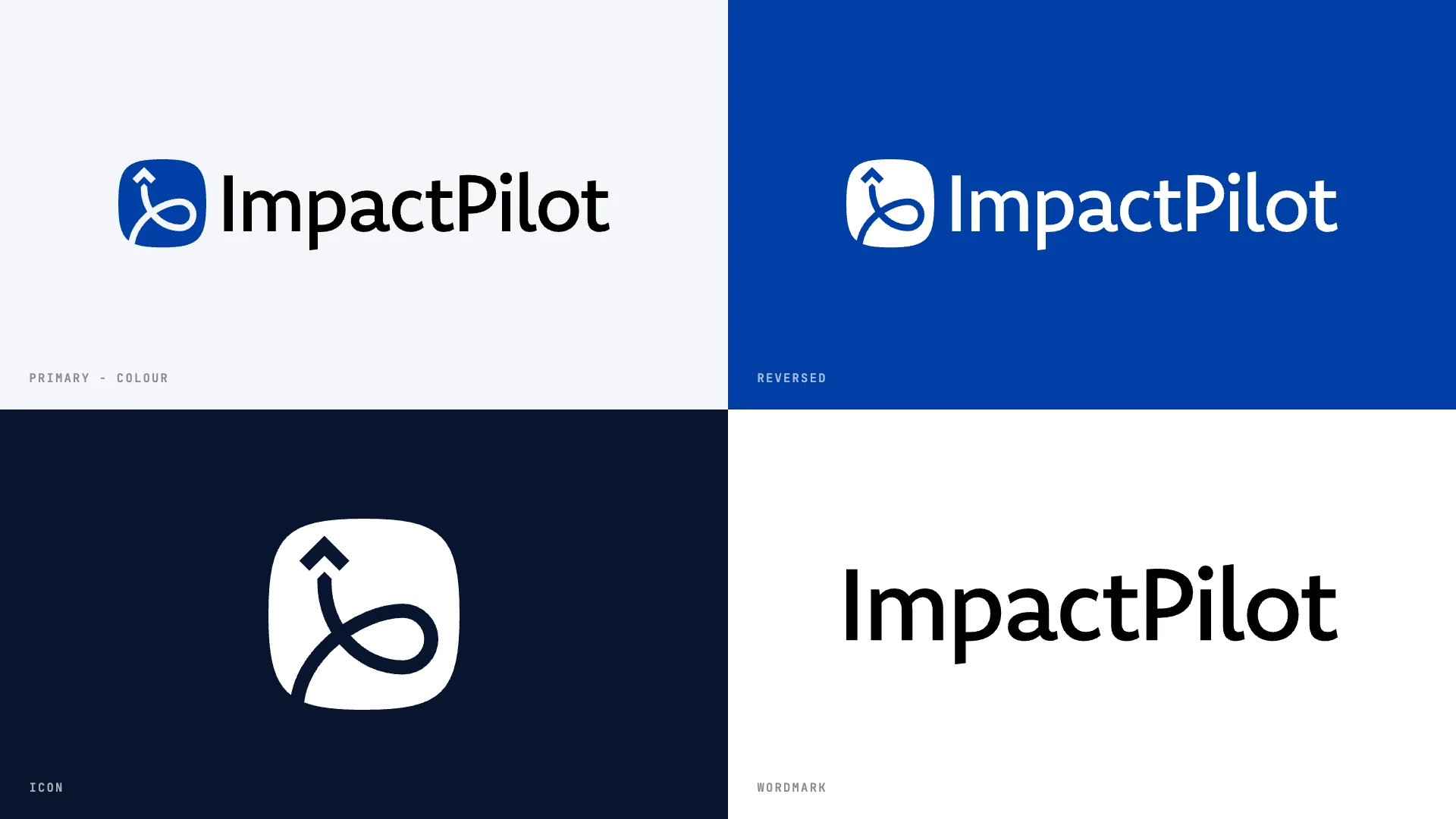
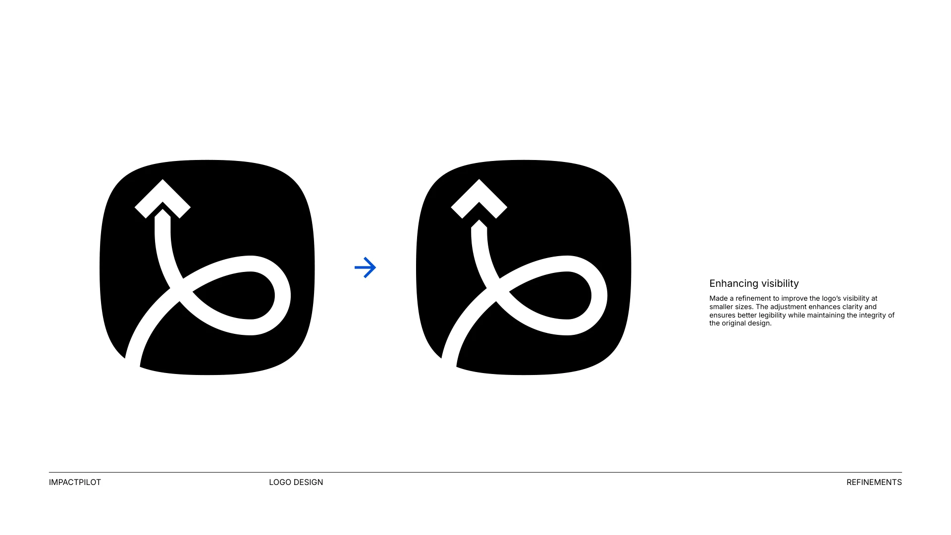
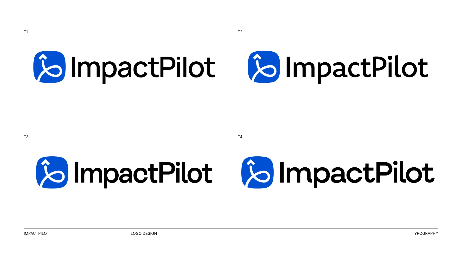
After the first round I refined the arrow and loop for small sizes, tested colour options and matched the wordmark weight to the arrow stroke so the lockup reads as one piece.
An arrow flies up and loops back - the path from risk to renewal, steered by the team.
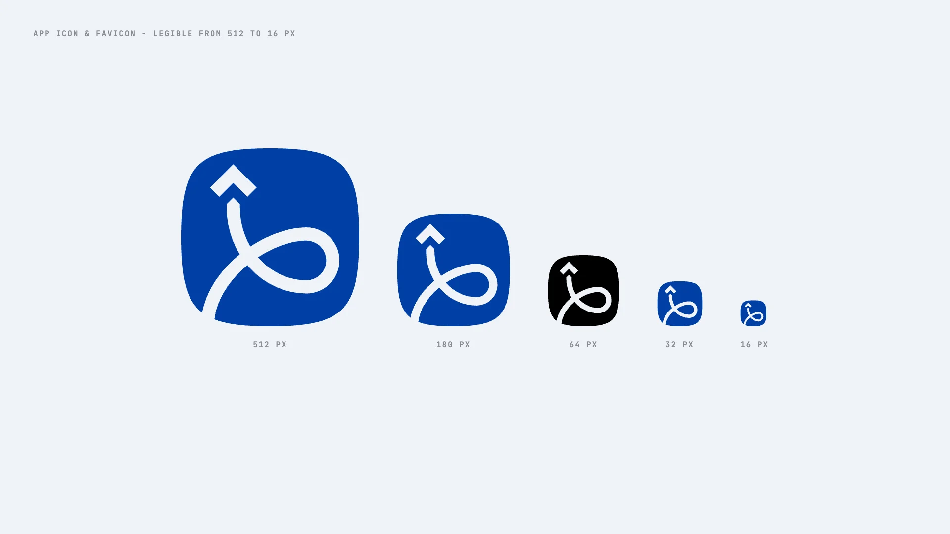
Arrow and loop were tuned after round one so the icon holds up at 16 px.
Built to sit next to other apps inside HubSpot from day one.
Letter weight follows the arrow stroke, so icon and name read as one.
A contrail that loops up and away - the route from risk to renewal.

The arrow and loop were tuned so the icon stays clear as a favicon, app icon and HubSpot avatar.
Pilot blue with a signal mint for success moments.


ImpactPilot got a distinctive, app-ready icon and lockup that works from a HubSpot app tile to pitch decks and product marketing visuals.

Send a short message about your company and what you need. I reply personally within one working day.