
 Hrvatski
Polaris. Direction, turned into a brand asset.
A consulting brand identity project for a US strategy and technology firm. I built a brand identity for a US strategy and technology consultancy. It centres on the North Star: six forms that meet at one direction. It uses red, black and white. I designed it for decks first. Done in 18 days.
The logo
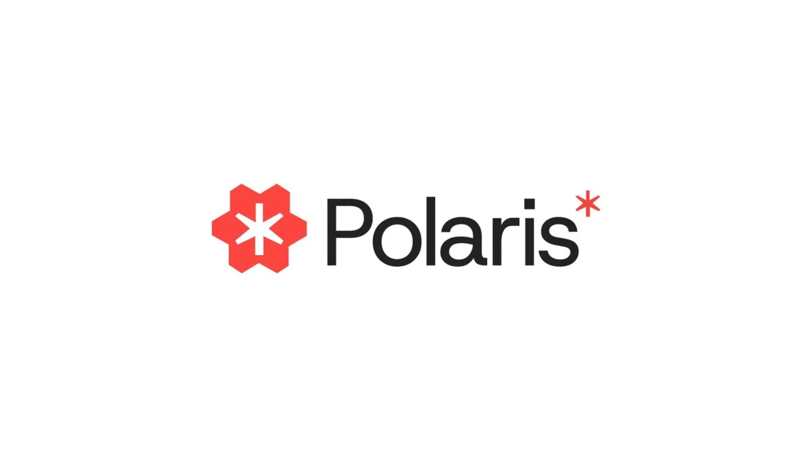
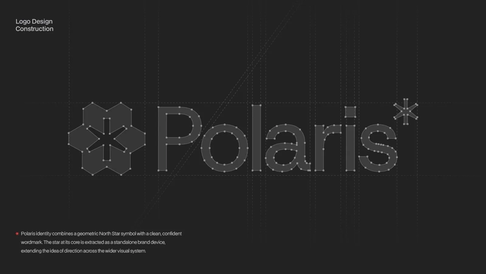
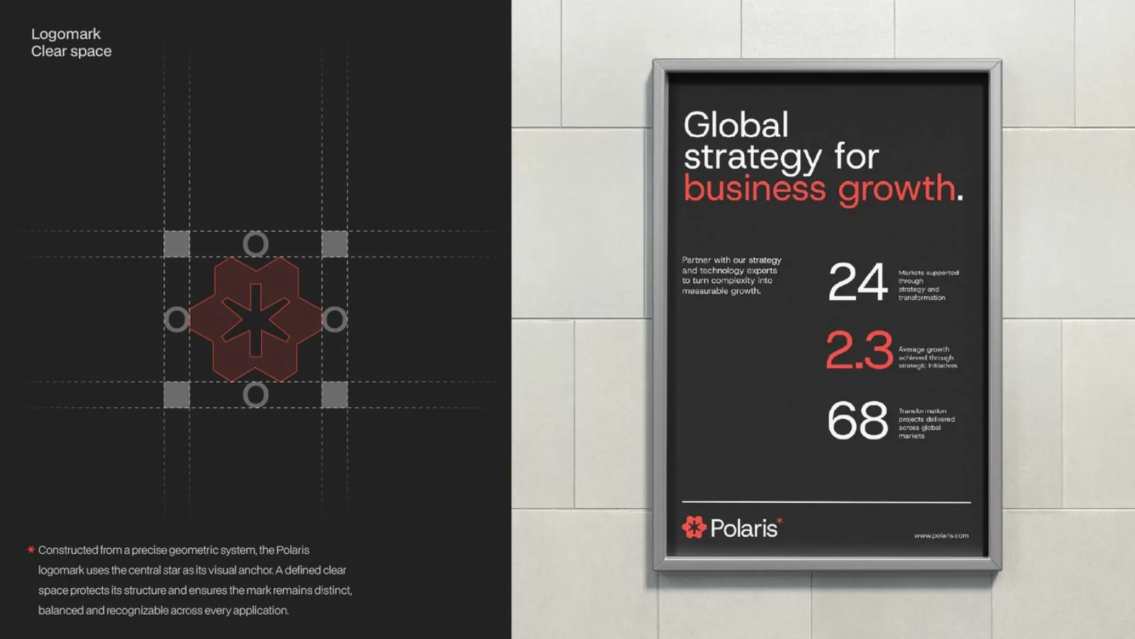
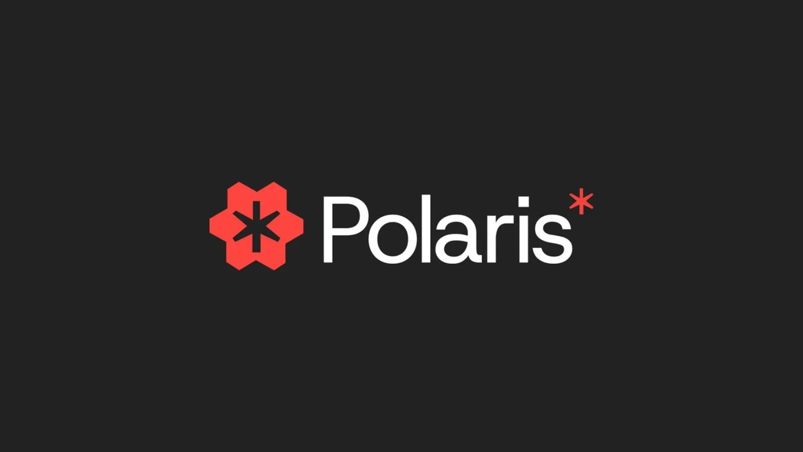
Six forms converging on one point: the North Star, built on a strict grid with clear space and a version for dark.
A consultancy that sold direction and looked like everyone else.
Polaris helps ambitious companies make hard decisions and turn change into momentum. Their work was sharp. Their identity was a safe corporate blue that could belong to any firm on the shortlist. Partners walked into boardrooms with decks that looked less sure than the advice inside them.
An identity that feels strategic, exact and ready for large companies, and that decision-makers remember after the pitch.
Clarity, precision, ambition, trust.
Confident, never stiff. Bold where consulting is timid. Built for decks, proposals and stages first.
A consultancy that sells direction should own a point to steer by. That became the North Star.
Every deck should look as sharp as your work.Brand OS Portal lets your team make decks and posts that follow your brand.
Colour and type
Red, black and white and one clean sans: a palette you spot in a stack of proposals, type that holds on a conference screen.
Polaris gives ambitious businesses clear direction through strategy and technology.
One clear point to steer by.
Clear thinking, visible in every layout.
Change that moves, not reports that sit.
Ready for large companies, without the grey.
The system in use
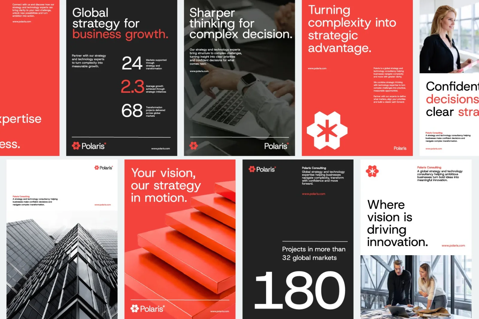
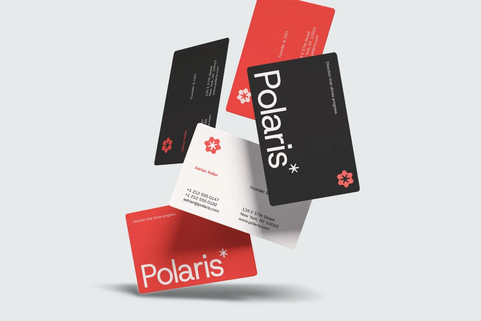
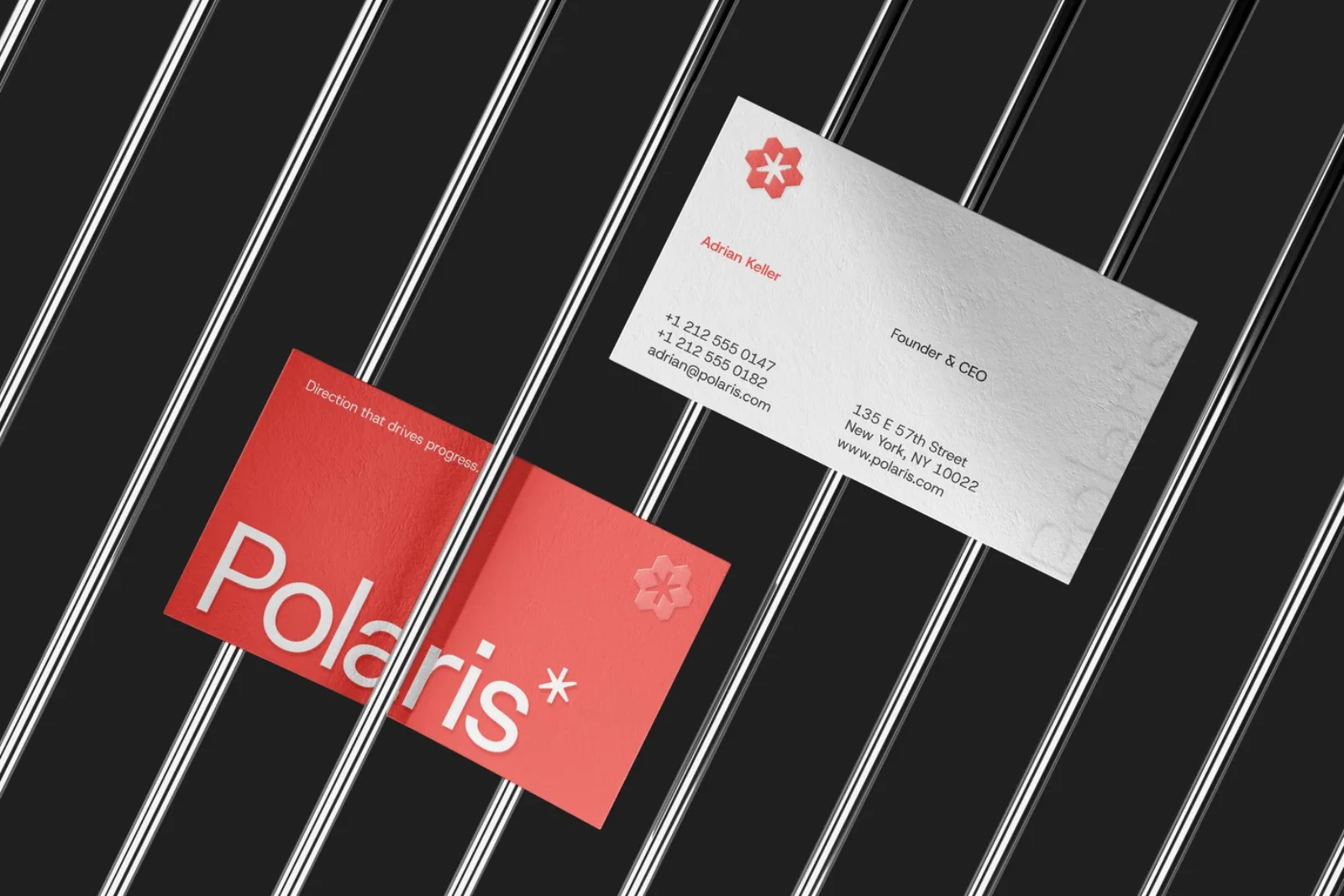
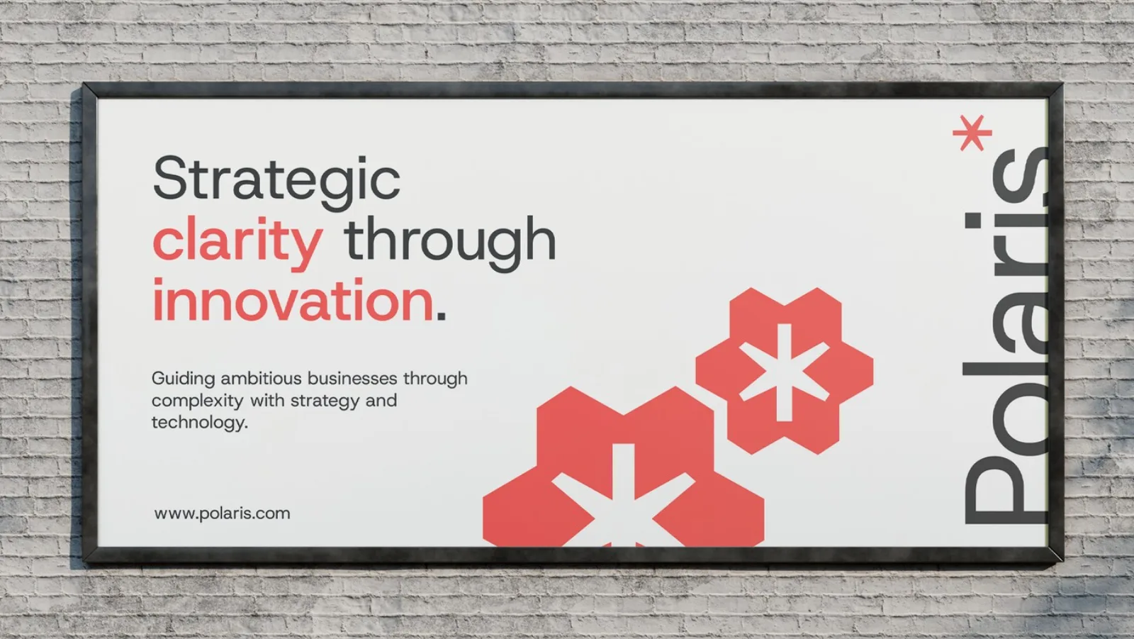
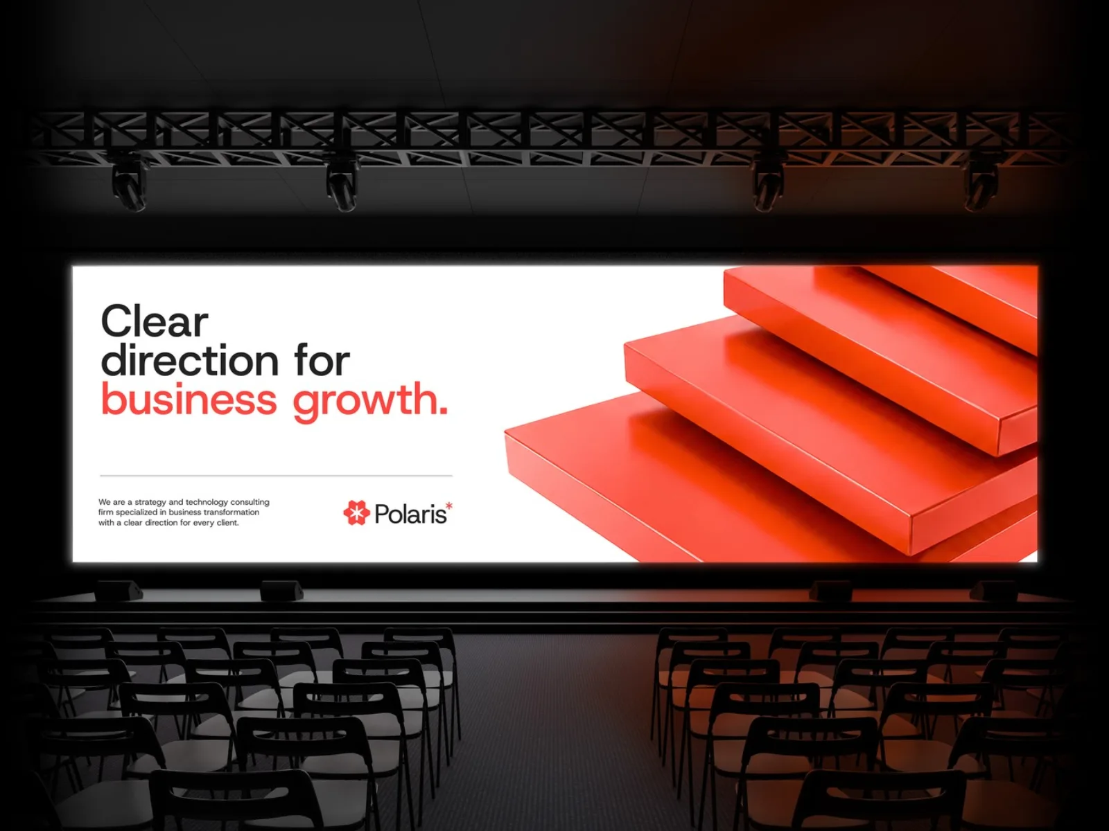
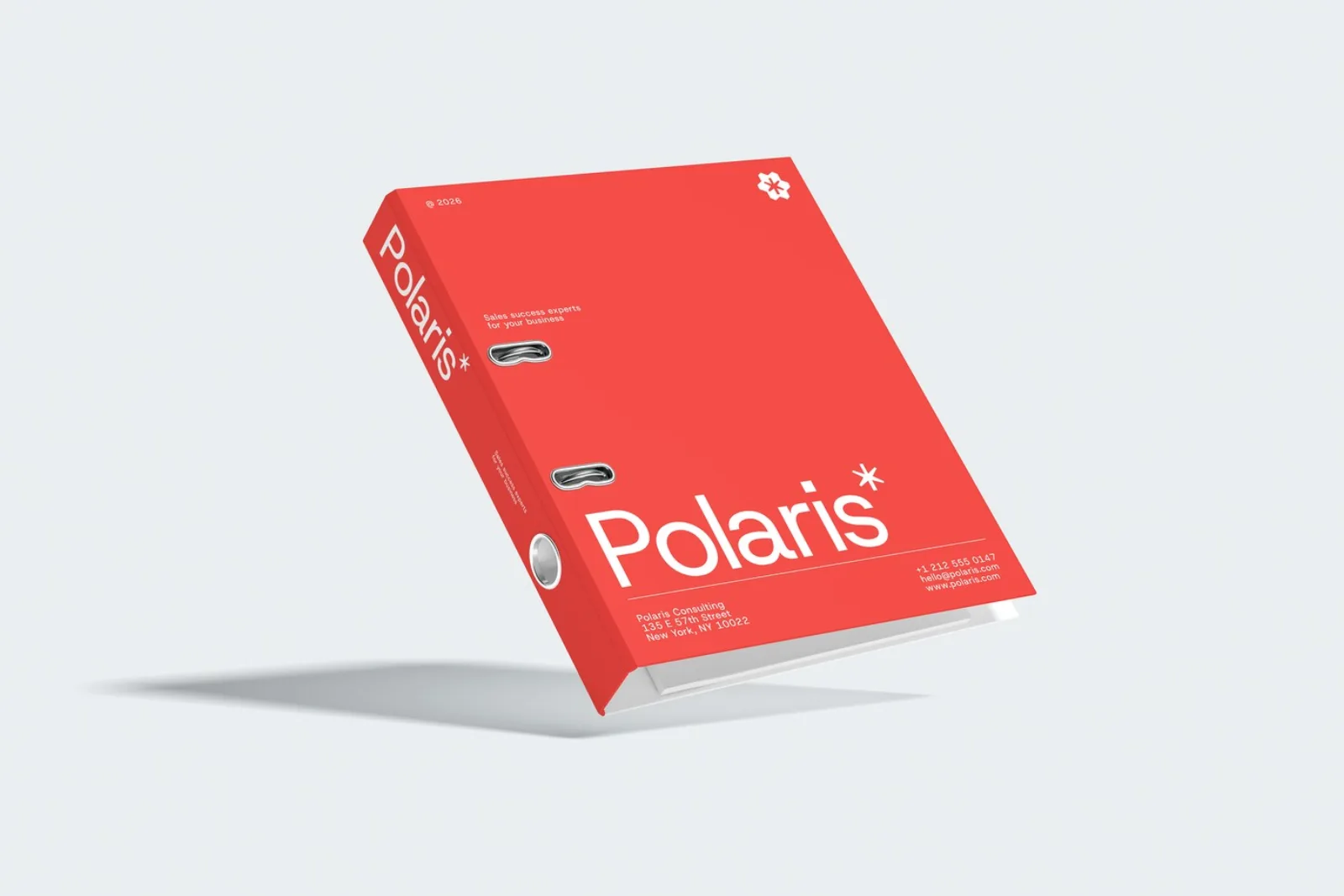
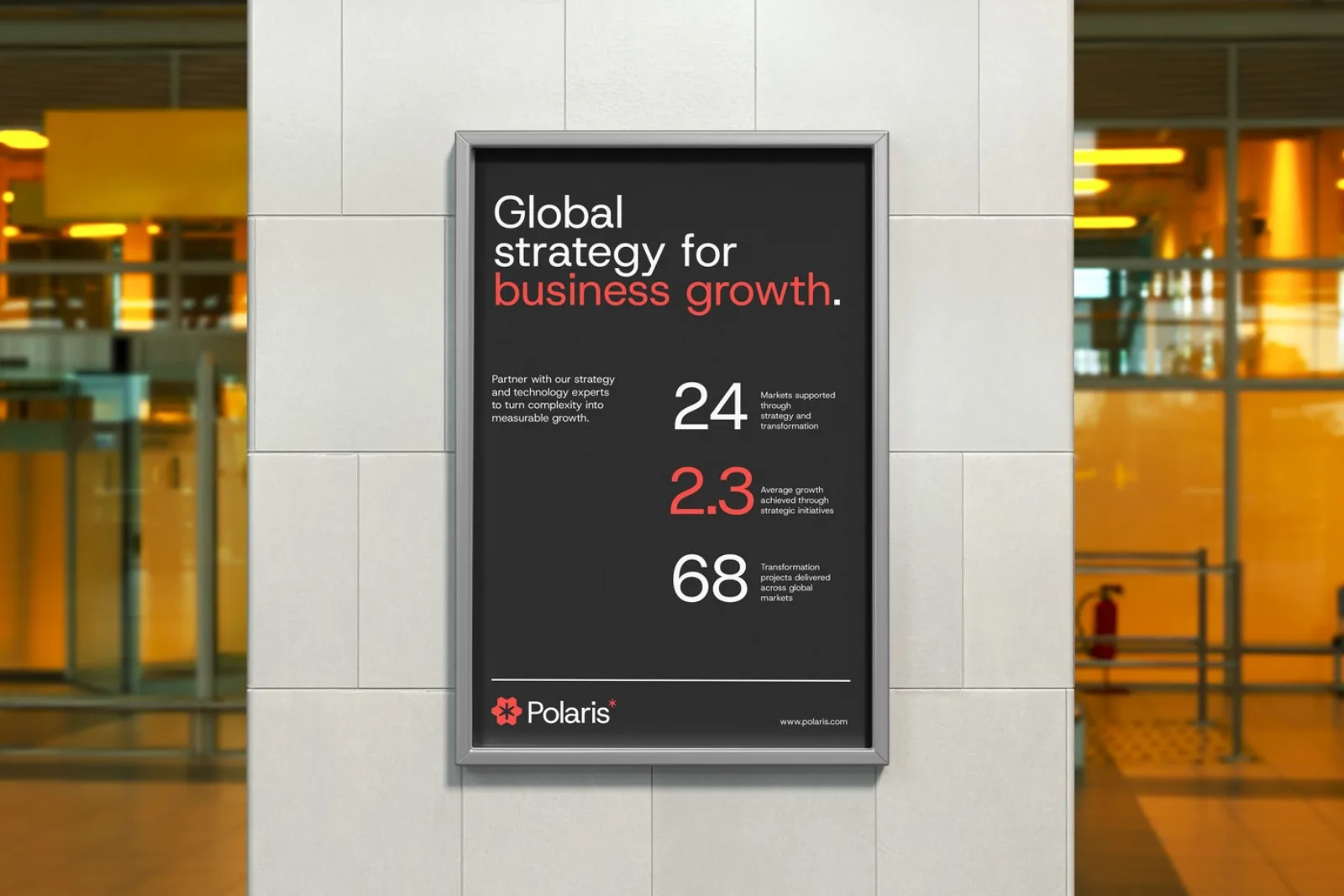
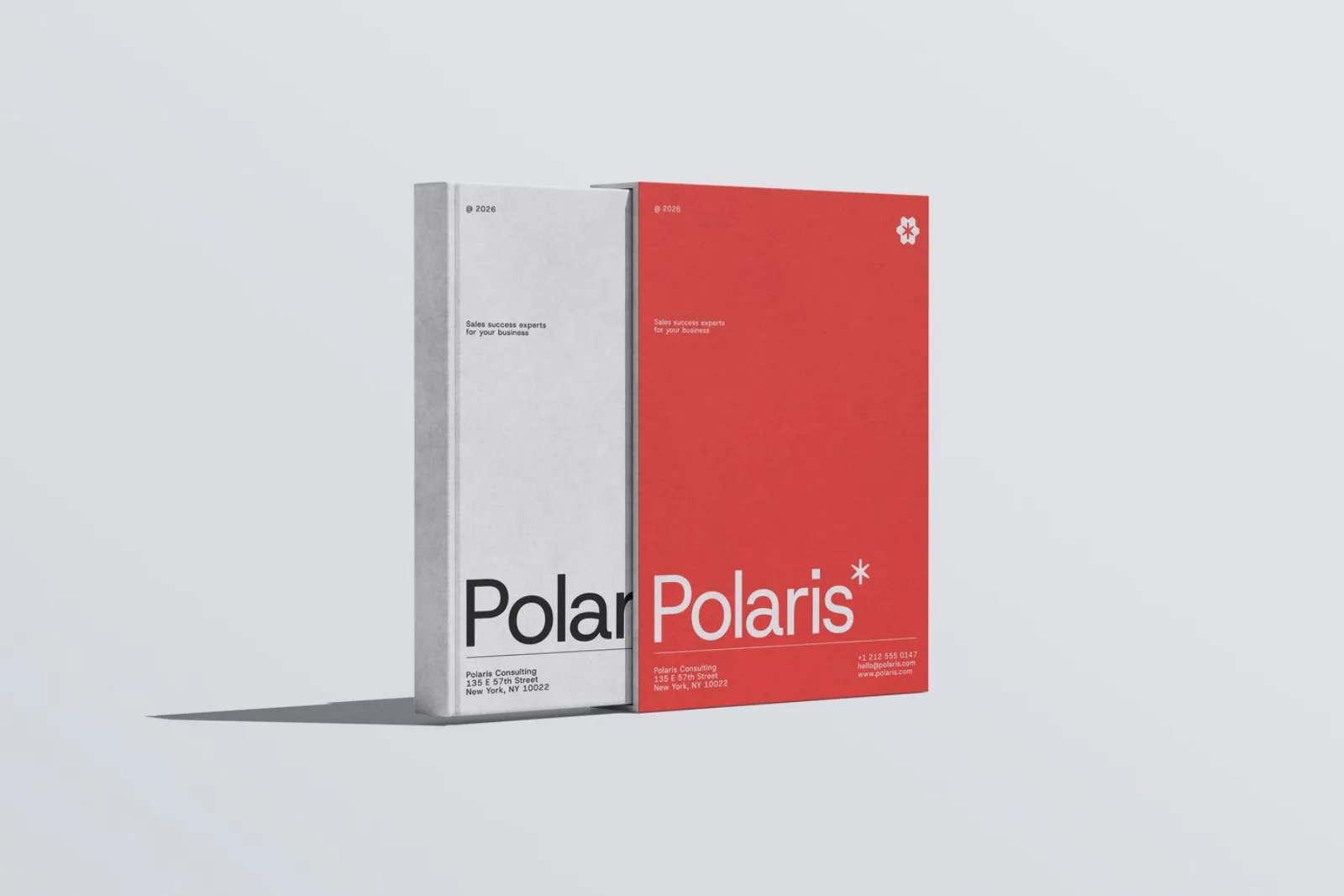
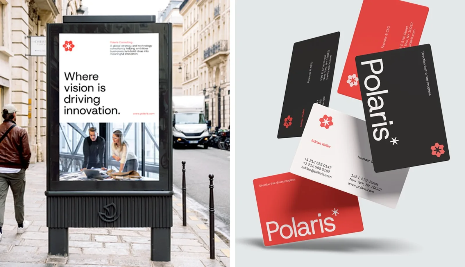
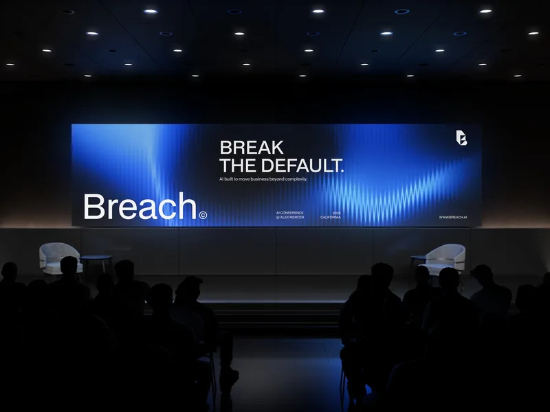
Posters, business cards, a billboard, a conference stage, binders and slipcases: one direction everywhere.
Five decisions, and what I rejected.
- 01Six forms around a central star
The symbol brings many paths into one point. It reads as focus at any size.
RejectedA literal compass or a generic star icon.
- 02Red, black and white only
A tight palette stands out. It works in a stack of proposals and on a conference screen.
RejectedConsulting blue and a long secondary palette.
- 03Steps as the image language
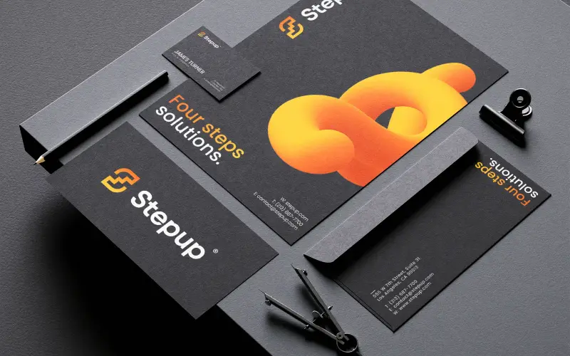
Red 3D steps show progress without stock photos of handshakes.
RejectedSkyline and boardroom stock photography.
- 04Headlines that state the value
Clear direction for business growth. Strategic clarity through innovation. Partners can say these lines out loud.
RejectedAbstract taglines about excellence.
- 05Built for presentations first
Consultants live in decks. So I designed the grid, type scale and layouts there. Then I carried them to print and signs.
RejectedA logo-first system that breaks inside PowerPoint.
What was broken, and what I built to fix it.
A consulting brand you can see across the room.
Polaris came out with a sharper brand. Its skill is easier to spot and its thinking is easier to trust. The North Star moved from an idea to an asset. You see it on cards, billboards, conference screens and every proposal the partners send.
North Star mark, lockups, construction.
Colour, type, steps imagery, layouts.
Stationery, signage, conference, decks.
Want a brand like Polaris's?
15 minutes. No sales talk. You leave knowing what to do next.
Rather write to me?
Got it.
You hear from me within 2 to 8 hours.