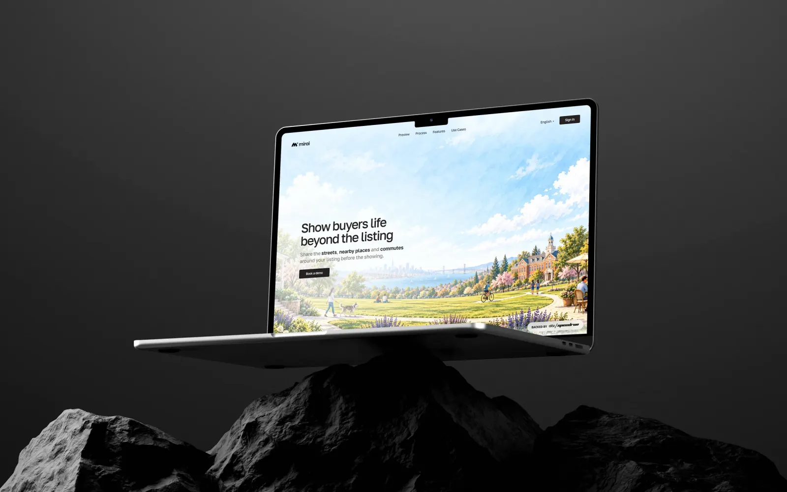
StratoSync. Speed and security, in sync.
Logo, visual identity, VPN app UI and a Framer website for StratoSync, a US satellite internet and VPN company. One idea, synchronized connectivity, carried from the mark into the product. I was their Branding Lead. Done in 3 weeks.
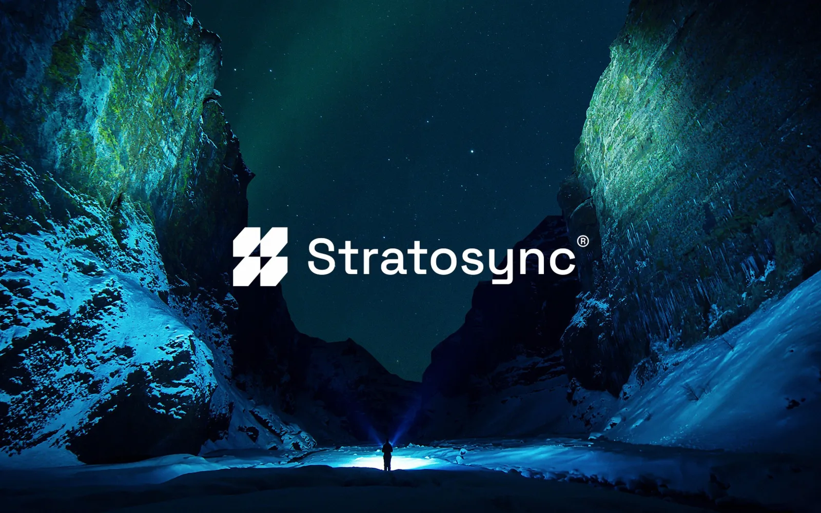
The logo
Data flow, satellite paths and one constant connection, in a compact mark set against a night landscape: speed and security as one idea.
A security brand that looked like every other dark-mode VPN.
StratoSync delivers encrypted satellite internet and VPN connectivity. The category speaks one visual language: dark screens, padlocks, network meshes. StratoSync looked like ten other VPNs, and its brand and its app felt like two different companies. People who route their traffic through you need to trust you in the first second.
A brand people trust with their connection, and a website that turns more visitors into customers.
Speed, security, constant connection, clarity.
Technical and credible, never generic. One identity from the logo to the VPN interface.
Speed and security sold as one promise. That promise is a connection that always stays in sync.
The VPN app
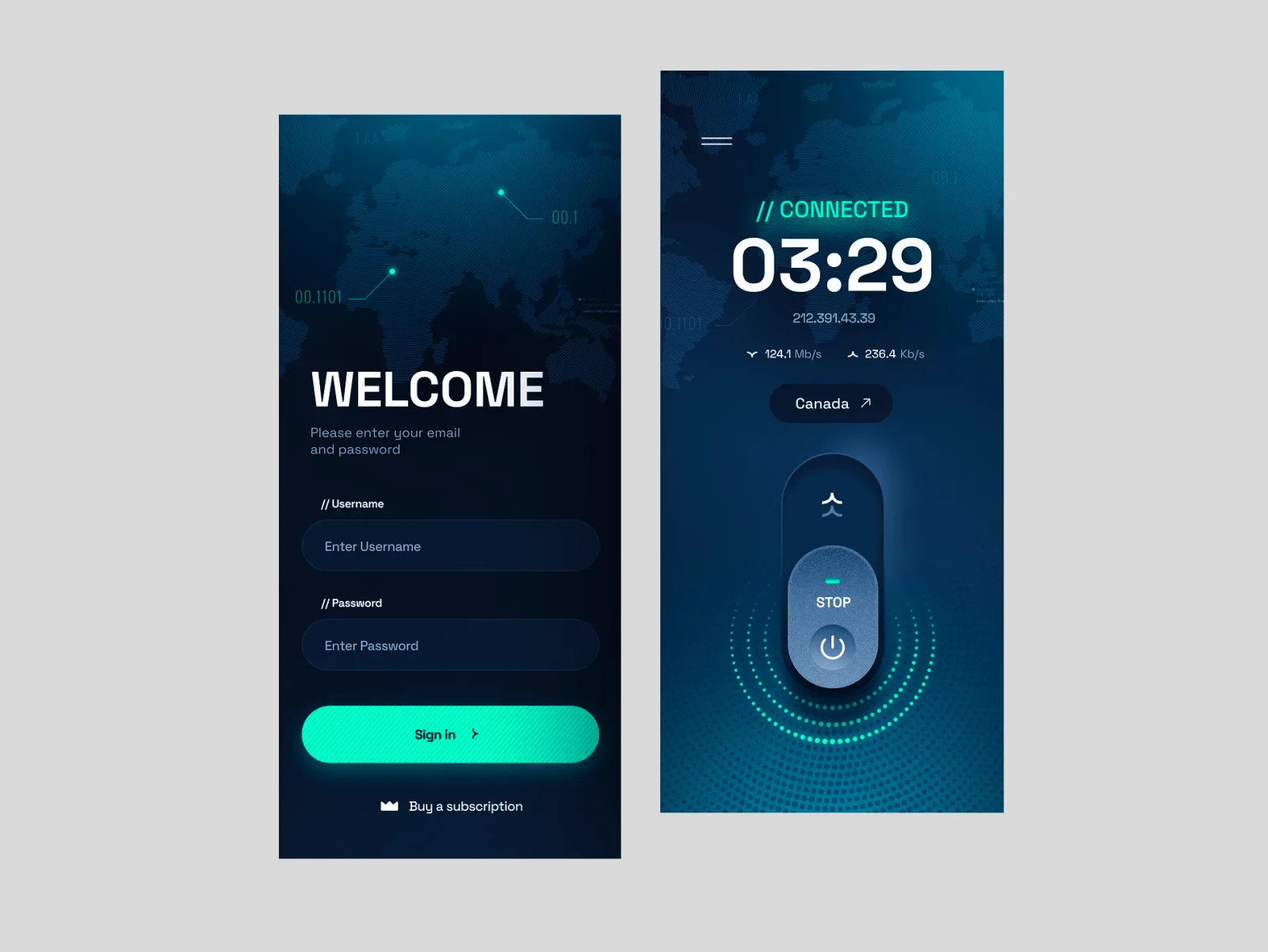
Sign in, connect, see your speed and location. Deep space blue, a cyan connect button and one action per screen.
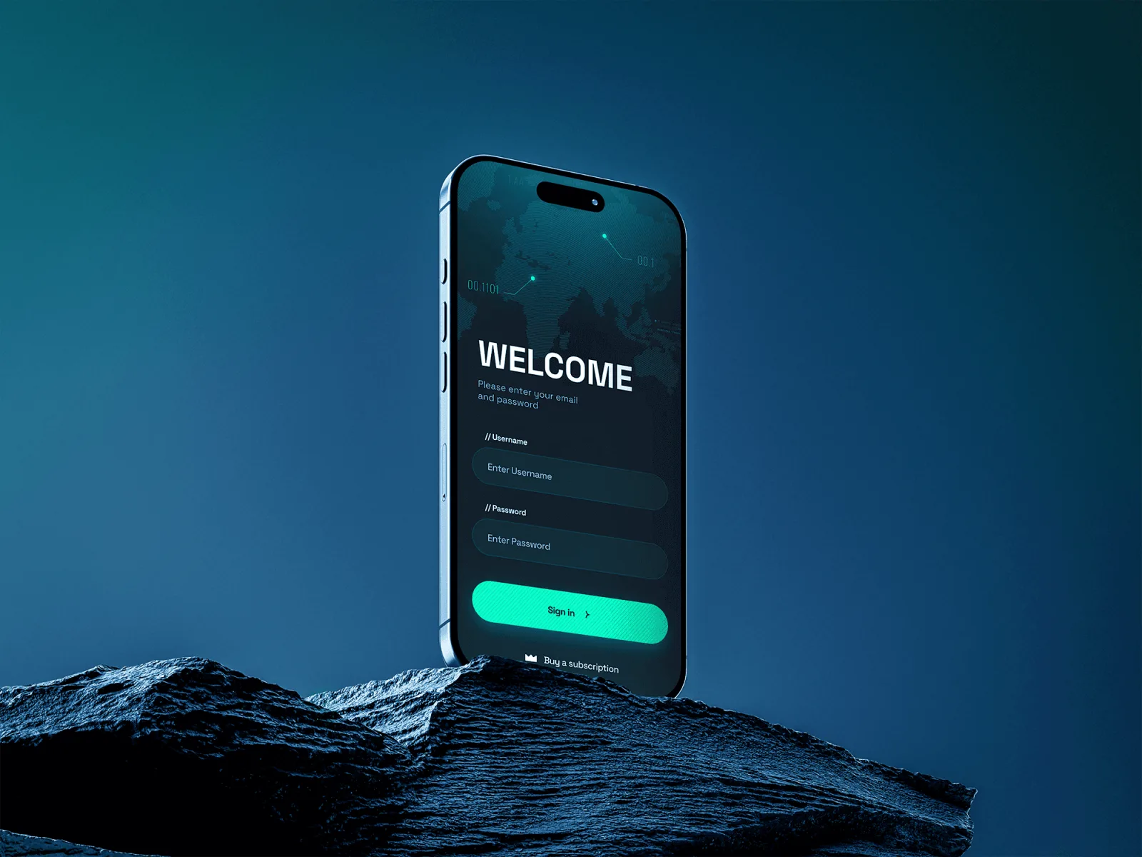
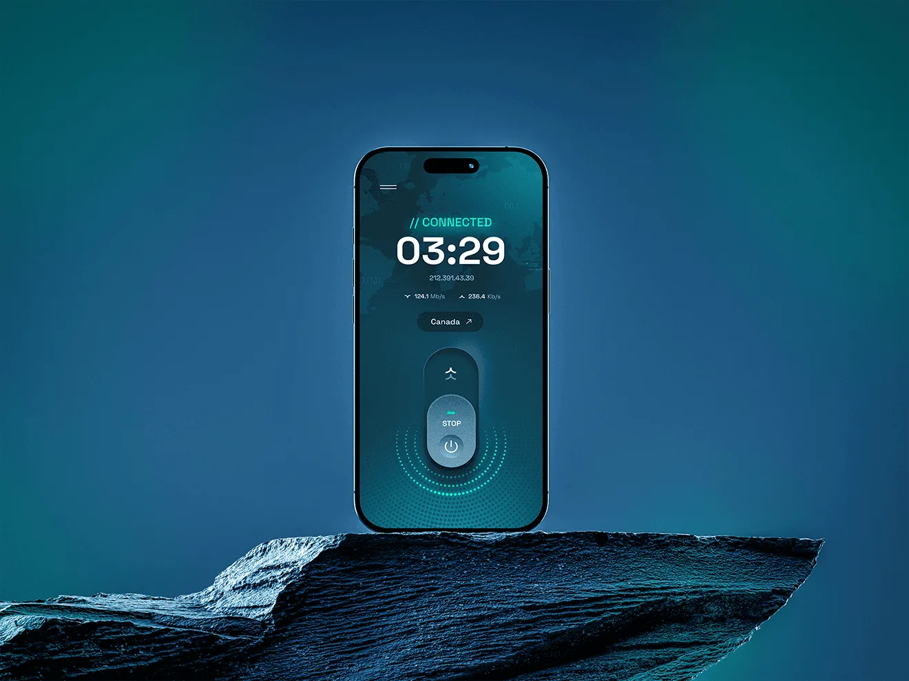
StratoSync keeps you connected and private, from orbit to your screen.
Data, satellite and user moving as one.
Encryption shown as calm, not fear.
Clean interfaces that feel instant.
One action per screen.
The Framer website
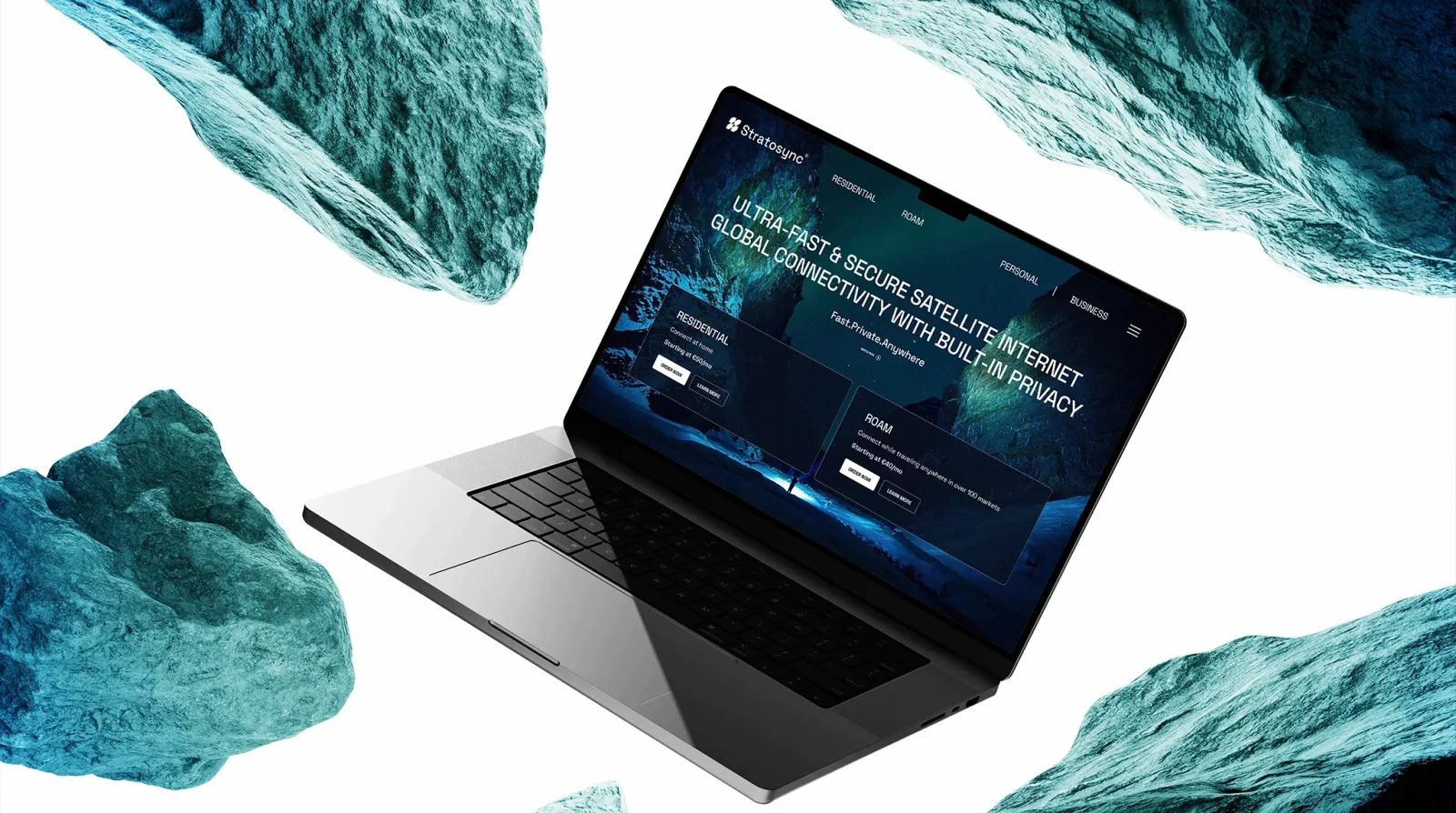
Satellite internet with built-in privacy, explained in short sections with one clear action each. Built in Framer.
Five decisions, and what I rejected.
- 01Synchronized connectivity as the idea
The symbol joins data flow, satellite paths and geometric precision into one compact mark that reads as a constant connection.
RejectedPadlocks, shields and globe meshes.
- 02Deep space blue with neon cyan
High contrast that reads technical and trustworthy inside a dark-mode product.
RejectedThe generic green-on-black hacker look.
- 03The identity carried into the VPN app
Interaction states, map graphics, type and the connect button use the same codes as the logo, so the product feels like the brand.
RejectedA separate, off-the-shelf app skin.
- 04A Framer website built to convert
Fast, focused pages with one clear action per section.
RejectedLong feature pages with competing calls to action.
- 05One mark that never changes shape
The same symbol works as the app icon, in the interface and on the website, from a favicon to a full screen.
RejectedA detailed emblem that only works large.
What was broken, and what I built to fix it.
Logo, app and website now read as one company.
StratoSync launched with one brand system across the logo, the VPN product and the website. The mark, the colours and the interface speak the same language, so the company looks as fast and as secure as the service it sells.
Mark, colour, type, graphics.
App screens in the brand system.
Conversion-focused build.
Want this for your brand? 3 quick taps, a fixed-price proposal in 2-8 hours.