 Hrvatski
Wide
Quote or news
Big headline on the left, logo in one corner, one photo or one colour block.
Make three sizes and you cover most company posts: a wide image, a square and a tall story.
Free: your brand in 3 real designs, in 48 hours.
Most company posts need three shapes: a wide image for link-style posts, a square for the feed, and a tall 9:16 image for stories and short video. Common starting sizes are 1200 x 627 wide, 1080 x 1080 square and 1080 x 1920 tall.
Platforms change their advice, so check each help page before you lock a template. The bigger job is keeping all three shapes on brand, which is easier with one design that fits every size.
 By Vedran Obradović · Updated 7 November 2026
These are common starting sizes, not rules from me. Platforms change them, so check each help page before you lock a template.
| Shape | Common size | Use it for | Template idea |
|---|---|---|---|
| Wide (1.91:1) | 1200 x 627 | LinkedIn image posts and link cards | News post, quote post |
| Square (1:1) | 1080 x 1080 | Feed posts on most networks | Stat post, testimonial |
| Portrait (4:5) | 1080 x 1350 | Feed posts and carousel slides | Carousel slide, how-to |
| Tall (9:16) | 1080 x 1920 | Stories, reels, short video | Event reminder, short clip |
| Wide (16:9) | 1920 x 1080 | Video and slides | Webinar title, talk clip |
| Banner (4:1) | 1584 x 396 | LinkedIn personal banner | One banner per person |
The banner size is the size LinkedIn asks for on a personal profile. Company page banners differ, see LinkedIn banner size for a company team. For link cards, share images are a different job, covered in the website pre-launch checklist.
The size is half of it. Apps cover parts of the picture.
Free tool
Answer a few short questions. You get your brand score and the top thing to fix. It is free and runs right here.
Do not try ten sizes. Build the three you use each week.
Wide
Big headline on the left, logo in one corner, one photo or one colour block.
Square
One big number or one short quote. Name and role under it.
Tall
Headline in the middle third, date and link near the bottom but above the app strip.
Need ideas for what to put in them? Read customer testimonial posts, webinar graphics and carousel slides.
Leave your email. I design them by hand and send them to you within 48 hours. It costs you nothing.
I write to you from [email protected]. If you do not see it, check spam.
Someone resizes a post by hand. The logo stretches. The text gets cut.
When a team shares one file, every size becomes a small design job. Each person fixes it a little differently. After a month, no two posts match.
The fix is one design that adapts to every size, and a rule: nobody resizes by hand. In a Brand OS Portal, you pick feed, square or story, and the layout adjusts. No stretching. No request to a designer.
Tick before you export. Your ticks stay on this device.
0 of 7 done
For the rules that sit behind your templates, see social media brand guidelines.
Try one Brand OS Portal tool
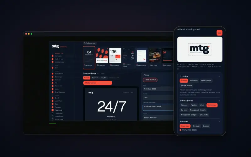
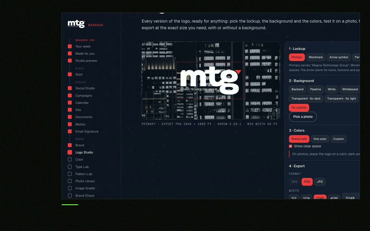
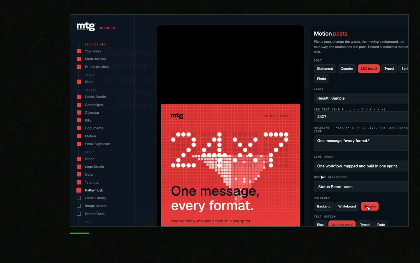
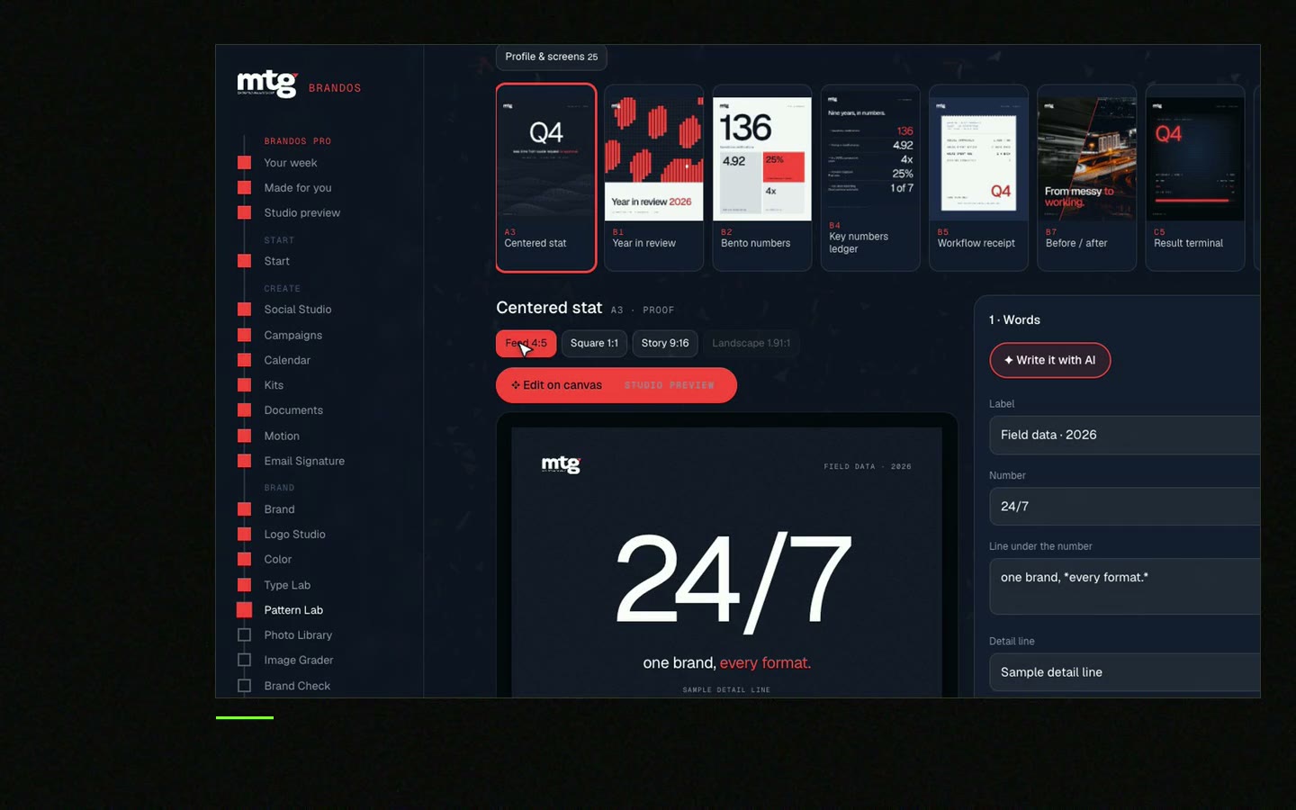
This is a real tool from a real Brand OS Portal, on the MTG brand. Make a post once. Switch between feed, square and story. The design still looks right.
Watch
I made short videos of the tools. Hear me explain them, then scroll through every one at work. Real tools, on a real brand.
Start with three: wide about 1200 x 627, square 1080 x 1080 and tall 1080 x 1920. Check each platform's help page, because sizes change.
Not for every network. Most use the same three shapes. Make one design that adapts to wide, square and tall.
A square or a 4:5 portrait is safe on most feeds. Keep important words in the middle.
Give them a design that already adapts to each size, so nobody stretches or crops by hand.
LinkedIn asks for 1584 x 396 on a personal profile. Keep the photo spot in mind when you place words.
Death List Five. Five headaches, one portal. Sound on.
See what ChatGPT says about your company, and how to fix it.
You hear from me within 2 to 8 hours.
May I use cookies for Google Analytics and Clarity to see which pages help? Privacy