 Hrvatski
Rule 1
Clear space
The empty space around the logo. Often set by the height of one letter of the logo.
Logo usage guidelines are a short set of rules that keep your logo looking right everywhere: clear space, smallest size, which colour on which background, and what never to do.
Read next: Brand book online: what to put on each page · How to share brand guidelines with agencies and freelancers
Most teams need one page, not ten. Below is what to put on it, a list of don'ts to copy, and a free tool that makes the clear space rule for you.
 By Vedran Obradović · Updated 4 November 2026
Rule 1
The empty space around the logo. Often set by the height of one letter of the logo.
Rule 2
Below this the logo is hard to read. Give it in pixels for screens and in millimetres for print.
Rule 3
Which version to use where: full logo, horizontal, symbol only.
Rule 4
Colour, white and black. Which one goes on which background.
Rule 5
Light, dark and photos. On photos, a calm area or a dark overlay.
Rule 6
Five to eight pictures of what never to do. People learn faster from these than from text.
Free tool
Add your logo, pick a rule and download the guide. Your file stays on your device.
Show each one as a small picture with a red cross. These cover most mistakes.
Fill in the brackets. Add one picture per rule.
[Brand] logo rules

1. Clear space: keep space equal to [the height of the letter X] on every side. Nothing goes inside it.
2. Smallest size: [80] px wide on screens, [20] mm wide in print. The symbol alone: [16] px.
3. Versions: full logo for [site, slides, documents]. Horizontal logo for [headers, email]. Symbol for [profile pictures, app icon, browser tab].
4. Colours: colour logo on [white and light grey]. White logo on [our dark colour and dark photos]. Black logo only for [one-colour print].
5. Photos: place the logo on a calm part of the photo, or add a dark layer at [40]%.
6. Never: stretch it, change its colours, add effects, rotate it, rebuild it, or use it below the smallest size.

Files: [one link to the latest logo files]
Questions: [name, email]
Leave your email. I design them by hand and send them to you within 48 hours. It costs you nothing.
I write to you from [email protected]. If you do not see it, check spam.
Rules in a PDF get read once. Rules next to the download button get read every time.
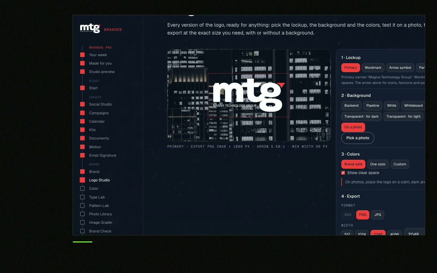
Put the rules where people get the logo: on your shared logo page, in your brand portal and in your brand guidelines.
Tick what yours already cover. Your ticks stay on this device.
0 of 8 done
Try one Brand OS Portal tool
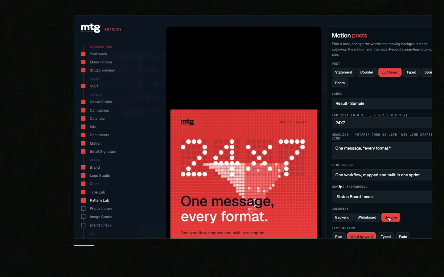
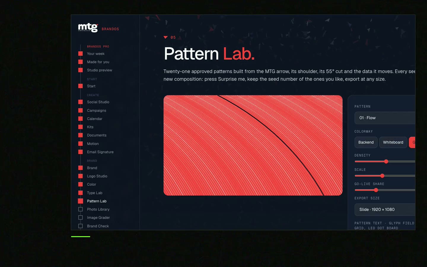
This is a real tool from a real Brand OS Portal, on the MTG brand. Try a logo on the wrong background. The portal shows you the right one.
A short set of rules for using a logo: clear space, smallest size, versions, colours, backgrounds and what never to do.
A common rule is the height of one letter of the logo, or about a quarter of the logo height. Make yours with the free clear space generator.
The size below which it is hard to read. Test it on a phone screen and on a business card, then write both numbers down.
No. One page with pictures beats ten pages of text. Big brands add more, but the six rules on this page come first.
Yes. Logo rules are part of every brand I design. See logo design.
See what ChatGPT says about your company, and how to fix it.
You hear from me within 2 to 8 hours.
May I use cookies for Google Analytics and Clarity to see which pages help? Privacy