 Hrvatski
Slide 1
Cover
A promise in under ten words. The reader should know what they get for swiping.
A good B2B carousel is a cover, one idea per slide and a clear last slide, all in your brand.
Free: your brand in 3 real designs, in 48 hours.
A B2B LinkedIn carousel is a set of slides people swipe through. A simple plan works: a cover slide with a promise, five to eight slides with one idea each, and a last slide that says what to do next.
Copy the slide text below and fill it in. Then lock the design, so anyone on your team can change the words and the carousel still looks like your company.
 By Vedran Obradović · Updated 7 November 2026
Most weak carousels fail because the plan is missing, not because the design is weak.
Slide 1
A promise in under ten words. The reader should know what they get for swiping.
Slide 2
One sentence the reader nods at. Use their words, not yours.
Slides 3-6
A short headline, one line of support, maybe a number. Never two ideas on one slide.
Slide 7
Pull the ideas into one takeaway the reader can screenshot.
Slide 8
One action: reply, read the guide, or book a 15-minute call.
Always
Logo in the same corner, same fonts, same colours, a small page counter.
More post ideas for the cover line are in LinkedIn post templates for B2B.
Replace every part in brackets. Delete any line you cannot prove.
SLIDE 1 (cover)
[Promise: "How we cut onboarding from 3 weeks to 5 days"]
[Small line: "A 7-slide guide for [role]"]

SLIDE 2 (the problem)
[One sentence the reader says out loud: "New customers wait weeks before they see value."]

SLIDE 3
[Headline: "Step 1: [short action]"]
[Support: one line, max 15 words]

SLIDE 4
[Headline: "Step 2: [short action]"]
[Support: one line]

SLIDE 5
[Headline: "Step 3: [short action]"]
[Support: one line]

SLIDE 6 (proof)
[One real number with its source: "Median onboarding: 5 days (Q3 data)"]

SLIDE 7 (the answer)
[Takeaway in one sentence]

SLIDE 8 (next step)
[One action: "Want the checklist? Comment CHECK or visit [short link]"]
[Name, role, logo]
The numbers in brackets are made-up examples. Use your own approved facts. This is the short 8-slide version, add more idea slides if you need them.
Free tool
Answer a few short questions. You get your brand score and the top thing to fix. It is free and runs right here.
Keep them boring on purpose. Boring slides get read.
| Rule | Do | Do not |
|---|---|---|
| Words per slide | One headline and one short line | A paragraph in tiny type |
| Type size | Big enough to read on a phone without zoom | Small text that looks fine on a laptop |
| Colour | Two brand colours plus text colour | A new colour for every slide |
| Logo | Same corner, same size, on every slide | Logo missing after the cover |
| Photos | One approved photo if it helps the idea | Stock handshakes |
| Size | One size for all slides in the file | Mixed sizes in one carousel |
Check sizes on LinkedIn's help page before you lock the template, because platforms change them. My size cheat sheet lists common starting sizes.
Leave your email. I design them by hand and send them to you within 48 hours. It costs you nothing.
I write to you from [email protected]. If you do not see it, check spam.
Non-designers go off brand even with templates. Usually the template lets them.
Locked and open parts are the idea behind editing brand templates without breaking the brand and the brand templates for teams guide.
Tick before each carousel. Your ticks stay on this device.
0 of 8 done
A designer is the right person for your brand strategy and a new identity. The daily posts are different work.
The question I see most from founders is: how are you handling design when you don't have a designer yet? The honest answer is a locked template and a short rule list, so the team can make the post the same day.
That is what a Brand OS Portal is for. I set it up once for your brand. Then your team makes posts, banners, signatures and decks in your brand without sending a request. Read what a Brand OS is, or see how employee posts on LinkedIn stay consistent.
Try one Brand OS Portal tool
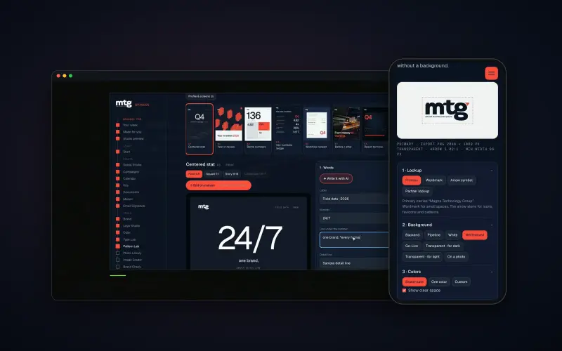
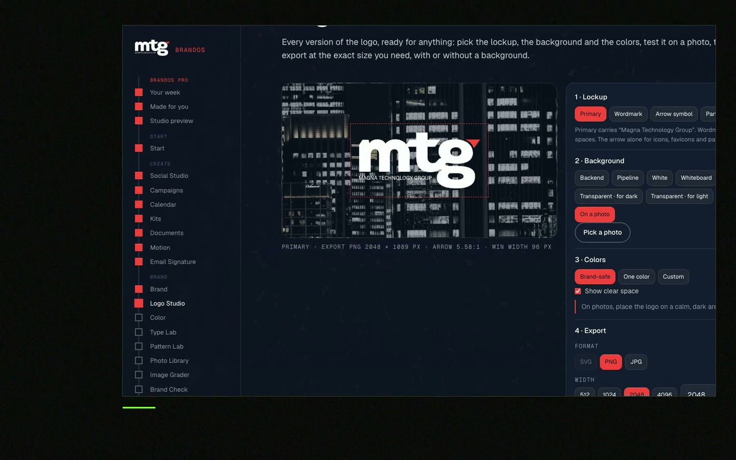
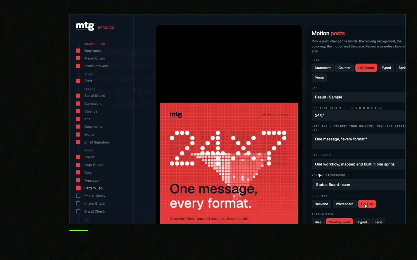
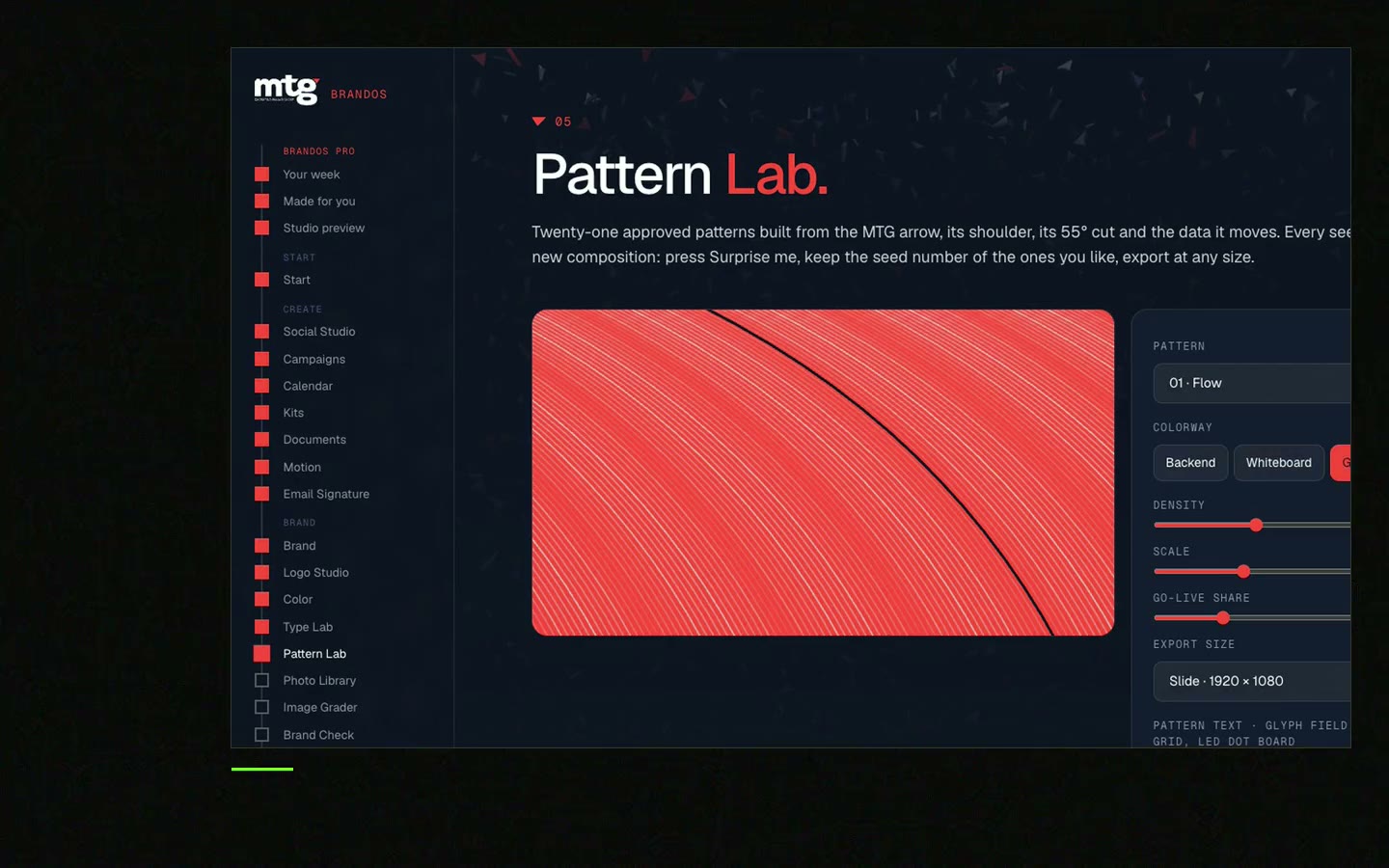
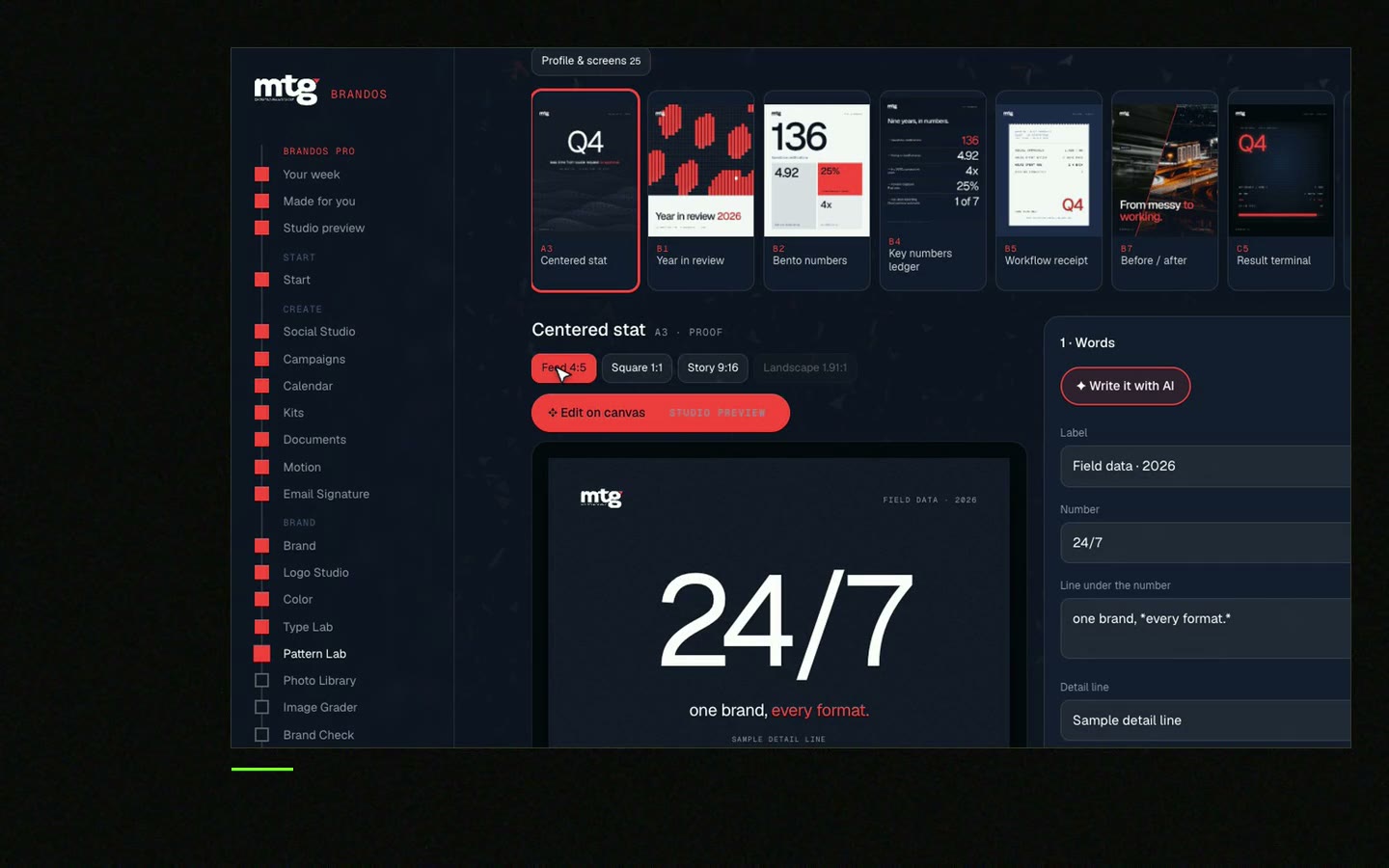
This is a real tool from a real Brand OS Portal, on the MTG brand. Pick a design, change the words, download the picture. Your slides can work the same way.
Watch
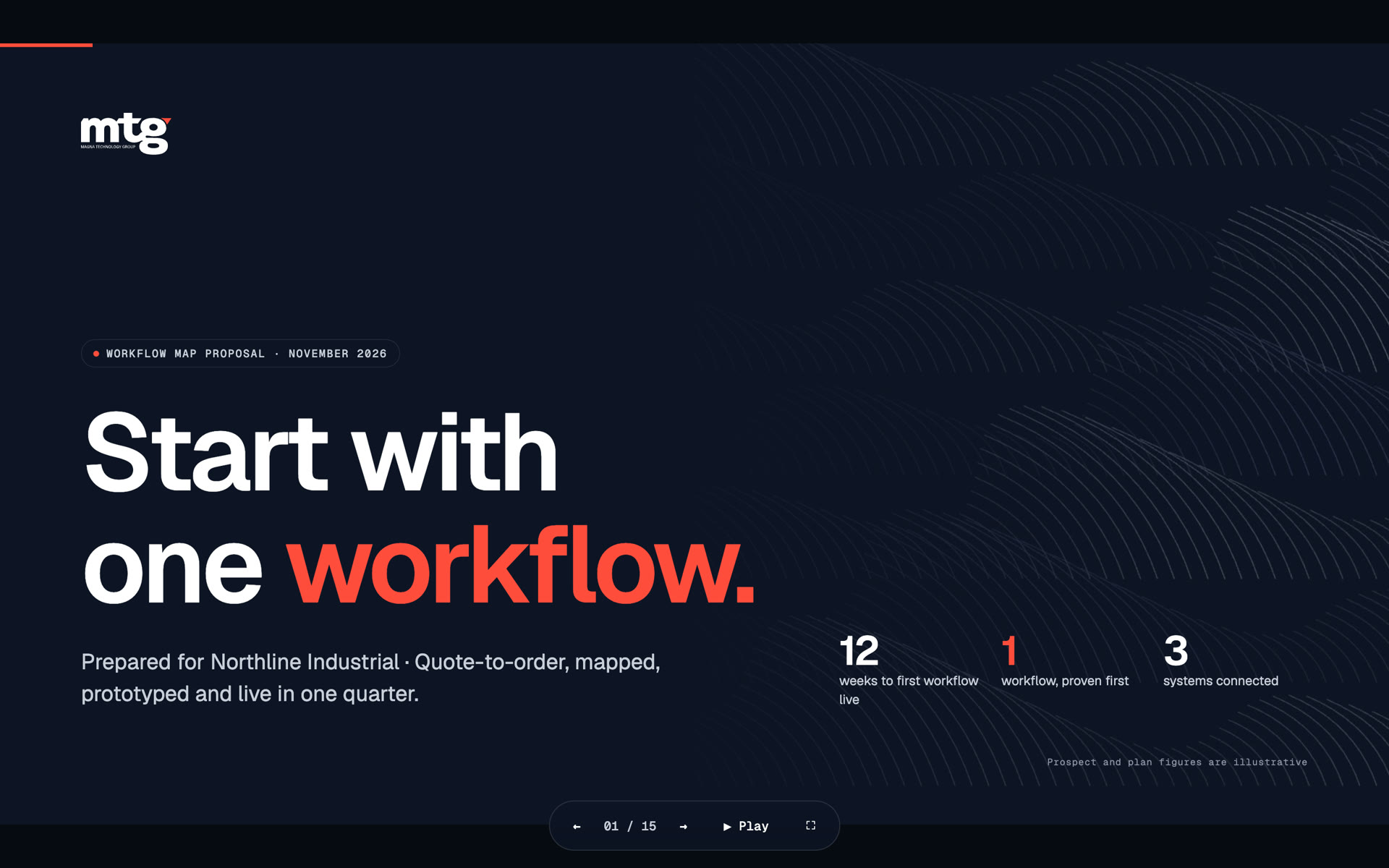
I made short videos of the tools. Hear me explain them, then scroll through every one at work. Real tools, on a real brand.
Most B2B carousels work with a cover, five to eight idea slides and a last slide. Shorter is easier to finish. Keep one idea per slide.
A clear promise in under ten words, such as what the reader will know after swiping. Skip slogans.
Yes, if the design is locked and just the words and photo are open. Then the carousel keeps the brand even when a non-designer makes it.
LinkedIn carousels are posted as a document, usually a PDF with one slide per page. Check LinkedIn's help page for the current file rules.
Lock the logo, fonts and colours in a template, open just the words, and give the team one link to the latest version.
Death List Five. Five headaches, one portal. Sound on.
See what ChatGPT says about your company, and how to fix it.
You hear from me within 2 to 8 hours.
May I use cookies for Google Analytics and Clarity to see which pages help? Privacy