 Hrvatski
Shape
Stretching
Pulled wider or taller. Fix: scale from a corner, keep the shape.
Most logo mistakes are small and common. Learn the 12, put them in your guidelines, and your brand stops drifting.
Free: your brand in 3 real designs, in 48 hours.
Logo misuse is any change that breaks the approved logo. The most common ones are stretching, squashing, recolouring, tilting, adding a shadow, putting the logo on a busy photo, and crowding it with other things.
The fix is the same each time: use the approved file as it is, leave clear space around it, and show right and wrong examples in your guidelines so people can see the difference.
 By Vedran Obradović · Updated 7 November 2026
Show these as pictures in your guidelines. Words alone are easy to skip.
Shape
Pulled wider or taller. Fix: scale from a corner, keep the shape.
Shape
Pushed flat to fit a box. Fix: pick a stacked or square version.
Shape
Turned at an angle to look lively. Fix: keep it level.
Colour
New colours chosen to match a slide. Fix: use the approved colour, white or dark.
Colour
Grey logo on a grey photo. Fix: pick the version made for that background.
Colour
Added to look modern. Fix: leave the logo flat, as designed.
Effects
Added for pop. Fix: remove them. Change the background if it hides the logo.
Effects
Faded to a ghost. Fix: use a watermark version if you need one.
Effects
Logo sits on faces or detail. Fix: use a calm spot or a solid panel.
Layout
Text or edges touch the logo. Fix: keep the clear space.
Layout
Mark and name moved to far corners. Fix: use the lockup as one piece.
Layout
Letters turn to mush. Fix: use the small version. See minimum size.
It is rarely carelessness. It is usually one of three things.
All three are fixed upstream. Give people the right file, show right and wrong, and make the right way the fast way. See logo usage guidelines and brand compliance.
Free tool
Crowding is the most common misuse in real life. Upload your logo and see how much space it needs. It is free and runs right here.
One row for each rule. Same layout every time.
| Rule | Show wrong | Show right | One line of words |
|---|---|---|---|
| Proportions | Stretched logo | Original logo | Never change the shape. |
| Colour | Pink logo on slide | Approved colour | Use approved colours, no others. |
| Background | Logo on busy photo | Logo on a calm area or solid panel | Pick a background that lets it breathe. |
| Space | Text touching the logo | Clear space kept | Leave room on every side. |
| Effects | Shadow and glow | Flat logo | No effects. |
More on what else belongs in the document: brand guidelines, what to include. Real examples from a real brand are in the Talentix guidelines.
Leave your email. I design them by hand and send them to you within 48 hours. It costs you nothing.
I write to you from [email protected]. If you do not see it, check spam.
Say it kindly, attach the right file, make it easy. People fix it in minutes when it is easy.
Hi [name],

Thank you for including [company] in [post / page / deck]. It looks great.

One small thing: the logo [is stretched / has a different colour / sits on a busy photo]. Here is the correct file: [link]. It also has clear spaces and a short guide.

Could you swap it when you have a minute? If you tell me where it appears, I can check it too.

Thank you,
[your name]
Partners will keep asking, so send them one pack, not many emails. See how to share logo files and co-branding guidelines.
Rules do not fix a tired person at 5 pm.
A page full of dos and donts helps. A tool that does the right thing for you helps more.
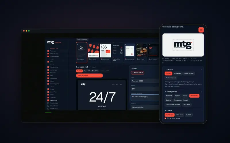
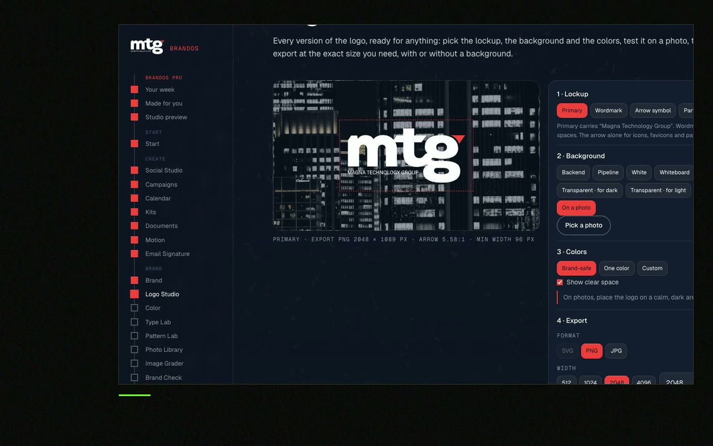
In a Brand OS Portal, Logo Studio lets the team pick a background and a size, and the logo that fits comes out. A logo that breaks a rule fixes itself. Colour, light, dark, white and black are all there. Nobody has to remember the twelve things above.
A designer is still the right person for the logo and the rules. The portal makes sure the team follows them. See Brand OS Portal or read about brand compliance.
Look at your last five posts, decks and web pages. Tick what is true.
0 of 8 done
A good audit needs a good checklist. See the brand audit checklist.
Try one Brand OS Portal tool
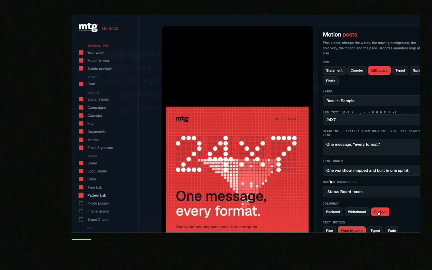
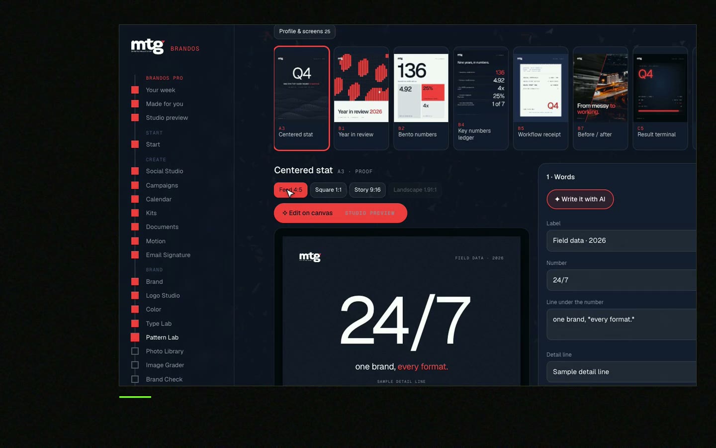
This is a real tool from a real Brand OS Portal, on the MTG brand. Pick a background and a size. The portal gives you the right logo, and a logo that breaks a rule fixes itself.
Watch
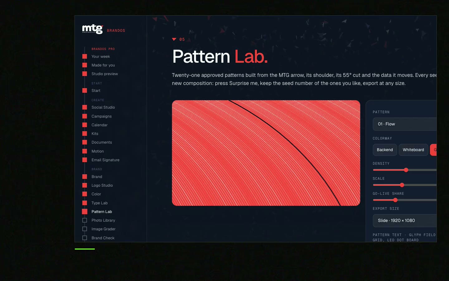
I made short videos of the tools. Hear me explain them, then scroll through every one at work. Real tools, on a real brand.
Logo misuse is any change to the approved logo, like stretching it, changing its colour, adding a shadow or placing it on a background where it is hard to read.
Stretching, recolouring, low contrast, shadows, busy backgrounds and no clear space are the ones I see most.
Give them the right files in one place, show right and wrong examples, and use templates that lock the logo in place.
No. Use an approved colour version, white or dark. If none works, ask for a new approved version.
Send them the correct file with a kind note. Most fix it quickly when you make it easy.
Death List Five. Five headaches, one portal. Sound on.
See what ChatGPT says about your company, and how to fix it.
You hear from me within 2 to 8 hours.
May I use cookies for Google Analytics and Clarity to see which pages help? Privacy