 Hrvatski
Step 1
Open the logo on screen
Use the real SVG, at 100 percent.
Every logo has a size where it stops being readable. Find it in two minutes and write it down.
Free: your brand in 3 real designs, in 48 hours.
A logo's minimum size is the smallest it can be and still be clear. There is no one number for every logo. It depends on the thin lines and the small letters in yours.
To find it, shrink the logo until the smallest detail blurs, then go a bit bigger. Write that size down for screens in pixels and for print in millimetres. Below it, switch to a simpler small version.
 By Vedran Obradović · Updated 7 November 2026
Small is where logos break.
A logo that looks great on a slide can turn to mush in a mobile header, an invoice or a pen. Thin lines fill in. Small words blur. Gaps close.
A minimum size rule stops that. It also tells the team when to use the small version instead. Read the rest of the logo rules in logo usage guidelines.
You do not need a tool for this. You need your eyes.
Step 1
Use the real SVG, at 100 percent.
Step 2
Look at the smallest letters and the thinnest line.
Step 3
The size before that is your limit. Add a little room for safety.
Step 4
Print it. Look at it at arm's length. Is the name readable?
Step 5
Screen in pixels (width). Print in millimetres (width).
Step 6
A simpler logo for tab icons, avatars and pens. See favicon from logo.
Test on a real phone as well. What looks fine on a laptop can look rough on a small screen.
Free tool
Small logos also need room. Upload yours and see the clear space it needs. It is free and runs right here.
These are places to check, not rules. Your logo sets its own numbers.
| Place | What goes wrong | What to do |
|---|---|---|
| Website header on a phone | Tagline and small letters vanish | Use the logo without the tagline. |
| Email signature | Logo shrinks with the screen | Set a fixed width and use PNG. See company email signature. |
| Tab icon | Full logo is unreadable | Use the mark alone, simplified. |
| Profile picture | Wordmark squeezed into a circle | Use the square version. See logo for social profile pictures. |
| Invoice or letter | Fine print and thin lines fill in | Use the one-colour version. |
| Pen, bag, merch | Detail disappears | Use the simple version, one colour, bigger than you expect. |
The right file helps too. A blurry PNG has no real minimum. See SVG vs PNG for logos.
Leave your email. I design them by hand and send them to you within 48 hours. It costs you nothing.
I write to you from [email protected]. If you do not see it, check spam.
Fill in the numbers you found in the test. Keep it to five lines.
LOGO MINIMUM SIZE
- Screen: never below [__] px wide (full logo).
- Print: never below [__] mm wide (full logo).
- Below that, use the small version: [file name, link].
- Below [__] px or [__] mm, use the mark alone: [file name, link].
- Always keep the clear space around the logo. See [link].
Example, right: [image]   Example, wrong: [image]
The picture matters more than the number. Show a right and a wrong example. More in brand guidelines, what to include and logo misuse examples.
A rule on page 14 helps nobody at 5 pm.
People do not remember pixel limits. They grab a logo and drag it. If the file is too small, it looks bad, and no one knows why.
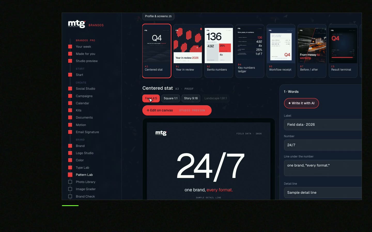
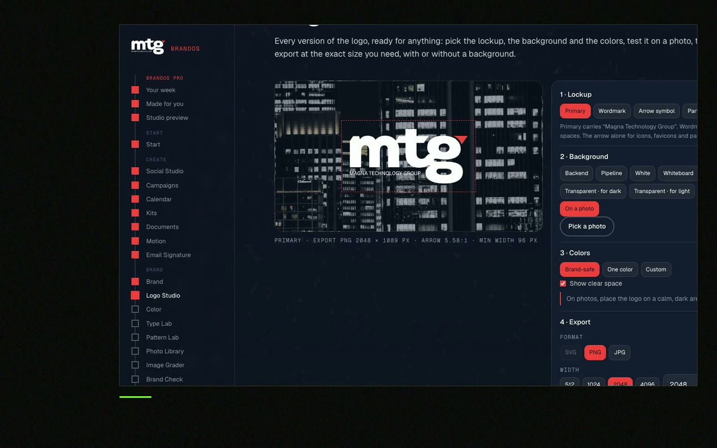
In a Brand OS Portal, Logo Studio holds the sizes for tab icon, profile, slide and big sign. The team picks the use and the logo that fits comes out. If a choice would break a rule, the logo fixes itself.
A designer is still the right person to draw the logo and its small version. The portal is for the work after that. See Brand OS Portal.
Tick what is true today. Your ticks stay on this device.
0 of 7 done
See the whole picture in your visual identity system.
Try one Brand OS Portal tool
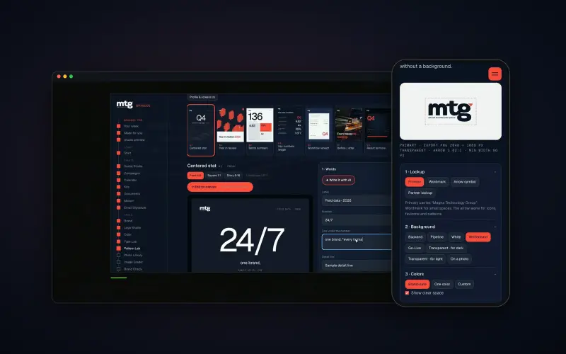
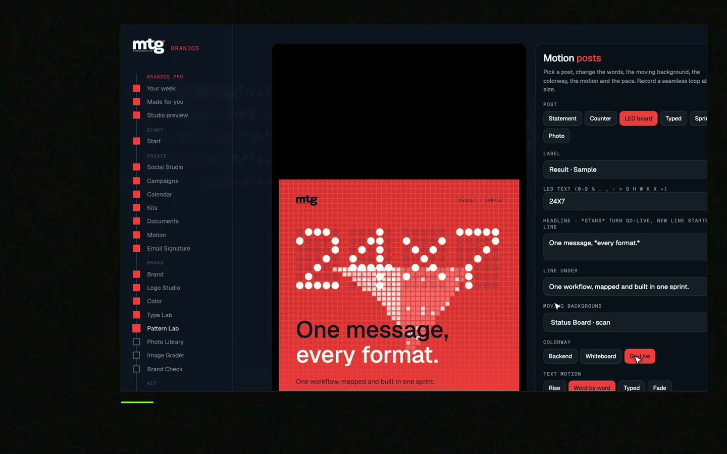
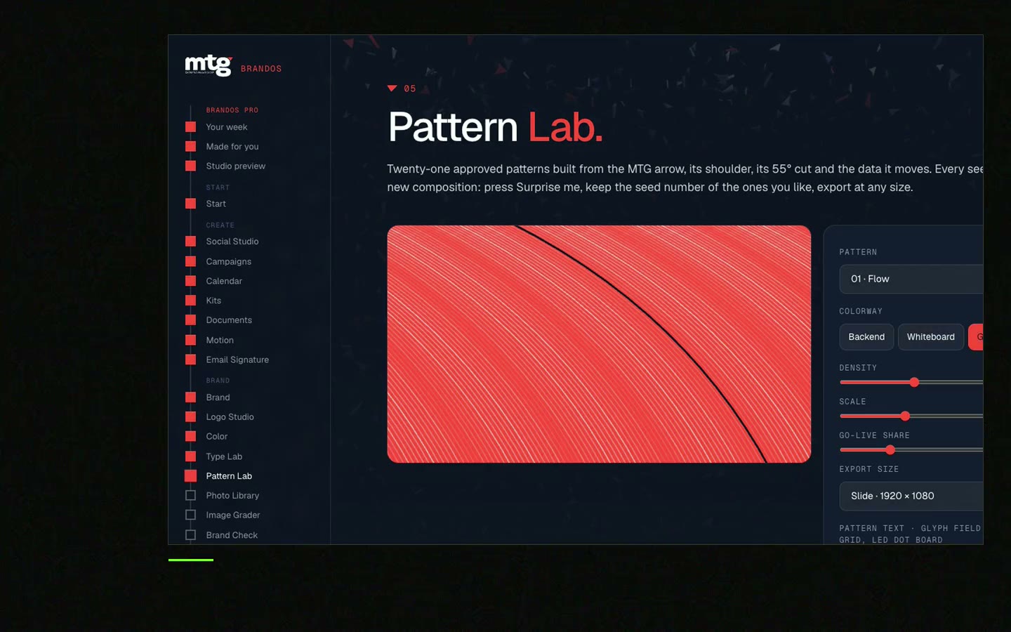
This is a real tool from a real Brand OS Portal, on the MTG brand. Pick a background and a size. The portal gives you the right logo, and a logo that breaks a rule fixes itself.
Watch
I made short videos of the tools. Hear me explain them, then scroll through every one at work. Real tools, on a real brand.
There is no one size for all logos. It depends on the thin lines and small letters in yours. Test it and write down a size in pixels for screens and in millimetres for print.
As small as it stays readable on a real phone. If the tagline or small words blur, use a version without them.
Print it and look at arm's length. If the name is still clear, it works. Write that width in millimetres into your rule.
Switch to a simpler small version, such as the mark alone, instead of shrinking the full logo.
Often yes. A small version drops the tagline and thin details so it stays clear on tab icons, avatars and pens.
Death List Five. Five headaches, one portal. Sound on.
See what ChatGPT says about your company, and how to fix it.
You hear from me within 2 to 8 hours.
May I use cookies for Google Analytics and Clarity to see which pages help? Privacy