 Hrvatski
Problem 1
Wide logo, tiny box
A long wordmark gets squeezed. The letters shrink until nobody can read them.
Social sites show your logo tiny and in a circle. Make a square avatar version once, and use it everywhere.
Free: your brand in 3 real designs, in 48 hours.
A profile picture is small and often cut into a circle. A wide logo with a long name becomes unreadable. So make a special avatar version: a square file with the logo mark or short wordmark in the middle and room on every side.
Export it as a square PNG, about 1000 px each side, with a solid background. Then use the same file on LinkedIn, X, Instagram and Facebook. Check each site's help page for its current size.
 By Vedran Obradović · Updated 7 November 2026
Three things go wrong again and again.
Problem 1
A long wordmark gets squeezed. The letters shrink until nobody can read them.
Problem 2
Sites crop to a circle. Anything near the edge disappears.
Problem 3
A see-through PNG turns black or white on some screens. The logo vanishes.
The fix is not a better crop each time. The fix is one prepared file. See what a full pack holds in which logo files you need.
Pick from this ladder, from the top.
| If your logo is... | Use as avatar | Tip |
|---|---|---|
| A mark plus a name | The mark alone | Put the full logo in the banner, not the avatar. |
| A wordmark with a short name | The wordmark, centred | Keep letters big. Two or three lines at most. |
| A wordmark with a long name | The initials or a short form | Ask your designer for an approved short form. Do not invent one. |
| A thin or light logo | A bold version on a solid colour | Thin lines vanish at small sizes. |
No mark? Then your avatar shape is a rule for your identity, not a patch. A wordmark logo often needs a stacked version for this.
Free tool
A round crop cuts the corners. Upload your logo and check the space around it. It is free and runs right here.
Do this once. Then everyone on the team uses the same file.
Step 1
Open the SVG. Do not start from a screenshot.
Step 2
Use 1000 x 1000 px. Big enough for every site.
Step 3
Leave about a fifth of the space empty on every side. The circle will not cut it.
Step 4
A brand colour or white. No see-through, no photo.
Step 5
Shrink it to the size of a thumb. Can you read it? If not, simplify.
Step 6
One for light screens, one for dark screens, if the logo needs it.
Not sure about the room around the logo? Read logo usage guidelines for the clear space rule.
Leave your email. I design them by hand and send them to you within 48 hours. It costs you nothing.
I write to you from [email protected]. If you do not see it, check spam.
Post it where people join: onboarding, Slack, the shared folder.
Company profile pictures
- Company pages (LinkedIn, X, Instagram, Facebook): use [file name, link]. It is a square, 1000 x 1000 px.
- Do not crop it yourself, do not add a filter, do not add text.
- Your own profile photo: a clear photo of your face. Not the logo.
- Banner: use the template at [link]. See the LinkedIn size in [link].
- Something wrong with the file? Tell [name]. Do not fix it yourself.
Banners have their own size. See LinkedIn banner size for company and team and the LinkedIn company page branding kit.
Avatars are a small job that eats time.
A new hire joins. A new page opens. A partner wants a badge. Each time someone asks for a version, and a designer opens a file.
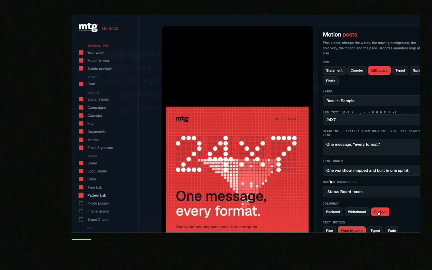
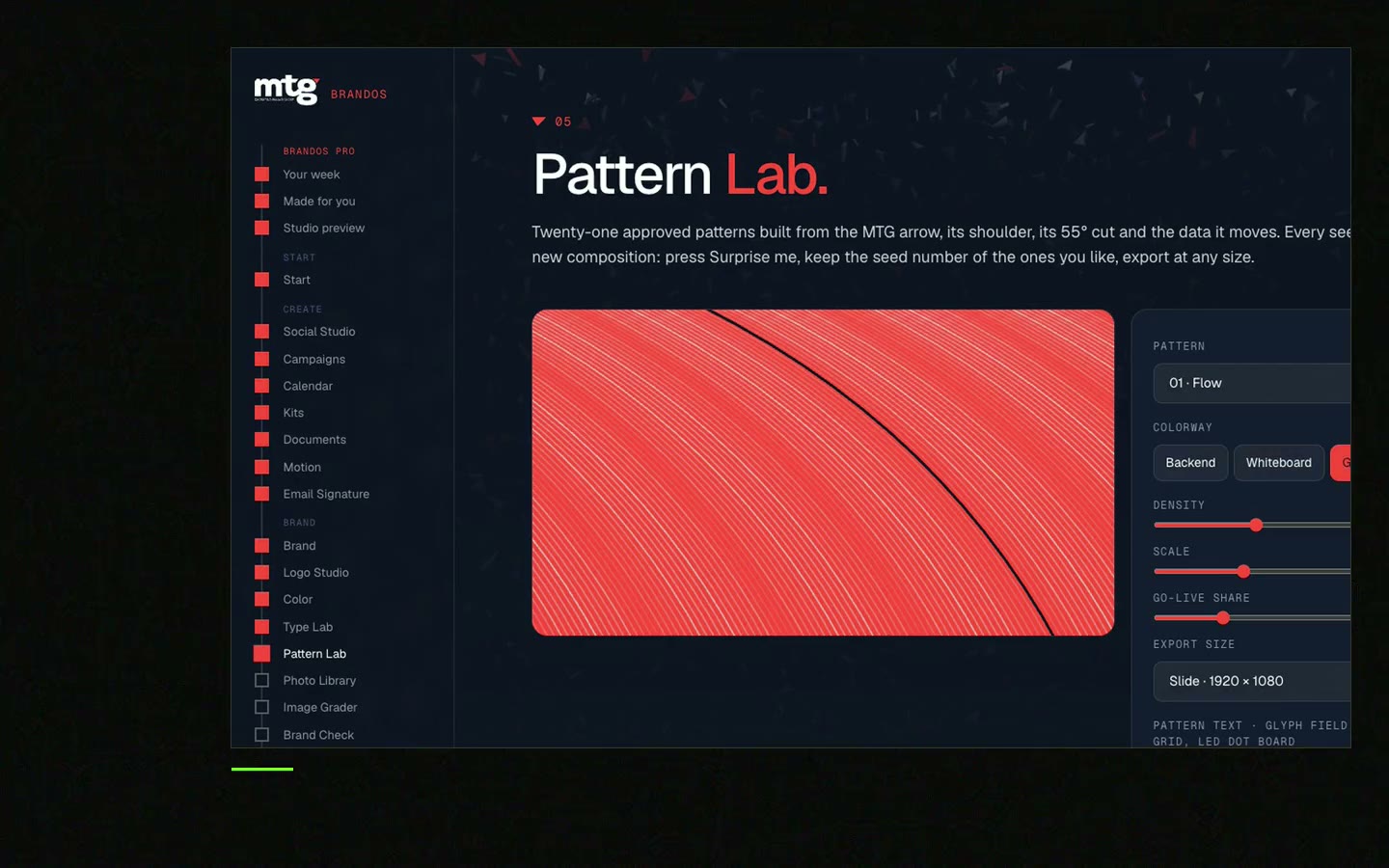
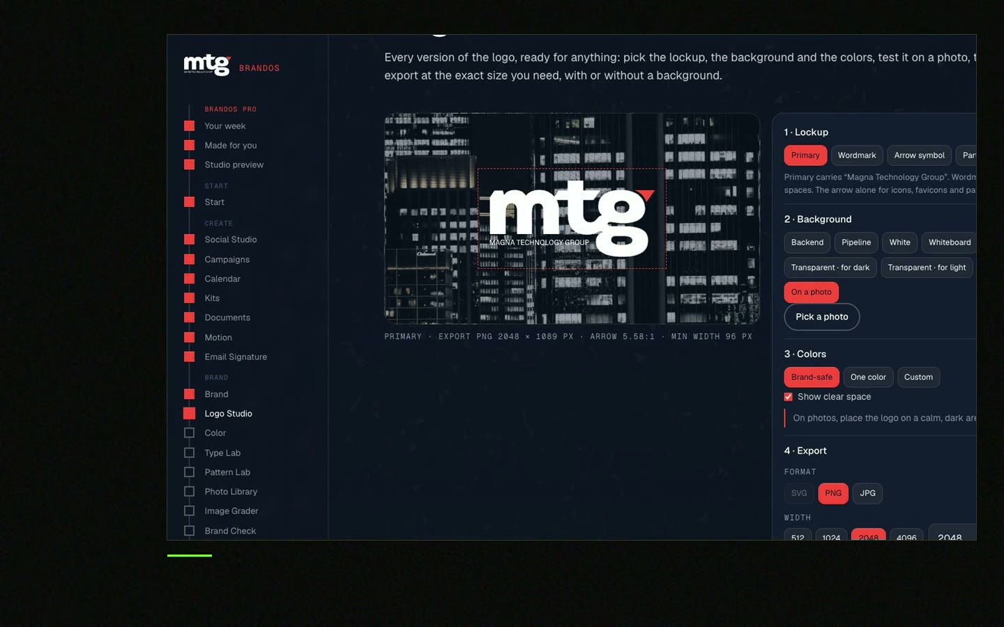
In a Brand OS Portal, Logo Studio holds the sizes: tab icon, profile, slide and big sign. The team picks a size and a background and gets the right logo. If a logo would break a rule, it fixes itself. And LinkedIn Banners makes a banner at the size LinkedIn asks for, for every person.
A designer is still right for the logo itself. The portal is for the work after that. Read what Brand OS Portal does.
Tick what is true today. Your ticks stay on this device.
0 of 8 done
Then see how the pieces fit in your social media brand guidelines.
Try one Brand OS Portal tool
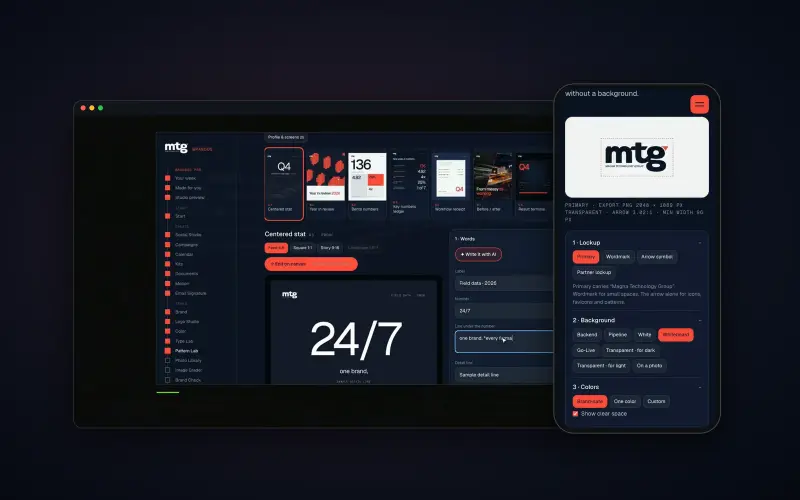
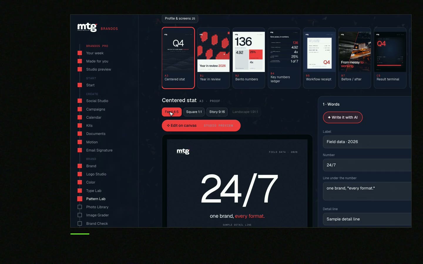
This is a real tool from a real Brand OS Portal, on the MTG brand. Pick a background and a size. The portal gives you the right logo, and a logo that breaks a rule fixes itself.
Watch
I made short videos of the tools. Hear me explain them, then scroll through every one at work. Real tools, on a real brand.
Make a square file about 1000 x 1000 px and upload it everywhere. Sites shrink it themselves. Check each site's help page for its current minimum.
Yes, if it still reads at thumbnail size. If your logo is long, use the mark or a short approved form.
Most sites crop profile pictures to a circle. Keep the logo in the middle and leave about a fifth of empty space on every side.
No. Use a solid colour. A see-through file can turn black or white on some screens and the logo can disappear.
No. People trust a face. Use the logo for the company page and a good photo for each person.
Death List Five. Five headaches, one portal. Sound on.
See what ChatGPT says about your company, and how to fix it.
You hear from me within 2 to 8 hours.
May I use cookies for Google Analytics and Clarity to see which pages help? Privacy