 Hrvatski
Step 1
Colour
Hold the photo next to your brand colours. Look for one clear match, not five colours fighting.
Pick stock photos with a simple filter: colour, light, people, message. Then keep every photo in one approved set.
Free: your brand in 3 real designs, in 48 hours.
To choose stock photos that match your brand, write down your colours, mood and the kind of people you serve. Then filter every photo by colour, light, real-looking people and message fit.
Save the winners in one approved set. Next time, pick from that set, not from a new search. That is how a site stops looking like five companies.
 By Vedran Obradović · Updated 7 November 2026
Stock sites show thousands of photos. Most of them are made to fit every brand, so they fit none.
Founders told me the same thing in forums: "we have no designer yet, so we grab a photo and move on". That works for one post. After 20 posts the feed has 20 moods.
The cure is not a better search. It is a filter you apply every time, and one folder of approved photos.
Run every candidate through these five steps. It takes under a minute per photo.
Step 1
Hold the photo next to your brand colours. Look for one clear match, not five colours fighting.
Step 2
Soft or hard? Warm or cool? Pick one light and stay with it across the set.
Step 3
Skip the stiff handshake. Choose people who look like your buyers doing real work.
Step 4
Does it say what the headline says? If you must explain the photo, skip it.
Step 5
Is there quiet space for a headline? Can it crop to square, tall and wide?
Write the result into your rules. Here is how to write brand photography guidelines and a brand photo checklist for websites.
Free tool
You cannot match photos to a brand that is vague. Answer a few short questions and get your brand score and the next thing to fix. It is free.
If you see one of these, keep scrolling.
Leave your email. I design them by hand and send them to you within 48 hours. It costs you nothing.
I write to you from [email protected]. If you do not see it, check spam.
Search with plain words that match your brand, not with the word "business".
1. [your product type] + at work + natural light
2. [your customer job title] + real office + candid
3. close up hands + [your tool or device] + soft light
4. [your industry] + abstract + [your main brand colour]
5. team + meeting + no posed + wide shot
6. [your city or region] + skyline OR street + morning

Save the 5 closest matches from each search into one folder.
Name the folder: Approved photos - [month year].
Tip: add the colour name of your brand to a search. Many stock sites let you filter by colour too. Tune the words with your brand voice. For where photos end up, see on-brand photos for LinkedIn and brand templates for teams.
All three can work. The rule is the same: one look.
| Stock | Your own | AI image | |
|---|---|---|---|
| Real to your company | Low | High | Low, can look fake |
| Speed | Fast | Slow, needs a shoot | Fast |
| Seen elsewhere | Often | Never | Sometimes similar to others |
| Needs a brand check | Yes | Yes | Yes, read the AI image fit check |
Use your own photos for people and product. Use stock for backgrounds and mood. That mix keeps trust and saves budget for the shoot you really need.
A filter in your head is not enough. Put it where people work.
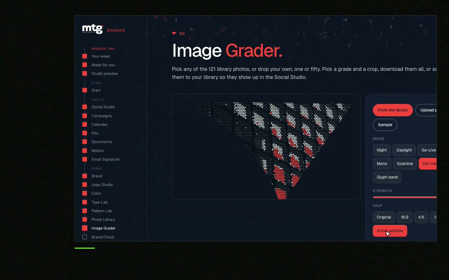
In a Brand OS Portal, the Image Grader grades a photo against your brand rules, and Social Studio places it into a ready design. So the CEO, the marketer and the sales lead all pick photos the same way. No waiting for a designer to say yes or no.
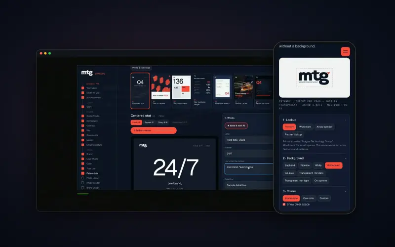
Brand OS Pro Portal. The team makes its own posts. No waiting.
Brand OS Core Portal. The CEO writes and designs an on-brand LinkedIn post in about 3 minutes.
A designer is still the right person for a photo shoot, art direction and a new identity. The portal covers the daily work after. More in what is a Brand OS.
Try one Brand OS Portal tool
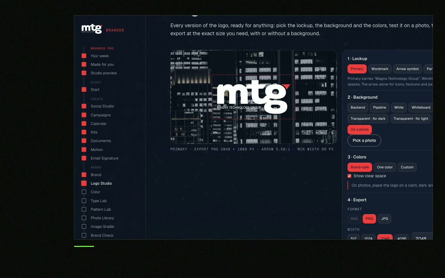
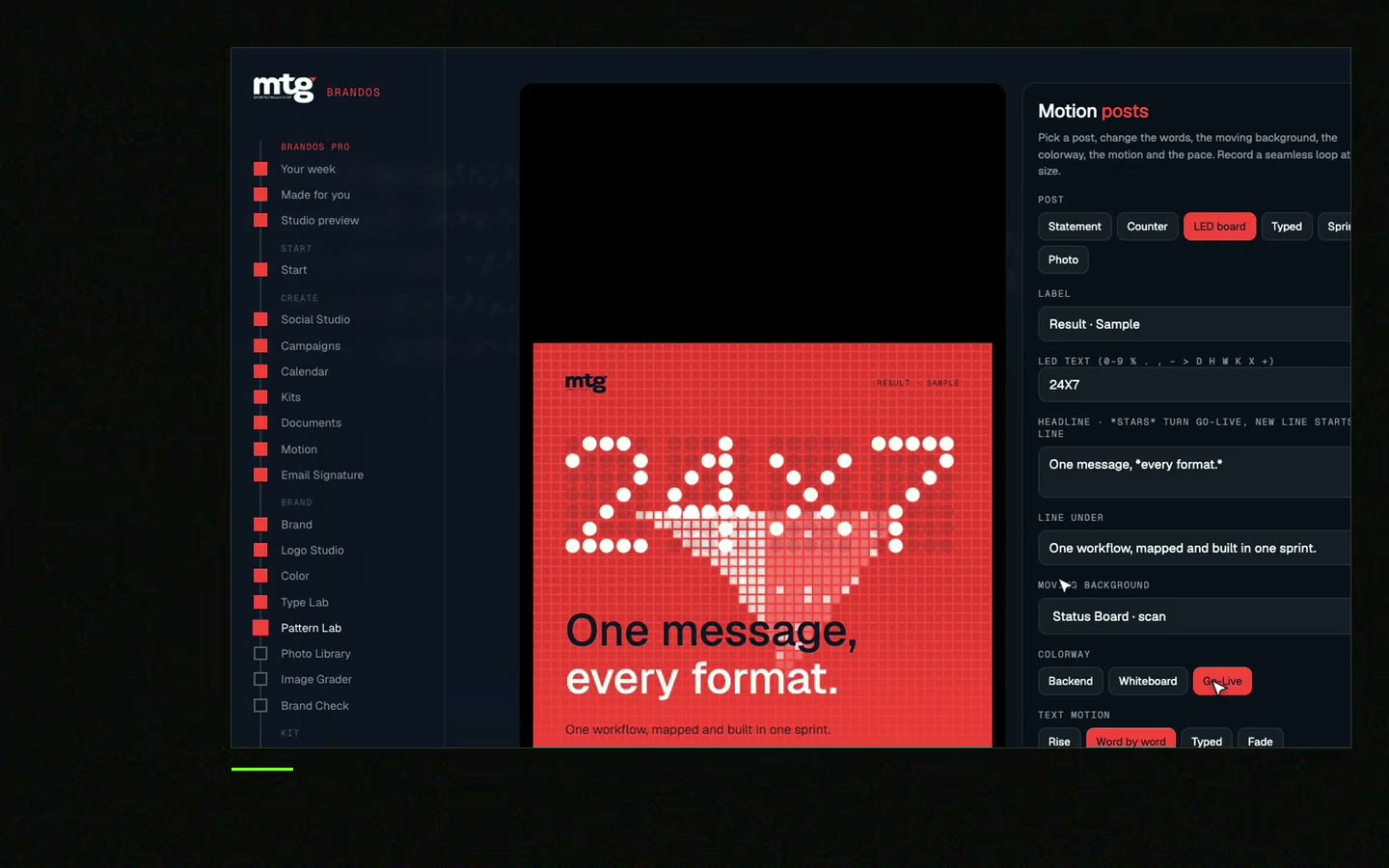
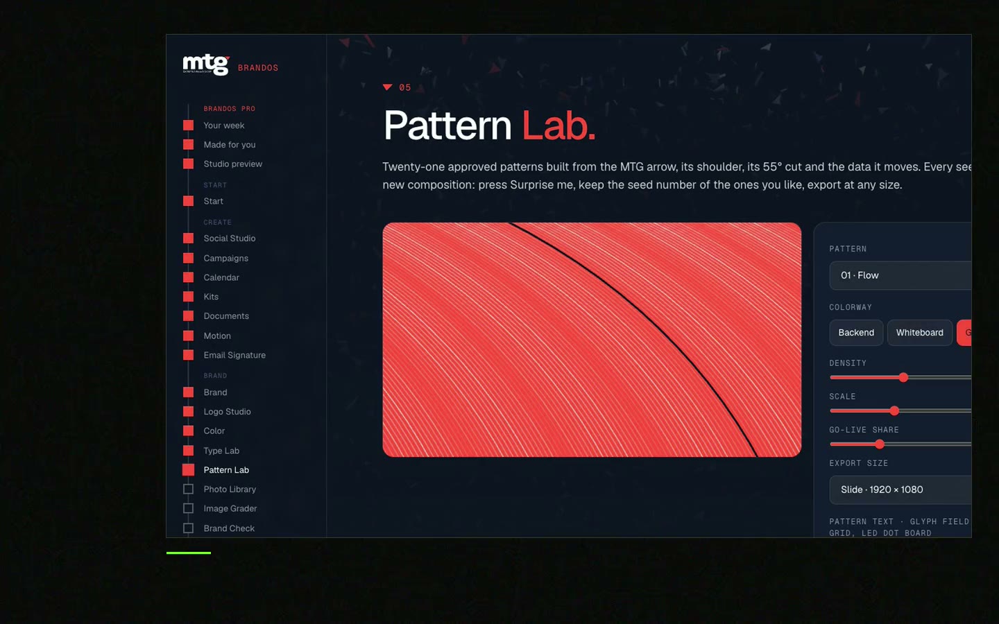
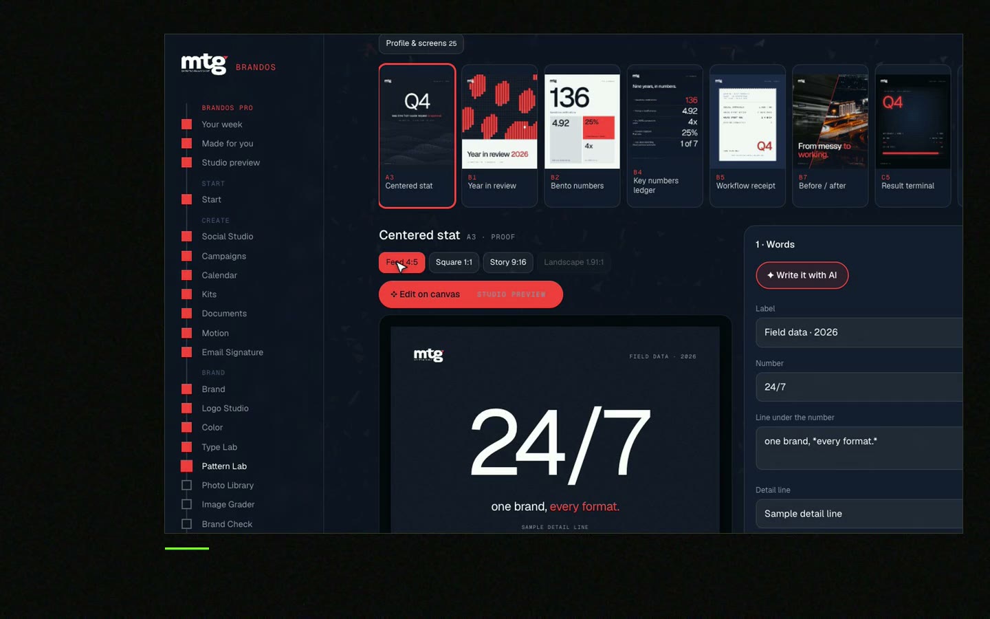
This is a real tool from a real Brand OS Portal, on the MTG brand. Change the photo and the words. Logo, colours and fonts stay locked.
Watch
I made short videos of the tools. Hear me explain them, then scroll through every one at work. Real tools, on a real brand.
Choose photos with one clear colour match and the same light. A small colour grade across the set also helps.
Use plain, specific searches such as a job title at work in natural light. Skip the top results, since everyone sees them.
Yes, if the licence allows edits. Crop, tone and colour grade are the usual changes.
They can work for mood and backgrounds. Check each one against your brand before use. See AI generated images brand fit check.
Start with 20 to 30 you really like. A small set that you reuse beats a huge set you never finish.
Death List Five. Five headaches, one portal. Sound on.
See what ChatGPT says about your company, and how to fix it.
You hear from me within 2 to 8 hours.
May I use cookies for Google Analytics and Clarity to see which pages help? Privacy