 Hrvatski
Look
1. Colour
Does the photo sit well next to your brand colours? Warm photos on a cool brand clash.
Twelve quick checks tell you if a photo belongs on your website. Tick them off before you publish.
Free: your brand in 3 real designs, in 48 hours.
A brand photo for a website must match your colours and mood, look like your real company, load fast, work at every screen size, and be yours to use. If a photo fails one of these checks, swap it.
Use the 12 checks below. Run them on every photo on your home page. Start there, because that page is where most visitors decide if you look like a real, steady company.
 By Vedran Obradović · Updated 7 November 2026
People read a photo before they read a word. One off-brand photo can make a good page feel cheap.
A CEO or marketing director often has no designer on call. So photos get picked in a hurry, from whatever folder is open. After a year the site looks like five different companies.
A short checklist fixes that. It takes about 10 minutes per page, and anyone on the team can run it. No design degree needed.
Look, truth and tech. Fail one and the photo needs a fix or a swap.
Look
Does the photo sit well next to your brand colours? Warm photos on a cool brand clash.
Look
Is the feel calm, bold or friendly in the same way as your words?
Look
Do all photos on the page share the same light and tone?
Look
Is there a quiet area where a headline can sit?
Truth
Do the people look like your customers and your team, not a model shoot?
Truth
Is it your product, office or work, or at least something close to it?
Truth
Does it support the line next to it, or just fill the gap?
Truth
Do you have written rights to use it on a website?
Tech
Is it sharp at the biggest size it will show?
Tech
Is it small enough to load fast on a phone?
Tech
Does it still work when the box changes shape on a phone? Nothing important should be cut.
Tech
Does it have a short, plain description for screen readers and search?
Want the rules in writing so the team stops guessing? Read how to write brand photography guidelines.
Free tool
Photos can match a brand that is written down. Answer a few short questions and get your brand score and the next thing to fix. It is free.
Open your home page. Pick the three biggest photos. Tick what is true. Your ticks stay on this device.
0 of 12 done
Ten or more ticks is a good page. Fewer than eight, and I would swap the photo, not fix it.
Leave your email. I design them by hand and send them to you within 48 hours. It costs you nothing.
I write to you from [email protected]. If you do not see it, check spam.
Alt text is one short sentence. Say what is in the photo, in plain words. Do not stuff it with keywords.
[Who or what] + [doing what] + [where, if it helps]

Good: Two engineers review a network map on a wall screen.
Good: Founder presenting the product roadmap to the team.
Weak: team business office photo stock company.
Weak: image1.jpg
Keep the same voice as the rest of your site. See brand voice guidelines.
Three fixes, in this order.
Step 1
A small colour or crop change often saves a good photo. Keep the whole subject visible.
Step 2
Pick a photo from the same set as the others. Read how to choose stock photos that match your brand.
Step 3
Add the lesson to your guidelines so the next person does not repeat it. See what to include.
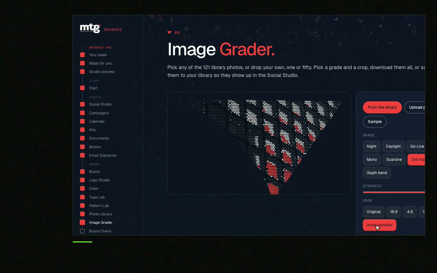
Every fix costs time when a designer does it by hand. In a Brand OS Portal, the Image Grader grades a photo against your brand and Social Studio puts it inside a design that already looks right. A designer is still the right call for a new identity or a photo shoot. The portal handles the daily work after.
The checklist works for one person. A team needs one shared home for approved photos.
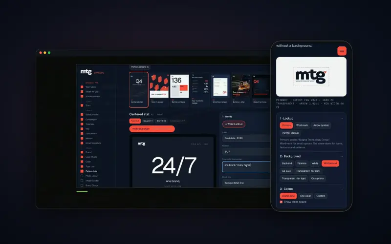
Brand OS Pro Portal. The team makes its own posts. No waiting.
Brand OS Core Portal. The CEO writes and designs an on-brand LinkedIn post in about 3 minutes.
MTG has 121 graded photos inside its portal, and the team makes its own posts. More on sharing brand files in brand templates for teams and what brand assets are.
Try one Brand OS Portal tool
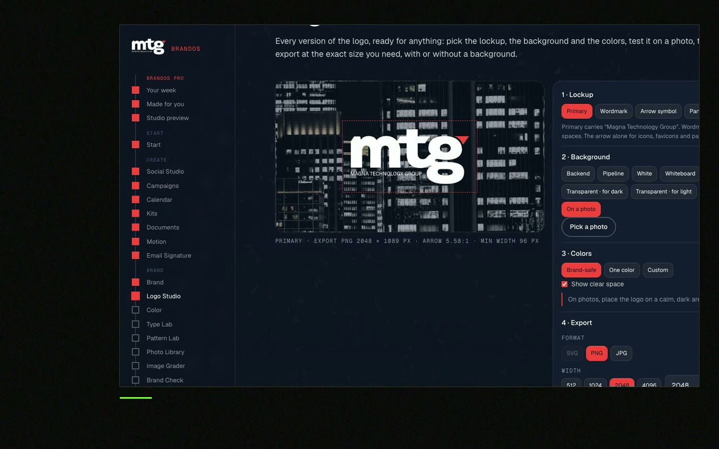
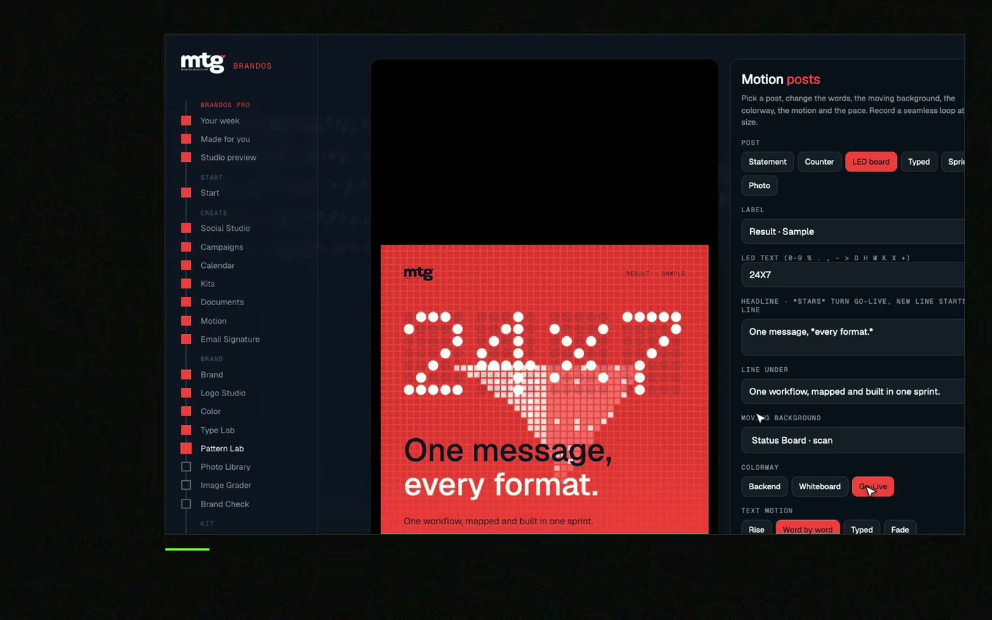
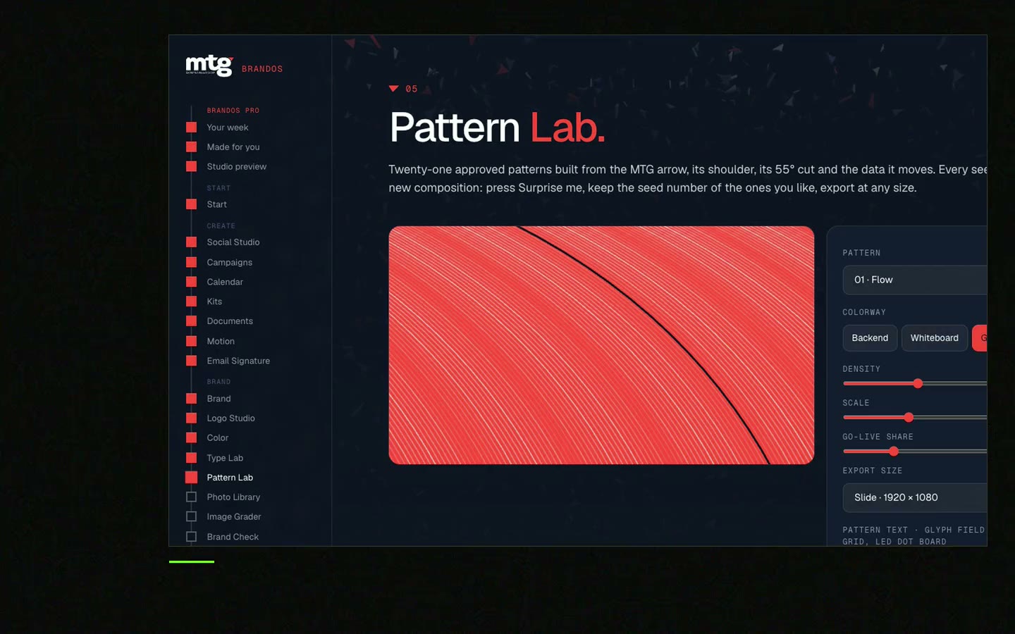
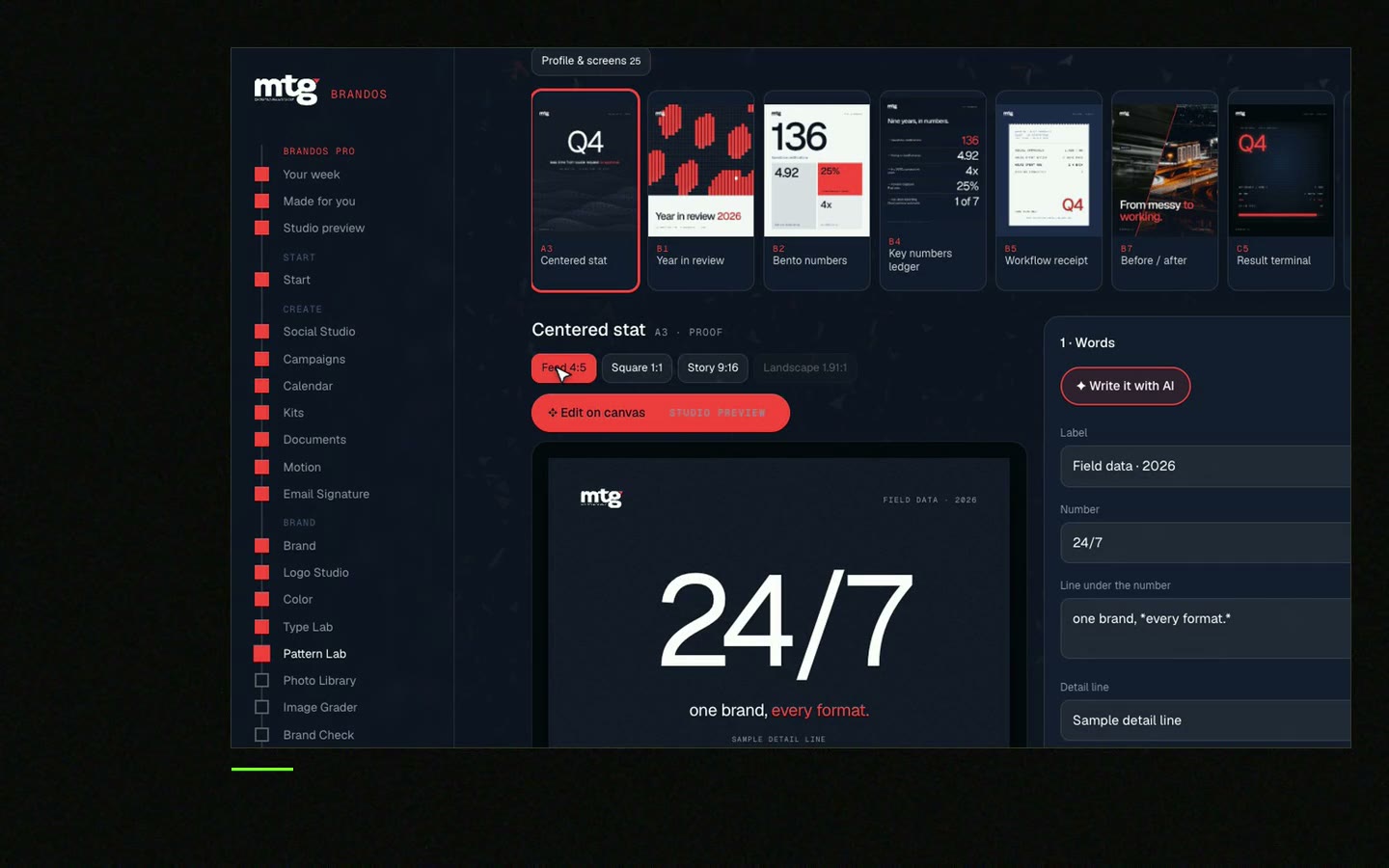
This is a real tool from a real Brand OS Portal, on the MTG brand. Change the photo and the words. The design stays on brand.
Watch
I made short videos of the tools. Hear me explain them, then scroll through every one at work. Real tools, on a real brand.
It matches your colours and mood, looks like your real company, and shares light and tone with your other photos.
As many as help the message, no more. Three strong photos beat ten random ones.
Yes for photos that carry meaning. A short, plain sentence is enough.
You can, but it makes you look the same. Use your own photos where you can. Read why AI startups look the same.
Give them a short rule list and a tool that grades photos for them. A Brand OS Portal does this. See Brand OS Portal.
Death List Five. Five headaches, one portal. Sound on.
See what ChatGPT says about your company, and how to fix it.
You hear from me within 2 to 8 hours.
May I use cookies for Google Analytics and Clarity to see which pages help? Privacy