 Hrvatski
1
Subject
What the photos show: people at work, the product in use, places, details.
Seven rules decide if your photos look like one brand. Write them once, then every photo has a clear yes or no.
Brand photography guidelines are a short set of rules for how photos look: subject, light, colour, framing, people, editing and what you never show. They let anyone pick or make a photo that fits.
Keep them to one or two pages with real example photos. Below are the seven rules, a template to copy, do and do not examples, and a check to grade any photo.
 By Vedran Obradović · Updated 5 November 2026
If you only write these seven, you are already ahead of most brands.
1
What the photos show: people at work, the product in use, places, details.
2
Soft daylight, dark and moody, or bright studio. Pick one.
3
Warm or cool, rich or muted, and how close to your brand colours.
4
Close-ups or wide shots, centred or off to one side, room for text.
5
Real or posed, looking at the camera or not, who you show.
6
Contrast, grain, sharpness. One recipe for every photo.
7
The photos you never use, like handshakes or glowing brains.
Your photos should match your brand colours and your brand voice. Calm words and loud photos feel like two brands.
Fill in the brackets. Add two good and two bad example photos to each rule.
PHOTOGRAPHY GUIDELINES - [Brand name]

Our photos feel: [3 words, e.g. calm, precise, human]

1. Subject: we show [people at work / the product in use / places / details].
2. Light: [soft daylight from the side / dark with one strong light].
3. Colour: [cool and muted / warm and rich], with [brand colour] where it fits.
4. Framing: [close-ups / wide], with room for a headline on the [left / top].
5. People: [real teams, not models], [not looking at the camera].
6. Editing: [slight contrast, light grain, no heavy filters]. Same for every photo.
7. Never: [stock handshakes, people pointing at screens, glowing brains, blue neon, text in the photo].

Sizes we use: [1:1, 4:5, 16:9]
Where to find approved photos: [one link]
Who to ask: [name]
This chapter sits next to the other parts of your rules. See what brand guidelines include and the brand style guide template.
Free tool
Photo rules sit on top of the brand. Answer a few short questions and get your brand score and the first thing to fix.
Tech brands fall into the same photo traps. Here is what to do instead.
| Instead of | Show | Why |
|---|---|---|
| A handshake in an office | Two people solving a real problem at a desk | Shows the work, not a cliche |
| A glowing brain or robot for AI | A person using the product on a real screen | People buy the result, not the idea of AI |
| A padlock for security | The team that watches the system, or a calm control room | Real people build trust |
| A city skyline at night | Your real office, team or product | Anyone can buy the skyline |
| Models smiling at the camera | Real staff, mid-task, natural light | It looks honest |
Leave your email. I design them by hand and send them to you within 48 hours. It costs you nothing.
I write to you from [email protected]. If you do not see it, check spam.
The same seven rules make AI images look like you.
Turn your rules into a short prompt block: subject, light, colour, framing, mood and the "never" list. Then use the same reference photos every time. I show how in Midjourney prompts that stay on brand and Gemini image tools for brand assets.
Tick each line for one photo. Fewer than 6 ticks means it does not go out.
0 of 8 done
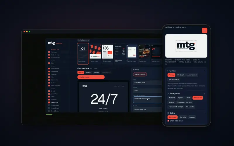
Brand OS Pro Portal. The team makes its own posts. No waiting.
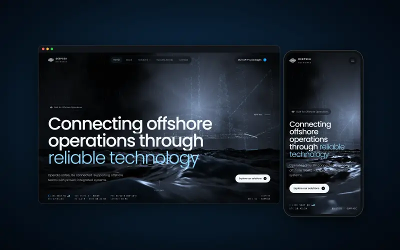
Brand OS Core Portal. The CEO writes and designs an on-brand LinkedIn post in about 3 minutes.
For MTG I graded 121 photos to one look. See the MTG case and my visual identity system page.
Try one Brand OS Portal tool
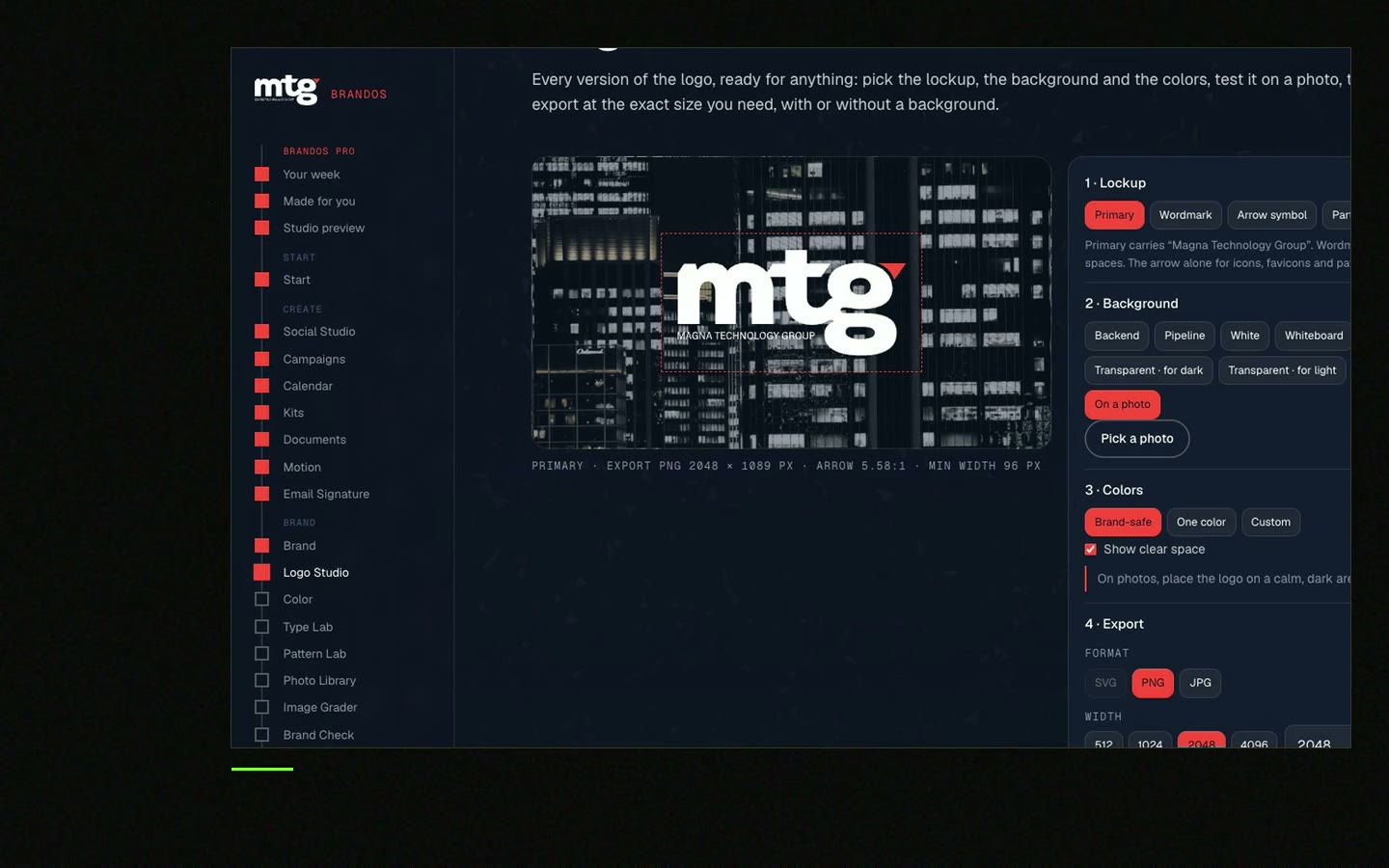
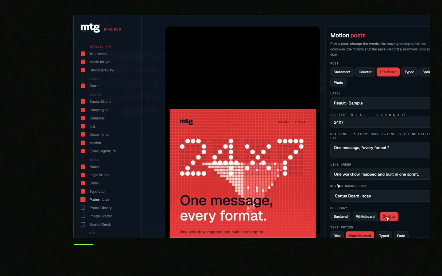
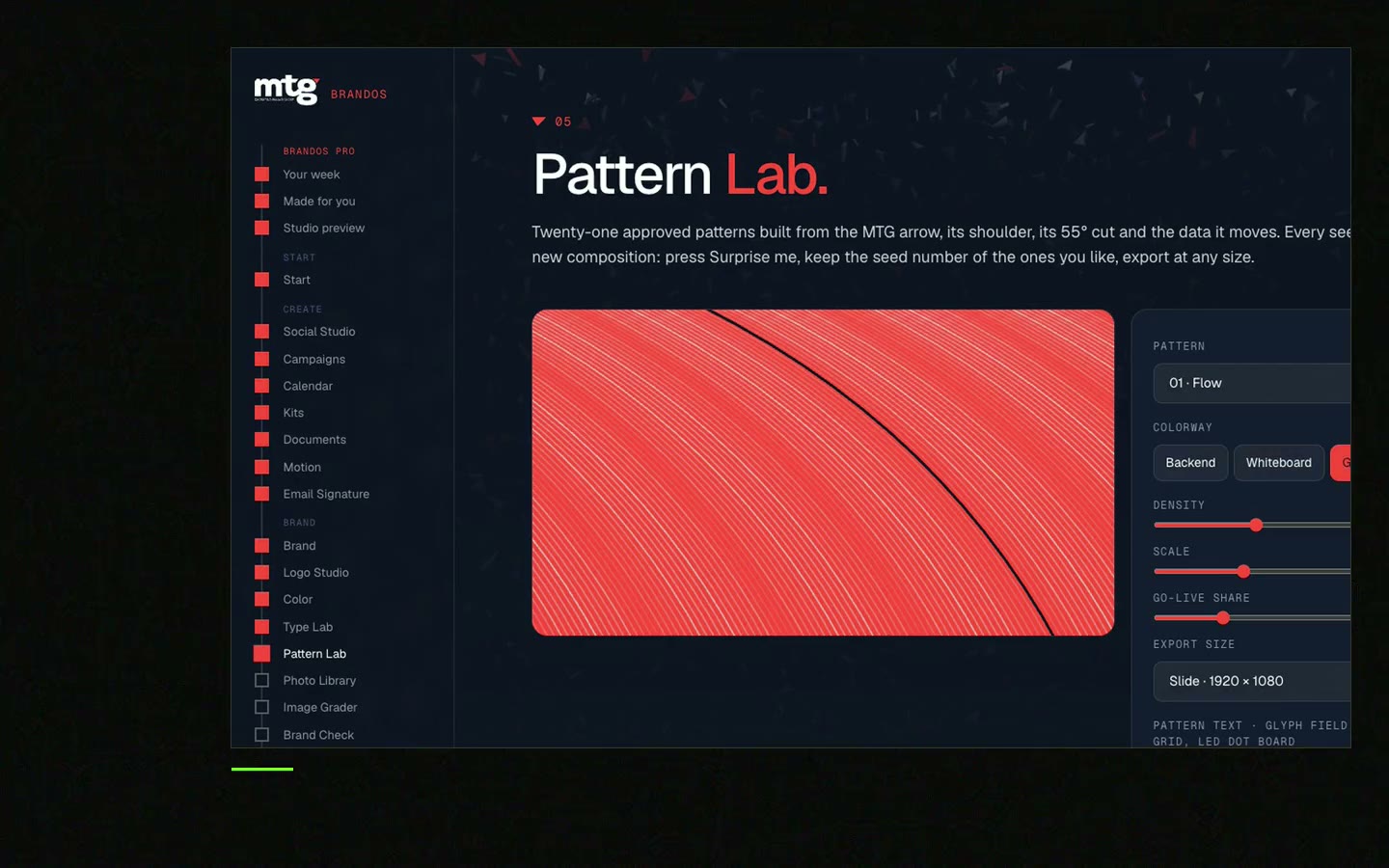
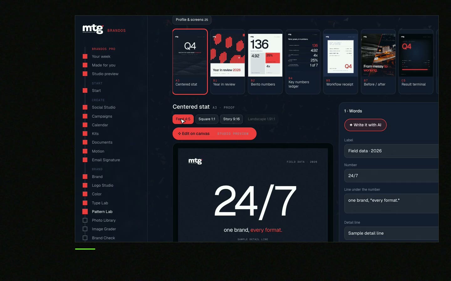
This is a real tool from a real Brand OS Portal, on the MTG brand. Change the photo and the words. The layout stays on brand.
Subject, light, colour, framing, people, editing and a list of photos you never use, plus real good and bad examples.
One or two pages is enough. Example photos teach more than long text.
Yes, if each one passes your rules and gets your editing recipe. Skip the cliches like handshakes.
The look all your photos share: the same kind of light, colour, framing and mood, so people know the photo is yours.
Yes. Turn the rules into a prompt block and use the same reference photos. Then grade the AI image like a real photo.
"He is a brand magician; he understood the challenge quickly and delivered a brand identity, complete with motion graphics, messaging, etc."
 Leah MarsdenCMO, MTG
"It was never really about creating one logo. It was about building something strong enough to grow with the company."
 Pierre-Marc NoëlFounder & CEO, Deepsea Networks

"The brand looks premium and actually fits an AI / tech company, and the guidelines are so clear our team just uses them without asking questions."
 Jeremy MurrayFounder, KORDIN and Stack8s

Get your brand score and the first thing to fix.
You hear from me within 2 to 8 hours.
May I use cookies for Google Analytics and Clarity to see which pages help? Privacy