 Hrvatski
Step 1
Write three feeling words
How should buyers feel? Calm, sharp, warm, bold. Colour follows these words.
Start with what you want people to feel, not with your favourite colour. Then test every colour in real use.
To choose brand colors, start from your position and your buyers. Look at the colours your competitors use, then pick one main colour that stands apart, two or three neutrals for text and backgrounds, and one accent.
Test every pair for contrast so text is easy to read. Then try the palette on real things: a slide, a post, a dark screen and a tiny icon. Write down the codes so everyone uses the same ones.
 By Vedran Obradović · Updated 4 November 2026
Step 1
How should buyers feel? Calm, sharp, warm, bold. Colour follows these words.
Step 2
Put their logos and sites side by side. Note the main colour of each.
Step 3
One colour people will link to you. Different from your closest competitors.
Step 4
A dark for text, a light for backgrounds, one or two greys. They do most of the work.
Step 5
A small, bright colour for buttons and key points. Use it sparingly.
Step 6
Check every text and background pair. Small text needs strong contrast.
Step 7
Slides, posts, a dark screen, a printed page, a 16 px icon. Fix what fails.
Most B2B tech markets are full of the same blue. A map shows where the space is.
Competitor | Main colour | Accent | Light or dark site | Feeling
[Name 1]   | [colour]    | [colour] | [light/dark]     | [word]
[Name 2]   | [colour]    | [colour] | [light/dark]     | [word]
[Name 3]   | [colour]    | [colour] | [light/dark]     | [word]
[Name 4]   | [colour]    | [colour] | [light/dark]     | [word]
[Name 5]   | [colour]    | [colour] | [light/dark]     | [word]

Colours nobody uses: [list]
Colours everyone uses: [list]
Our three feeling words: [word], [word], [word]
Main colour ideas that fit the words and the gap: [colour], [colour], [colour]
Look at real examples in SaaS branding examples and cybersecurity branding examples.
Leave your email. I design them by hand and send them to you within 48 hours. It costs you nothing.
I write to you from [email protected]. If you do not see it, check spam.
A palette works when each colour has one clear role and a rough share of the space.
| Role | Share of a page | Job | Example |
|---|---|---|---|
| Background | About 60% | Calm space | Off-white or very dark |
| Text | About 25% | Easy reading | Near-black or near-white |
| Main colour | About 10% | Says "this is us" | Headlines, shapes, logo |
| Accent | About 5% | Points to one thing | One button, one key number |
| Support colours | As needed | Charts and states | Success, warning, error |
Free tool
Answer a few short questions. You get your brand score and the first thing to fix. It is free and runs right here.
A colour that fails contrast cannot carry text. Find out now, not after the website is built.
Write each colour once as a token, so the website, slides and AI tools use the same value. See design tokens for brands.
Fill it in and put it in your brand guidelines. Delete every colour without a job.
[Brand] colours

Main colour: [name]
HEX [#000000] | RGB [0, 0, 0] | CMYK [0, 0, 0, 0] | Pantone [code]
Job: [logo, headlines, big shapes]

Accent: [name]
HEX [#000000] | RGB [0, 0, 0]
Job: [one button or one key point per page]. Never as text colour on light backgrounds.

Dark: [name] HEX [#000000]. Job: text on light, dark backgrounds.
Light: [name] HEX [#000000]. Job: backgrounds, text on dark.
Grey: [name] HEX [#000000]. Job: lines, small notes.

Pairs that pass contrast: [dark on light], [light on dark], [dark on accent]
Pairs we never use: [accent on light for text], [main on dark for small text]
Need the full picture? What to include in brand guidelines shows where the palette sits.
Tick what is true today. Your ticks stay on this device.
0 of 10 done
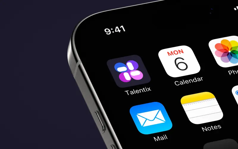
Guidelines with real rules: clear space, variations, monochrome, what not to do, colour pairing and type.
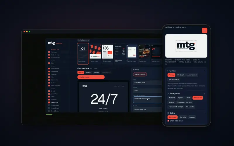
Brand OS Pro Portal. The team makes its own posts. No waiting.
Colours are part of a bigger system. See what a visual identity system holds.
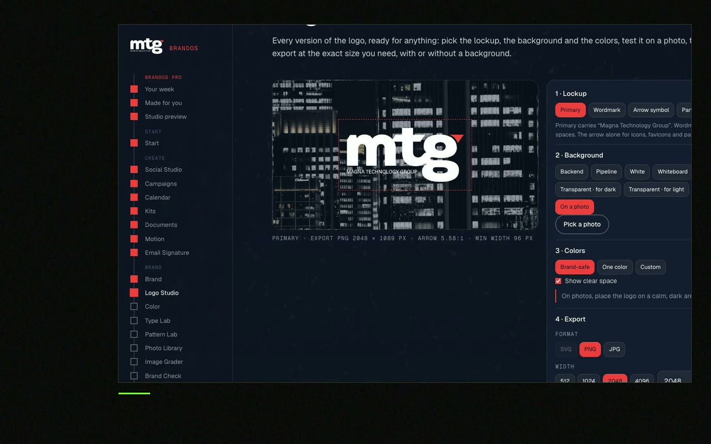
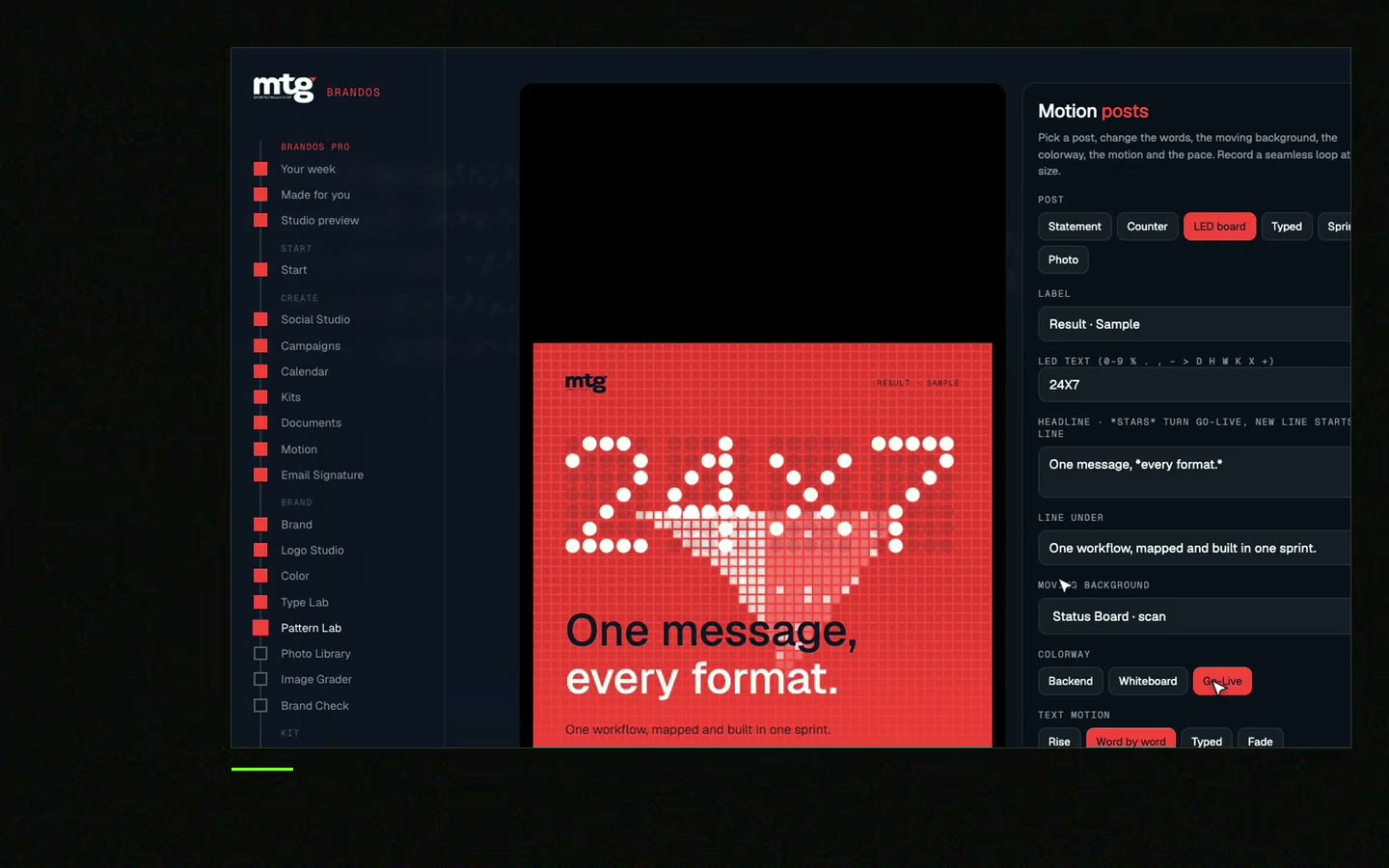
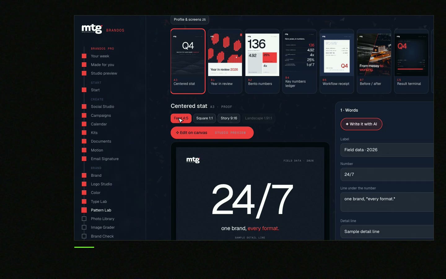
Try one Brand OS Portal tool
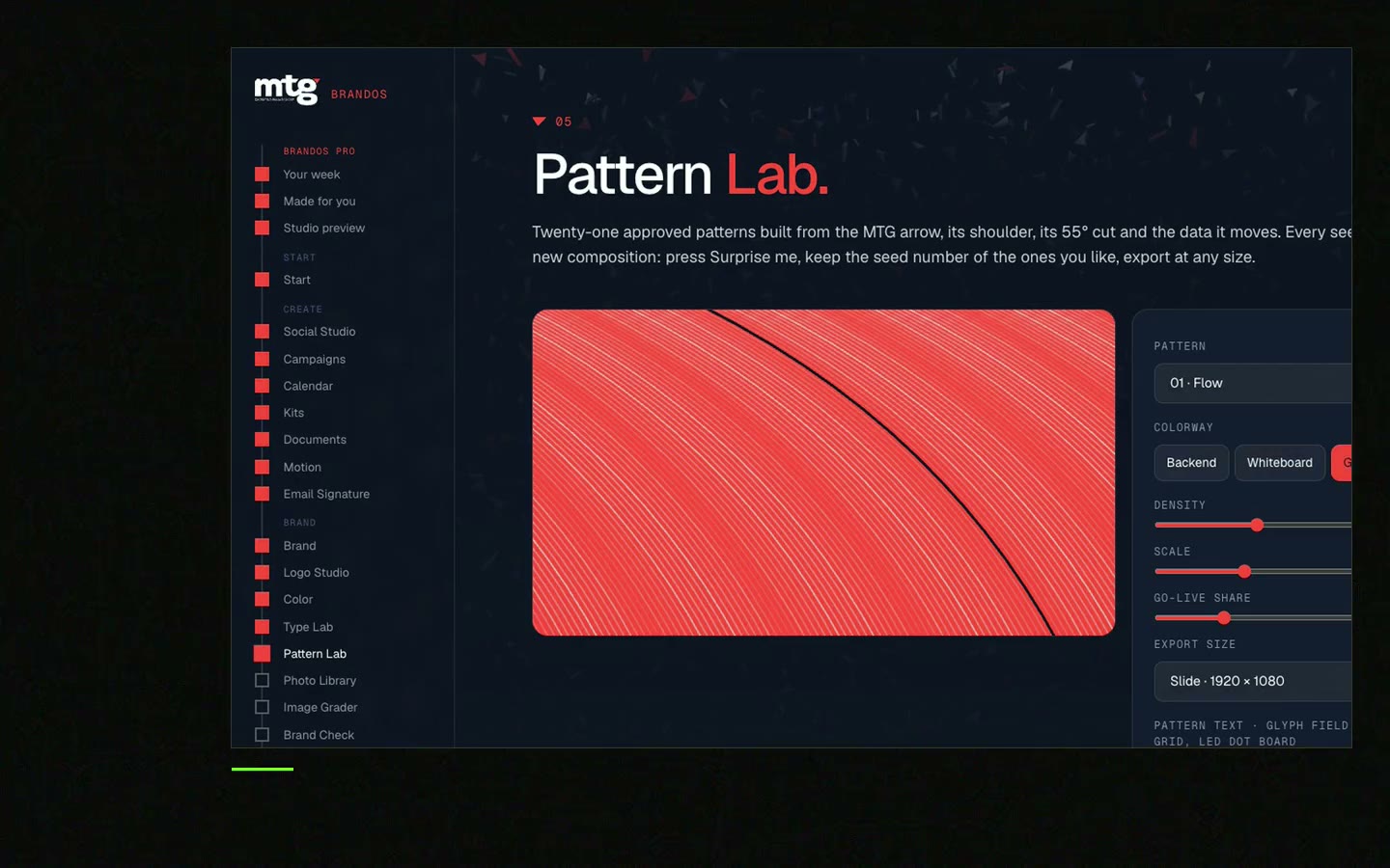
This is a real tool from a real Brand OS Portal, on the MTG brand. Make a pattern. The brand colours and rules stay right.
Most brands do well with one main colour, one accent and two or three neutrals. That is four to six in total.
A simple guide: about 60% calm base, 30% second colour, 10% accent. On this page I split the 30% into text and main colour, which suits B2B websites.
It can, but many tech companies already do. If your competitors are blue, a different main colour helps people remember you.
Colour meaning changes by culture and market. Your feeling words and your competitors tell you more than a colour meaning chart.
Use any free WCAG contrast checker. Aim for 4.5 to 1 for small text and 3 to 1 for large text.
Yes, but it costs time on every file. Test well now. See the rebrand checklist if you are changing them.
"He is a brand magician; he understood the challenge quickly and delivered a brand identity, complete with motion graphics, messaging, etc."
 Leah MarsdenCMO, MTG

"It was never really about creating one logo. It was about building something strong enough to grow with the company."
 Pierre-Marc NoëlFounder & CEO, Deepsea Networks

"The brand looks premium and actually fits an AI / tech company, and the guidelines are so clear our team just uses them without asking questions."
 Jeremy MurrayFounder, KORDIN and Stack8s

Get your brand score and the first thing to fix.
You hear from me within 2 to 8 hours.
May I use cookies for Google Analytics and Clarity to see which pages help? Privacy