 Hrvatski
Rule 1
Start with the text font
Most of your brand is small text. Pick a font that reads well at 14-16 px first.
One family is often enough. When you pair two, make them clearly different and give each one a job.
Good font pairing for tech and SaaS brands uses one clear sans serif for text and either the same family or a clearly different font for headlines. Each font gets one job.
Below are 8 free pairs from Google Fonts with what each pair feels like, plus a type test to check a pair on your own words before you choose.
 By Vedran Obradović · Updated 4 November 2026
Rule 1
Most of your brand is small text. Pick a font that reads well at 14-16 px first.
Rule 2
Two fonts that look almost the same look like a mistake. Pick one family, or two clearly different ones.
Rule 3
Headline font for headlines. Text font for everything else. No third font for fun.
Rule 4
You need at least regular and bold. Variable fonts give you every weight in one file.
Rule 5
Your font must be allowed on the web, in apps and in documents. Google Fonts use an open licence.
All of these are free on Google Fonts. Try them on your own headline before you choose.
| Headlines | Text | Feels | Good for |
|---|---|---|---|
| Inter | Inter | Neutral, clear | Dashboards, product-first SaaS |
| Geist | Geist Mono for code | Clean, developer | Dev tools, APIs, AI tools |
| IBM Plex Sans | IBM Plex Mono | Solid, technical | Enterprise, security, data |
| Space Grotesk | Inter | Young, sharp | AI startups, launches |
| Manrope | Manrope | Modern, friendly | B2B platforms, studios |
| Fraunces | Inter | Warm, editorial | Content-led brands, HR tech |
| Instrument Serif | Inter | Calm, premium | AI and finance brands that want warmth |
| DM Sans | DM Mono | Soft, simple | SMB tools, onboarding-heavy apps |
Every font in this table is on Google Fonts under the SIL Open Font License. Checked on 4 November 2026.
A custom wordmark is a different job from a brand font. The logo can have its own drawn letters. See wordmark logo design.
Free tool
Answer a few short questions. You get your brand score and the first thing to fix. It is free and runs right here.
Mono fonts give every letter the same width. They are a tool, not a style.
Look at how real SaaS sites handle type in SaaS website examples.
Leave your email. I design them by hand and send them to you within 48 hours. It costs you nothing.
I write to you from [email protected]. If you do not see it, check spam.
Set this page up in any tool. Look at it on a laptop and a phone. Then decide.
Headline font: [font], [weight]
Text font: [font], [weight]

H1 (48-64 px): [your real homepage headline]
H2 (28-36 px): [a real section title]
Body (16 px): [a real paragraph, 3-4 lines]
Small (13-14 px): [a real footnote or label]
Button (15-16 px): [a real button text]
Numbers: 0123456789 | 12% | 3-5 days | 1,250
Look-alikes: Il1 O0 rn m

Check:
- Can you read the small text on a phone?
- Do the headline and text fonts look clearly different, or clearly the same family?
- Do numbers line up in tables?
- Does the headline still look good in one long line and on three short lines?
- Does it look like your three closest competitors? If yes, try another pair.
Fonts without rules drift fast. Put these lines in your brand guidelines.
1. Headlines: [font], [weight], sentence case, line height [1.1].
2. Text: [font], [weight], [16] px on screens, line height [1.5].
3. Never more than two fonts on one page.
4. Code and data tables: [mono font].
5. In Google Docs, Slides or Office use [fallback font] if [brand font] is missing.
Type is one part of the system. See visual identity system, design tokens for brands and how to choose brand colors.
Tick what is true today. Your ticks stay on this device.
Try one Brand OS Portal tool
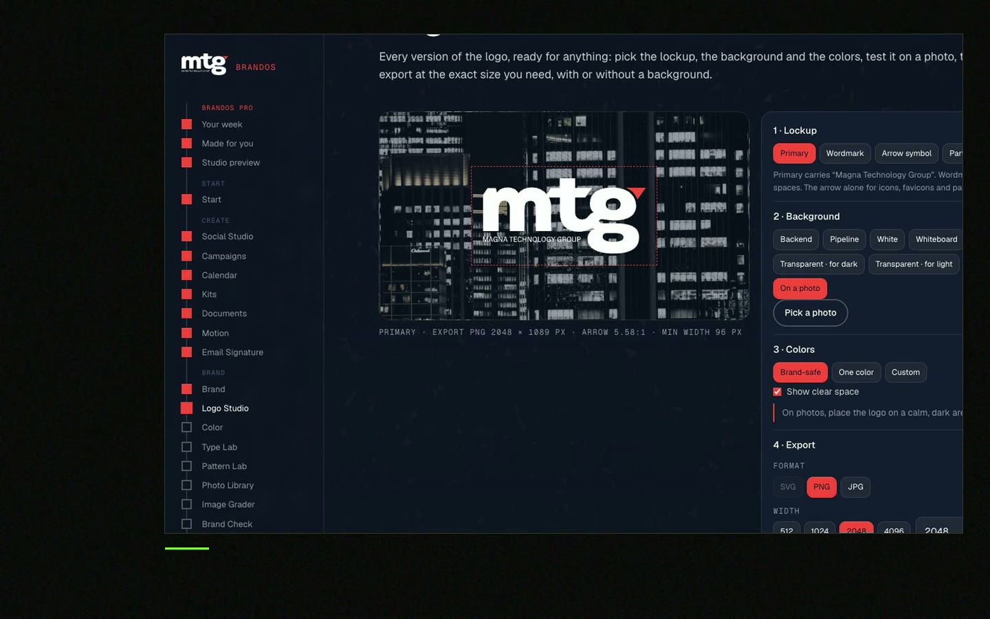
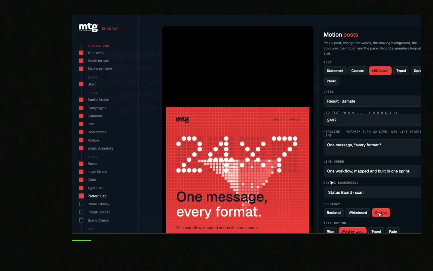
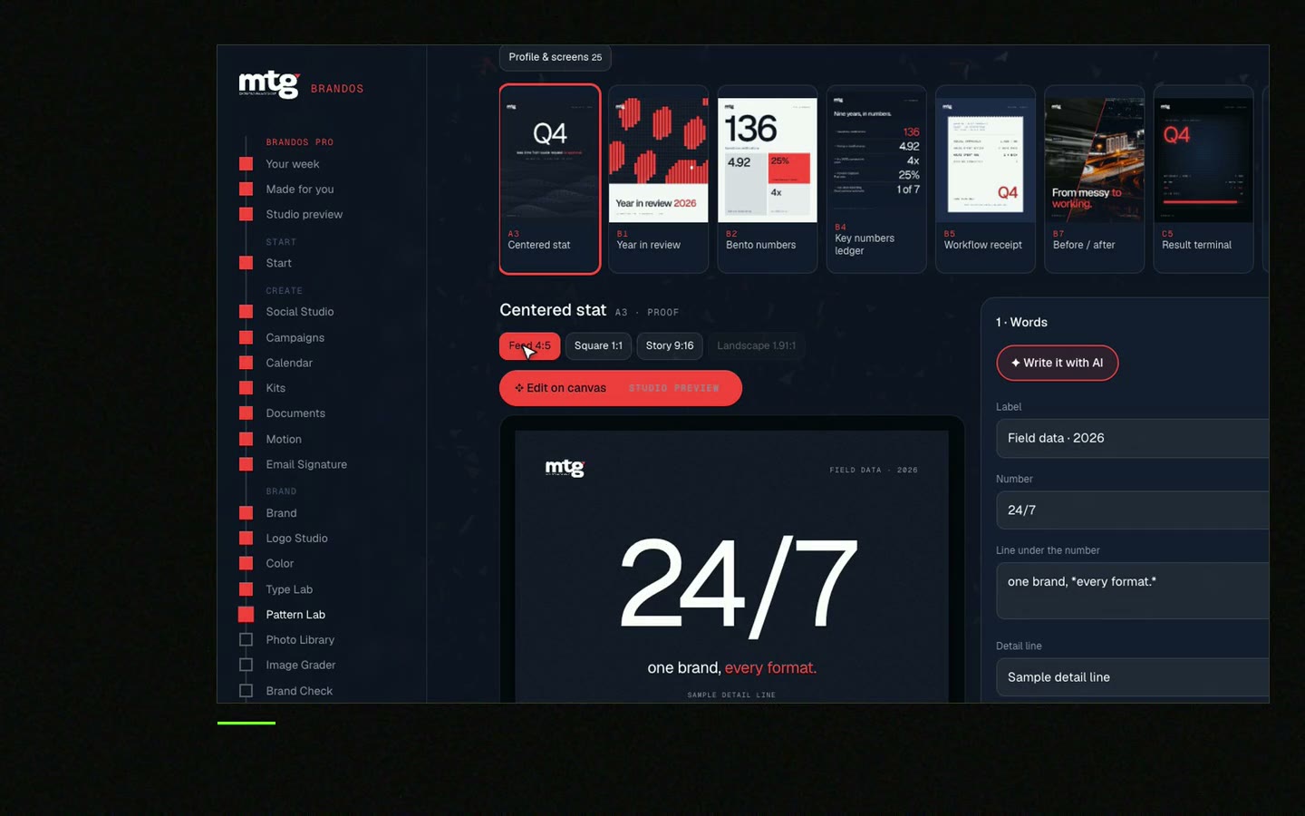
This is a real tool from a real Brand OS Portal, on the MTG brand. Change the words. The fonts, sizes and spacing stay right.
There is no single best one. A clear sans serif like Inter, Geist or IBM Plex Sans is a safe start. Pick the one that fits your feeling words and is not what your closest competitors use.
One or two. One family with several weights is often enough. A second font only makes sense if it has a clear job.
It can work well: a serif for headlines and a sans serif for text gives warmth and contrast. Keep the text font simple.
Yes. Google Fonts are under open licences, most under the SIL Open Font License, which allows commercial use.
Not always. A wordmark often has drawn letters. The brand font should sit well next to it. See wordmark logo design.
"He is a brand magician; he understood the challenge quickly and delivered a brand identity, complete with motion graphics, messaging, etc."
 Leah MarsdenCMO, MTG
"It was never really about creating one logo. It was about building something strong enough to grow with the company."
 Pierre-Marc NoëlFounder & CEO, Deepsea Networks
"The brand looks premium and actually fits an AI / tech company, and the guidelines are so clear our team just uses them without asking questions."
 Jeremy MurrayFounder, KORDIN and Stack8s

Get your brand score and the first thing to fix.
You hear from me within 2 to 8 hours.
May I use cookies for Google Analytics and Clarity to see which pages help? Privacy