 Hrvatski
Rule 1
Use the light version
White or a pale brand tint. Not the colour logo, unless it was made for dark. See white and black logo versions.
Use the light logo on dark backgrounds, place it on a calm area of the photo, and test it small.
Free: your brand in 3 real designs, in 48 hours.
On a dark background, use the white or light version of your logo. On a photo, place the logo on a calm, even area, like sky, a wall or a dark corner, and keep the clear space free of detail.
If the photo is busy, add a soft dark layer under it or move the logo. Then do a simple test: shrink the image to thumbnail size and squint. If the logo still stands out, it works.
 By Vedran Obradović · Updated 7 November 2026
This is the easy case. Three rules.
Rule 1
White or a pale brand tint. Not the colour logo, unless it was made for dark. See white and black logo versions.
Rule 2
A dark blue logo on a black background fades out. Dark on dark is not enough contrast.
Rule 3
Dark backgrounds look empty, so people put things close. Keep the space from your logo rules.
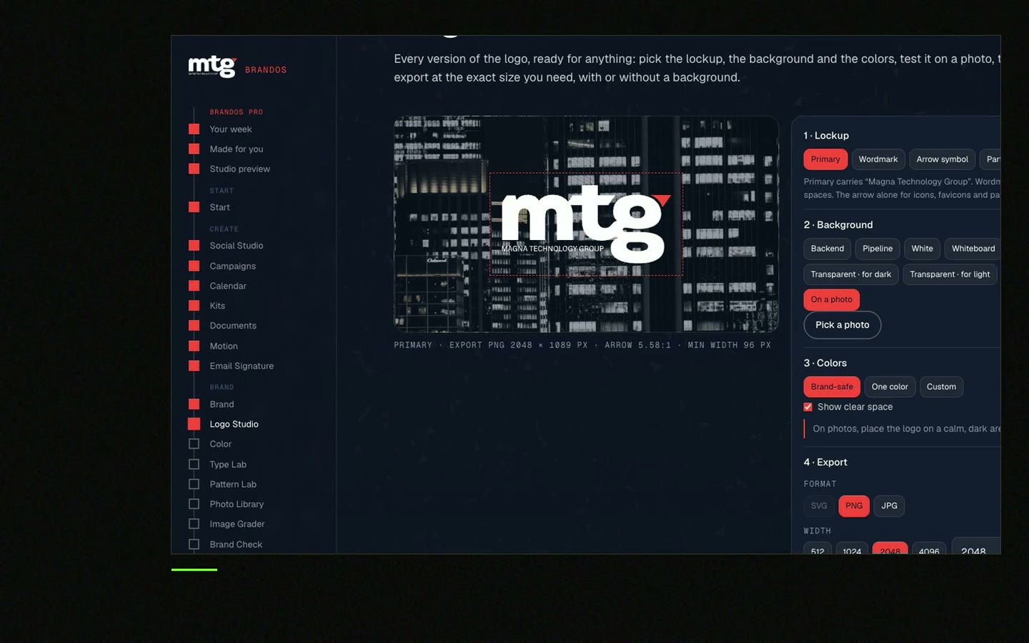
Photos are harder, because the background changes everywhere.
Step 1
Sky, a wall, a blurred part, a dark corner. Not faces, text or sharp patterns.
Step 2
Dark area: white logo. Light area: dark logo.
Step 3
No lines, objects or text inside the space around the logo.
Step 4
A gentle dark gradient under the logo helps on a mixed photo. Keep it subtle.
Step 5
Shrink the image to a thumbnail. Can you still see the logo?
Good photos make this easier. See brand photography guidelines for picking images with calm space.
Free tool
A logo on a photo needs room with no detail. Add your logo, pick a rule and download a guide. The file stays on your device.
Short rules are followed. Long ones are skipped.
LOGO ON DARK AND PHOTO BACKGROUNDS

1. Dark background: use the white [or light] logo.
2. Light background: use the colour or dark logo.
3. Photo: place the logo on a calm area with no faces, text or sharp detail.
4. Keep the clear space ([x] around the logo) free of detail.
5. If the photo is mixed, add a soft dark layer under the logo ([opacity]).
6. Never put the colour logo on a busy photo.
7. Never add a shadow, glow or outline to make it stand out.
8. Test: shrink to thumbnail size. If the logo is hard to see, move it or change the version.

Where the files are: [link]
The rest of the logo rules are in logo usage guidelines. For colours that keep contrast, see how to choose brand colors.
Leave your email. I design them by hand and send them to you within 48 hours. It costs you nothing.
I write to you from [email protected]. If you do not see it, check spam.
Teams make these mistakes when the right logo is hard to find. See how to share logo files and logo variations every company needs.
A designer sets the rules once. A portal makes them easy to follow.
Most people do not read a rule page before they make a slide. They want the right file in seconds.
In a Brand OS Portal, Logo Studio does that. Pick a background and a size. A logo that breaks the rules fixes itself. You see colour, light, dark, white and black, for a tab icon, a profile, a slide or a big sign.
A designer is still the right choice to draw the logo and set the rules. The portal is for the everyday work after.
Tick each line. Your ticks stay on this device.
0 of 8 done
Making a video with a logo ending? See logo reveal for social videos.
Try one Brand OS Portal tool
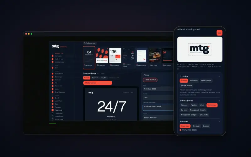
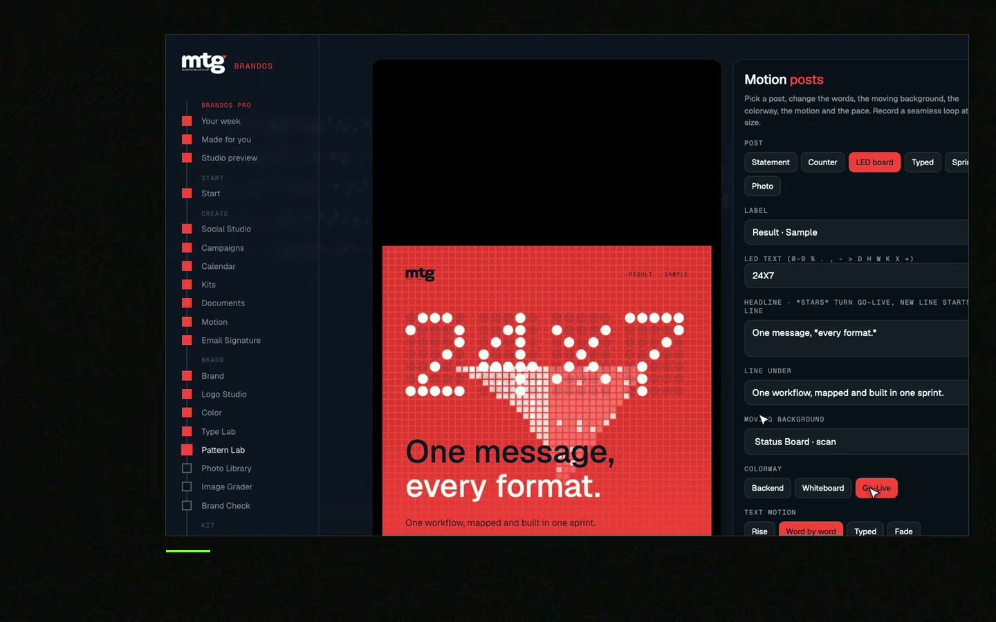
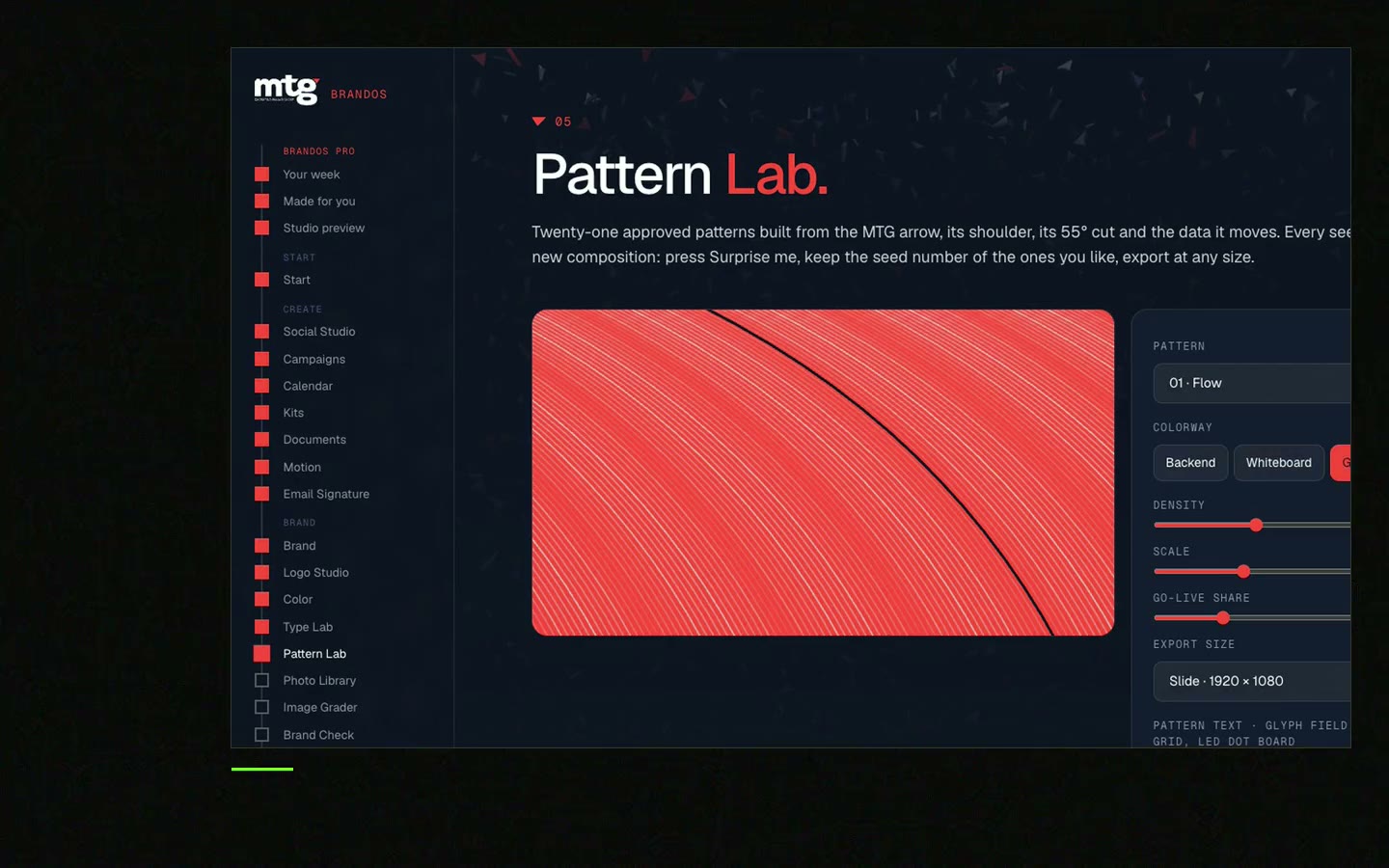
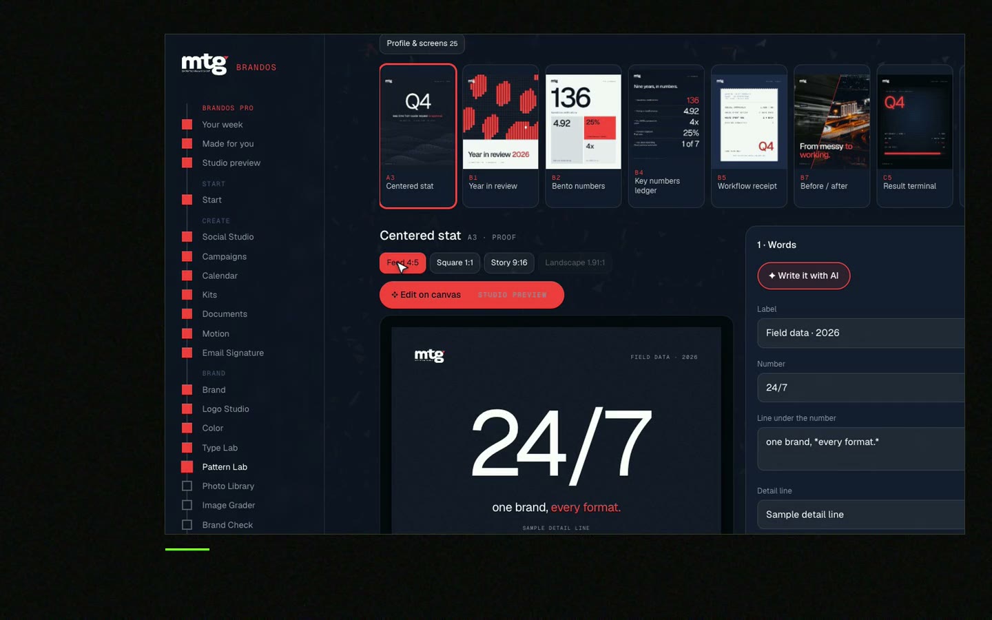
This is a real tool from a real Brand OS Portal, on the MTG brand. Pick a background and a size. A logo that breaks the rules fixes itself.
Watch
I made short videos of the tools. Hear me explain them, then scroll through every one at work. Real tools, on a real brand.
The white or light version. A colour logo works on dark just when it was made for dark.
Place it on a calm area, use the version that has strong contrast there, keep clear space free of detail, and test it at thumbnail size.
No. A shadow or glow often looks dated. Move the logo or add a soft layer under it instead.
Add a soft dark layer under the logo, crop the photo differently, or pick another photo.
Your logo rules should state the smallest size. If it is hard to read on a phone, it is too small.
Death List Five. Five headaches, one portal. Sound on.
See what ChatGPT says about your company, and how to fix it.
You hear from me within 2 to 8 hours.
May I use cookies for Google Analytics and Clarity to see which pages help? Privacy