 Hrvatski
Shape 1
Horizontal
Symbol and name side by side. For website headers, email signatures, slide corners and banners.
Most companies need six logo versions, so the logo always fits the space and the background.
Free: your brand in 3 real designs, in 48 hours.
Every company needs a small set of logo variations: a horizontal version, a stacked version, an icon (symbol alone), and each one in full colour, light for dark backgrounds, dark for light backgrounds, and one colour (black and white).
The point is fit. A wide logo does not fit a round profile picture. A dark logo vanishes on a dark slide. With the right set, nobody has to guess.
 By Vedran Obradović · Updated 7 November 2026
Shape solves the "where does it fit" problem.
Shape 1
Symbol and name side by side. For website headers, email signatures, slide corners and banners.
Shape 2
Symbol above the name. For square spaces: social posts, badges, covers, packaging.
Shape 3
The symbol alone. For small spaces: browser tab, app icon, profile picture. See favicon from logo.
If your logo is just a name, you may need a wordmark and a short mark. See wordmark logo design.
Colour solves the "can you see it" problem.
| Version | Use it on | Example |
|---|---|---|
| Full colour | White and light backgrounds | Website, documents, light slides |
| Light (white) | Dark backgrounds and photos | Dark slides, video endings |
| Dark (black) | Light backgrounds where colour is not allowed | Newspaper, forms, stamps, invoices |
| One colour | Single-colour print and merch | Embroidery, engraving, labels |
More on the one-colour versions in white and black logo versions, and on photos in logo on dark and photo backgrounds.
Free tool
Every variation needs room to breathe. Add your logo, pick a rule and download a guide. The file stays on your device.
A set is useful when people can find the right file.
The full list of what to keep is in logo files: what you need. How to send them is in how to share logo files.
Leave your email. I design them by hand and send them to you within 48 hours. It costs you nothing.
I write to you from [email protected]. If you do not see it, check spam.
Teams ask the same question again and again: "which logo do I use here?"
The set exists, but it is in a folder. People pick what they find. A stretched logo, an old one, a white logo on white.
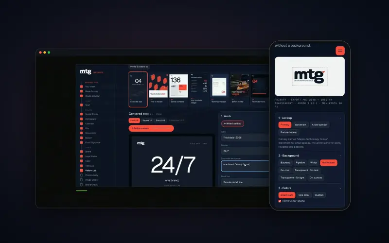
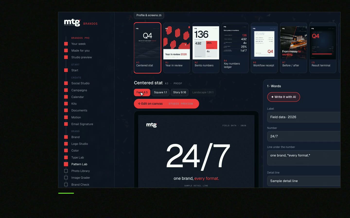
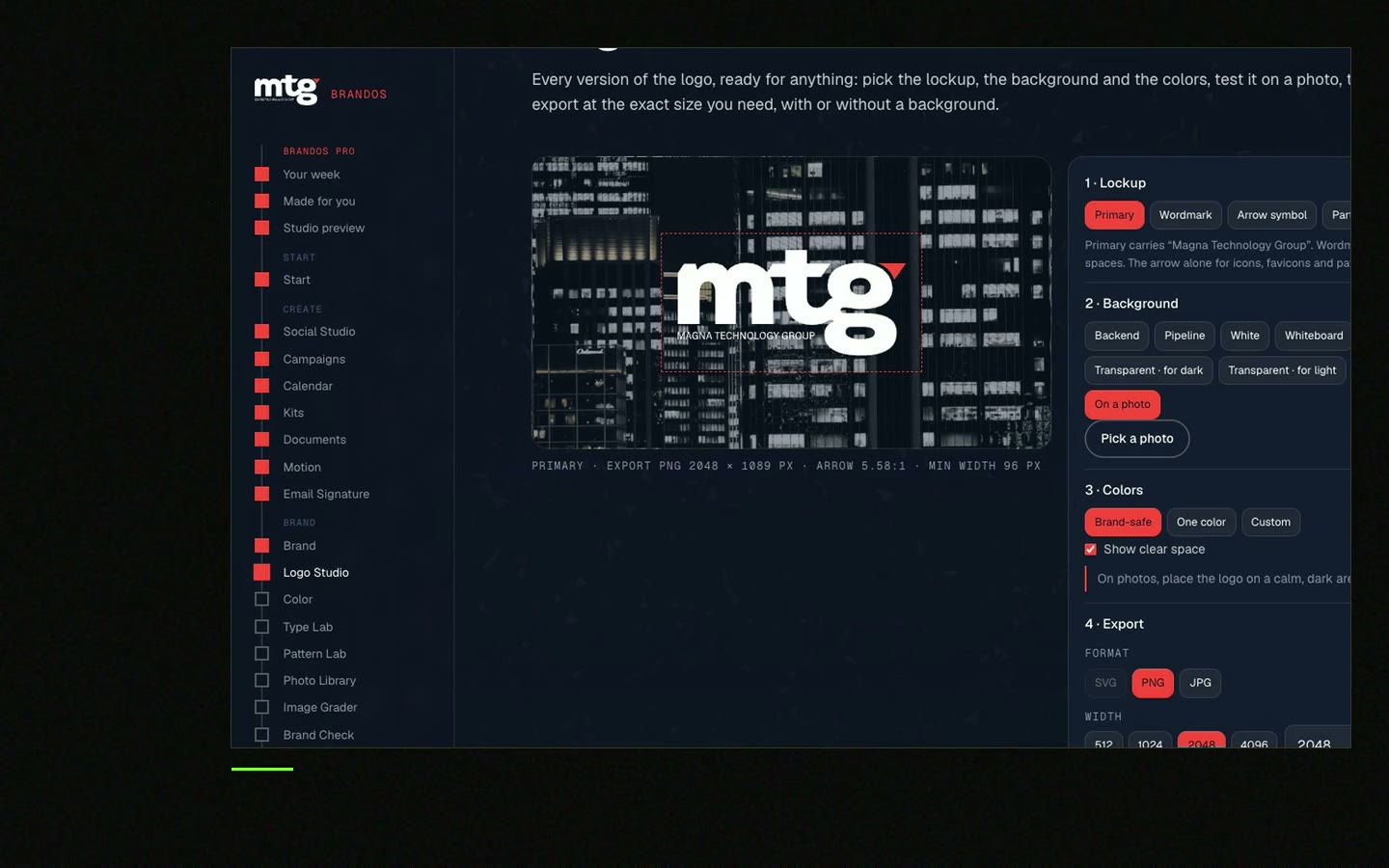
In a Brand OS Portal, Logo Studio fixes that. You pick the background and the size. A logo that breaks the rules fixes itself. You see colour, light, dark, white and black. Sizes cover tab icon, profile, slide and big sign.
A designer is still the right choice for drawing the logo and its set. The portal is for the daily "just give me the right file".
Tick what you have. Your ticks stay on this device.
0 of 10 done
Missing three or more? Ask your designer for the set, or write a brief with the logo design brief template. Need a lockup with a tagline or product? Read how to make a logo lockup.
Try one Brand OS Portal tool
This is a real tool from a real Brand OS Portal, on the MTG brand. Pick a background and a size. A logo that breaks the rules fixes itself.
Watch
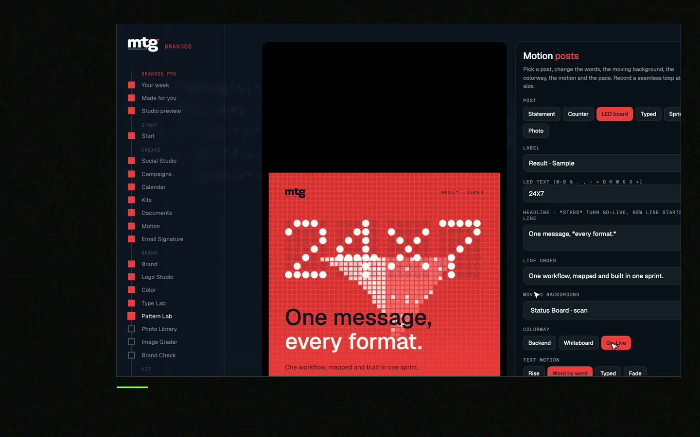
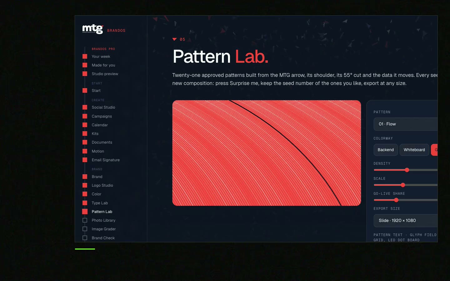
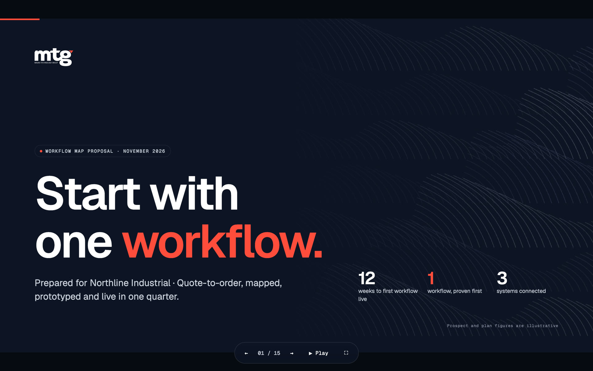
I made short videos of the tools. Hear me explain them, then scroll through every one at work. Real tools, on a real brand.
Six is a good set: horizontal, stacked and icon, with full colour, light, dark and one-colour versions.
A version where the symbol sits above the name. It fits square spaces better than a wide logo.
The symbol alone, without the name. Use it for small spaces like a profile picture or a browser tab.
Vector files (SVG or PDF) for print and scaling, and PNG files with a clear background for slides, documents and web.
The designer who made the logo, as part of the logo set. See logo design.
Death List Five. Five headaches, one portal. Sound on.
See what ChatGPT says about your company, and how to fix it.
You hear from me within 2 to 8 hours.
May I use cookies for Google Analytics and Clarity to see which pages help? Privacy