 Hrvatski
Source
Your own shape
It comes from the logo mark, a letter, or a line style in your identity.
A brand pattern is a background nobody else has. Use it quietly and your work stops looking like everyone else's.
Free: your brand in 3 real designs, in 48 hours.
A brand pattern is a repeating shape built from your own brand, like your logo mark, a line style or a colour grid. You use it as a background on slides, social posts, banners, packaging and web pages.
Keep it calm. Put it behind big areas, keep the text area clear, use one or two brand colours, and use it in the same few places every time.
 By Vedran Obradović · Updated 7 November 2026
It is a background that carries your identity.
Source
It comes from the logo mark, a letter, or a line style in your identity.
Job
It sits behind words and photos. It never fights them.
Result
People see the texture and know it is you before they read a word.
If you do not have a pattern yet, read how to make a brand pattern from your logo.
Use them in a few places and do it every time.
| Place | How to use the pattern | Watch out |
|---|---|---|
| Slide cover and section slides | Full bleed on one side or behind the title | Keep content slides plain. |
| Social posts | Soft background behind a short line | Leave a clear area for the words. See background textures for B2B social posts. |
| LinkedIn banner | A strip or a corner | Put name and photo spots on a calm area. |
| Website sections | Behind a hero or a quiet band | Never behind long text. |
| Print and packaging | Inside covers, tape, tissue, boxes | Check the scale on the real item. |
| Event signs | Large and bold | Here you can be loud. Faces and words still matter most. |
For deck pages, see company PowerPoint template and on-brand sales deck template.
Free tool
A pattern repeats what is already there. Answer a few short questions. You get your brand score and the top thing to fix. It is free and runs right here.
The most common mistake is too much. Use this simple ladder.
Whisper
Low contrast, big spaces. Behind body text and long pages.
Quiet
Light on dark or dark on light. Behind short lines on posts.
Normal
Visible but calm. Covers, banners, section slides.
Loud
Large, strong colour. Signs, event walls, packaging.
Leave your email. I design them by hand and send them to you within 48 hours. It costs you nothing.
I write to you from [email protected]. If you do not see it, check spam.
Five lines. Add a right and a wrong picture.
BRAND PATTERN RULES
- Use it as a background, never behind long text.
- Colours: [brand colour A] and [brand colour B]. No others.
- Keep a clear area of at least [__] for words and the logo.
- Never stretch, rotate or recolour the pattern file. Pick a ready size: [list].
- Allowed places: [slide covers, social posts, banners, packaging].
- Right example: [image]  Wrong example: [image]
- Pattern files live here: [link]. Owner: [name].
More shapes, lines and textures belong in your identity too. See graphic elements for brand identity and your visual identity system.
This is the daily work that fills a designer's week.
Every banner, post and slide wants a background. Asking a designer each time is slow. Grabbing a stock image is quick but looks like everyone else.
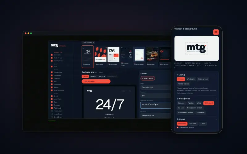
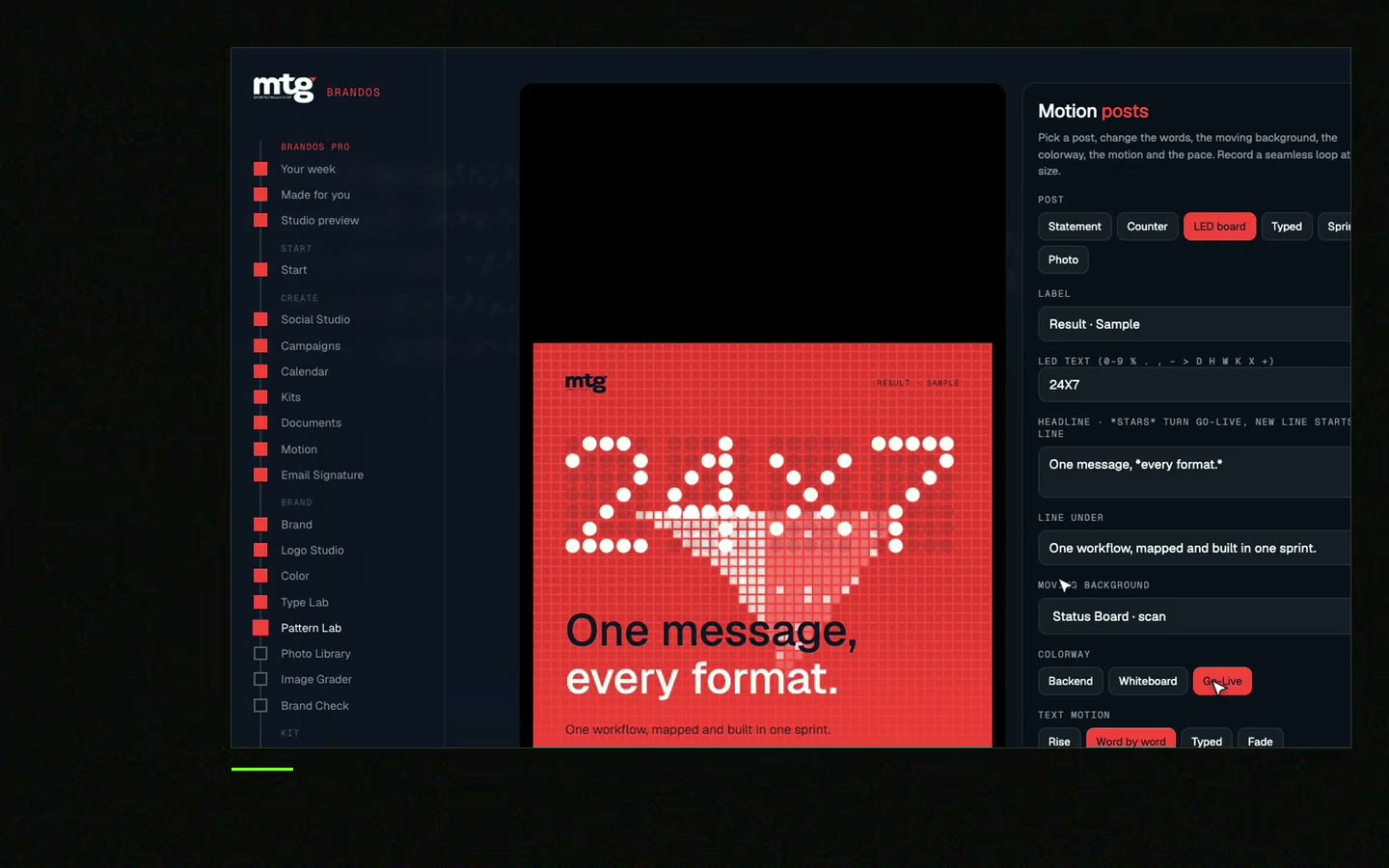
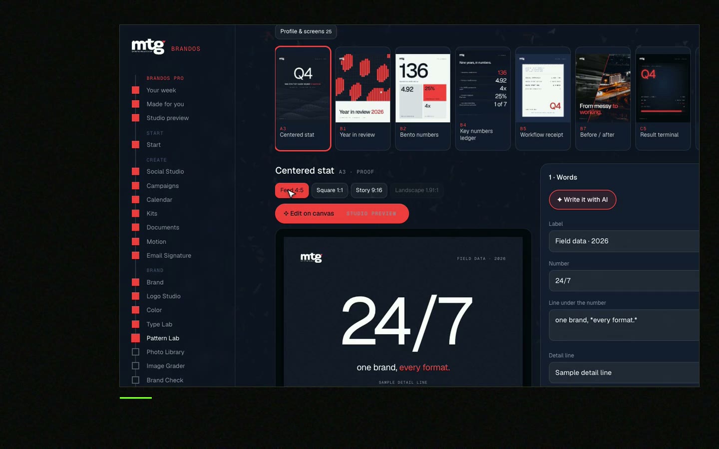
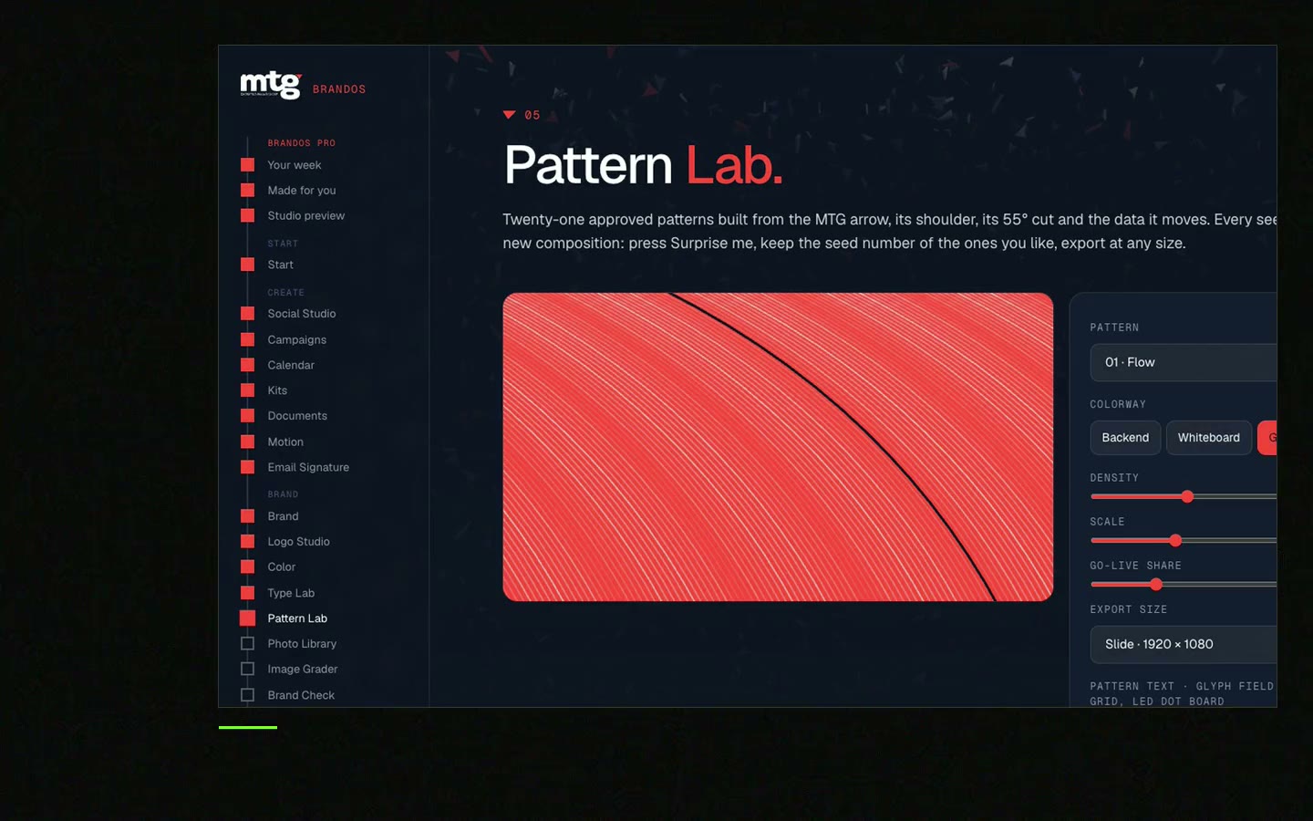
In a Brand OS Portal, Pattern Lab draws patterns from your own logo shape. You pick moving or still, the colour, how many and how big. The team makes its own backgrounds, and they stay yours.
A designer is still the right person for strategy and a new identity. The portal is for the daily work after that. See Brand OS Portal.
Tick what is true today. Your ticks stay on this device.
0 of 8 done
Compare it with stock in brand pattern vs stock background.
Try one Brand OS Portal tool
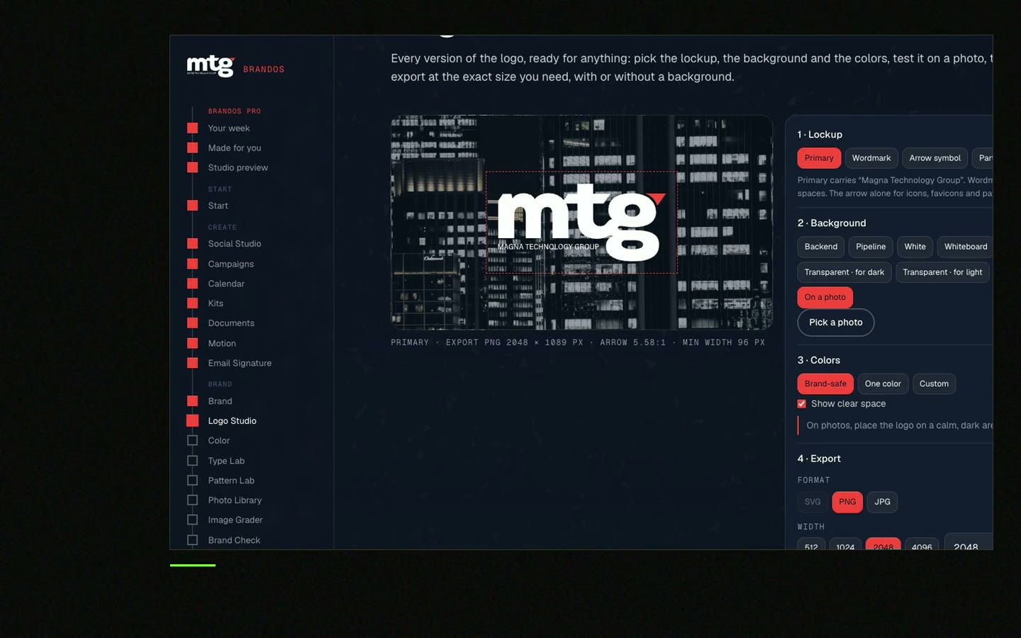
This is a real tool from a real Brand OS Portal, on the MTG brand. Pick moving or still, colour, how many and how big. The pattern comes from the brand itself and belongs to no one else.
Watch
I made short videos of the tools. Hear me explain them, then scroll through every one at work. Real tools, on a real brand.
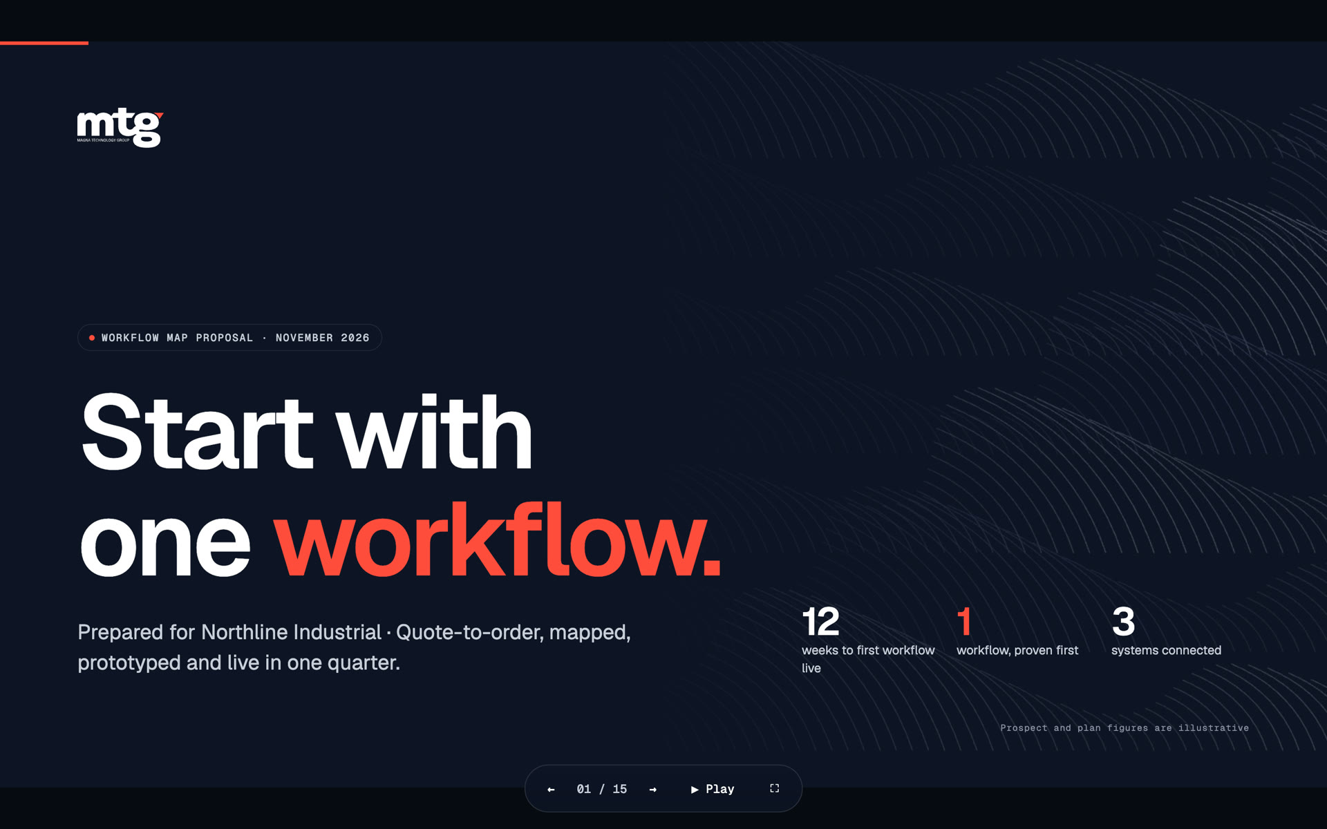
A brand pattern is a repeating design built from your own brand elements, such as the logo mark, a letter or a line style. It is used as a background.
On slide covers, social posts, banners, web page sections, print and packaging. Not behind long text.
One or two brand colours. More looks messy and hides your text.
Yes, for short text, if the pattern is soft and there is a clear area. Not behind long paragraphs.
It helps. A pattern makes a small team look consistent with very little work.
Death List Five. Five headaches, one portal. Sound on.
See what ChatGPT says about your company, and how to fix it.
You hear from me within 2 to 8 hours.
May I use cookies for Google Analytics and Clarity to see which pages help? Privacy