 Hrvatski
Texture 1
Soft grain
A fine noise over a flat colour. Adds warmth. Needs almost no space.
A good texture is felt, not seen. It adds depth behind a short line and never fights the words.
Free: your brand in 3 real designs, in 48 hours.
For B2B social posts, the textures that work are soft grain, a faint grid, a gentle glow and a brand pattern. They add depth to a flat colour while the words stay clear.
Keep contrast low, keep a clean area for the text, use brand colours, and use the same texture on most posts so people know it is you.
 By Vedran Obradović · Updated 7 November 2026
B2B readers scroll fast and want clear. Choose calm.
Texture 1
A fine noise over a flat colour. Adds warmth. Needs almost no space.
Texture 2
Thin lines at low contrast. Feels technical. Good for data and AI topics.
Texture 3
A soft light behind the headline. Pulls the eye to the words.
Texture 4
A repeat from your own logo shape. The most yours. See make a brand pattern.
Five habits that keep posts clean.
The words need a layout too. See LinkedIn post templates for B2B and social media brand guidelines.
Free tool
A texture works when it sits on top of a steady brand. Answer a few short questions. You get your brand score and the top thing to fix. It is free and runs right here.
Do this before you hit publish.
Step 1
View the post at thumb size. Can you read the headline?
Step 2
Squint. Do the words still stand out from the background?
Step 3
Screens differ. A soft texture can disappear or turn noisy.
Wondering about the photo? Read brand photography guidelines.
Leave your email. I design them by hand and send them to you within 48 hours. It costs you nothing.
I write to you from [email protected]. If you do not see it, check spam.
Short enough that people read it.
SOCIAL POST BACKGROUNDS
- Base: [brand colour, hex].
- Texture: [grain / grid / glow / pattern]. One per post.
- Strength: low. The texture must not touch the text zone.
- Text zone: [left / centre], at least [__] percent of the post.
- Colours: brand colours, no others.
- Do not use stock backgrounds, gradients from other brands, or heavy photo textures.
- Ready backgrounds live here: [link]. Ask [name] if you need a new one.
Right: [image]   Wrong: [image]
More rules for posts in the LinkedIn company page branding kit.
A background is a small job. There are a lot of them.
A team posts a few times a week. Each post needs a background in the brand look. If each one goes to a designer, you wait. If each one goes to a stock site, you look like everyone else.
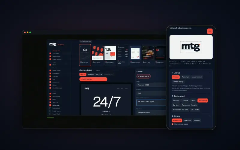
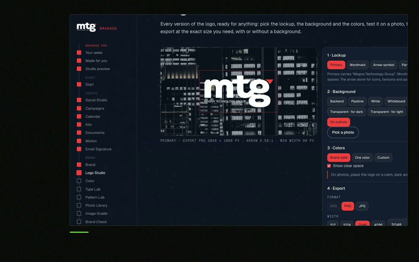
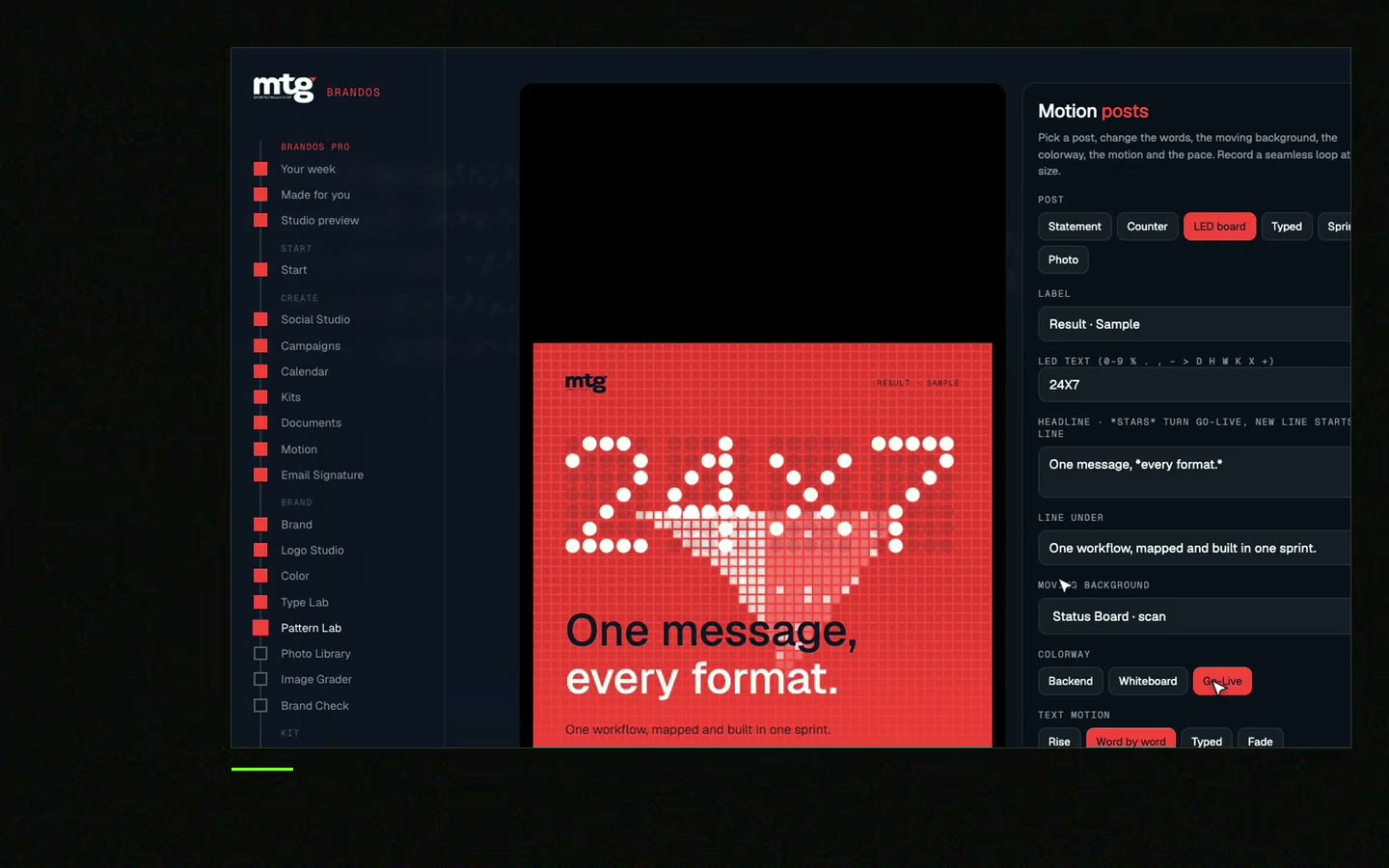
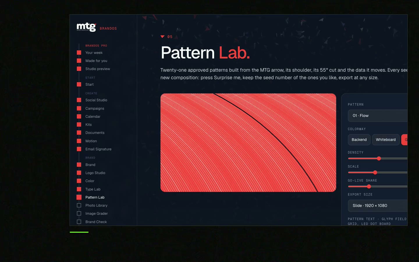
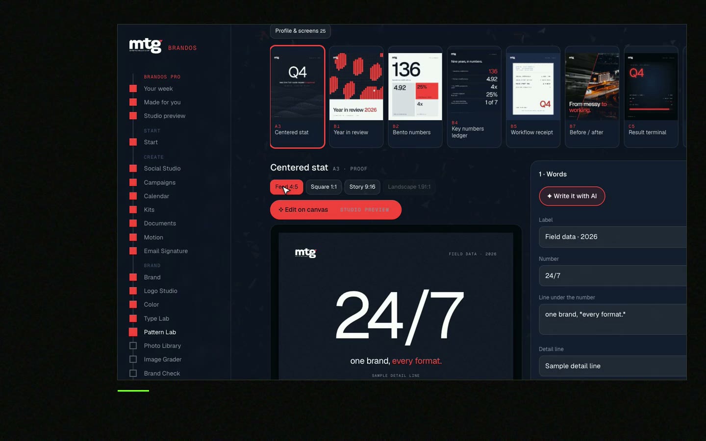
In a Brand OS Portal, the team picks a design in Social Studio, changes the words and the photo, and the design still looks right. Feed, square or story. They download the PNG. Pattern Lab makes the pattern backgrounds from your own logo shape. And Motion Posts turns one line into a video.
A designer is still right for the brand. The portal is for the daily work. See Brand OS Portal.
Tick what is true today. Your ticks stay on this device.
0 of 8 done
Next, read why a custom pattern beats stock in brand pattern vs stock background.
Try one Brand OS Portal tool
This is a real tool from a real Brand OS Portal, on the MTG brand. Pick moving or still, colour, how many and how big. The pattern comes from the brand itself and belongs to no one else.
Watch
I made short videos of the tools. Hear me explain them, then scroll through every one at work. Real tools, on a real brand.
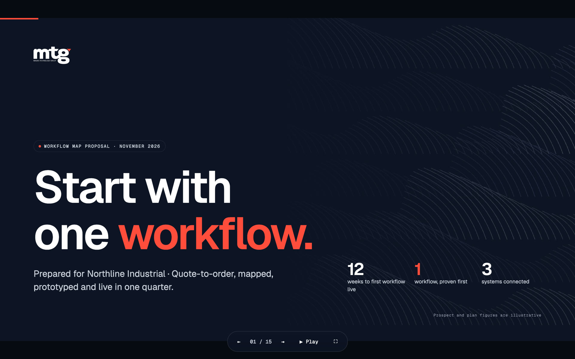
A calm one: a solid brand colour with a faint texture, grain, grid or glow, and a clear zone for the words.
Sometimes. Keep the text on a calm area and follow your photo rules. See brand photography guidelines.
Lower the texture contrast, keep a clear text zone and test the post at thumb size.
Mostly yes. A steady texture becomes part of your look. Vary the words and photos.
Yes, with a locked set of designs. Read brand templates for teams.
Death List Five. Five headaches, one portal. Sound on.
See what ChatGPT says about your company, and how to fix it.
You hear from me within 2 to 8 hours.
May I use cookies for Google Analytics and Clarity to see which pages help? Privacy