 Hrvatski
Rule 1
One banner at a time
Two banners fight each other. Pick the campaign that matters this month.
Every mail your team sends can show news. Here is how to add one banner without a messy signature.
Free: your brand in 3 real designs, in 48 hours.
An email signature campaign banner is one small image under your signature that promotes a launch, event or offer. Link it to one page and remove it when the campaign ends.
Keep it short and simple: one banner at a time, a clear action, a link with tracking, and an end date.
 By Vedran Obradović · Updated 7 November 2026
Your team sends many mails each week. Each one can carry a small message.
A banner turns normal mail into a quiet announcement. A webinar, a new product, a hiring call, a case study. People already read your mail, so they see it.
It is not an ad that interrupts. It sits at the bottom and invites a click. That is why it works for B2B teams that send one-to-one mail all day.
Before you add one, fix the basics. Read the signature mistakes list and the company email signature guide.
Follow these and the banner helps instead of annoying.
Rule 1
Two banners fight each other. Pick the campaign that matters this month.
Rule 2
Read, register, book. Not three choices.
Rule 3
It should be about the width of the signature, and short. Do not let it take over the mail.
Rule 4
Some apps block images. Add short text above the banner too, like "Join our webinar on 14 December".
Rule 5
A page made for the campaign, not your homepage.
Rule 6
Add a campaign tag, so you see how many clicks came from signatures.
Rule 7
Write the date in the calendar. A stale banner is worse than none.
Free tool
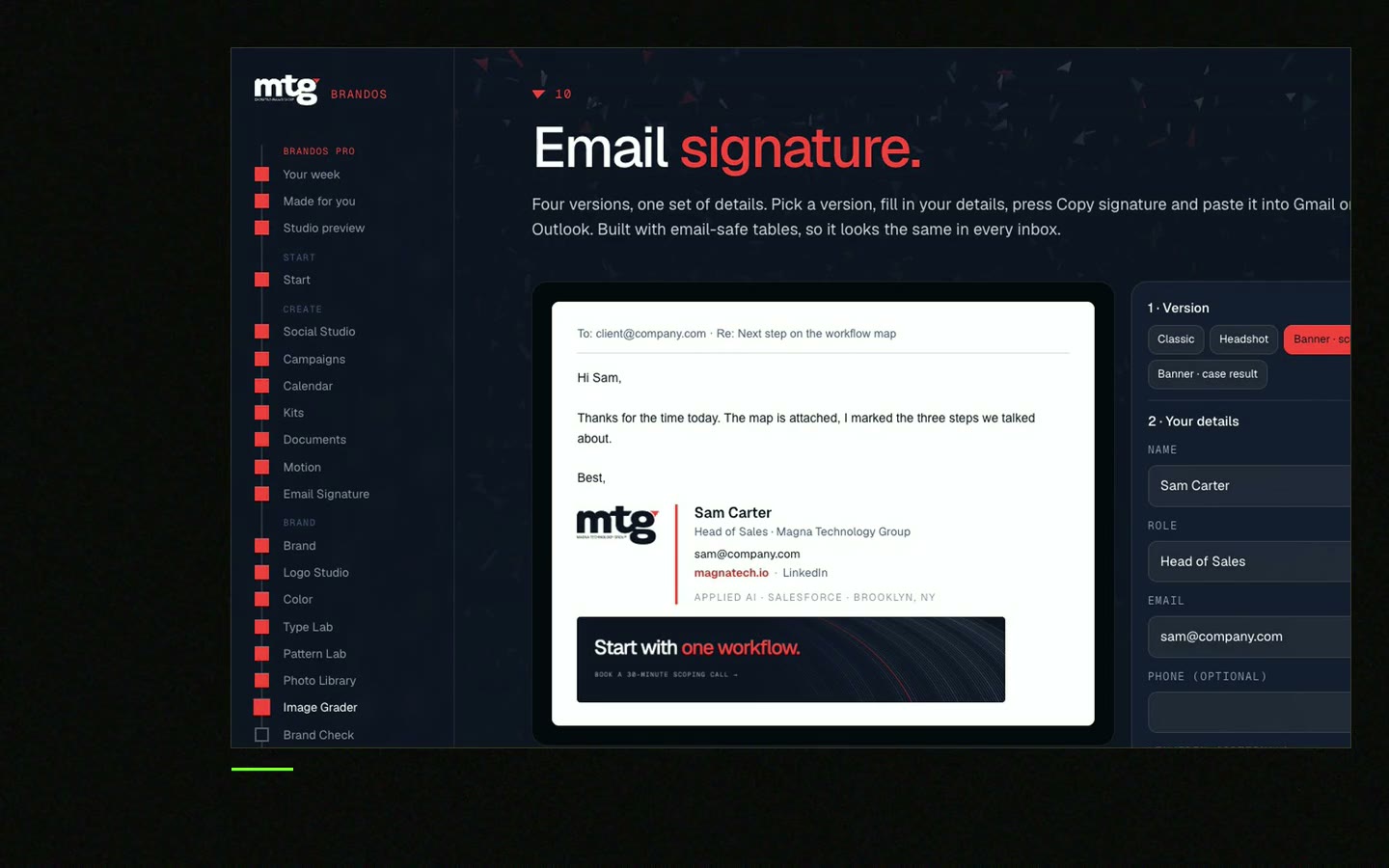
A banner sits on top of a good signature. Type a name and a role and see one layout for everyone. It is free and runs right here.
Fill it in before you design. It takes five minutes.
SIGNATURE BANNER BRIEF - [CAMPAIGN NAME]

Goal: [e.g. 50 registrations for the December webinar]
Who sees it: [everyone / sales team alone]
Action: [Register / Read / Book]
Words on the banner (max 8): [e.g. "Webinar: 5 AI brand mistakes"]
Words above the banner (1 line): [e.g. Join us on 14 December]
Link: [campaign page URL + tracking tag]
Picture: [brand colours, logo small, one clear headline]
Start date: [date]
End date: [date]
Owner: [name]
After the end: remove the banner from every signature
The same brief works for a social post. See the product launch brand assets checklist for the other pieces of a launch.
Leave your email. I design them by hand and send them to you within 48 hours. It costs you nothing.
I write to you from [email protected]. If you do not see it, check spam.
The hard part is not the picture. It is changing 20 signatures on the same day.
Step 1
Use brand colours and fonts. Check it looks fine small.
Step 2
Same width, same place, for everyone.
Step 3
One message with the steps. See the Gmail and Outlook install guide.
Step 4
Ask three people for a test mail. Check phone and dark mode.
Step 5
Look at the page visits from the tagged link after a week.
Step 6
On the end date, send the clean signature again.
Tick before you send the new signature to the team.
0 of 8 done
A banner for every launch, a signature for every person, a post for every news item. That is a lot of small design jobs. Brand OS Portal lets your team make them without waiting for a designer. A designer is still right for strategy and a new identity. The Portal is for the daily work after. Also see the LinkedIn company page kit.
Try one Brand OS Portal tool
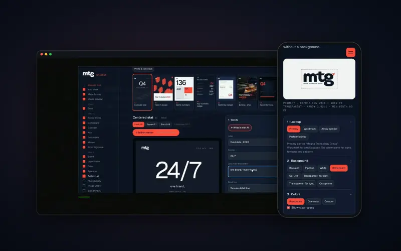
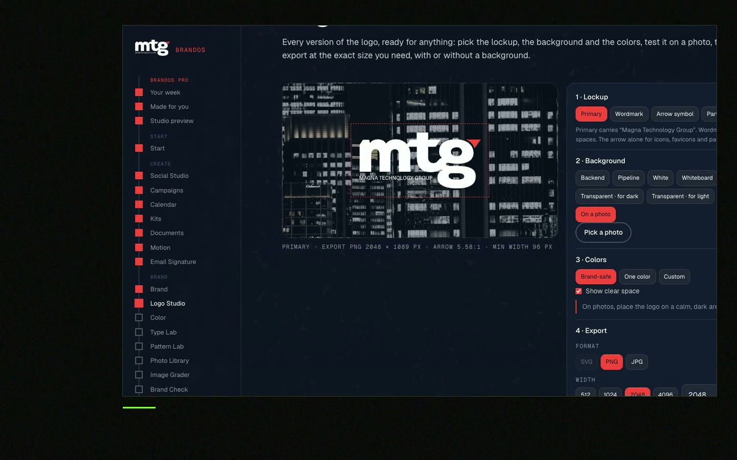
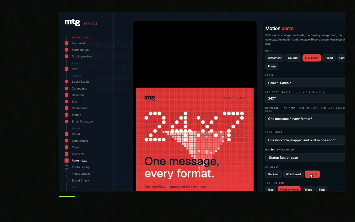
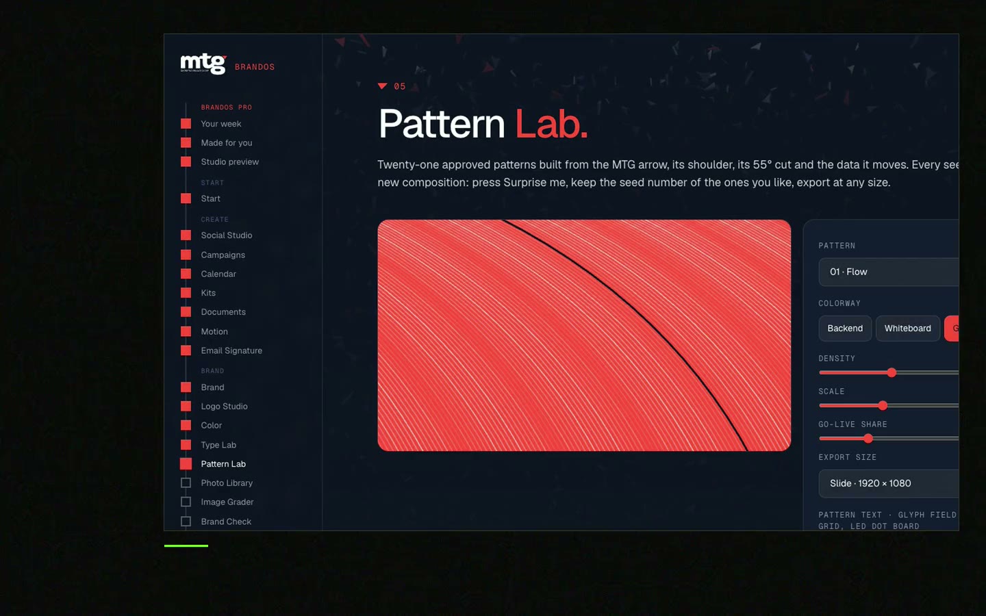
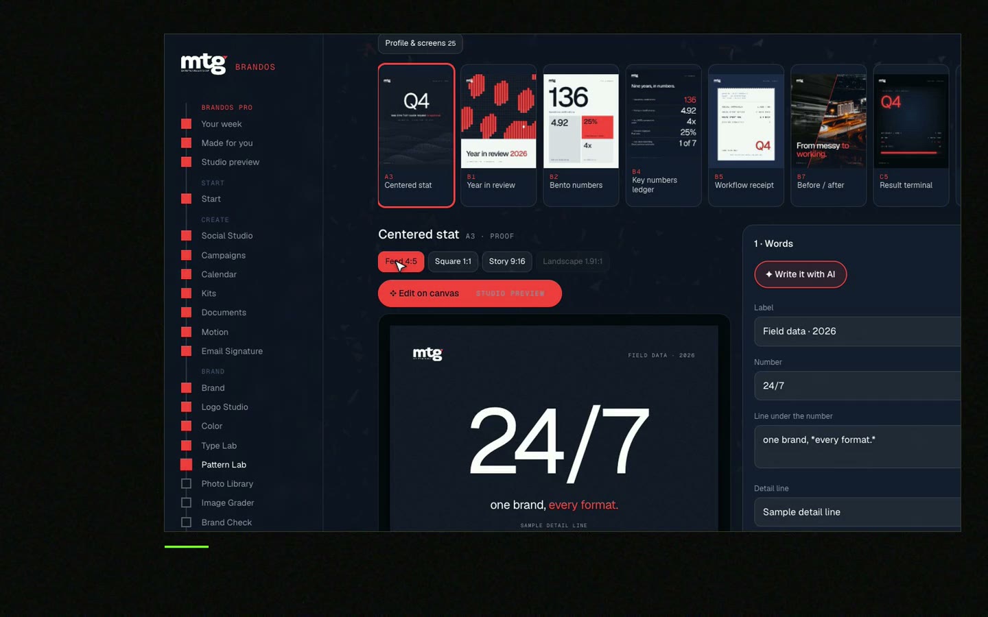
This is a real tool from a real Brand OS Portal, on the MTG brand. Pick a design and change the words. The look stays right.
Watch
I made short videos of the tools. Hear me explain them, then scroll through every one at work. Real tools, on a real brand.
Keep it wide and short, about the width of your signature. Check how it looks on a phone before you send it to the team.
They give you a small, quiet message in every mail. Add a tracking tag to the link and you can see how many visits came from signatures.
Just as long as the campaign runs. Set an end date at the start and remove the banner on that day.
You can, but one works better. Two banners split attention and make the signature look messy.
Use your brand colours, fonts and logo rules. A tool that locks the brand, like Brand OS Portal, helps non-designers keep it right.
Death List Five. Five headaches, one portal. Sound on.
See what ChatGPT says about your company, and how to fix it.
You hear from me within 2 to 8 hours.
May I use cookies for Google Analytics and Clarity to see which pages help? Privacy