 Hrvatski
Mistake 1
The logo is too big
A tall logo pushes the real message down. Keep it small, about the height of two lines of text.
Most teams have five different signatures. These ten mistakes are the usual reason, and each one has a simple fix.
Free: your brand in 3 real designs, in 48 hours.
The most common email signature mistakes are a huge logo, a different font in every signature, too many links, a missing role or phone line, and an old logo that nobody replaced.
Fix them by making one signature for the whole team. Lock the logo, font and layout. Let each person change just the name, role and contact line.
 By Vedran Obradović · Updated 7 November 2026
Check your own signature against this list. Most teams hit at least four.
Mistake 1
A tall logo pushes the real message down. Keep it small, about the height of two lines of text.
Mistake 2
One uses blue, one uses black, one has a new font. Clients see a company with no rules.
Mistake 3
After a rebrand, old signatures live on for years. Everyone must switch on the same day.
Mistake 4
Six social icons and three links. Pick the one or two that help a customer act.
Mistake 5
Some mail apps hide images. If the name sits in the picture alone, it vanishes. Write the name as text too.
Mistake 6
People want to know who you are and how to reach you. Add a role and one contact line.
Mistake 7
A wall of grey text is rarely read. Keep it to one or two short lines.
Mistake 8
A fancy font that is not installed turns into a plain one. Use a safe font in the signature.
Mistake 9
A campaign banner from last spring says the team forgot the signature. Update it or remove it.
Mistake 10
Nobody is in charge, so nothing gets fixed. Give one person the job.
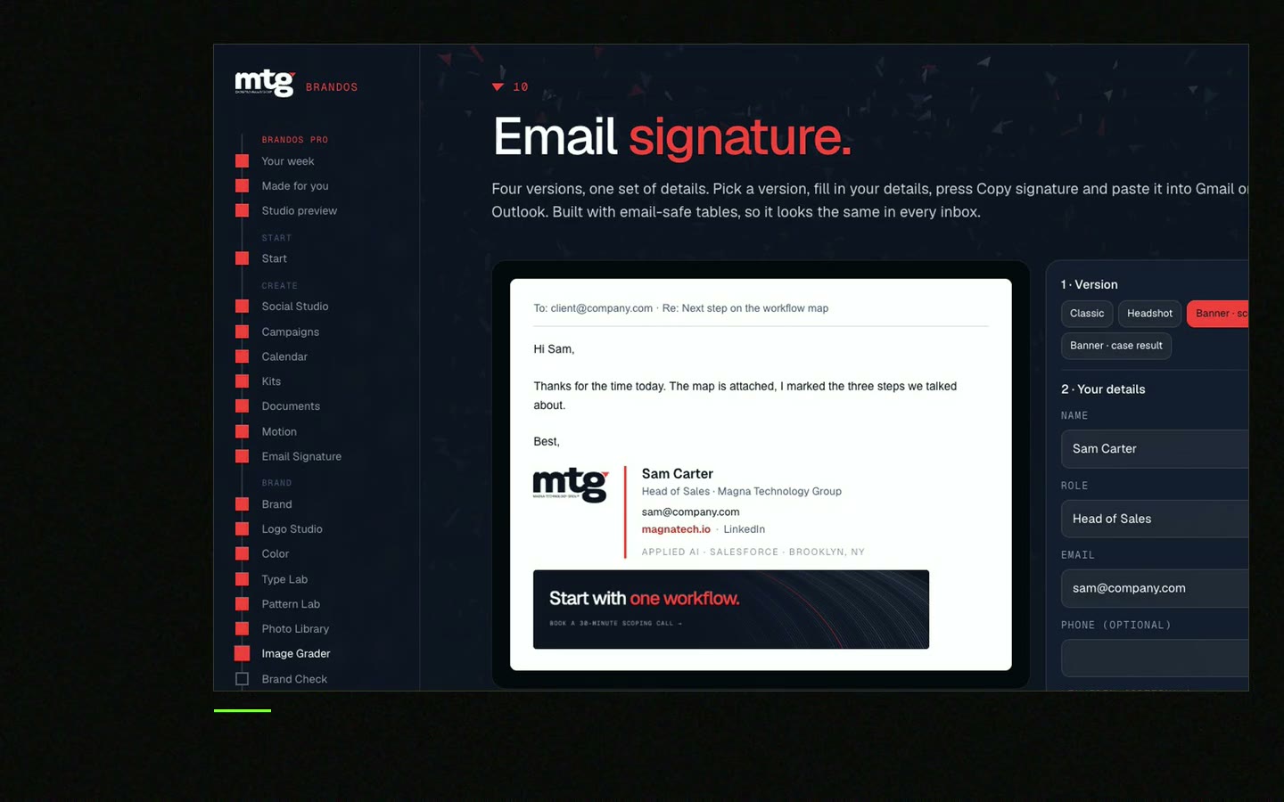
A signature is a tiny ad that goes out with every mail. It is seen more often than your homepage.
Think about who gets your mail: customers, partners, investors, new hires. They all see your signature. If it looks messy, it tells them the company is messy.
If it looks calm and the same for every person, it tells them the team is organised. That is a good feeling to leave in a customer's inbox.
Your signature should follow the same rules as your posts and slides. Read the company email signature guide for what to include, and the brand rules checklist for the rest.
Free tool
Type a name and a role. You get a signature that follows one layout for everyone. It is free and runs right here.
Send it to your team. It ends the "which logo do I use" mails.
EMAIL SIGNATURE RULES - [COMPANY]

Layout
- Name on line 1, bold
- Role and company on line 2
- One contact line: [phone] or [booking link], not both
- Website on line 4

Logo
- Use the logo file from [link to brand files]
- Height: about two lines of text
- Always link the logo to [website]
- Never stretch it, never recolour it

Text
- Font: [safe font, e.g. Arial or Calibri]
- Size: [e.g. 12 px], colour: [dark grey hex]
- Company name is written as text, not just in the picture

Never
- No quotes, no jokes, no extra icons
- No more than 2 links
- No legal text longer than 2 lines

Banner (optional)
- One banner at a time, from [campaign owner]
- Remove it on [end date]

Owner: [name] - ask before you change anything
The same idea works for every format. See how to build brand templates your team will use.
Leave your email. I design them by hand and send them to you within 48 hours. It costs you nothing.
I write to you from [email protected]. If you do not see it, check spam.
You do not need a big project. You need one owner and one hour.
Step 1
Ask five people to send you a screenshot of their signature. You will see the mess fast.
Step 2
Use the rule sheet above. Decide, do not vote.
Step 3
Make one master signature with the right logo and fonts.
Step 4
Name, role, contact line. Nothing else changes.
Step 5
Each person pastes the signature into their mail app. The Gmail and Outlook install guide shows how.
Step 6
Ask a friend to mail you. Look at it on a phone too.
Tick what is true today. Your ticks stay on this device.
0 of 10 done
The hard part is not making it once. It is keeping it right for every new hire. Brand OS Portal gives each person the right signature, plus posts, banners and slides, from one link. That stops you paying a designer to fix them one by one. A designer is still right for a new identity. The Portal is for the daily work after.
Try one Brand OS Portal tool
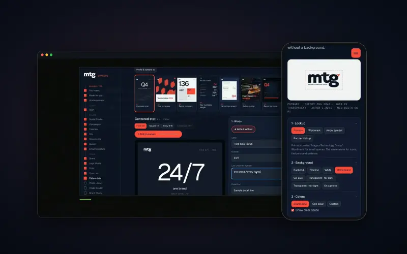
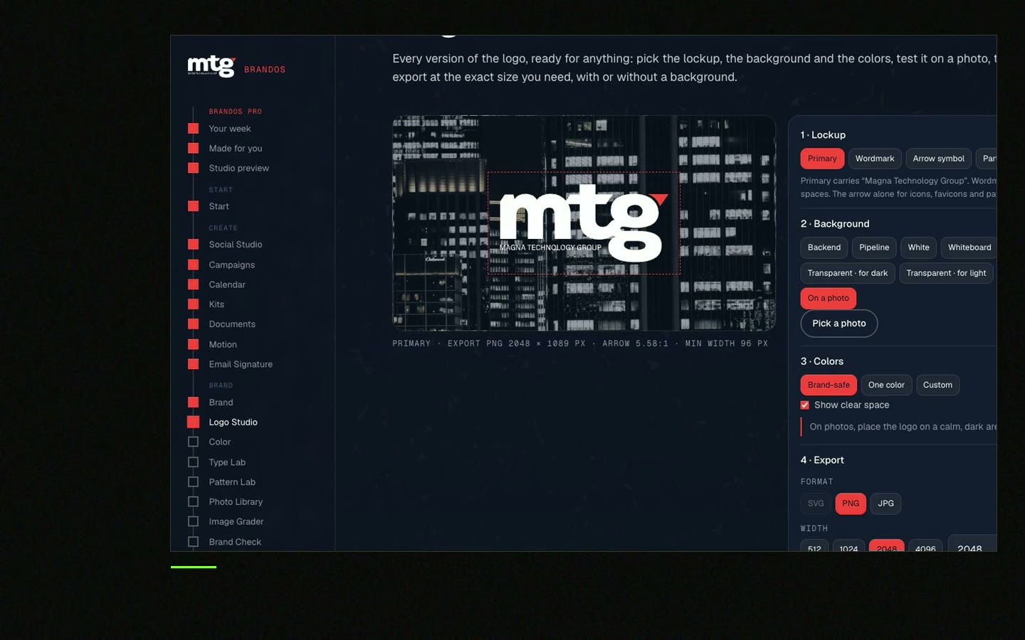
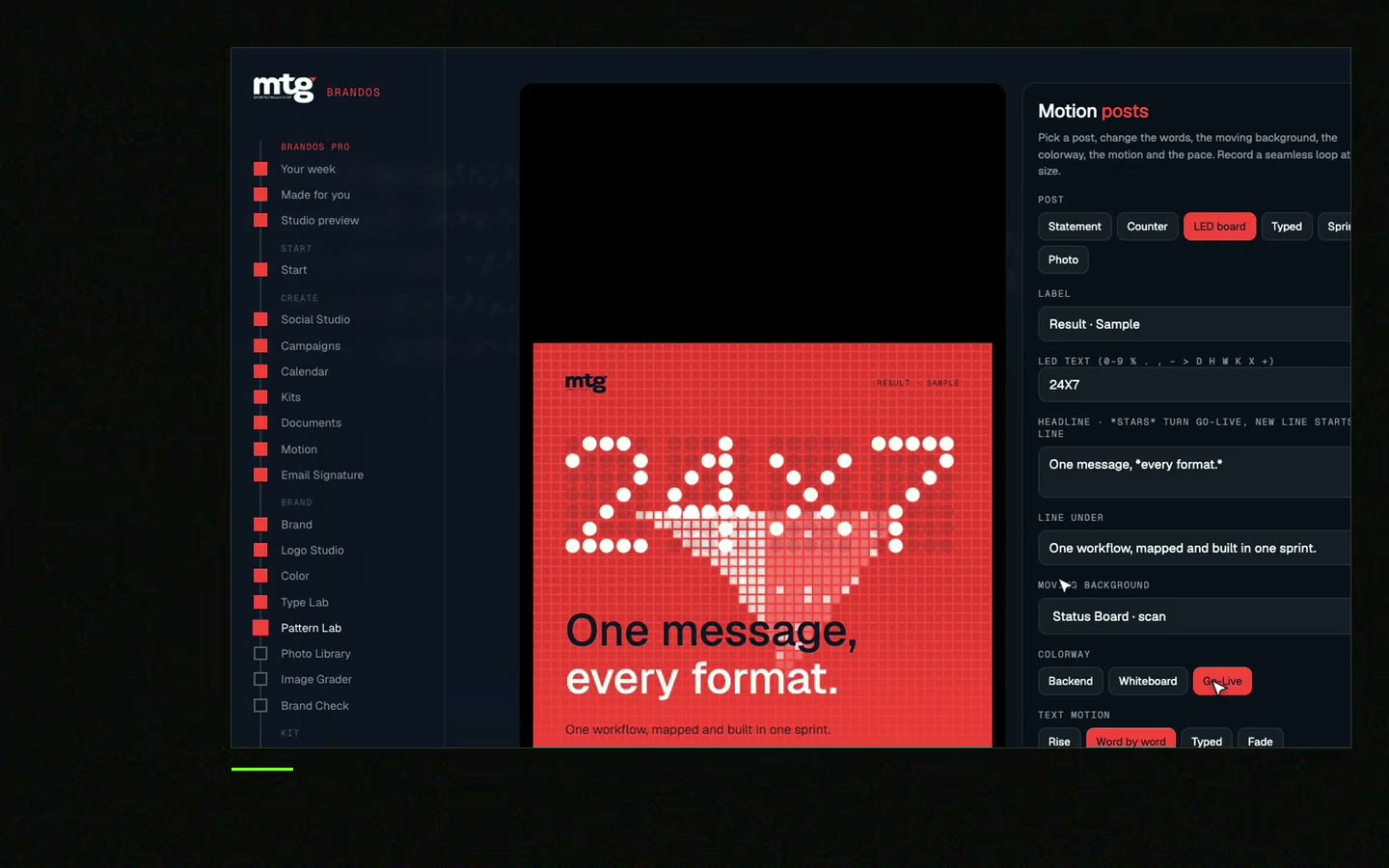
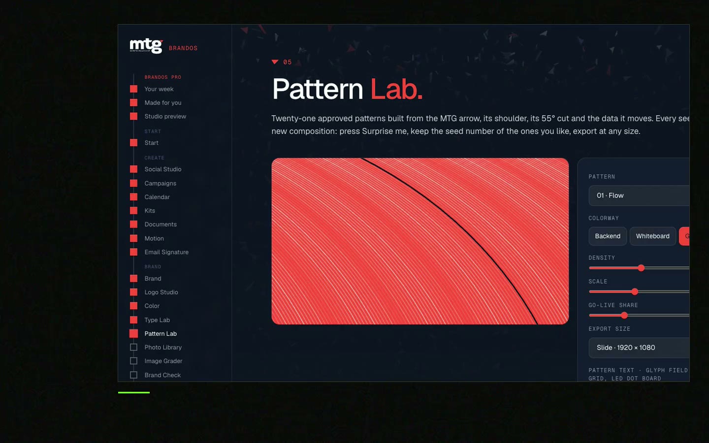
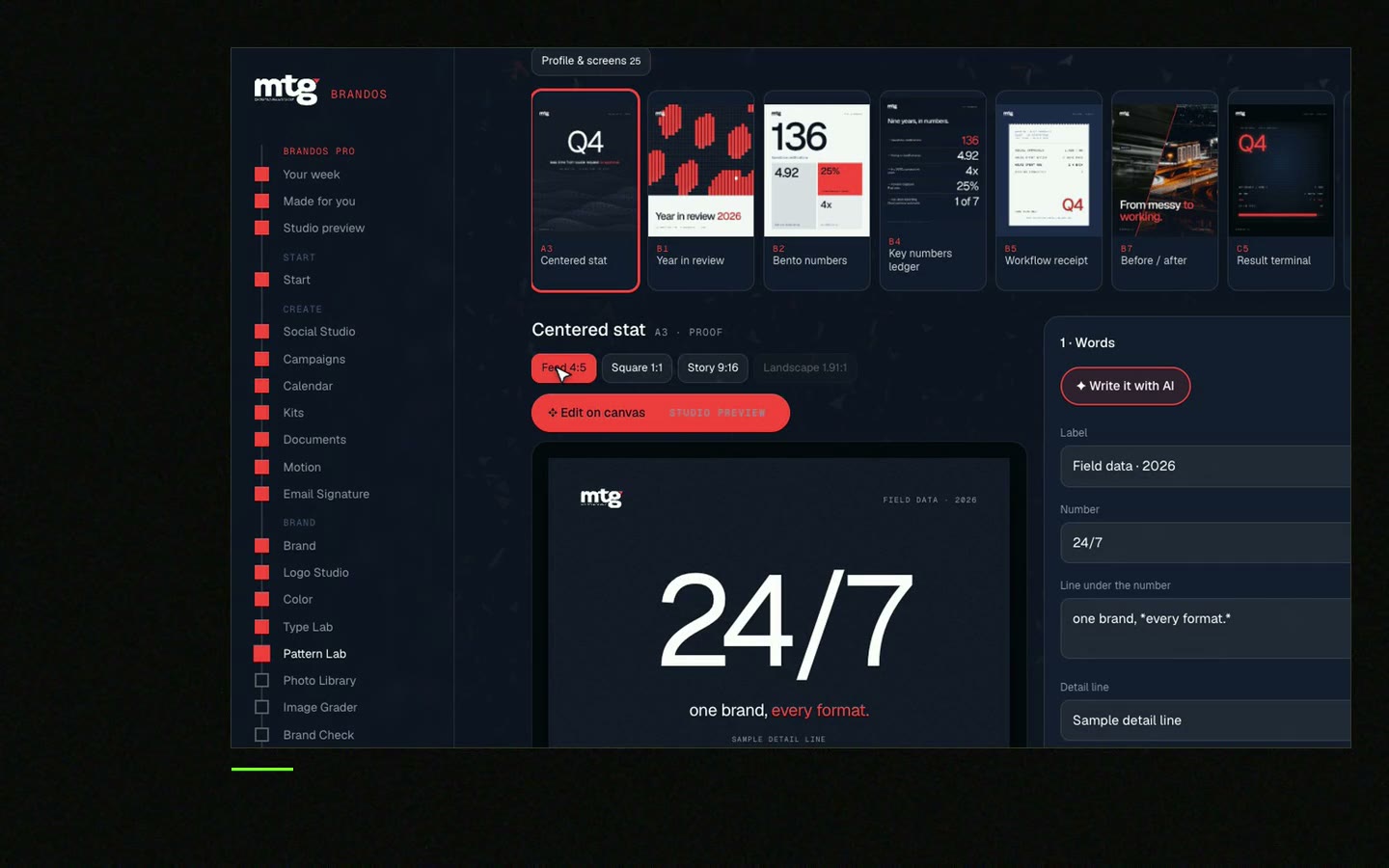
This is a real tool from a real Brand OS Portal, on the MTG brand. Change the words. The design stays on brand, just like a good signature.
Watch
I made short videos of the tools. Hear me explain them, then scroll through every one at work. Real tools, on a real brand.
Skip long quotes, many icons, big images and long legal text. Keep a name, role, company, one contact line and one link.
Small. About the height of two lines of text is a good rule. A huge logo pushes your message down and can slow loading.
Fonts, image blocking and dark mode change how a signature looks. Use a safe font, write the company name as text and test on a phone.
One or two. Pick the links that help a reader act, like your website or a booking link.
Make one master layout with a rule sheet, fill in each person, and send the install steps. Or use a signature builder that keeps the layout locked. See the team email signature generator.
Death List Five. Five headaches, one portal. Sound on.
See what ChatGPT says about your company, and how to fix it.
You hear from me within 2 to 8 hours.
May I use cookies for Google Analytics and Clarity to see which pages help? Privacy