 Hrvatski
Mistake 1
The default image
No banner says you did not care. Fix: put up a simple on-brand banner today.
Nine mistakes I see on LinkedIn profiles of founders and teams. Each one takes minutes to fix.
Free: your brand in 3 real designs, in 48 hours.
The most common LinkedIn cover photo mistakes are the default image, the wrong size, text hidden by the profile photo, small words, too many messages and a banner that does not match the company brand.
The right size for a personal profile is 1584 x 396 px. Below are nine mistakes with a fix for each, and a checklist to run on your own profile.
 By Vedran Obradović · Updated 7 November 2026
Check your own profile as you read.
Mistake 1
No banner says you did not care. Fix: put up a simple on-brand banner today.
Mistake 2
A stretched or cut banner looks cheap. Fix: use 1584 x 396 px.
Mistake 3
Your profile photo covers the left side. Fix: move key words toward the middle and right.
Mistake 4
Most people look on a phone. Fix: make text big enough to read at arm length.
Mistake 5
Three offers say nothing. Fix: one idea per banner.
Mistake 6
A handshake or a skyline helps nobody. Fix: use your pattern, your product or one clear line.
Mistake 7
The page, site and profile look unrelated. Fix: use brand colours and fonts.
Mistake 8
A launch banner from last year. Fix: swap it after the date.
Mistake 9
Every person has a different style. Fix: one tool for the team.
Do this on your own profile now.
Sizes for every banner and photo are in LinkedIn banner size for company and team.
Free tool
A clean banner starts with a clear brand. Answer a few short questions and get your score and what to fix next.
Replace the default image with one line:
I help [who] [get what].

Replace a stock photo with:
Your brand pattern + your name + your role.

Replace many offers with:
One offer. One reader. One next step.

Before you upload:
- Size 1584 x 396 px
- Key words in the middle or right
- Brand colours and fonts
- Checked on a phone
More ideas in LinkedIn banner ideas for founders and what to write on a LinkedIn banner.
Leave your email. I design them by hand and send them to you within 48 hours. It costs you nothing.
I write to you from [email protected]. If you do not see it, check spam.
One bad banner is small. Twenty different ones are a pattern.
When every person makes their own banner, buyers see a company with no standard. The fix is not a stricter email. It is one tool with the brand inside. See matching banners for the whole team.
This is what a brand portal is for. The team stops asking for files and starts making. A designer is still right for strategy and a new identity. The portal handles the daily work after that.
0 of 9 done
Try one Brand OS Portal tool
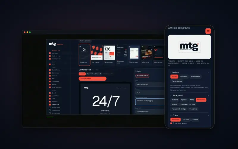
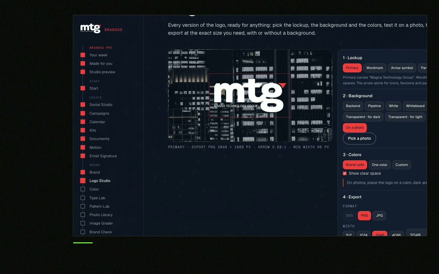
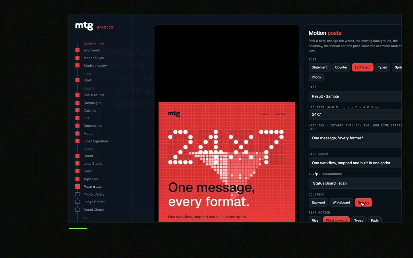
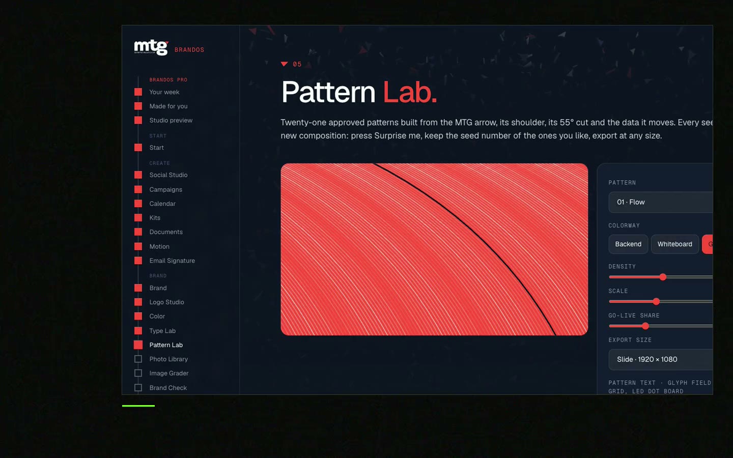
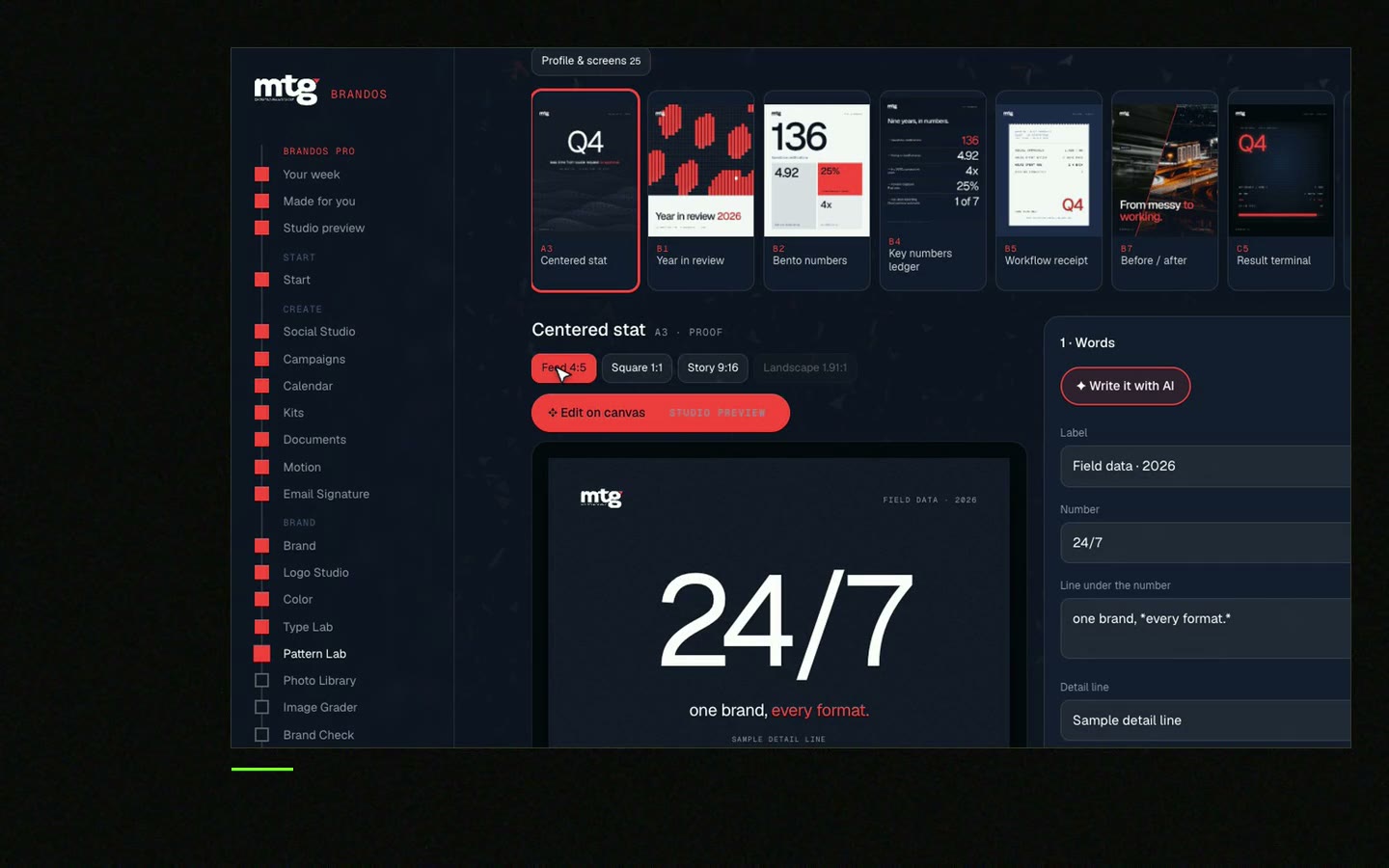
This is a real tool from a real Brand OS Portal, on the MTG brand. It makes the right size with your brand inside.
Watch
I made short videos of the tools. Hear me explain them, then scroll through every one at work. Real tools, on a real brand.
For a personal profile, 1584 x 396 px.
Usually the image is too small and was stretched. Make it at 1584 x 396 px from the start.
It sits over the left side, so keep key words toward the middle and right. Test on your phone.
Short text on a calm background, or your brand pattern, works well. Avoid stock photos that mean nothing.
Yes. It is the biggest part of your profile that people see. A clear one tells people what you do in two seconds.
Give them a banner tool with your brand inside. See Brand OS Portal.
Death List Five. Five headaches, one portal. Sound on.
See what ChatGPT says about your company, and how to fix it.
You hear from me within 2 to 8 hours.
May I use cookies for Google Analytics and Clarity to see which pages help? Privacy