 Hrvatski
Tip 1
Pick one goal
Meeting, demo, or call. The whole brochure points to it.
A good B2B brochure is short, clear and easy to skim, with one job: a yes to the next step.
Free: your brand in 3 real designs, in 48 hours.
Good B2B brochure design comes down to ten rules: one goal, a clear cover, short headings, one idea per page, real proof, few fonts, space around text, real photos, a clear next step and a print check.
Plan the pages before you design. Write the words before the layout. Then lay them out in your brand colours and fonts, and check the file before it goes to print.
 By Vedran Obradović · Updated 7 November 2026
Read them once. Then use them as a review list.
Tip 1
Meeting, demo, or call. The whole brochure points to it.
Tip 2
Logo, a clear promise and one strong image. A buyer decides in seconds.
Tip 3
A reader should get the story from the headings alone.
Tip 4
If a page has two ideas, split it.
Tip 5
Customer names, approved results and quotes. Skip words like "world-class".
Tip 6
One for headings, one for text. Sizes that you can read at arm length.
Tip 7
Margins, space between lines, short columns. White space looks calm and sure.
Tip 8
Your team, your product, your place. Stock smiles look like everyone else.
Tip 9
A link, a phone number or a 15-minute call. Not five options.
Tip 10
Colours, bleed, fonts and the logo file. See the checklist below.
Six pages fold well and cover what a buyer asks. Fill the brackets.
PAGE 1 COVER: logo, promise in 10 words, one strong image
PAGE 2 THE PROBLEM: what your buyer struggles with, in their words
PAGE 3 WHAT YOU DO: your offer in 3 clear parts, one line each
PAGE 4 PROOF: 2 customer stories or approved results, with names
PAGE 5 HOW TO START: 3 steps, how long each takes, who does what
PAGE 6 NEXT STEP: one action, contact, website, logo

RULES FOR EVERY PAGE
- one idea
- heading you can understand alone
- text under 60 words
- one image or one number
A brochure is long-lived, so the words must match your voice. Start with brand voice guidelines. For a shorter leave-behind use the sales one-pager template.
Free tool
Print shows every flaw. Answer a few short questions. You get a brand score and the top thing to fix before you spend on print. It is free.
You should not guess any of these. They are in your guidelines.
| Brochure part | Take it from | Common mistake |
|---|---|---|
| Logo | Logo files and clear space rules | A small low-quality logo from a website |
| Colours | Your palette, with print values | Screen colours that print dull |
| Fonts | The heading and text fonts | A free font that looks close |
| Photos | Your approved photos | Stock images with a different style |
| Voice | Your tone of voice rules | Brochure talk nobody uses |
No guidelines yet? Read what to include in brand guidelines, and check which logo files you need before the printer asks for them. See also brand photography guidelines.
Leave your email. I design them by hand and send them to you within 48 hours. It costs you nothing.
I write to you from [email protected]. If you do not see it, check spam.
Mistakes in print cannot be undone. Spend ten minutes here.
0 of 10 done
The printer sets the technical needs, so ask them before you finish the file.
You may make a brochure once a year. You will make posts, sheets and decks every week.
That is where costs of waiting add up: every small request goes to a designer. A Brand OS Portal lets your team make the small things itself, in the brand, so the designer time goes where it counts. A designer is still the right call for brand strategy and a new identity. Brand OS Portal is for the daily work after that.
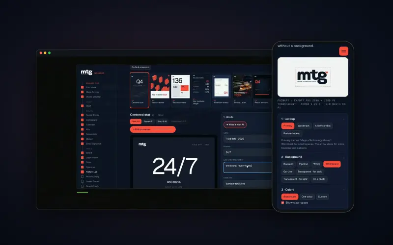
Brand OS Pro Portal. The team makes its own posts. No waiting.
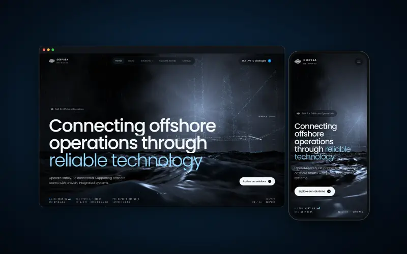
Brand OS Core Portal. The CEO writes and designs an on-brand LinkedIn post in about 3 minutes.
Next: the business proposal design template and the SaaS datasheet template.
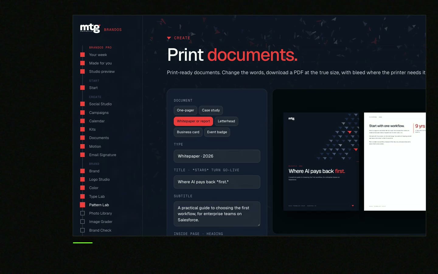
Try one Brand OS Portal tool
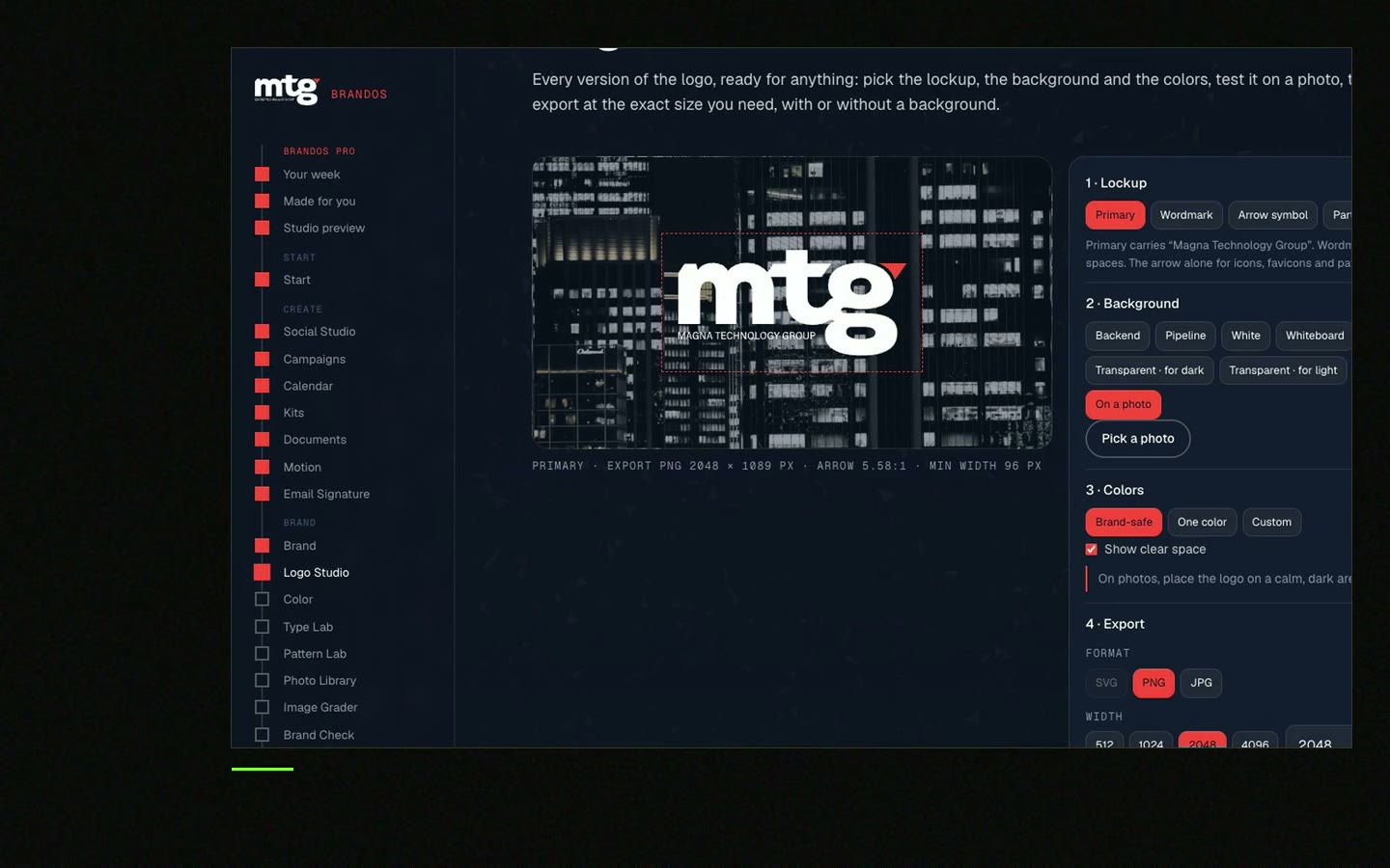
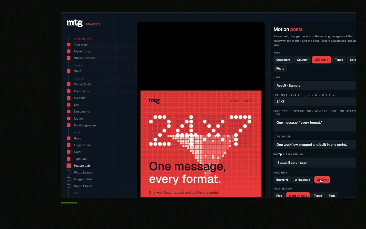
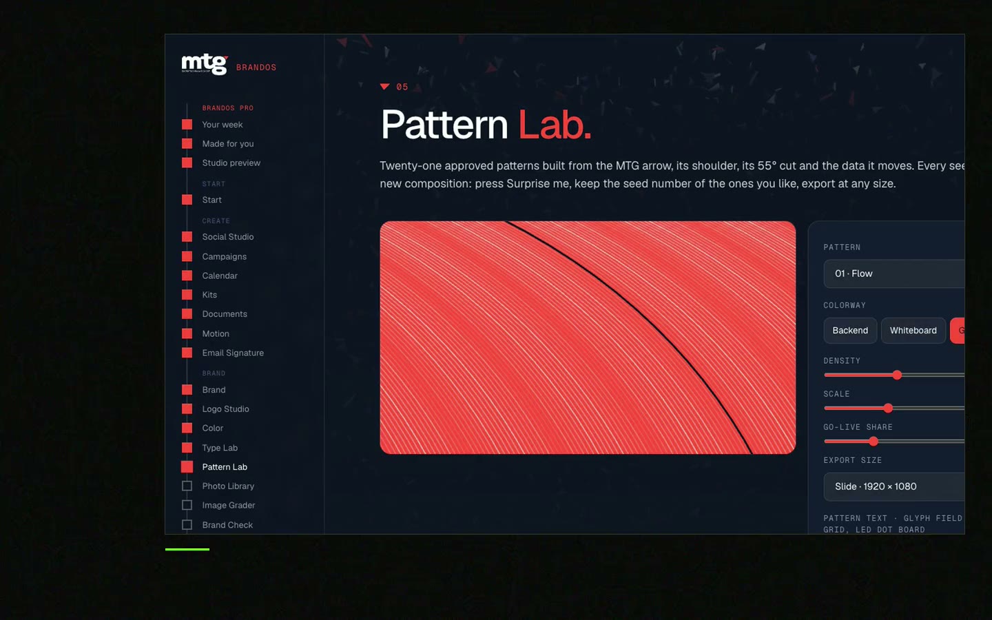
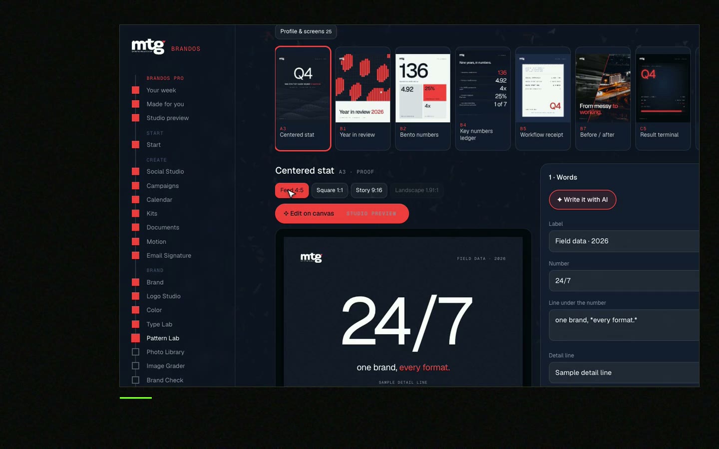
This is a real tool from a real Brand OS Portal, on the MTG brand. A brochure and a post should look like the same company. See how the design holds when the words change.
Watch
I made short videos of the tools. Hear me explain them, then scroll through every one at work. Real tools, on a real brand.
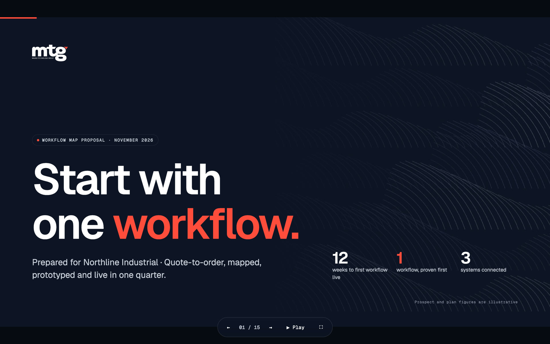
One clear goal, short headings, one idea per page, real proof, a few fonts, space around text, real photos and one next step.
Many teams use four to eight pages. Six pages fold well and cover the problem, the offer, proof and the next step.
It depends on the printer and the country. Many B2B teams use A4 or US Letter folded. Ask your printer before you design.
Use real photos of your team and product when you can. Stock photos make you look like everyone else.
Take the logo, colours, fonts and voice from your guidelines, lock them in a layout and have one person check the file.
Death List Five. Five headaches, one portal. Sound on.
See what ChatGPT says about your company, and how to fix it.
You hear from me within 2 to 8 hours.
May I use cookies for Google Analytics and Clarity to see which pages help? Privacy