 Hrvatski
Idea 1
Grid of dots
Calm and clear. Good for data, security and infrastructure. Change dot size to show depth.
A pattern gives your tech brand a look people know in one second. Here are six ideas, the rules and a checklist.
Free: your brand in 3 real designs, in 48 hours.
A good geometric pattern for a tech brand is built from one simple shape, repeated with a clear rhythm, in two or three brand colours. The strongest source for that shape is your own logo.
Below are six pattern ideas, five rules that keep a pattern on brand, a brief you can copy and a checklist. Patterns that come from generic stock shapes make you look like everyone else.
 By Vedran Obradović · Updated 7 November 2026
Most tech brands have a logo, one colour and a lot of white space. A pattern fills the gap.
A logo is small. It sits in a corner. A pattern can fill a slide, a banner, a booth wall or the back of a card. People see it and know whose it is, even without the logo.
This matters most for B2B tech and AI. Many of these brands look alike: dark screen, glow, gradient. Read why AI startups look the same. A pattern built from your own shape is a simple way out.
Pick one. Do not mix three.
Idea 1
Calm and clear. Good for data, security and infrastructure. Change dot size to show depth.
Idea 2
Parallel or crossing lines. Feels exact, like a blueprint. Works well on dark and light.
Idea 3
Cut one part of your logo and repeat it. Rotate it in steps of 90 degrees.
Idea 4
Dots joined by thin lines. Fits networks, AI and platforms. Keep it sparse.
Idea 5
Squares, circles or triangles in layers. Feels built, like blocks of a system.
Idea 6
The same pattern, drifting a little. Good for a website hero or a video intro.
Not sure which fits? Look at your visual identity system. The shape language of your logo decides. Round logo, round pattern. Sharp logo, sharp pattern.
Free tool
A pattern adds to a clear brand. It cannot make an unclear one. Answer a few short questions and see your score and what to fix next.
Write these five lines into your one-page brand guidelines. A pattern with no rules turns into decoration that every person changes a little.
Leave your email. I design them by hand and send them to you within 48 hours. It costs you nothing.
I write to you from [email protected]. If you do not see it, check spam.
Send it to a designer, or use it to decide for yourself.
Pattern brief for [company]

Base shape: [part of our logo, or a simple shape that matches it]
Style: [dots / lines / tiles / nodes / stacked shapes]
Colours: [colour 1], [colour 2], optional [colour 3]
Feeling: [calm / exact / technical / warm]
Where it is used: [website hero, slides, banners, event wall, packaging]
Where it is never used: [behind the logo, behind body text]
Smallest size: [for example, still readable on a phone]
Moving version: [yes or no, slow drift, nothing fast]
Files needed: [PNG, SVG, video loop]
Need the full identity before that? That is a job for a designer. See brand identity. The portal is for the daily work that comes after.
Here is where most teams get stuck.
The pattern exists. It sits in a folder. Marketing needs it on a banner. Sales needs it on a slide. Someone asks the designer. The designer is busy. It waits.
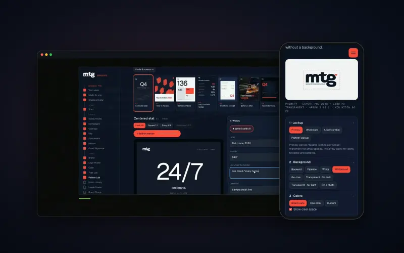
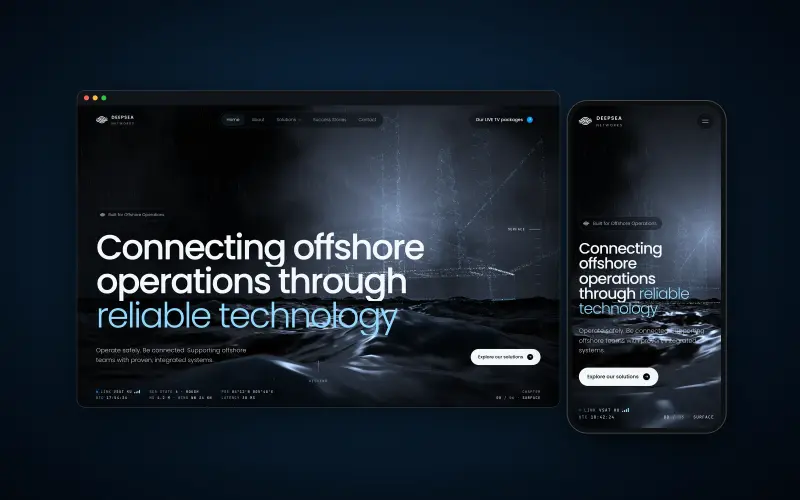
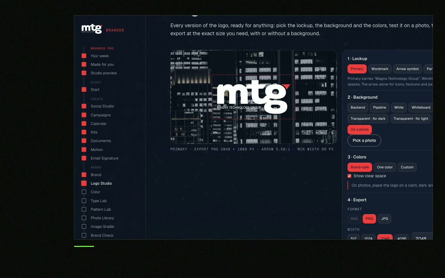
With a brand portal the team makes the pattern in the right colours and sizes itself. I built this for MTG, and the team makes its own posts now. At Deepsea Networks the CEO writes and designs an on-brand LinkedIn post in about 3 minutes.
0 of 8 done
Ticks missing? Check your brand rules too. See what to include in brand guidelines. Want it done for your brand? Book a 15 minute call.
Try one Brand OS Portal tool
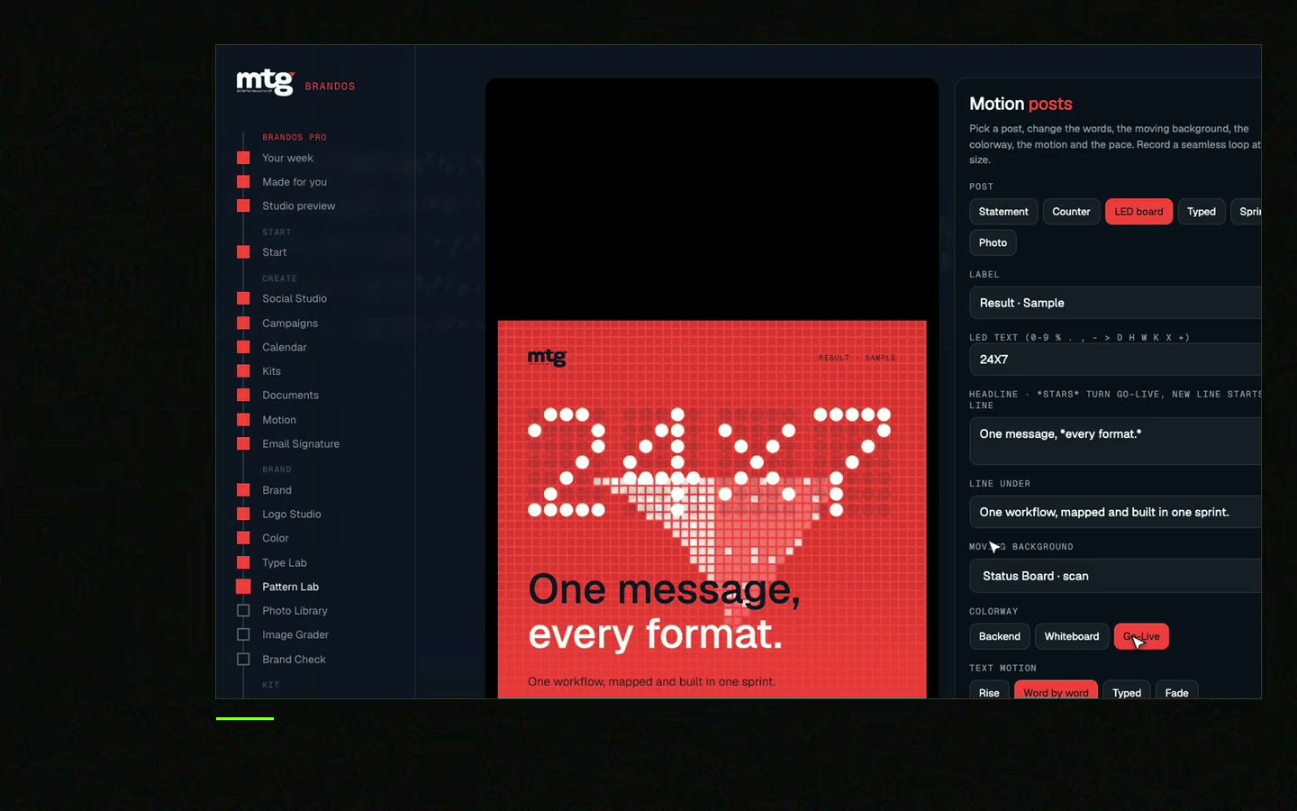
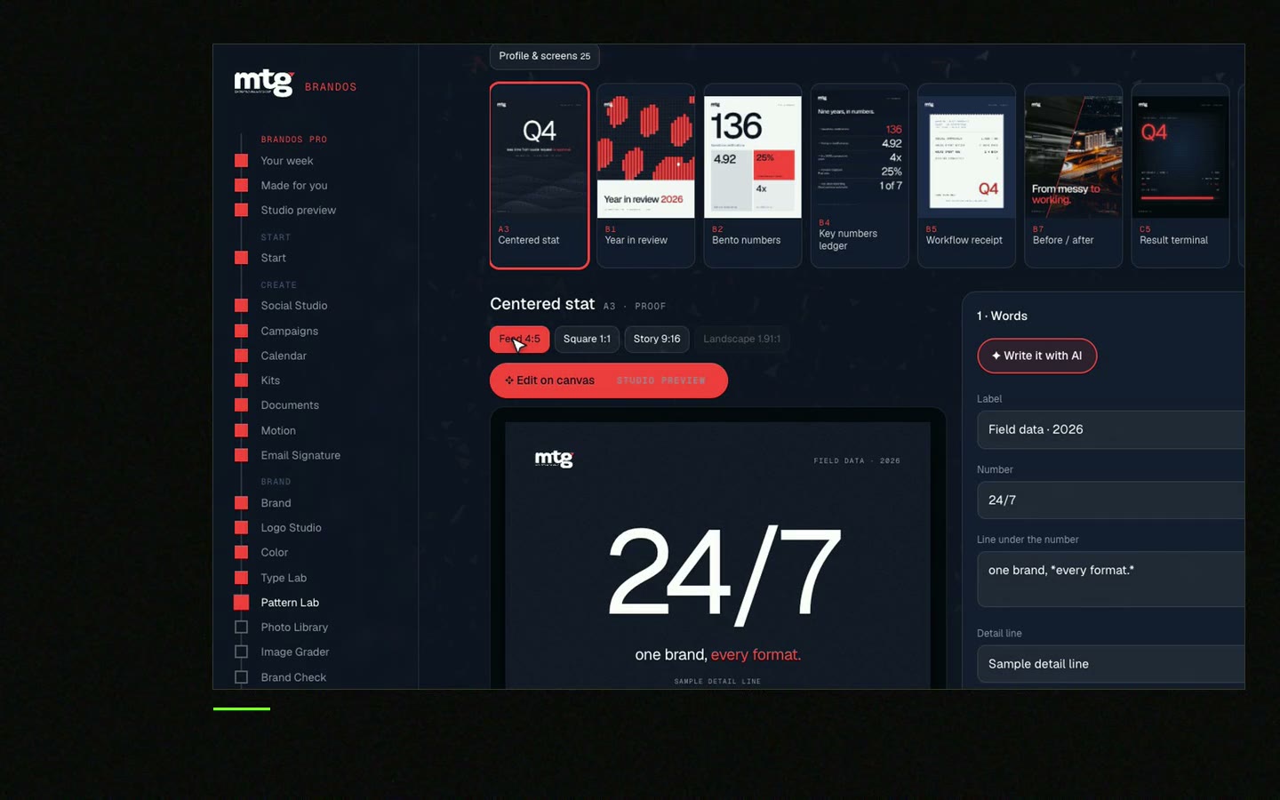
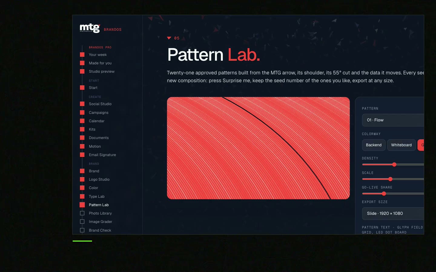
This is a real tool from a real Brand OS Portal, on the MTG brand. Choose colour, how many and how big. Moving or still. It is made for your brand.
Watch
I made short videos of the tools. Hear me explain them, then scroll through every one at work. Real tools, on a real brand.
A geometric pattern is a repeated set of simple shapes like dots, lines, squares or triangles. In branding it gives a company a look people know even without the logo.
Pick one part of the logo, like a curve or a corner. Repeat it, rotate it in steps and use two or three brand colours. Pattern Lab in a Brand OS Portal draws it from your logo shape.
On website heroes, slides, banners, event walls and covers. Keep it away from the logo and quiet behind body text.
A slow moving version works well for a website hero or a video intro. Keep a still version for print and slides.
Two or three, taken from your brand palette. More colours make it look busy and hard to reuse.
Yes, if the portal has the pattern tool. A designer is still right for strategy and a new identity. See Brand OS Portal.
Death List Five. Five headaches, one portal. Sound on.
See what ChatGPT says about your company, and how to fix it.
You hear from me within 2 to 8 hours.
May I use cookies for Google Analytics and Clarity to see which pages help? Privacy