
 Hrvatski
Underdog. From overlooked to undeniable.
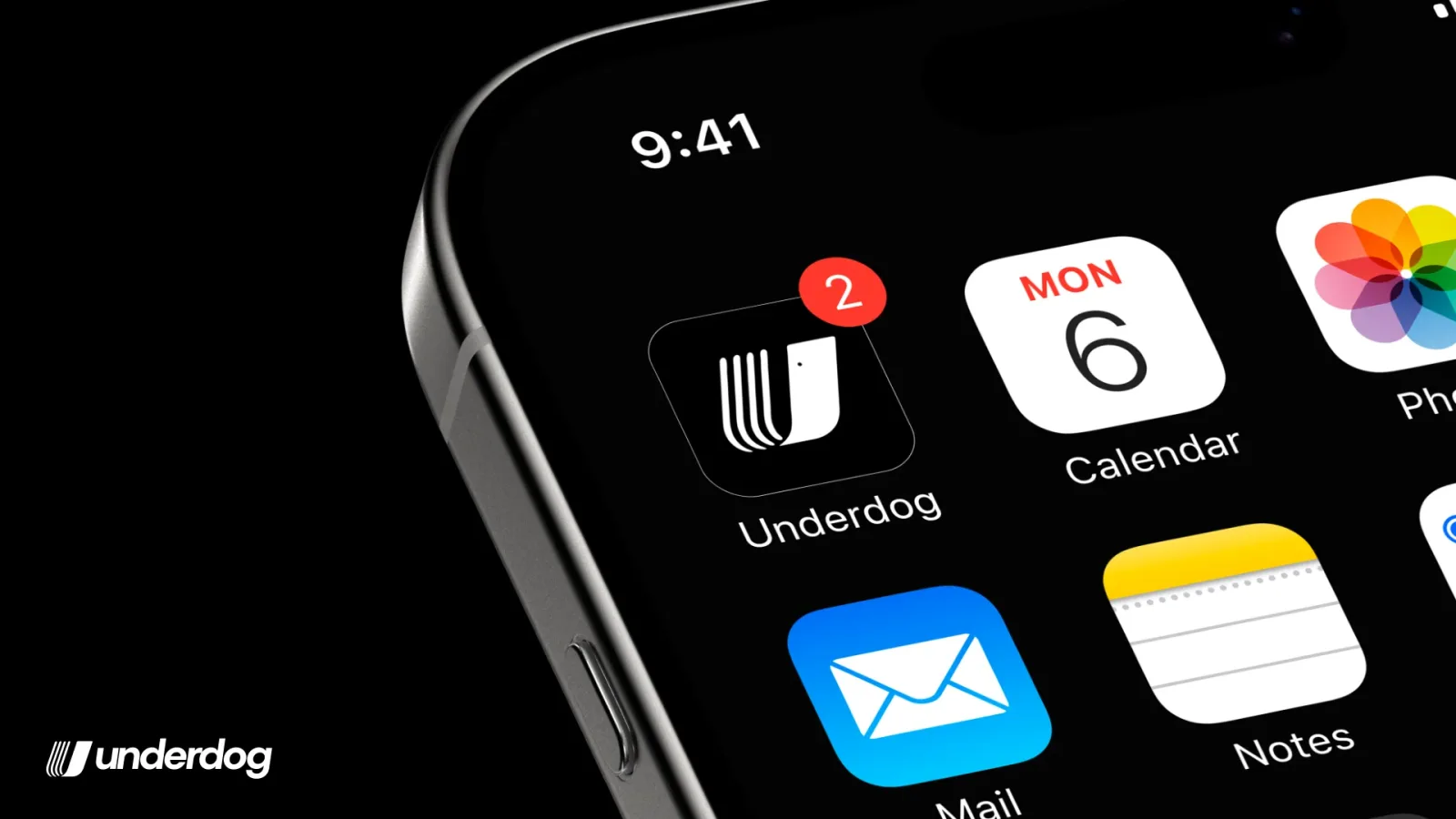
A SaaS branding project for youth sports software. I made the logo, brand guidelines, app icon and website visuals for Underdog. It is a US platform that gives independent youth sports trainers the tools big clubs always had. The mark: an athletic U in forward motion. I finished in 4 weeks, ahead of a seed round.
The logo
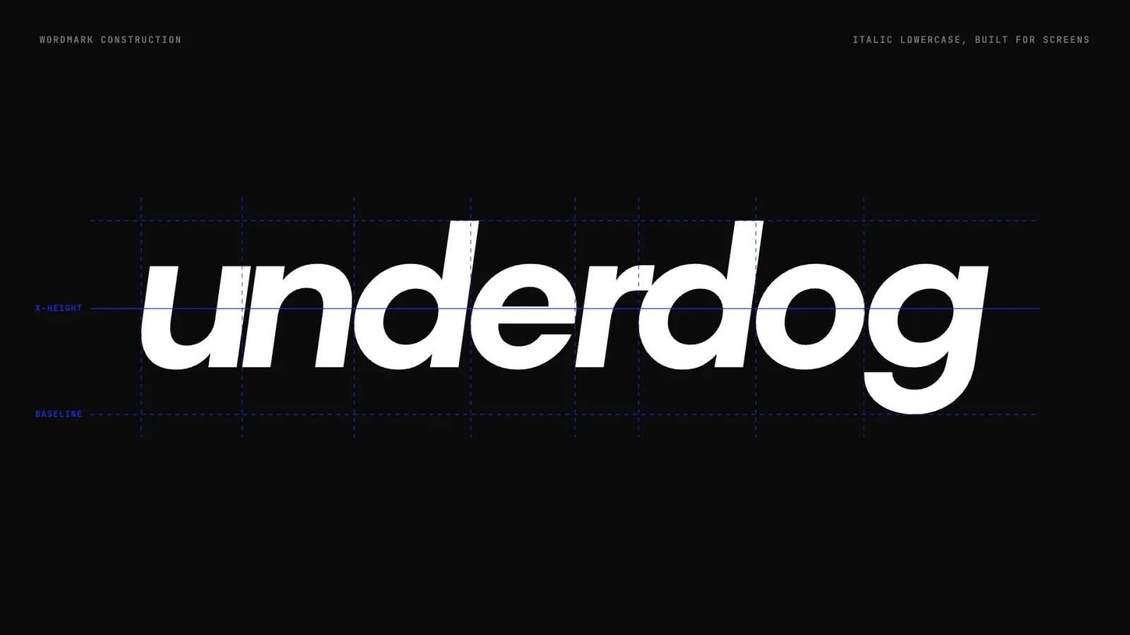
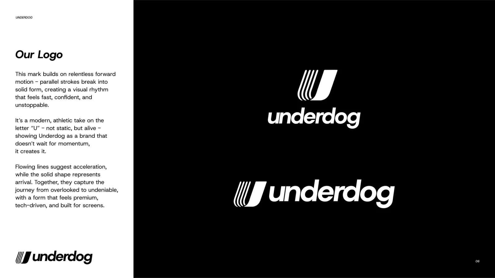
An athletic U in forward motion. Parallel strokes on a grid of golden ratio circles, and an italic wordmark built for screens.

Trainers running a real business on spreadsheets and DMs.
Underdog is an all-in-one platform for independent sports trainers, academies and parents. It does bookings, payments, scheduling and growth dashboards. It also has a marketplace where parents find private training and camps. Its users are the coaches big platforms overlook. They run sessions through Google Forms, Venmo and Instagram DMs, while big clubs have real software. The brand had to tell them: we see you, you deserve powerful tools too.
Look as serious as the big clubs. Speak to trainers and parents at once. Support the company before its raise.
Bold, elevated, trusted, built for momentum.
Premium, never scrappy. Never too corporate, too techy, too loud or too startup-shiny.
Pride. A trainer should feel like a real business the first time they open the dashboard.
Look serious in every post.Brand OS Portal lets your team make posts that look the part, without waiting on a designer.
Brand guidelines
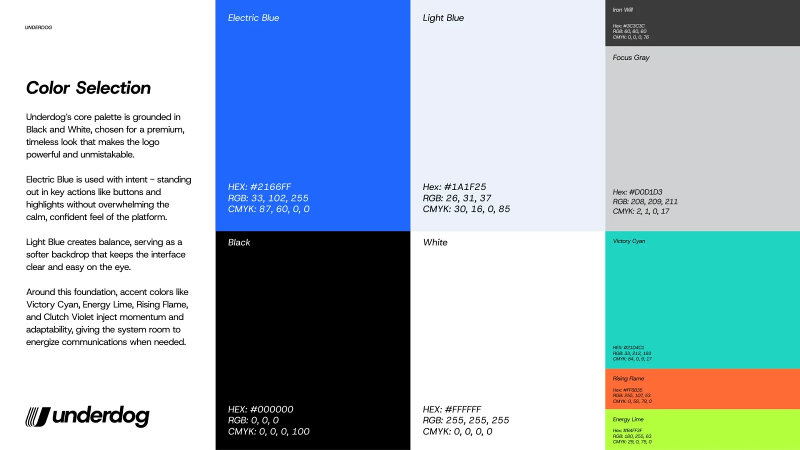
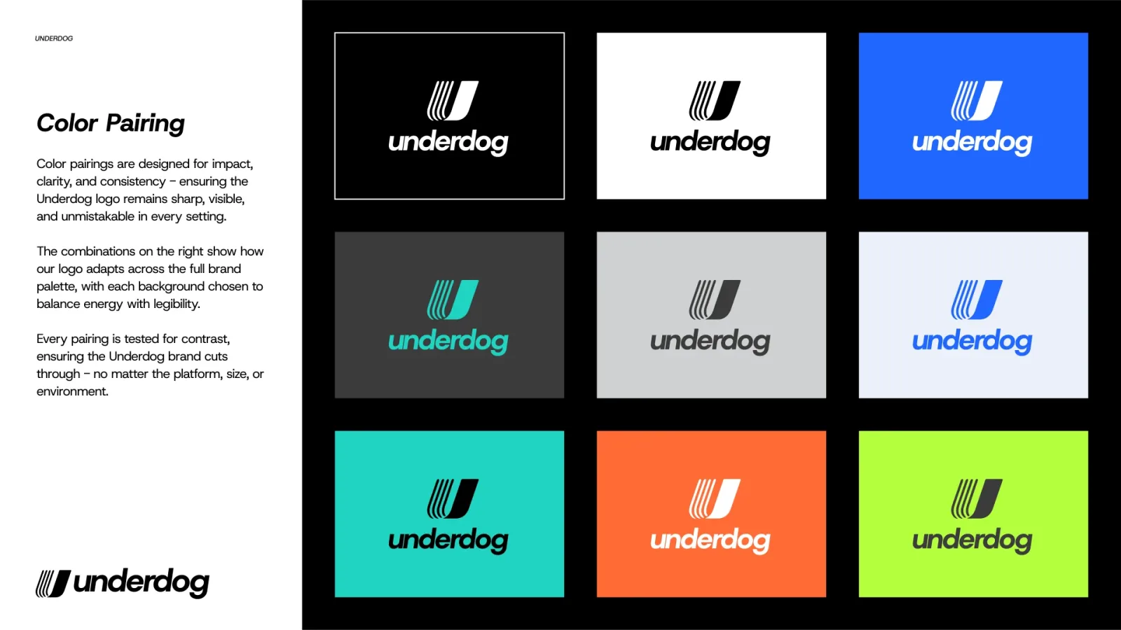
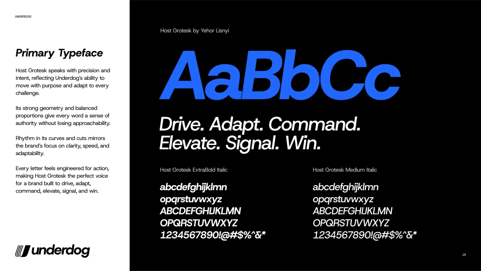
Logo, clearspace, colour, pairings and type: Host Grotesk for headlines, electric blue for everything that matters. Down to the app icon.
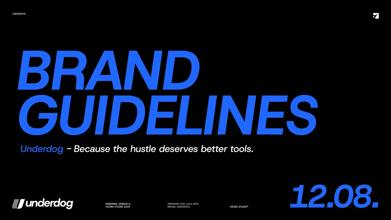
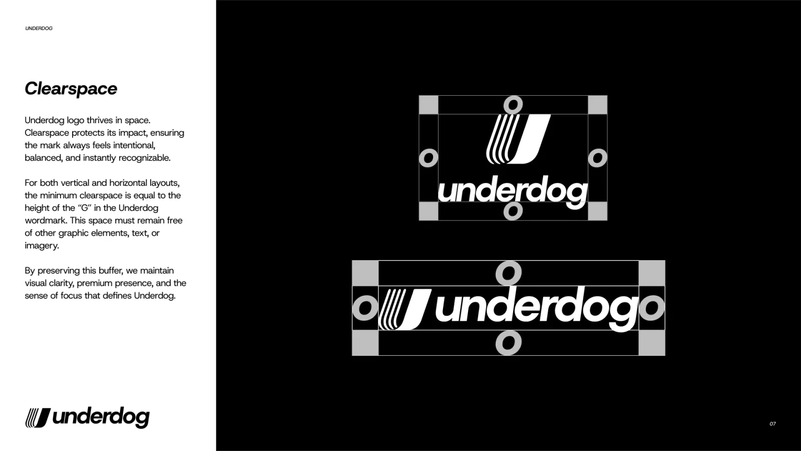
Underdog gives independent sports trainers the tools big clubs always had.
Built for the coaches big platforms overlook.
Look like a real business from the first booking.
Like picking up a ball: easy, never techy.
Underdogs do not wait for it. They create it.
The website I designed
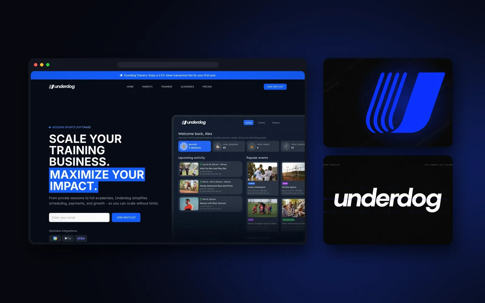
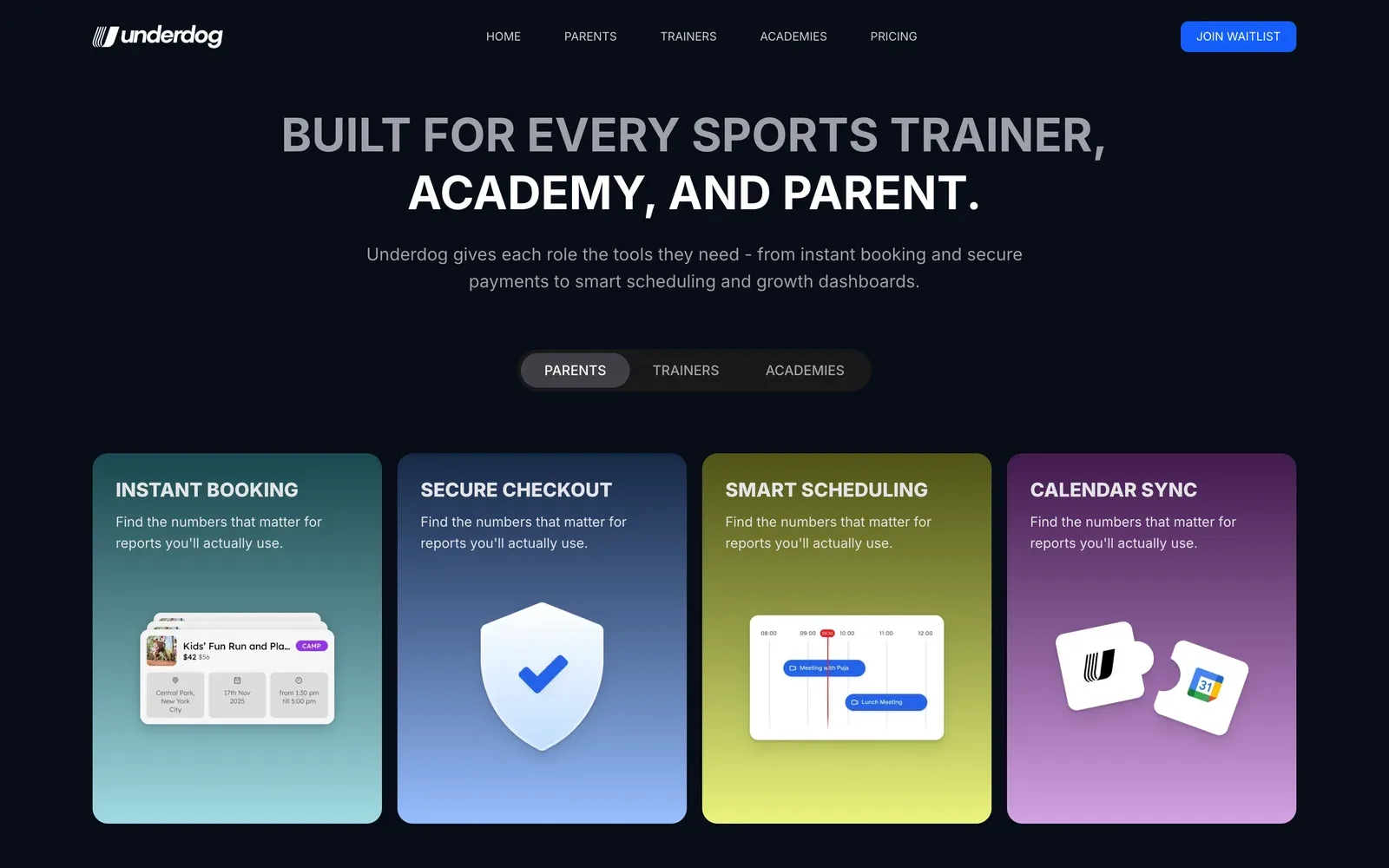
underdogplatform.com, which I designed: one platform for trainers, academies and parents, with the real dashboard as the hero.
Five decisions, and what I said no to.
- 01Parallel strokes that land as one solid U
Speed lines pick up pace and join into a single form. It is the journey from overlooked to undeniable. It stays clear as a tiny app icon.
RejectedA dog mascot or a ball icon that ties the brand to one sport.
- 02An italic lowercase wordmark
Fast, athletic and friendly. It reads well on screens and never shouts.
RejectedHeavy all-caps sports lettering that feels loud and exclusive.
- 03Electric blue as the one brand colour
One confident blue owns the app, the website and the merchandise. It sits on a black and white premium base.
RejectedA team-jersey palette with several equal brand colours.
- 04A sports palette only for data
Victory Cyan, Rising Flame and Energy Lime are the data colours. They mark progress, payments and goals.
RejectedDashboards in one flat blue where every number looks the same.
- 05Three guideline modes
Black and blue, light mode, and premium black and white. It holds on the pitch, in the app and in a deck.
RejectedOne dark version that breaks on light screens and print.
What was broken, and what I built to fix it.
A brand that looks as serious as the clubs it competes with.
Underdog launched with a complete identity and guidelines in three modes. It also got product visuals for the trainer and parent dashboards, and for the website. The overlooked trainers now get software that looks the part.
U mark, wordmark, lockups, tagline.
Colour, type, pairings, three modes.
App icon, dashboard and website visuals.
Want a brand like Underdog's?
15 minutes. No sales talk. You leave knowing what to do next.
Rather write to me?
Got it.
You hear from me within 2 to 8 hours.