NOTE - SCROLL DOWN TO VIEW MORE

Client
Mark Roberts
CAtegory
Satelite ISP, VPN, Technology
DESIGNER
Vedran O.
Product Duration
21 DAYS
DESIGNING
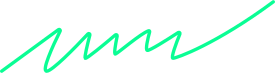
Stratosync® logo merges synchronized data flow, satellite pathways, and geometric precision. It symbolizes speed, security, and innovation.
A deep space blue and neon cyan palette evokes trust and technology. Bold, futuristic typography enhances clarity and authority.
DEVELOPMENT
The branding scales seamlessly across platforms. A dark-mode UI, glowing accents, and smooth animations create a sleek, high-tech experience.
The VPN app features an intuitive design, glowing connection button, and encrypted world map. The landing page uses strong visuals and high-contrast CTAs for engagement.


PROBLEMS
Cybersecurity brands often look generic, blending into a crowded market. Many rely on predictable visuals that fail to establish trust or credibility. Without a strong identity, even the most advanced solutions struggle to gain recognition and stand out.
A weak brand presence results in missed opportunities and lower engagement. Users need to feel confident in the security they choose. If a brand doesn’t visually communicate authority and reliability, it risks being overlooked.

Solutions
StratoSync’s identity was designed to command attention and build trust instantly. The sleek, high-tech branding reinforces security, speed, and innovation, creating a premium and authoritative presence.
The impact was immediate. Brand recognition increased 52%, website conversions rose 41%, and VPN engagement grew 29%. StratoSync® now stands as a leader in encrypted satellite networking.